Feb 15, 2026

4 min read

A website prototype is essentially a working model of your site. It’s an interactive, clickable blueprint that lets you test-drive the user experience long before a single line of code gets written. Think of it as a dress rehearsal for your website.
This approach allows your entire team to click through navigation, try out features, and get a real feel for the end product. The goal? To catch design flaws and usability issues early, saving you from headaches and costly revisions later on.

You wouldn't build a skyscraper based on a conversation, would you? Of course not. An architect first creates detailed blueprints and scale models to make sure everyone—from the investors to the construction crew—is on the same page. It’s how you spot potential structural problems and visualize the finished building.
A website prototype does the exact same thing for a digital product. It’s the critical bridge that connects a brilliant idea to a functional, user-friendly website. It makes abstract concepts tangible, ensuring the final build is exactly what your users need and expect.
One of the biggest hurdles in any web project is getting everyone to share the same vision. Designers, developers, marketers, and stakeholders often have slightly different ideas of what the final product should be. A prototype cuts through that ambiguity.
Instead of trying to interpret static design files or dense project briefs, everyone can actually use a simulation of the website. They can click through the user journey and see for themselves how it all works.
This shared understanding delivers some serious advantages:
The concept ties in directly with the principles of building a minimum viable product for success. A solid prototype is often the very first step in validating an MVP's core ideas.
A prototype isn’t just a design file; it’s a communication tool. It forces you to have the tough, critical conversations about features and user needs before you sink a ton of money into development.
The savings are even more dramatic for cross-platform apps. For instance, building with a framework like React Native can already cut mobile app development costs by 30-40% compared to building separate native apps. When you prototype first, you amplify those savings. A well-prototyped project can stay under $500,000, whereas a native build with less planning might balloon closer to $600,000 for the same scope.
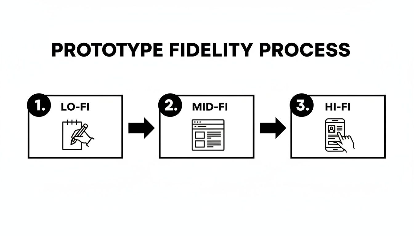
Picking the right level of detail—or fidelity—for your website prototype is one of those crucial early decisions that sets the tone for your entire design process. Think of it like a movie director storyboarding a film. You wouldn't hire A-list actors and build million-dollar sets just to test out a rough scene idea. You’d start with simple sketches to get the sequence right.
It’s the same logic in web development. You don't jump straight into a pixel-perfect, fully interactive model. You match the prototype's fidelity to your current goal, whether that's just hashing out a basic user flow or nailing the final animation details. Each level has its place, saving you a ton of time and money by focusing only on what matters at that specific stage.
Low-fidelity (lo-fi) prototypes are your quickest, dirtiest way to get an idea out of your head and into the world. They’re the digital equivalent of a frantic sketch on a whiteboard or scribbles on a napkin. The whole point here is to focus on structure, layout, and the core user journey—forget about aesthetics.
These are meant to be rough. We're talking simple shapes, placeholder "lorem ipsum" text, and maybe a splash of grayscale.
Once you've got the basic structure locked down, it's time to graduate to a mid-fidelity (mid-fi) prototype. This is where your sketch starts to feel less like an idea and more like an actual website. These are usually digital wireframes with more realistic spacing, a clear content hierarchy, and defined interactive elements like buttons and forms.
They still skip the final colors, fonts, and fancy images, but mid-fi prototypes introduce basic interactivity. Users can click through menus, play with form fields, and follow the main user paths. This makes them absolute gold for early usability testing.
Mid-fidelity is all about balance. It gives you a real feel for the site's structure and flow without the massive time commitment of a polished design. It's the perfect sweet spot for catching major usability headaches before they become expensive problems.
High-fidelity (hi-fi) prototypes are as close as you can get to the final product without writing a line of code. They look and feel almost identical to the live website, loaded with the real branding, final copy, gorgeous images, and slick animations. Every little detail is interactive and polished.
For a deeper dive into this stage, our guide on high-fidelity wireframes has you covered.
These prototypes are absolutely essential for the final leg of the design process.
Deciding which fidelity to use can be tricky. It really depends on what you need to learn and who you need to show it to. This table breaks down the key differences to help you choose the right tool for the job.
| Fidelity Level | Visual Detail | Interactivity | Best For | Tools |
|---|---|---|---|---|
| Low-Fidelity | Basic sketches, grayscale, simple shapes, placeholder content. | None or very limited (e.g., linking static screens). | Early brainstorming, concept validation, mapping user flows. | Pen & paper, Balsamiq, Whimsical |
| Mid-Fidelity | Digital wireframes, clear layout, defined elements, some real text. | Basic clicking, navigation, simple form interactions. | Usability testing, structural feedback, content placement. | Figma, Sketch, Adobe XD |
| High-Fidelity | Pixel-perfect UI, final branding, real content, animations. | Complex interactions, micro-animations, full user journeys. | Final stakeholder approval, developer handoff, investor pitches. | Figma, ProtoPie, Framer |
Ultimately, you'll likely move through all three stages. Starting with a quick lo-fi sketch lets you fail fast and cheap, a mid-fi wireframe helps you iron out the structural kinks, and a hi-fi prototype ensures your final product is both beautiful and functional.
Turning a raw idea into a working model that people can actually click on requires a smart, structured workflow. When you have a solid process, each stage builds on the last, which saves you from chasing dead ends and keeps the focus where it belongs: on the user. Think of it as a journey from a vague concept to something tangible you can test.
The very first step is always about the foundation: defining your goals and getting inside your users' heads. What problem are you really solving? And for whom? You absolutely have to create detailed user personas and map out their potential journeys. Skipping this is like trying to build a house without a blueprint—every decision from here on out will be a guess.
Once you have a crystal-clear "who" and "why," you can start giving the idea some shape. This is where you’ll get into low-fidelity sketches and wireframes.
Think of this part of the process as creating the architectural plans for your website. The goal here isn't to win any design awards; it's to lay down a rock-solid structural foundation for the user experience.
I always recommend starting with quick-and-dirty paper sketches to blast through different layout ideas for your key pages. Once you’ve landed on a direction you like, it's time to move to digital wireframes. These are just clean, grayscale layouts that decide where every single button, image, and block of text is going to live. If you want to dive deeper into this crucial step, we've got a great guide on how to create a wireframe for a website.
Okay, now for the fun part: adding interactivity. Using your design tool of choice, you’ll start linking your static screens together to create clickable paths. This is the magic moment your flat blueprint becomes a dynamic, mid-fidelity prototype of a website.
This flow chart really shows how a design naturally evolves from a simple napkin sketch to a model you can actually interact with.
The key takeaway here is to start simple and only add detail and functionality as you validate the core concept.
Finally, you need to make it feel real by swapping out placeholder text with actual content. Sure, "Lorem ipsum" works for initial layouts, but using realistic copy and images is what makes a prototype feel authentic during user testing. This is how you get feedback that's actually valuable.
A prototype without realistic content is like a car with no engine—it might look the part, but you can’t truly test how it performs. Real content reveals awkward phrasing, spacing issues, and unclear calls to action.
And remember, this workflow isn't a one-and-done deal. It’s a loop: build a version, test it with real people, listen to their feedback, and refine the design. Every cycle gets you closer to a final product that isn't just well-designed but has been thoroughly battle-tested.
Picking the right software isn't just a small choice—it pretty much dictates your entire prototyping workflow. The market is absolutely packed with options. Some are design-centric powerhouses perfect for crafting stunning visuals, while others are built on code to deliver a sense of realism you just can't get otherwise.
Your team’s real goals are what will guide you to the perfect fit. Are you sweating the details of the user interface and visual design? Or is your main challenge simulating tricky data interactions and backend logic? Answering that question will help you cut through the noise.
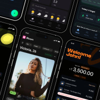
For a long time, the obvious choices were tools like Figma and Sketch. And for good reason—they are brilliant for creating beautiful, high-fidelity mockups with clickable interactions. They give designers the power to build a pixel-perfect prototype of a website and are fantastic for user testing sessions and showing stakeholders what you're thinking.
But a new breed of tool is starting to connect the dots between design and development. Platforms built on actual code offer a level of realism that static design tools just can't replicate, making the jump to a final product feel a lot less like a leap of faith. When you're weighing your options, exploring tools like the best AI website builders can also open up some surprisingly efficient paths.
The whole point of a tool is to make things easier. A great prototyping tool doesn't just help you build a model; it helps your team communicate better, test ideas faster, and arrive at a stronger final product with way fewer headaches.
This is a huge deal for teams building apps that need to work everywhere. Instead of designing for iOS, then Android, then the web, what if you could just prototype for all three at the same time?
This is where innovative marketplaces like gluestack market are changing the game for developers. By offering production-ready React Native templates and UI kits, they seriously shorten the distance between a great idea and a high-fidelity, working prototype.
This approach brings some massive advantages to the table:
It’s an approach that's become a lifeline for startups and indie developers. In fact, recent data showed an impressive 790 React Native apps were pulling in monthly revenues between $10,000 and $100,000, which really speaks to the framework's power in the market. You can dive deeper into these React Native vs. Flutter revenue findings on Statista. By using pre-built assets, teams can pour their energy into the unique features that matter instead of rebuilding basic UI, helping them get to an MVP and beyond much faster.

A prototype isn't truly alive until a real user gets their hands on it. Until then, it's just a collection of your team's best guesses. User testing is where the magic happens—it’s the moment you swap those assumptions for cold, hard facts about what works and what absolutely doesn't.
Think of it less as a final exam and more as a collaborative discovery session. The goal isn't to get a perfect score. It's to find all the cracks, the confusing bits, and the moments of pure frustration. That raw, unfiltered feedback is gold. It’s what you’ll use to build something people genuinely love to use.
How you test can be as simple as a casual sit-down or as structured as a formal lab study. The right call really boils down to your budget, your timeline, and what you’re trying to learn about your prototype of a website.
There are two main roads you can take:
Here’s a hard truth: feedback from the wrong people can be worse than no feedback at all. It can send your project spiraling in the wrong direction. You have to test with people who actually represent your target audience.
Don't just focus on demographics like age or location. Zero in on their behaviors and needs. Building a new fitness app? Then you need to talk to people who are already tracking their workouts or have tried similar apps in the past, not just any random person off the street.
The most insightful feedback comes from watching someone struggle. Don't lead them to the answer. Instead, create a test script with clear, scenario-based tasks and ask them to think out loud as they navigate your prototype.
After just a few testing sessions, you'll start to see patterns. The same confusing button, the same dead-end flow, the same frustrated sighs. These recurring themes are your roadmap for improvement.
Group the feedback by issue, then prioritize what to fix. A minor typo is annoying, but a bug that blocks users from completing a purchase is a five-alarm fire. Use these insights to iterate on the design, making your prototype of a website stronger and more intuitive before a single line of production code gets written.
Let's be real—when you're under pressure to deliver, starting a prototype of a website from a blank screen isn't always the smartest play. Jumping on pre-built templates and UI kits is a strategic shortcut that can take your project from a raw idea to a testable model in a fraction of the time.
It's all about working smarter, not harder. Instead of burning hundreds of hours designing and coding basics like navigation bars, forms, or button styles, you start with a high-quality foundation already in place. This lets your team skip the grunt work and pour their energy into the unique features and user experiences that will actually make your product stand out.
Marketplaces like gluestack are goldmines for this. They offer domain-specific templates that aren't just pretty designs; they're built with production-ready code. Picture this: you need a prototype for a new fitness app. Instead of starting from scratch, you could grab a template and have a polished, cross-platform model up and running in days, not weeks.
This approach is a game-changer for teams using frameworks like React Native, which is already a top pick for its cross-platform muscle. The numbers don't lie: 43,149 companies are currently using React Native. What's more, 50% of them are small businesses and 72% generate under $50M in revenue, proving its value for teams that need to move fast and stay lean. You can dig into more React Native adoption stats on enlyft.com.
Using a production-ready template completely changes the prototyping game. The model you build for testing isn't a throwaway file; it’s the actual foundation of your final application, dramatically closing the gap between design and development.
Opting for a template is a strategic move that really pays off in certain scenarios. It's the perfect way to go if you need to:
By starting with a solid framework, you ensure your project is built on accessible, high-quality code right from the get-go. If you're building with React, checking out a well-structured React website template can give you a massive head start.
Even with the best plan in place, a few questions always seem to bubble up when you start building a prototype of a website. Getting clear, no-nonsense answers is the best way to keep things moving. Here are some of the most common things we hear from teams in the middle of a project.
We'll tackle the usual hurdles, from telling key deliverables apart to figuring out just how much detail you really need in your final model.
Let’s think about it like building a house. A wireframe is your static blueprint. It's the architectural drawing showing where the walls, doors, and windows go—it’s all about structure, layout, and hierarchy. Nothing more.
A prototype, on the other hand, is the interactive scale model of that house. You can actually open the doors, walk through the rooms, and get a feel for what it's like to live there. You can click around a prototype; a wireframe is just a picture.
The single biggest difference is interactivity. A wireframe shows what the site will contain, while a prototype shows how the site will function. That's a critical distinction when it comes to user testing and getting good feedback from stakeholders.
Honestly, it depends entirely on how detailed you need it to be. You could sketch out a low-fidelity paper prototype in a couple of hours. A digital, mid-fidelity prototype with some basic click-through links might take a few days to a week.
A really polished, high-fidelity prototype built from the ground up? That could easily take several weeks. But there’s a shortcut. Using a pre-built template from a place like gluestack market can slash that time, letting you get a code-based, professional-looking model up and running in just a few days.
Absolutely. In fact, it’s one of the most powerful tools you can bring into that room. A high-fidelity prototype takes your idea from an abstract concept and makes it a tangible, interactive product they can hold and use.
Instead of just telling them about your user journey with a slide deck, you can show them. It makes your vision far more compelling, proves you’ve thought through the entire user experience, and shows investors that your idea isn't just a dream—it's achievable.
Ready to build your next prototype faster? gluestack market offers production-ready React Native templates and UI kits to help you launch cross-platform apps in record time. Explore our marketplace and accelerate your development today at https://market.gluestack.io.
Feb 23, 2026
4 min read
Discover powerful mobile app monetization strategies to boost your revenue. Our guide covers IAPs, ads, and subscriptions for React Native apps and beyond.

Feb 22, 2026
4 min read
A clear guide to app development cost estimation. Learn what drives costs, see budget examples, and discover strategies to build your app for less.

Feb 21, 2026
4 min read
Discover how to promote mobile application effectively with proven ASO, paid campaigns, and retention strategies.

Feb 14, 2026
4 min read
Confused about mockups vs wireframes? Learn the key differences, when to use each, and how to streamline your React Native app development workflow.

Feb 13, 2026
4 min read
Discover how mobile apps templates accelerate development. Learn to choose, customize, and deploy high-quality React Native templates for your next project.

Feb 12, 2026
4 min read
Explore mobile application interface design with practical tips, core principles, and platform-aware workflows to craft apps users love.
Feb 10, 2026
4 min read
Learn mobile first design principles to craft fast, accessible apps that delight users. Practical tips, examples, and testing strategies.
Feb 08, 2026
4 min read
Explore the progressive web app vs native debate with our in-depth guide. We compare performance, cost, and UX to help you make the right strategic choice.
Feb 07, 2026
4 min read
Discover how React Native templates can accelerate your app development. This guide explores choosing, customizing, and deploying templates for faster launches.

Feb 05, 2026
4 min read
Discover the key differences between expo vs react native, including workflow, builds, and performance to help you pick the right path for your app.
Feb 03, 2026
4 min read
Master image with text overlay in React Native with responsive, accessible patterns. Learn expo setup, NativeWind styling, and gluestack-ui examples.

Feb 03, 2026
4 min read
Discover cross platform app development with proven strategies to build faster for iOS, Android, and the web using a single, unified codebase.
Feb 01, 2026
4 min read
Learn how to make an app for my business quickly with template-based steps from planning to launch, plus tips to scale and optimize.
Jan 31, 2026
4 min read
Ready to build an app? This guide shares practical strategies for validating your idea, choosing a tech stack, and navigating the App Store launch.
Jan 30, 2026
4 min read
Master responsive design for mobile apps with this guide on fluid layouts, breakpoints, and React Native. Build UIs that adapt perfectly to any screen.

Jan 25, 2026
4 min read
Learn how to design an Android app that stands out. This guide covers UX research, wireframing, Material Design, and the developer handoff process.

Jan 24, 2026
4 min read
Explore ui design web essentials: a complete guide to principles, responsive patterns, and workflows for intuitive, engaging web interfaces.

Jan 23, 2026
4 min read
Discover 10 essential mobile app design best practices for building exceptional cross-platform apps. Actionable tips for UI, UX, navigation, and performance.

Jan 21, 2026
4 min read
Discover how to debug React Native apps effectively. This guide covers Flipper, React DevTools, and native code troubleshooting for faster development cycles.
Jan 20, 2026
4 min read
Learn how to create app for your business with a practical, modern approach. Plan, customize, and launch with proven steps.
Jan 19, 2026
4 min read
A complete guide to mobile app development for startups. Learn how to validate your idea, build an MVP, and launch a successful app faster and more affordably.

Jan 18, 2026
4 min read
Discover how to choose the right React website template to accelerate your project. Our guide covers everything from quality checklists to deployment.
Jan 17, 2026
4 min read
Discover how to choose, customize, and deploy a React Native app template. This guide provides practical steps for launching production-ready apps faster.

Jan 16, 2026
4 min read
Discover how mobile application templates accelerate development. This guide covers how to choose, customize, and launch your app with the right foundation.

Jan 13, 2026
4 min read
Start your journey in mobile app development for beginners. This guide breaks down how to build your first cross-platform app with React Native and Expo.

Jan 12, 2026
4 min read
Explore the best react native ui libraries and compare features, performance, and ease of use to pick the right toolkit for your app.

Jan 11, 2026
4 min read
Launch your own ride-hailing service with our guide to building a production-ready Uber app clone. Learn MVP strategy, tech stacks, and backend integration.

Jan 10, 2026
4 min read
Master modern cash app design with this guide. Learn the UI/UX, security, and React Native strategies needed to build a fintech app that users trust and love.

Jan 09, 2026
4 min read
Learn how to build a personal finance dashboard with React Native. A practical guide for developers on UI design, data architecture, and production readiness.
Jan 08, 2026
4 min read
A practical guide to building a cross-platform event check in app with React Native. Learn to implement QR scanning, offline sync, and deployment.

Jan 07, 2026
4 min read
Master linear gradient React Native components with our complete guide. Learn practical techniques for Expo, bare RN, and NativeWind to build stunning UIs.

Jan 06, 2026
4 min read
Learn how to change application name in your React Native & Expo projects. This guide covers display names, package IDs, and app store listings.
Jan 05, 2026
4 min read
Discover how to monetize mobile apps with our founder's guide. Learn proven React Native strategies for ads, IAPs, and subscriptions to maximize your revenue.

Jan 04, 2026
4 min read
A practical guide on how to create a website app with a single codebase. Learn to build for web, iOS, and Android using React Native, Expo, and TypeScript.

Jan 03, 2026
4 min read
Learn how to create an app for your business with this definitive guide. Discover practical strategies for validation, development, and launch that work.

Jan 02, 2026
4 min read
Learn how to create a wireframe for a website with this practical guide. Move from initial sketches to developer-ready designs that get built right.
Jan 01, 2026
4 min read
Deciding on progressive web application vs native? This guide offers a deep comparison of performance, cost, UX, and use cases to help you choose wisely.

Dec 31, 2025
4 min read
Discover 10 mobile app security best practices for React Native. Learn to secure data, APIs, and code with actionable tips and examples for 2025.

Dec 30, 2025
4 min read
Unlock the real React Native app development cost. Our guide breaks down pricing by feature, team, and complexity to help you budget with confidence.

Dec 29, 2025
4 min read
A practical guide to master your React Native debug workflow. Learn to use Flipper, React DevTools, and Hermes to solve bugs in Expo and bare RN apps.

Dec 28, 2025
4 min read
The ultimate React Native tutorial for beginners. Learn to build beautiful cross-platform apps using a modern stack like Expo, TypeScript, and gluestack-ui.

Dec 27, 2025
4 min read
A practical guide on how to build a mobile app. Learn to go from concept to a market-ready app using templates, React Native, and proven development strategies.

Dec 26, 2025
4 min read
Discover interface design for websites with actionable tips on layout, responsiveness, and usability to boost conversions.

Dec 25, 2025
4 min read
Discover designs for apps that blend minimal aesthetics with personalization, and learn to build user-centric interfaces that boost engagement.

Dec 24, 2025
4 min read
Learn graphical interface design - essentials for mastering core principles, modern workflows, and cross-platform strategies to build intuitive, engaging UIs.

Dec 23, 2025
4 min read
Discover how high fi wireframes bridge the gap between ideas and code. Learn a practical workflow for creating, testing, and handing off effective UI designs.

Dec 22, 2025
4 min read
Discover mobile app interface design with practical principles, accessibility, and workflows that boost user engagement.

Dec 21, 2025
4 min read
Explore the top 10 UI UX design trends for 2025. Get expert insights and practical React Native tips to build next-gen cross-platform apps that stand out.

Dec 20, 2025
4 min read
Discover how mobile app templates accelerate development from idea to launch. Learn to select, customize, and deploy templates for a faster time to market.

Dec 18, 2025
4 min read
Explore the best react native ui libraries to accelerate mobile development with performance, theming, and accessibility. Expert tips inside.
Dec 16, 2025
4 min read
Master React Native PDF handling. Learn to generate, view, and share PDFs with practical code examples, library comparisons, and performance tips.
Dec 15, 2025
4 min read
A practical guide to choosing the right React Native component library. Learn how to evaluate options, avoid common pitfalls, and build apps faster.

Dec 14, 2025
4 min read
Find the perfect React Native UI library for your project. This guide compares top libraries, selection criteria, and customization strategies.
Dec 13, 2025
4 min read
Learn how to change app name in React Native and Expo. Our guide covers display names, bundle IDs, and store listings for iOS and Android projects.
Dec 12, 2025
4 min read
Discover the best React Native component library for your next project. We compare top libraries on performance, customization, and real-world use cases.

Dec 11, 2025
4 min read
Discover how to choose the right React Native UI kit. This guide covers top kits, selection criteria, and customization to accelerate your app development.
Dec 10, 2025
4 min read
Explore our in-depth guide to find the best React Native UI library. We compare top contenders to help you choose the right fit for your project.
Dec 09, 2025
4 min read
Discover a practical approach to building apps with React Native. This guide covers setup, UI, state management, and testing to help you ship great apps.

Dec 08, 2025
4 min read
android login with facebook: Learn to set up the Facebook SDK, manage tokens, and implement secure authentication across native Android, cross-platform apps.

Dec 07, 2025
4 min read
Master the alert in React Native. Learn to handle platform differences, build custom modals, and apply best practices for a seamless user experience.
Dec 06, 2025
4 min read
keyboardavoidingview react native: Master keyboard handling with KeyboardAvoidingView across iOS, Android, Expo, and TypeScript.
Dec 05, 2025
4 min read
A practical guide to implementing a React Native PDF viewer. Learn to compare libraries, handle native setup, and troubleshoot common issues with real code.

Dec 04, 2025
4 min read
how to validate startup idea: learn proven methods like customer interviews, MVPs, and metrics to confirm market fit.

Dec 03, 2025
4 min read
how to make app like uber: Learn core features, tech stack, development steps, testing, and launch tips.

Dec 02, 2025
4 min read
Build a rock-solid React Native setup. This guide covers Expo vs. Bare workflows, TypeScript, pnpm monorepos, NativeWind, and deployment strategies.

Dec 01, 2025
4 min read
A practical guide to Stripe React Native integration. Learn to set up your server, build payment UIs, handle webhooks, and launch secure mobile payments.

Nov 30, 2025
4 min read
Learn how to master push notifications in React Native. This guide covers setup, best practices, and advanced techniques for engaging your users.

Nov 29, 2025
4 min read
Build powerful location-based apps with our practical guide to react native with google maps. Get setup guides, pro tips, and best practices for iOS & Android.

Nov 28, 2025
4 min read
Explore deep linking react native with a practical guide to configuring URL schemes, universal links, navigation, and testing for Expo and bare apps.

Nov 28, 2025
4 min read
A practical guide to building a scalable React Native design system. Learn to implement tokens, theming, and tools like NativeWind and gluestack-ui.
Nov 26, 2025
4 min read
Learn why react native expo templates speed up your projects with ready-made patterns and practical tips.

Nov 25, 2025
4 min read
Discover how to improve developer productivity with actionable strategies for workflow, tooling, and culture. A practical guide for software engineering teams.

Nov 24, 2025
4 min read
Discover the best cross platform app development tools. Compare top frameworks like Flutter and React Native to build and ship apps faster.
Nov 23, 2025
4 min read
This Expo React Native tutorial provides a hands-on guide to building cross-platform apps. Learn setup, styling with NativeWind, navigation, and deployment.
Nov 22, 2025
4 min read
Build beautiful UIs faster with this guide to Tailwind CSS React Native. Learn setup, styling, and advanced techniques with NativeWind for mobile apps.
Nov 21, 2025
4 min read
Explore our curated list of 7 top-tier React Native app examples. Discover production-ready templates and resources to build your next app faster.
Mar 19, 2025
4 min read
gluestack market offers React Native UI templates to accelerate development. Get customizable, production-ready React Native app templates and Ui kit, some free. Build faster & smarter today!