Dec 21, 2025

4 min read


In the fast-paced world of mobile app development, staying ahead means more than just writing clean code. It requires crafting intuitive, engaging, and memorable user experiences. As we move forward, the line between beautiful aesthetics and seamless functionality is blurring, driven by powerful new UI UX design trends. This guide moves past abstract concepts to deliver a practical roadmap for implementation.
This is not just another trend list; it is a deep dive into the 10 most impactful trends transforming app interfaces today. We will go beyond theory to provide actionable strategies, UX patterns, and practical examples specifically tailored for building stunning cross-platform apps with React Native. You'll learn how to implement everything from dynamic typography and glassmorphism to advanced micro-interactions and accessible design principles.
Our focus is on making these UI UX design trends achievable. For developers at startups, agencies, or those building their own products, this means translating design concepts into functional, high-performance components. We will explore how to leverage these trends to create apps that not only look modern but feel incredible to use across iOS, Android, and the web. To accelerate your workflow, we’ll also highlight production-ready templates and screens from the gluestack market that bring these designs to life with minimal effort. This guide is your blueprint for building next-generation app experiences that captivate users and drive engagement, without getting bogged down in generic advice.
The dual-mode theme, offering both a light and dark interface, has evolved from a niche feature to a fundamental expectation in modern app design. This trend prioritizes user control and comfort, acknowledging that a single, static theme cannot accommodate every user or environment. Dark mode reduces eye strain in low-light conditions and can conserve battery life on OLED/AMOLED screens, while light mode provides optimal readability in bright environments and remains a preference for many users. Offering a seamless toggle between these states is a key element in today's user-centric ui ux design trends.
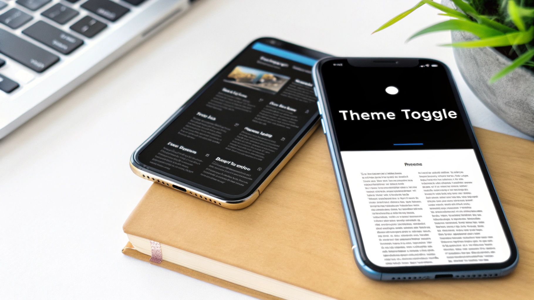
This approach is no longer just an aesthetic choice; it's a core accessibility and usability feature. Platforms like Apple's iOS 13 and Google's Material Design 3 have integrated system-wide theme settings, allowing apps to automatically adapt to the user's OS-level preference. This creates a cohesive and less disruptive experience as users navigate between different applications.
For React Native developers, implementing a theme toggle is streamlined with context APIs and UI libraries like gluestack-ui.
Context API or a state management library to provide the current theme (light/dark) to all components. This avoids prop-drilling and centralizes theme logic.Appearance module from React Native to detect the user's system-wide color scheme preference on initial app load.'#FFFFFF', use semantic variables like colors.background. This makes switching themes as simple as swapping the active color palette.Key Insight: A successful dual-mode implementation is not just about inverting colors. It requires a thoughtful redesign of the color palette to maintain brand identity, hierarchy, and accessibility standards (WCAG contrast ratios) in both modes.
Neumorphism, often called Soft UI, is a design language that bridges the gap between hyper-realistic skeuomorphism and stark flat design. It creates a soft, extruded plastic look where UI elements appear as if they are pushed through or protrude from the background. This effect is achieved through subtle, consistent use of inner and outer shadows, creating a tactile and visually cohesive interface. Unlike flat design's minimalism, neumorphism adds depth and a sense of physical interaction, making it one of the more visually distinctive ui ux design trends.
This trend gained popularity through platforms like Dribbble, where designers explored its potential for creating clean, modern, and almost futuristic interfaces. While its low-contrast nature presents accessibility challenges, its application in specific contexts, such as premium financial dashboards or minimalist smart home control apps, can produce a stunning and sophisticated user experience. The key is using it selectively for non-critical components to enhance aesthetics without sacrificing usability.
Crafting a convincing neumorphic effect in React Native requires careful manipulation of styling properties, particularly shadows and gradients.
box-shadow properties: one light shadow from the top-left (e.g., -10px -10px 20px #FFFFFF) and one dark shadow from the bottom-right (e.g., 10px 10px 20px #D1D9E6). For a concave (pressed) effect, use inset shadows.Key Insight: Neumorphism is most effective when used sparingly as an accent. Applying it to every single button, card, and input field can overwhelm the user and harm usability. Use it to highlight key interactive areas while keeping primary content clean and legible.
Micro-interactions are the small, purposeful animations that respond to user actions, providing immediate feedback and transforming a functional interface into an engaging one. This trend moves beyond purely decorative effects, focusing on meaningful motion that guides users, communicates state changes, and adds a layer of delight. From the subtle animation of a "like" button to the smooth transition of a page loading, these details are crucial in modern ui ux design trends for creating intuitive and satisfying experiences.

Pioneered by design teams at companies like Apple and Stripe, effective motion design reinforces user actions and builds a stronger connection between the user and the digital product. For instance, a gentle shake on an incorrect password entry instantly communicates an error without needing disruptive text. This approach enhances usability by making interactions feel more responsive, direct, and human.
React Native offers powerful libraries like react-native-reanimated and moti that enable developers to create fluid, performant animations.
useNativeDriver: true) with React Native's Animated API for animations that don't depend on the JavaScript thread. This ensures smooth performance, especially for complex transitions and gestures.AccessibilityInfo API to check for isReduceMotionEnabled and disable or simplify non-essential animations for users who prefer reduced motion.react-native-haptic-feedback can trigger subtle vibrations that correspond to on-screen actions, making the interface feel more tangible.Key Insight: The goal of motion design is not to distract but to clarify. Effective micro-interactions should be brief (under 300ms), purposeful, and consistent with your app's overall brand personality and motion system.
Designing for inclusivity and accessibility has shifted from a compliance checkbox to a core principle of ethical and effective product design. This approach involves creating interfaces usable by people with a wide range of abilities, including visual, auditory, motor, and cognitive impairments. By prioritizing standards like the Web Content Accessibility Guidelines (WCAG), designers create products that are not just accessible but are fundamentally better for everyone, solidifying its place among crucial ui ux design trends.
This trend recognizes that accessibility is not a niche requirement; it benefits users in various contexts, such as someone trying to use an app in bright sunlight (high contrast) or in a noisy environment (captions). Companies like Microsoft with their Inclusive Design Toolkit and Apple with its built-in accessibility features (VoiceOver, Switch Control) have demonstrated that building for the edges of human experience often leads to innovation that serves the center.
For React Native developers, building accessible apps is achievable by leveraging built-in APIs and accessible-first components.
accessibilityRole prop to define UI elements for screen readers (e.g., 'button', 'header', 'link'). This provides essential context for non-visual navigation.accessibilityLabel. Use accessibilityHint to provide extra information on what the element does.Key Insight: True accessibility goes beyond automated tools and checklists. It requires empathy and direct engagement, including usability testing with individuals with disabilities, to uncover real-world barriers and create genuinely equitable experiences.
Glassmorphism creates a frosted-glass effect by using background blur and transparency on UI elements, giving them a sense of depth and hierarchy. This aesthetic allows objects behind the "glass" layer to be partially visible yet obscured, creating a sophisticated, multi-layered feel. By combining transparency, blur, a subtle border, and a light shadow, designers can make elements appear as if they are floating on a translucent pane, making it one of the most visually striking ui ux design trends today.

This trend was heavily popularized by Apple’s macOS Big Sur and Microsoft’s Windows 11 interfaces, which use it for elements like sidebars, modal windows, and notification centers. The style lends a modern, airy quality to interfaces, making them feel clean and premium. When applied thoughtfully, glassmorphism guides the user's focus by elevating key interactive components like action sheets or navigation bars.
Achieving a true glassmorphism effect in React Native, especially on Android, requires specific packages, as it's not a native CSS property like on the web.
@react-native-community/blur to create the essential BlurView component. This component will apply the frosted glass effect to anything rendered behind it.BlurView component above the background content you want to obscure. Inside the BlurView, you can add your foreground content, such as text or buttons.BlurView to simulate a light reflection on the glass edge. A soft drop shadow can further enhance the perception of depth and lift the element off the background.blurAmount is high enough and the foreground text has sufficient contrast against the varied, blurred background. Always test against WCAG guidelines.Key Insight: Glassmorphism is most effective when used sparingly for transient or layered UI elements like modals, pop-ups, and navigation panels. Overusing it can make an interface feel cluttered and may impact performance on lower-end devices due to the rendering cost of blur effects.
Variable and dynamic typography represents a significant leap forward from static, fixed-size fonts. This approach uses variable font files and responsive sizing techniques to create text that fluidly adapts to different screen sizes, resolutions, and contexts. Instead of loading multiple font files for different weights or styles, a single variable font file contains all variations, offering performance benefits and immense design flexibility. This is a core evolution in ui ux design trends, enabling more sophisticated and readable interfaces.
This trend is about more than just scaling text; it's about crafting a typographic system that maintains its hierarchy and legibility across every device, from a smartwatch to a desktop monitor. Leading platforms like Google Fonts have championed variable fonts, while companies like Stripe have built entire design systems around their custom variable typefaces to ensure brand consistency and a polished user experience.
Implementing dynamic typography in React Native requires a combination of modern CSS techniques and careful system design.
vw, vh) and pixel-based units to create text that scales with the screen. Libraries and custom hooks can help calculate a clamped value that prevents text from becoming too large or too small.@font-face rules to load variable fonts. On native, you must include the font file (e.g., a .ttf or .otf) in your project's assets and reference it by its PostScript name.fontSize: 16, use semantic names like theme.typography.body. This scale can then be adjusted based on the screen width or device type.lineHeight and letterSpacing as the fontSize changes. This ensures that readability is maintained at all sizes, preventing lines from becoming too cramped or spaced out.Key Insight: The power of variable typography lies in its axes of variation, such as weight, width, slant, and even optical size. A well-implemented system uses these axes not just for aesthetics but to actively enhance legibility and user experience in different contexts.
Transforming complex datasets into clear, interactive, and aesthetically pleasing visuals has become a cornerstone of modern user experience. This trend moves beyond static charts to create dynamic, digestible stories from data, empowering users to understand insights at a glance. In an age of information overload, effective data visualization in dashboards, analytics platforms, and health apps is a critical component of leading ui ux design trends.
This approach is no longer confined to specialized analytics tools like Tableau or Google Analytics; it's now integral to user-facing features in apps like the Apple Health app or Stripe Dashboard. The goal is to make data accessible and meaningful, enabling users to make informed decisions without needing to be data scientists. As data becomes more central to design, implementing essential data visualization best practices ensures your infographics are not only beautiful but also insightful.
For React Native developers, integrating powerful data visualizations is achievable with dedicated charting libraries.
react-native-svg-charts offer a flexible, SVG-based solution for custom charts. For more complex and interactive needs, consider integrating web-based libraries like Apache ECharts or D3.js via a WebView.Key Insight: Great data visualization is not about displaying all the data; it's about telling a clear and accurate story. Select the right chart type for your data's narrative, simplify where possible, and guide the user to the most important insights first.
The integration of 3D elements is pushing interfaces beyond flat, two-dimensional planes into immersive, interactive spaces. This trend leverages technologies like WebGL and libraries such as Three.js to introduce depth, realism, and a tactile sense of engagement. By allowing users to manipulate, rotate, and explore products or data in three dimensions, designers can create highly memorable and informative experiences. This evolution from static imagery to interactive models is a defining characteristic of modern ui ux design trends, particularly in e-commerce and product showcases.
This approach transforms digital browsing into an experience more akin to physical interaction. Apple's product pages, which allow users to inspect devices from every angle, and automotive sites like Tesla, which feature 3D car configurators, are prime examples. The goal is not just aesthetic flair; it is about providing deeper product understanding, boosting user confidence, and creating a powerful brand differentiator in a crowded digital marketplace.
Bringing 3D models into a React Native app is more accessible than ever, thanks to powerful libraries that bridge the gap between native performance and web-based 3D technologies.
react-three-fiber, a React renderer for Three.js. It allows you to build a 3D scene declaratively with reusable components, making complex 3D logic feel like standard React development.@react-three/drei, which offers helpers for orbit controls, allowing users to easily pinch-to-zoom and pan-to-rotate models.Key Insight: Effective 3D integration is about purpose, not just presentation. The interaction should serve a clear user goal, such as visualizing a product in their own space with AR or understanding a complex mechanism, rather than being a purely decorative feature that harms performance.
The shift from one-size-fits-all interfaces to highly personalized experiences is a defining characteristic of modern digital products. This trend leverages artificial intelligence (AI) and machine learning (ML) to analyze user behavior, preferences, and context, creating interfaces that adapt dynamically to each individual. Instead of static layouts, users encounter customized content, recommendations, and even UI elements, making interactions more relevant and efficient. This focus on individualization is a critical component in the evolution of ui ux design trends.
This data-driven approach moves beyond simple user segmentation. Services like Netflix, which personalizes content thumbnails to appeal to different viewing habits, and Spotify, with its hyper-curated "Discover Weekly" playlists, demonstrate the power of AI in enhancing user engagement and retention. By anticipating user needs and surfacing relevant information, personalization reduces friction and creates a more intuitive, almost conversational, relationship between the user and the app.
For React Native developers, integrating AI-driven personalization requires a combination of frontend logic and backend data processing.
Key Insight: Effective personalization is a balance between helpful adaptation and user autonomy. The goal is to assist users without being intrusive or creating a filter bubble. Always prioritize ethical AI practices, data privacy, and provide clear user controls.
A design system is no longer a luxury reserved for large enterprises; it's a foundational strategy for creating scalable, consistent, and efficient digital products. This approach systematizes design by creating a single source of truth: a comprehensive library of reusable UI components, clear usage guidelines, and design principles. By building with predefined, well-documented components like buttons, inputs, and cards, teams can accelerate both design and development cycles, eliminate inconsistencies, and maintain brand coherence across all platforms. This systematic method is a cornerstone of modern ui ux design trends, enabling teams to focus on complex user problems instead of reinventing basic UI elements.
The power of a design system lies in its ability to create a shared language between designers and developers. Systems like Google's Material Design and Salesforce's Lightning Design System have set the standard, proving that this investment significantly reduces redundant work and improves product quality. For startups and agencies, adopting this approach from the start prevents the accumulation of design debt and ensures a polished, professional user experience as the application grows.
Building or adopting a design system in React Native is highly effective, as the framework's component-based architecture is a natural fit.
default, hover, disabled, error) and is fully accessible.Key Insight: A design system is a product, not a project. It requires ongoing maintenance, versioning, and a dedicated team or process to evolve with your products and brand. A successful system is one that is actively used, trusted, and maintained.
| Item | 🔄 Implementation Complexity | ⚡ Resource Requirements | 📊 Expected Outcomes | 💡 Ideal Use Cases | ⭐ Key Advantages |
|---|---|---|---|---|---|
| Dark Mode and Light Mode Toggle | 🔄 Medium — theme system + testing | ⚡ Low–Medium — CSS vars, storage, tests | 📊 Better comfort, retention, battery on OLED | 💡 Consumer apps, mobile, productivity tools | ⭐ Improves accessibility & user preference support |
| Neumorphism (Soft UI) | 🔄 Medium–High — layered shadows & polish | ⚡ Medium — design time, detailed QA | 📊 Premium, soft aesthetic but potential readability issues | 💡 High-end apps, landing pages, product showcases | ⭐ Creates tactile, minimal visual depth |
| Micro-interactions and Motion Design | 🔄 Medium — timing, easing, state handling | ⚡ Medium — animation assets, performance testing | 📊 Enhanced feedback, perceived responsiveness, engagement | 💡 Buttons, onboarding, form feedback, transitions | ⭐ Clarifies state changes and improves UX delight |
| Inclusive and Accessible Design | 🔄 Medium — WCAG & assistive support integration | ⚡ Medium–High — user testing, tooling, audits | 📊 Broader reach, legal compliance, improved UX for all | 💡 Public services, enterprise, education, any consumer-facing site | ⭐ Ensures accessibility, compliance, and wider audience reach |
| Glassmorphism | 🔄 Medium — backdrop filters + fallbacks | ⚡ Medium — graphics, performance considerations | 📊 Sophisticated, layered UI with possible performance cost | 💡 Dashboards, modals, premium brand interfaces | ⭐ Adds depth and a modern, premium visual layer |
| Variable and Dynamic Typography | 🔄 Medium — font axes & responsive rules | ⚡ Low–Medium — variable fonts, CSS tooling | 📊 Better readability, smaller font payloads, refined hierarchy | 💡 Content-heavy sites, responsive apps, design systems | ⭐ Flexible typography with performance gains |
| Data Visualization and Infographics | 🔄 High — data modeling, interaction design | ⚡ High — engineering, libraries, domain expertise | 📊 Actionable insights, improved decision-making | 💡 Dashboards, analytics platforms, reporting tools | ⭐ Makes complex data understandable and actionable |
| 3D Design and Interactive Elements | 🔄 High — 3D pipelines, rendering, UX considerations | ⚡ High — compute, specialized skills, optimization | 📊 Immersive experiences, strong engagement but heavier load | 💡 E‑commerce product demos, AR/VR, experiential sites | ⭐ Delivers immersive visualization and brand differentiation |
| Personalization and AI-Driven Design | 🔄 High — ML models, data pipelines, evaluation | ⚡ High — data, compute, privacy and infra needs | 📊 Increased engagement, conversions, tailored UX | 💡 Content platforms, e‑commerce, recommendation-heavy products | ⭐ Provides highly relevant, adaptive user experiences |
| Component-Based and Design System Approach | 🔄 High upfront, lower ongoing complexity | ⚡ High upfront — documentation, tooling, governance | 📊 Consistency, faster dev cycles, reduced design debt | 💡 Large products, multi-team organizations, scalable platforms | ⭐ Ensures consistency, reuse, and faster product iteration |
Navigating the landscape of modern UI/UX design trends can feel like a formidable task, but it doesn't have to be. As we've explored, the core principles driving user interface innovation are not just fleeting aesthetic choices; they represent a fundamental shift towards more intuitive, inclusive, and engaging digital experiences. The journey from Dark Mode toggles and subtle Neumorphism to dynamic 3D elements and AI-driven personalization is guided by a singular goal: creating applications that feel less like tools and more like extensions of the user's own intent.
The overarching theme connecting these trends is a deep respect for the end-user. Whether through the thoughtful implementation of micro-interactions that provide delightful feedback or the critical adoption of inclusive design practices that welcome everyone, the message is clear. Users today demand more than just functionality; they expect consideration, clarity, and a touch of personality in the apps they use daily. Mastering these UI/UX design trends is no longer a "nice-to-have" for developers and product teams, it's a competitive necessity for building products that capture attention and foster long-term loyalty.
To effectively implement these concepts, it's crucial to move beyond theory and into actionable strategy. Let's distill the most important takeaways from our exploration:
The challenge for many startups, indie developers, and even established agencies is the significant time and resource investment required to build these sophisticated, trend-aligned interfaces from the ground up. The true secret to success in this fast-paced environment is not just understanding the latest UI/UX design trends, but finding the most efficient way to implement them without compromising quality. To truly 'Start Building Smarter, Not Harder', it's essential to stay informed on the latest design trends for 2025 reshaping the visual landscape.
By leveraging pre-built, production-ready foundations, you can leapfrog the tedious groundwork of creating basic components and focus your energy on what truly makes your app unique: its core features, business logic, and brand identity. This strategic shortcut allows you to deliver a polished, modern, and high-performing application to the market faster, giving you a critical advantage. The future of app development is about assembling, customizing, and innovating, not reinventing the wheel with every new project.
Ready to bring these cutting-edge UI/UX design trends to your next React Native project without the manual effort? Explore gluestack market for professionally designed, production-ready screens and templates built on a robust, accessible component library. Accelerate your development and launch a beautiful, modern app in a fraction of the time by visiting gluestack market today.

Feb 23, 2026
4 min read
Discover powerful mobile app monetization strategies to boost your revenue. Our guide covers IAPs, ads, and subscriptions for React Native apps and beyond.

Feb 22, 2026
4 min read
A clear guide to app development cost estimation. Learn what drives costs, see budget examples, and discover strategies to build your app for less.

Feb 21, 2026
4 min read
Discover how to promote mobile application effectively with proven ASO, paid campaigns, and retention strategies.

Feb 15, 2026
4 min read
Discover how to create a prototype of a website with a practical, step-by-step guide. Explore tools, testing methods, and tips to bring your idea to life.

Feb 14, 2026
4 min read
Confused about mockups vs wireframes? Learn the key differences, when to use each, and how to streamline your React Native app development workflow.

Feb 13, 2026
4 min read
Discover how mobile apps templates accelerate development. Learn to choose, customize, and deploy high-quality React Native templates for your next project.

Feb 12, 2026
4 min read
Explore mobile application interface design with practical tips, core principles, and platform-aware workflows to craft apps users love.

Feb 10, 2026
4 min read
Learn mobile first design principles to craft fast, accessible apps that delight users. Practical tips, examples, and testing strategies.

Feb 08, 2026
4 min read
Explore the progressive web app vs native debate with our in-depth guide. We compare performance, cost, and UX to help you make the right strategic choice.
Feb 07, 2026
4 min read
Discover how React Native templates can accelerate your app development. This guide explores choosing, customizing, and deploying templates for faster launches.

Feb 05, 2026
4 min read
Discover the key differences between expo vs react native, including workflow, builds, and performance to help you pick the right path for your app.
Feb 03, 2026
4 min read
Master image with text overlay in React Native with responsive, accessible patterns. Learn expo setup, NativeWind styling, and gluestack-ui examples.

Feb 03, 2026
4 min read
Discover cross platform app development with proven strategies to build faster for iOS, Android, and the web using a single, unified codebase.

Feb 01, 2026
4 min read
Learn how to make an app for my business quickly with template-based steps from planning to launch, plus tips to scale and optimize.

Jan 31, 2026
4 min read
Ready to build an app? This guide shares practical strategies for validating your idea, choosing a tech stack, and navigating the App Store launch.
Jan 30, 2026
4 min read
Master responsive design for mobile apps with this guide on fluid layouts, breakpoints, and React Native. Build UIs that adapt perfectly to any screen.

Jan 25, 2026
4 min read
Learn how to design an Android app that stands out. This guide covers UX research, wireframing, Material Design, and the developer handoff process.

Jan 24, 2026
4 min read
Explore ui design web essentials: a complete guide to principles, responsive patterns, and workflows for intuitive, engaging web interfaces.

Jan 23, 2026
4 min read
Discover 10 essential mobile app design best practices for building exceptional cross-platform apps. Actionable tips for UI, UX, navigation, and performance.

Jan 21, 2026
4 min read
Discover how to debug React Native apps effectively. This guide covers Flipper, React DevTools, and native code troubleshooting for faster development cycles.
Jan 20, 2026
4 min read
Learn how to create app for your business with a practical, modern approach. Plan, customize, and launch with proven steps.

Jan 19, 2026
4 min read
A complete guide to mobile app development for startups. Learn how to validate your idea, build an MVP, and launch a successful app faster and more affordably.

Jan 18, 2026
4 min read
Discover how to choose the right React website template to accelerate your project. Our guide covers everything from quality checklists to deployment.
Jan 17, 2026
4 min read
Discover how to choose, customize, and deploy a React Native app template. This guide provides practical steps for launching production-ready apps faster.

Jan 16, 2026
4 min read
Discover how mobile application templates accelerate development. This guide covers how to choose, customize, and launch your app with the right foundation.

Jan 13, 2026
4 min read
Start your journey in mobile app development for beginners. This guide breaks down how to build your first cross-platform app with React Native and Expo.

Jan 12, 2026
4 min read
Explore the best react native ui libraries and compare features, performance, and ease of use to pick the right toolkit for your app.

Jan 11, 2026
4 min read
Launch your own ride-hailing service with our guide to building a production-ready Uber app clone. Learn MVP strategy, tech stacks, and backend integration.

Jan 10, 2026
4 min read
Master modern cash app design with this guide. Learn the UI/UX, security, and React Native strategies needed to build a fintech app that users trust and love.

Jan 09, 2026
4 min read
Learn how to build a personal finance dashboard with React Native. A practical guide for developers on UI design, data architecture, and production readiness.

Jan 08, 2026
4 min read
A practical guide to building a cross-platform event check in app with React Native. Learn to implement QR scanning, offline sync, and deployment.

Jan 07, 2026
4 min read
Master linear gradient React Native components with our complete guide. Learn practical techniques for Expo, bare RN, and NativeWind to build stunning UIs.

Jan 06, 2026
4 min read
Learn how to change application name in your React Native & Expo projects. This guide covers display names, package IDs, and app store listings.
Jan 05, 2026
4 min read
Discover how to monetize mobile apps with our founder's guide. Learn proven React Native strategies for ads, IAPs, and subscriptions to maximize your revenue.

Jan 04, 2026
4 min read
A practical guide on how to create a website app with a single codebase. Learn to build for web, iOS, and Android using React Native, Expo, and TypeScript.

Jan 03, 2026
4 min read
Learn how to create an app for your business with this definitive guide. Discover practical strategies for validation, development, and launch that work.

Jan 02, 2026
4 min read
Learn how to create a wireframe for a website with this practical guide. Move from initial sketches to developer-ready designs that get built right.
Jan 01, 2026
4 min read
Deciding on progressive web application vs native? This guide offers a deep comparison of performance, cost, UX, and use cases to help you choose wisely.

Dec 31, 2025
4 min read
Discover 10 mobile app security best practices for React Native. Learn to secure data, APIs, and code with actionable tips and examples for 2025.

Dec 30, 2025
4 min read
Unlock the real React Native app development cost. Our guide breaks down pricing by feature, team, and complexity to help you budget with confidence.

Dec 29, 2025
4 min read
A practical guide to master your React Native debug workflow. Learn to use Flipper, React DevTools, and Hermes to solve bugs in Expo and bare RN apps.

Dec 28, 2025
4 min read
The ultimate React Native tutorial for beginners. Learn to build beautiful cross-platform apps using a modern stack like Expo, TypeScript, and gluestack-ui.

Dec 27, 2025
4 min read
A practical guide on how to build a mobile app. Learn to go from concept to a market-ready app using templates, React Native, and proven development strategies.

Dec 26, 2025
4 min read
Discover interface design for websites with actionable tips on layout, responsiveness, and usability to boost conversions.

Dec 25, 2025
4 min read
Discover designs for apps that blend minimal aesthetics with personalization, and learn to build user-centric interfaces that boost engagement.

Dec 24, 2025
4 min read
Learn graphical interface design - essentials for mastering core principles, modern workflows, and cross-platform strategies to build intuitive, engaging UIs.

Dec 23, 2025
4 min read
Discover how high fi wireframes bridge the gap between ideas and code. Learn a practical workflow for creating, testing, and handing off effective UI designs.

Dec 22, 2025
4 min read
Discover mobile app interface design with practical principles, accessibility, and workflows that boost user engagement.

Dec 20, 2025
4 min read
Discover how mobile app templates accelerate development from idea to launch. Learn to select, customize, and deploy templates for a faster time to market.

Dec 18, 2025
4 min read
Explore the best react native ui libraries to accelerate mobile development with performance, theming, and accessibility. Expert tips inside.
Dec 16, 2025
4 min read
Master React Native PDF handling. Learn to generate, view, and share PDFs with practical code examples, library comparisons, and performance tips.
Dec 15, 2025
4 min read
A practical guide to choosing the right React Native component library. Learn how to evaluate options, avoid common pitfalls, and build apps faster.

Dec 14, 2025
4 min read
Find the perfect React Native UI library for your project. This guide compares top libraries, selection criteria, and customization strategies.

Dec 13, 2025
4 min read
Learn how to change app name in React Native and Expo. Our guide covers display names, bundle IDs, and store listings for iOS and Android projects.
Dec 12, 2025
4 min read
Discover the best React Native component library for your next project. We compare top libraries on performance, customization, and real-world use cases.
Dec 11, 2025
4 min read
Discover how to choose the right React Native UI kit. This guide covers top kits, selection criteria, and customization to accelerate your app development.

Dec 10, 2025
4 min read
Explore our in-depth guide to find the best React Native UI library. We compare top contenders to help you choose the right fit for your project.
Dec 09, 2025
4 min read
Discover a practical approach to building apps with React Native. This guide covers setup, UI, state management, and testing to help you ship great apps.

Dec 08, 2025
4 min read
android login with facebook: Learn to set up the Facebook SDK, manage tokens, and implement secure authentication across native Android, cross-platform apps.

Dec 07, 2025
4 min read
Master the alert in React Native. Learn to handle platform differences, build custom modals, and apply best practices for a seamless user experience.
Dec 06, 2025
4 min read
keyboardavoidingview react native: Master keyboard handling with KeyboardAvoidingView across iOS, Android, Expo, and TypeScript.
Dec 05, 2025
4 min read
A practical guide to implementing a React Native PDF viewer. Learn to compare libraries, handle native setup, and troubleshoot common issues with real code.

Dec 04, 2025
4 min read
how to validate startup idea: learn proven methods like customer interviews, MVPs, and metrics to confirm market fit.

Dec 03, 2025
4 min read
how to make app like uber: Learn core features, tech stack, development steps, testing, and launch tips.

Dec 02, 2025
4 min read
Build a rock-solid React Native setup. This guide covers Expo vs. Bare workflows, TypeScript, pnpm monorepos, NativeWind, and deployment strategies.

Dec 01, 2025
4 min read
A practical guide to Stripe React Native integration. Learn to set up your server, build payment UIs, handle webhooks, and launch secure mobile payments.

Nov 30, 2025
4 min read
Learn how to master push notifications in React Native. This guide covers setup, best practices, and advanced techniques for engaging your users.

Nov 29, 2025
4 min read
Build powerful location-based apps with our practical guide to react native with google maps. Get setup guides, pro tips, and best practices for iOS & Android.

Nov 28, 2025
4 min read
Explore deep linking react native with a practical guide to configuring URL schemes, universal links, navigation, and testing for Expo and bare apps.

Nov 28, 2025
4 min read
A practical guide to building a scalable React Native design system. Learn to implement tokens, theming, and tools like NativeWind and gluestack-ui.

Nov 26, 2025
4 min read
Learn why react native expo templates speed up your projects with ready-made patterns and practical tips.

Nov 25, 2025
4 min read
Discover how to improve developer productivity with actionable strategies for workflow, tooling, and culture. A practical guide for software engineering teams.

Nov 24, 2025
4 min read
Discover the best cross platform app development tools. Compare top frameworks like Flutter and React Native to build and ship apps faster.

Nov 23, 2025
4 min read
This Expo React Native tutorial provides a hands-on guide to building cross-platform apps. Learn setup, styling with NativeWind, navigation, and deployment.

Nov 22, 2025
4 min read
Build beautiful UIs faster with this guide to Tailwind CSS React Native. Learn setup, styling, and advanced techniques with NativeWind for mobile apps.

Nov 21, 2025
4 min read
Explore our curated list of 7 top-tier React Native app examples. Discover production-ready templates and resources to build your next app faster.
Mar 19, 2025
4 min read
gluestack market offers React Native UI templates to accelerate development. Get customizable, production-ready React Native app templates and Ui kit, some free. Build faster & smarter today!