Feb 03, 2026

4 min read

An image with text overlay is exactly what it sounds like: text placed directly on top of an image. But the magic is in the execution. Often, a semi-transparent color layer sits between the two, making the text pop without completely obscuring the visual behind it. It’s a technique that’s essential for creating engaging user interfaces—think promotional banners, content cards, and hero sections. You’re combining rich visuals with contextual info into one cohesive component.
In the crowded app market, you get one shot at a first impression. A polished, visually striking UI can be the difference between a user sticking around or bouncing immediately. The image with text overlay isn't just a fleeting design trend; it's a powerful tool for communication that can elevate your app from a simple MVP to a professional, production-ready product. For indie devs and startups, mastering this is a seriously high-impact skill.

Let's be real—people are drawn to great visuals. The data doesn't lie: visual content consistently gets 94% more views than plain text and is shared 40 times more often. This isn't just a social media thing; it's a core part of digital strategy, with the market projected to hit an incredible $19.17 billion by 2032.
An image overlay lets you tap into that power directly by:
To build these components, we'll be leaning on a modern, efficient stack that’s perfect for cross-platform development. This guide will walk you through building with React Native and Expo, styled with NativeWind and gluestack-ui. It’s a killer combination for creating beautiful, accessible, and performant UIs that run smoothly on iOS, Android, and the web—all from a single codebase.
When you combine a powerful image with clear, concise text, you create a component that's both informative and visually stunning. To truly nail effective interactive design principles and boost user engagement, you have to get image overlays right. This guide will show you exactly how to do that.
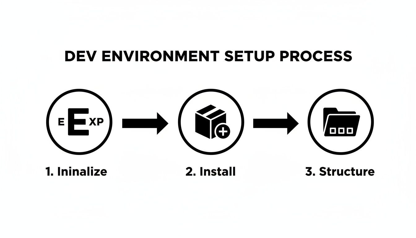
Before we can start building that perfect image with text overlay, we need to get our workspace in order. A solid, well-configured environment is the launchpad for any successful React Native project, and it's what ensures our components will work flawlessly across platforms.
We'll be using a modern stack designed for speed and consistency. The foundation is Expo, a framework that handles a ton of the tricky native configuration so we can focus purely on writing our app. On top of that, we'll use TypeScript for type safety, which is a lifesaver on larger projects.
First things first, let's spin up a new project. Pop open your terminal and run this command. It creates a fresh Expo project using a blank TypeScript template—a clean slate, just how we like it.
npx create-expo-app@latest my-overlay-app --template blank-typescript
Once that's done, jump into your new project directory:
cd my-overlay-app
This simple setup gives us all the core React Native and Expo dependencies we need. Now, we can start adding the libraries that will really power our UI development.
Next up, we'll install our styling and component libraries. My go-to combination here is NativeWind for styling and gluestack-ui for pre-built, accessible components. It’s a powerful duo: NativeWind brings the amazing utility-first approach of Tailwind CSS to React Native, while gluestack-ui gives us a robust set of UI building blocks right out of the box.
Let's install them with a single command:
npx expo install @gluestack-ui/themed @gluestack-style/react nativewind
After the installation, you'll need to do a few quick configuration steps to get these tools wired up correctly. I won't bog down this guide with those details, but you can find a comprehensive walkthrough in our full React Native setup guide.
Taking a moment to set up these libraries correctly from the start is absolutely crucial. Trust me, it prevents so many headaches down the line. NativeWind handles the complex logic of applying styles universally, and gluestack-ui ensures our components are accessible by default, which is a huge win.
And that's it! With our project initialized and our core UI libraries in place, we have a rock-solid foundation. Now we're ready to start building our reusable image overlay component, confident our environment is configured for cross-platform success.
Alright, let's roll up our sleeves and turn that theory into a real, working component. We're going to build <CardWithOverlay> from the ground up—a flexible, reusable block that you can drop into any app that needs to lay text over an image.
We'll be using primitive components from gluestack-ui (Box, Image, Text) for our structure and NativeWind to handle all the styling. This combo is fantastic because you get the solid, accessible foundation of gluestack-ui with the lightning-fast, responsive styling of utility classes.
The workflow is pretty straightforward, as you can see below.
We'll initialize the project, pull in our dependencies, and set up our files. This simple process paves the way for a smooth development experience.
The whole secret to a good overlay is layering. Think of it like a stack: the image is the bottom layer, a semi-transparent Box sits in the middle, and the text rests on top. We pull this off with absolute positioning, which lets us stack elements on top of one another within the same space.
Our main container, a Box, will serve as our frame. Inside goes the Image component. The most critical part here is giving the container a position: relative property (just the relative class in NativeWind). This tells any child with position: absolute to position itself relative to this container, not the entire screen.
Once the image is in place, we'll add another Box to serve as the overlay itself. This Box gets an absolute position and is styled to cover the parent container completely. NativeWind makes this a breeze with the absolute inset-0 classes.
To make sure our text is readable against any image, we'll give this overlay a semi-transparent black background. The class bg-black/50 does the trick perfectly.
Finally, we'll place our text elements (using the Text component from gluestack-ui) inside this overlay box. I like to use flexbox utilities like flex justify-end items-end to push the text neatly into the bottom-right corner for a clean, professional look. This level of control is exactly why utility-first styling is so powerful. If this is new to you, our guide on using Tailwind CSS in React Native is a great place to start.
Key Takeaway: The real power move here is creating a component that accepts props for the image source, title, and subtitle. This transforms our static design into a dynamic, reusable
<CardWithOverlay>that can be populated with any data. It’s perfect for mapping over an array of items in a list or grid.
To make this a bit clearer, here’s a quick-reference table of the key styling properties we're using.
| Property | Purpose | NativeWind Example |
|---|---|---|
position: relative |
Establishes the positioning context for child elements. | relative |
position: absolute |
Takes an element out of the normal flow to be positioned relative to its parent. | absolute |
inset |
A shorthand for top, right, bottom, and left. inset-0 makes it cover the parent. |
inset-0 |
bg-opacity |
Controls the opacity of the background color to create the semi-transparent effect. | bg-black/50 |
flexbox |
A powerful layout model for aligning and distributing items within a container. | flex justify-end items-end |
These few classes are the workhorses that make the entire overlay effect possible, giving you precise control over the final look and feel.
The demand for AI-powered visual tools is exploding. The global AI Text-to-Image Generator Market was valued at USD 401.6 Million in 2024 and is projected to surge to USD 1,528.5 Million by 2034. For developers, this trend is a clear signal: users expect visually rich, dynamic content in their apps. A well-built image overlay component isn't just a design detail; it’s a core feature that meets modern user expectations.
While we're working in the digital space, the core principles of layering visuals are universal. For example, the craft of creating a photo projection charm shows how an image can be intricately 'overlaid' or projected in the physical world. This layering of meaning and visuals, whether digital or physical, is what creates a memorable experience. Our component aims to achieve that same impact on the screen.
A single component design rarely covers every use case. Once you've got a solid foundation for your image-with-text overlay, you can start building on it to create some really engaging UI elements. We're going to walk through three popular and practical variations that build directly on our base component: a subtle gradient overlay, a corner badge for promotions, and a simple press-state animation.
Each of these adds a layer of polish and functionality, turning a simple card into something much more dynamic. These patterns are incredibly versatile, whether you're building an e-commerce product grid, a media app's video thumbnails, or a news feed.
A solid color overlay gets the job done, but a gradient often provides a more refined, professional look. It allows the top of an image to remain crystal clear while giving the text at the bottom a darker, more readable background. This is a go-to technique for hero images or featured content where you really want the visual to pop.
To pull this off, we'll swap our semi-transparent Box with a LinearGradient component. A fantastic choice for this is the expo-linear-gradient package, which is dead simple to install and use within the Expo ecosystem.
npx expo install expo-linear-gradient.Box component that you were using for the overlay. Instead of a background class like bg-black/50, you'll pass a colors prop to your new LinearGradient component.colors prop would look something like this: ['transparent', 'rgba(0,0,0,0.8)']. This creates a beautiful, smooth transition from fully transparent at the top to a dark, semi-opaque color at the bottom, making sure your text is always easy to read.If you want to go deeper, we have a whole guide on the power of using a linear gradient in React Native that covers different angles, colors, and more advanced scenarios.
Sometimes you need to convey a little extra information at a glance—think "New," "On Sale," or a category tag. A small badge tucked into the corner of the image is the perfect way to do this. You see this pattern everywhere in e-commerce apps for highlighting promotions or new arrivals.
The logic here is pretty much the same as our main overlay, relying on absolute positioning inside the same relative container.
<CardWithOverlay> component, just add another Box that will act as the badge.bg-red-500), rounded corners (rounded-full), and a little padding (px-2 py-1) usually does the trick.absolute top-2 right-2. This pins the badge 2 units from the top and 2 units from the right of its parent.This simple tweak adds a ton of contextual value without cluttering the main text overlay, resulting in a cleaner and more informative UI.
Static components are functional, but a little bit of animation on interaction gives the user that satisfying feedback they expect. A simple scale-down effect when someone presses the card is a great way to signal that the component is interactive. We can get this done easily with React Native's built-in Animated API and a Pressable component.
Here's the general game plan:
Pressable.useState and useRef hooks to manage an Animated.Value, which we'll initialize to 1.onPressIn, we'll animate that value down to 0.98.onPressOut, we'll animate it right back to 1.transform style of your main container, specifically targeting the scale property.This approach gives you a subtle but noticeable "bouncy" feedback that makes the app feel more alive and responsive. It's one of those small details that has a huge impact on how users perceive the quality and polish of your app.
Creating a beautiful image overlay is a great start, but it's only half the battle. For any component to be truly production-ready, it needs to be fast, efficient, and usable by everyone. Performance and accessibility can't be afterthoughts—they have to be baked in from the very beginning.
A laggy interface filled with unoptimized images is a surefire way to frustrate users and tank your app's ratings. On the flip side, an app that isn’t navigable for people using assistive technologies fails a huge portion of your potential audience. Let's dig into how to nail these critical optimizations.
Slow-loading images are one of the biggest culprits behind poor app performance, especially when you're dealing with long, scrollable lists. Every millisecond counts, and a few smart choices can make a massive difference in how responsive your UI feels.
Your first line of defense is always modern image formats. Formats like WebP and AVIF absolutely crush older formats like JPEG and PNG when it comes to compression. You get much smaller file sizes with no noticeable drop in quality, which means faster downloads and a much snappier user experience.
Another pro-level move is to prevent unnecessary re-renders, especially in lists. By simply wrapping your <CardWithOverlay> component in React.memo, you're telling React to skip re-rendering the component if its props haven't changed. It's a simple trick, but it's incredibly powerful for keeping your lists scrolling buttery smooth.
With the rise of generative AI, high-quality image creation is easier than ever. In fact, 62% of marketers now use AI to create new visual assets, and smart AI image editors are used by 45% of marketing teams. This makes it incredibly easy to produce optimized visuals right from the start. You can dive into more fascinating data about AI-driven image trends on PhotoRoom.
Accessibility isn't just a "nice-to-have" feature; it's a fundamental requirement for creating software that actually serves everyone. For our image overlay component, that means focusing on two key areas: screen reader support and text legibility.
A user relying on a screen reader needs to understand both the image and the text on top of it. You can make this happen by providing clear, descriptive accessibility props:
accessibilityLabel: This should describe the entire component's content and purpose. A good example would be, "Article: The Future of Urban Gardening, image of a rooftop garden."accessibilityRole: If the card is pressable, set this to 'button' or 'link'. This signals its interactive nature to assistive technologies, letting the user know they can tap it.Pro Tip: Never assume your text is readable just because it looks good to you. Text contrast against a busy background image is one of the most common accessibility failures. Always use a semi-transparent overlay—whether it's a solid color or a gradient—to ensure your text has enough contrast to meet WCAG guidelines. This simple step makes it legible for everyone.
As you start weaving image overlays into your projects, you're bound to run into a few tricky situations and edge cases. Getting these right from the beginning is the key to making sure your components are not just pretty, but also tough, fast, and ready for whatever you throw at them.
Let's walk through some of the most common hurdles I've seen developers face, from getting search engines to see your overlay text to taming unruly image grids. These are the kinds of practical tips that will help you sidestep common mistakes and really polish your components.
This is a great question. When you're building a web-compatible app with Expo, you have to think about how search engines "see" your content. If the text is just part of a flattened image, it's invisible to them.
Luckily, if you're using a library like gluestack-ui, you're already most of the way there. Their text components render as proper semantic HTML tags on the web, so the text is right there in the DOM for crawlers to find.
The most critical piece of the puzzle, though, is to always provide a descriptive alt tag for the background image. This gives search engines context for the image itself, and when paired with the real text in the DOM, it ensures everything is fully indexable.
Ah, the classic messy grid problem. You have a beautiful layout planned, but the images you're pulling in are all different shapes and sizes, throwing everything out of alignment. The best way to deal with this is to enforce a consistent container size and let the images adapt.
Here's the two-step combo I always use. First, apply a consistent aspect ratio to your card's container using a utility from a library like NativeWind, such as aspect-square or aspect-video.
Then, you need to set two properties:
Image component, add resizeMode='cover'. This tells the image to fill the entire container, cropping any overflow instead of getting stretched or distorted.overflow: 'hidden'. This clips off the parts of the image that were cropped by resizeMode, cleaning up the edges.This one-two punch guarantees every card in your grid has the exact same dimensions, giving you that clean, professional look you're after.
Using
resizeMode='cover'is a non-negotiable for responsive grids. It guarantees your images look great and fill their designated space on any screen size, preventing those awkward gaps or stretched visuals that can ruin a user interface.
Absolutely. The overlay logic we've built doesn't care what kind of media is behind it. You can just swap out the <Image> component for a <Video> component from a library like expo-av. All your absolutely positioned text and gradient layers will work just the same over a playing video.
Just be mindful of performance. A list of autoplaying videos can be a major resource hog. I'd recommend adding playback controls or only playing videos when they're visible on screen. This little bit of extra work gives your users a much better experience and keeps your app feeling snappy.
Ready to build your app faster with production-ready components? gluestack market offers a huge collection of free and premium React Native templates, UI kits, and screens. Skip the boilerplate and ship your cross-platform app in record time.

Feb 23, 2026
4 min read
Discover powerful mobile app monetization strategies to boost your revenue. Our guide covers IAPs, ads, and subscriptions for React Native apps and beyond.

Feb 22, 2026
4 min read
A clear guide to app development cost estimation. Learn what drives costs, see budget examples, and discover strategies to build your app for less.

Feb 21, 2026
4 min read
Discover how to promote mobile application effectively with proven ASO, paid campaigns, and retention strategies.

Feb 15, 2026
4 min read
Discover how to create a prototype of a website with a practical, step-by-step guide. Explore tools, testing methods, and tips to bring your idea to life.

Feb 14, 2026
4 min read
Confused about mockups vs wireframes? Learn the key differences, when to use each, and how to streamline your React Native app development workflow.

Feb 13, 2026
4 min read
Discover how mobile apps templates accelerate development. Learn to choose, customize, and deploy high-quality React Native templates for your next project.

Feb 12, 2026
4 min read
Explore mobile application interface design with practical tips, core principles, and platform-aware workflows to craft apps users love.

Feb 10, 2026
4 min read
Learn mobile first design principles to craft fast, accessible apps that delight users. Practical tips, examples, and testing strategies.

Feb 08, 2026
4 min read
Explore the progressive web app vs native debate with our in-depth guide. We compare performance, cost, and UX to help you make the right strategic choice.
Feb 07, 2026
4 min read
Discover how React Native templates can accelerate your app development. This guide explores choosing, customizing, and deploying templates for faster launches.

Feb 05, 2026
4 min read
Discover the key differences between expo vs react native, including workflow, builds, and performance to help you pick the right path for your app.

Feb 03, 2026
4 min read
Discover cross platform app development with proven strategies to build faster for iOS, Android, and the web using a single, unified codebase.

Feb 01, 2026
4 min read
Learn how to make an app for my business quickly with template-based steps from planning to launch, plus tips to scale and optimize.

Jan 31, 2026
4 min read
Ready to build an app? This guide shares practical strategies for validating your idea, choosing a tech stack, and navigating the App Store launch.

Jan 30, 2026
4 min read
Master responsive design for mobile apps with this guide on fluid layouts, breakpoints, and React Native. Build UIs that adapt perfectly to any screen.

Jan 25, 2026
4 min read
Learn how to design an Android app that stands out. This guide covers UX research, wireframing, Material Design, and the developer handoff process.

Jan 24, 2026
4 min read
Explore ui design web essentials: a complete guide to principles, responsive patterns, and workflows for intuitive, engaging web interfaces.

Jan 23, 2026
4 min read
Discover 10 essential mobile app design best practices for building exceptional cross-platform apps. Actionable tips for UI, UX, navigation, and performance.

Jan 21, 2026
4 min read
Discover how to debug React Native apps effectively. This guide covers Flipper, React DevTools, and native code troubleshooting for faster development cycles.

Jan 20, 2026
4 min read
Learn how to create app for your business with a practical, modern approach. Plan, customize, and launch with proven steps.

Jan 19, 2026
4 min read
A complete guide to mobile app development for startups. Learn how to validate your idea, build an MVP, and launch a successful app faster and more affordably.

Jan 18, 2026
4 min read
Discover how to choose the right React website template to accelerate your project. Our guide covers everything from quality checklists to deployment.
Jan 17, 2026
4 min read
Discover how to choose, customize, and deploy a React Native app template. This guide provides practical steps for launching production-ready apps faster.

Jan 16, 2026
4 min read
Discover how mobile application templates accelerate development. This guide covers how to choose, customize, and launch your app with the right foundation.

Jan 13, 2026
4 min read
Start your journey in mobile app development for beginners. This guide breaks down how to build your first cross-platform app with React Native and Expo.

Jan 12, 2026
4 min read
Explore the best react native ui libraries and compare features, performance, and ease of use to pick the right toolkit for your app.

Jan 11, 2026
4 min read
Launch your own ride-hailing service with our guide to building a production-ready Uber app clone. Learn MVP strategy, tech stacks, and backend integration.

Jan 10, 2026
4 min read
Master modern cash app design with this guide. Learn the UI/UX, security, and React Native strategies needed to build a fintech app that users trust and love.

Jan 09, 2026
4 min read
Learn how to build a personal finance dashboard with React Native. A practical guide for developers on UI design, data architecture, and production readiness.

Jan 08, 2026
4 min read
A practical guide to building a cross-platform event check in app with React Native. Learn to implement QR scanning, offline sync, and deployment.

Jan 07, 2026
4 min read
Master linear gradient React Native components with our complete guide. Learn practical techniques for Expo, bare RN, and NativeWind to build stunning UIs.

Jan 06, 2026
4 min read
Learn how to change application name in your React Native & Expo projects. This guide covers display names, package IDs, and app store listings.
Jan 05, 2026
4 min read
Discover how to monetize mobile apps with our founder's guide. Learn proven React Native strategies for ads, IAPs, and subscriptions to maximize your revenue.

Jan 04, 2026
4 min read
A practical guide on how to create a website app with a single codebase. Learn to build for web, iOS, and Android using React Native, Expo, and TypeScript.

Jan 03, 2026
4 min read
Learn how to create an app for your business with this definitive guide. Discover practical strategies for validation, development, and launch that work.

Jan 02, 2026
4 min read
Learn how to create a wireframe for a website with this practical guide. Move from initial sketches to developer-ready designs that get built right.
Jan 01, 2026
4 min read
Deciding on progressive web application vs native? This guide offers a deep comparison of performance, cost, UX, and use cases to help you choose wisely.

Dec 31, 2025
4 min read
Discover 10 mobile app security best practices for React Native. Learn to secure data, APIs, and code with actionable tips and examples for 2025.

Dec 30, 2025
4 min read
Unlock the real React Native app development cost. Our guide breaks down pricing by feature, team, and complexity to help you budget with confidence.

Dec 29, 2025
4 min read
A practical guide to master your React Native debug workflow. Learn to use Flipper, React DevTools, and Hermes to solve bugs in Expo and bare RN apps.

Dec 28, 2025
4 min read
The ultimate React Native tutorial for beginners. Learn to build beautiful cross-platform apps using a modern stack like Expo, TypeScript, and gluestack-ui.

Dec 27, 2025
4 min read
A practical guide on how to build a mobile app. Learn to go from concept to a market-ready app using templates, React Native, and proven development strategies.

Dec 26, 2025
4 min read
Discover interface design for websites with actionable tips on layout, responsiveness, and usability to boost conversions.

Dec 25, 2025
4 min read
Discover designs for apps that blend minimal aesthetics with personalization, and learn to build user-centric interfaces that boost engagement.

Dec 24, 2025
4 min read
Learn graphical interface design - essentials for mastering core principles, modern workflows, and cross-platform strategies to build intuitive, engaging UIs.

Dec 23, 2025
4 min read
Discover how high fi wireframes bridge the gap between ideas and code. Learn a practical workflow for creating, testing, and handing off effective UI designs.

Dec 22, 2025
4 min read
Discover mobile app interface design with practical principles, accessibility, and workflows that boost user engagement.

Dec 21, 2025
4 min read
Explore the top 10 UI UX design trends for 2025. Get expert insights and practical React Native tips to build next-gen cross-platform apps that stand out.

Dec 20, 2025
4 min read
Discover how mobile app templates accelerate development from idea to launch. Learn to select, customize, and deploy templates for a faster time to market.

Dec 18, 2025
4 min read
Explore the best react native ui libraries to accelerate mobile development with performance, theming, and accessibility. Expert tips inside.
Dec 16, 2025
4 min read
Master React Native PDF handling. Learn to generate, view, and share PDFs with practical code examples, library comparisons, and performance tips.

Dec 15, 2025
4 min read
A practical guide to choosing the right React Native component library. Learn how to evaluate options, avoid common pitfalls, and build apps faster.

Dec 14, 2025
4 min read
Find the perfect React Native UI library for your project. This guide compares top libraries, selection criteria, and customization strategies.

Dec 13, 2025
4 min read
Learn how to change app name in React Native and Expo. Our guide covers display names, bundle IDs, and store listings for iOS and Android projects.

Dec 12, 2025
4 min read
Discover the best React Native component library for your next project. We compare top libraries on performance, customization, and real-world use cases.

Dec 11, 2025
4 min read
Discover how to choose the right React Native UI kit. This guide covers top kits, selection criteria, and customization to accelerate your app development.

Dec 10, 2025
4 min read
Explore our in-depth guide to find the best React Native UI library. We compare top contenders to help you choose the right fit for your project.
Dec 09, 2025
4 min read
Discover a practical approach to building apps with React Native. This guide covers setup, UI, state management, and testing to help you ship great apps.

Dec 08, 2025
4 min read
android login with facebook: Learn to set up the Facebook SDK, manage tokens, and implement secure authentication across native Android, cross-platform apps.

Dec 07, 2025
4 min read
Master the alert in React Native. Learn to handle platform differences, build custom modals, and apply best practices for a seamless user experience.
Dec 06, 2025
4 min read
keyboardavoidingview react native: Master keyboard handling with KeyboardAvoidingView across iOS, Android, Expo, and TypeScript.

Dec 05, 2025
4 min read
A practical guide to implementing a React Native PDF viewer. Learn to compare libraries, handle native setup, and troubleshoot common issues with real code.

Dec 04, 2025
4 min read
how to validate startup idea: learn proven methods like customer interviews, MVPs, and metrics to confirm market fit.

Dec 03, 2025
4 min read
how to make app like uber: Learn core features, tech stack, development steps, testing, and launch tips.

Dec 02, 2025
4 min read
Build a rock-solid React Native setup. This guide covers Expo vs. Bare workflows, TypeScript, pnpm monorepos, NativeWind, and deployment strategies.

Dec 01, 2025
4 min read
A practical guide to Stripe React Native integration. Learn to set up your server, build payment UIs, handle webhooks, and launch secure mobile payments.

Nov 30, 2025
4 min read
Learn how to master push notifications in React Native. This guide covers setup, best practices, and advanced techniques for engaging your users.

Nov 29, 2025
4 min read
Build powerful location-based apps with our practical guide to react native with google maps. Get setup guides, pro tips, and best practices for iOS & Android.

Nov 28, 2025
4 min read
Explore deep linking react native with a practical guide to configuring URL schemes, universal links, navigation, and testing for Expo and bare apps.

Nov 28, 2025
4 min read
A practical guide to building a scalable React Native design system. Learn to implement tokens, theming, and tools like NativeWind and gluestack-ui.

Nov 26, 2025
4 min read
Learn why react native expo templates speed up your projects with ready-made patterns and practical tips.

Nov 25, 2025
4 min read
Discover how to improve developer productivity with actionable strategies for workflow, tooling, and culture. A practical guide for software engineering teams.

Nov 24, 2025
4 min read
Discover the best cross platform app development tools. Compare top frameworks like Flutter and React Native to build and ship apps faster.

Nov 23, 2025
4 min read
This Expo React Native tutorial provides a hands-on guide to building cross-platform apps. Learn setup, styling with NativeWind, navigation, and deployment.

Nov 22, 2025
4 min read
Build beautiful UIs faster with this guide to Tailwind CSS React Native. Learn setup, styling, and advanced techniques with NativeWind for mobile apps.

Nov 21, 2025
4 min read
Explore our curated list of 7 top-tier React Native app examples. Discover production-ready templates and resources to build your next app faster.
Mar 19, 2025
4 min read
gluestack market offers React Native UI templates to accelerate development. Get customizable, production-ready React Native app templates and Ui kit, some free. Build faster & smarter today!