Jan 24, 2026

4 min read


Your website's user interface (UI) is the first thing people notice and often the last thing they remember. It’s way more than just pretty colors and fonts; a great UI is a serious business tool. It’s the very thing that builds immediate trust, guides users where they need to go, and has a direct line to your conversions.
Think of it as the bridge between what you've built and the people you've built it for.
In a world overflowing with digital choices, people make snap judgments. Your website has less than a second to make its case, and that split-second decision is almost entirely visual. A clunky, confusing, or dated interface doesn't just look bad—it actively pushes potential customers away before they've even had a chance to read a single word.
This is exactly why mastering web UI design has gone from a "nice-to-have" skill to a core business necessity.

I like to think of a website's UI as the host of a party. A good host welcomes you, shows you where the drinks are, and makes you feel comfortable. A great UI does the exact same thing for your users. It creates a welcoming space, smooths out any friction, and makes hitting a goal (like buying something or signing up) feel totally natural and easy.
Before anyone even thinks about your product's features or price tag, they're judging its presentation. Study after study confirms that a professional-looking interface is a primary driver of trust. In fact, a mind-boggling 94% of user feedback often targets design-related issues, not the actual content.
That stat really hits home, doesn't it? If the design fails, the message is completely lost. You can dig into more of these kinds of web design statistics on vwo.com and see just how deep the rabbit hole goes.
A clean, consistent, and intuitive UI quietly communicates professionalism and reliability. It sends a subconscious signal that you care about the user's experience, and that's what builds the credibility you need to turn a casual visitor into a loyal customer.
An intuitive interface is the silent ambassador of your brand. It works 24/7 to ensure every visitor feels understood, valued, and confident in their decision to engage with your business.
Before we dive deeper, let's break down the core concepts that make a UI truly effective. These are the pillars we'll be building on throughout this guide.
| Pillar | What It Means for Users | Direct Business Impact |
|---|---|---|
| Clarity & Intuitiveness | "I know exactly where I am and what to do next without thinking." | Lower bounce rates, higher task completion. |
| Consistency | "Everything looks and feels familiar, like it all belongs together." | Stronger brand recall, faster user learning curve. |
| Responsiveness | "This works perfectly whether I'm on my phone, tablet, or desktop." | Increased mobile traffic engagement, better SEO rankings. |
| Accessibility (a11y) | "I can use this site easily, regardless of my abilities." | Broader audience reach, improved brand reputation. |
| Visual Hierarchy | "My eyes are naturally drawn to the most important information first." | Higher conversion rates, more effective calls-to-action. |
| Feedback & Interaction | "I get a clear signal when I click a button or complete an action." | Increased user satisfaction and confidence. |
Each of these pillars plays a vital role in creating an experience that not only looks good but also delivers real results.
The job of a good UI doesn't stop after that first click. It’s the very framework that supports the entire user journey, from start to finish. Let’s look at how the key elements of a high-impact UI directly feed into your business goals:
At the end of the day, investing in quality web UI design is an investment in your business's future. It’s about creating an experience so seamless that users don’t just complete a task—they actually enjoy the process.
Jumping into web UI design without a solid grasp of its core principles is like trying to build a house without a blueprint. Sure, you might end up with four walls and a roof, but it probably won't be a place anyone actually wants to live. The foundational principles of UI are the invisible architecture that turns a simple layout into an intuitive, engaging experience.
These aren't just rigid, academic rules; think of them as timeless concepts that guide how a user perceives and interacts with everything you create.

A great website feels like a good conversation. The principles of UI design are the grammar and etiquette of that conversation, making sure the dialogue flows smoothly and the user never feels lost or talked over. When these elements click, the interface feels less like a machine and more like a helpful guide.
At its heart, visual hierarchy is all about telling a story with your design. A film director uses camera angles and lighting to focus your attention on the most important character; a UI designer uses size, color, and placement to guide a user's eye. The most critical elements on the page—like a "Buy Now" button or a major headline—should always be the most prominent.
Picture a newspaper page. Your eyes are immediately drawn to the biggest headline, then the subheadings, and finally the smaller body text. This isn't random; it's a deliberate hierarchy built for quick understanding. In ui design for the web, this same technique ensures users can scan a page and instantly get what it's about and what they can do next.
An effective visual hierarchy doesn't just organize information; it creates a clear path for the user to follow, reducing cognitive load and making decisions feel effortless. A user who knows exactly where to look is a user who stays engaged.
Without a clear hierarchy, a webpage becomes a chaotic mess of competing elements. Users are forced to work harder to find what they need, which leads to frustration and, more often than not, a hasty exit. For a great look at how this applies in the real world, check out resources on Mastering Website Design for Car Dealers, where guiding a customer journey is everything.
Consistency is the bedrock of trust in any relationship—including the one between a user and an interface. It's a simple promise: an action will produce the same result every time, and elements that look the same will behave the same. A blue, underlined word should always be a link. A button with a trash can icon should always delete something.
This predictability helps the user build a mental model of your site, letting them navigate with confidence. Once they learn how one part of your interface works, they can apply that knowledge everywhere else. If you break that consistency, you force them to re-learn interactions, which creates friction and chips away at their trust in your product.
Ever clicked a button and wondered if anything actually happened? That moment of uncertainty is what happens when you have poor feedback. Good ui design web provides immediate, clear responses to every user action.
You can signal this in a few simple ways:
These signals, often called feedback loops, confirm that the system got the user's input and is working on it. This back-and-forth communication is what makes an interface feel responsive and alive. If you're looking for more on this topic, you might find our guide on interface design for websites helpful.
Closely related is the idea of affordance, which is just a fancy word for how an object’s properties suggest how it can be used. A well-designed button just looks clickable. A slider just looks draggable. By using familiar patterns and visual cues, you make the function of each UI element obvious without needing a user manual. Nailing these principles gives you a powerful toolkit for creating interfaces that aren't just functional, but genuinely a pleasure to use.
The days of designing for a single, predictable desktop monitor are long gone. Think about your own habits: you might start browsing on a laptop, switch to your phone on the train, and finish up on a tablet back home. That’s why modern ui design for the web is all about creating an interface that doesn’t just work on every device, but feels completely natural on each one.
This challenge has led to two main ways of thinking: responsive and adaptive design. They sound similar, but their approach is totally different. It's kind of like clothing. Responsive design is like a single, stretchy t-shirt that fits a bunch of different body types. Adaptive design, on the other hand, is like having that same shirt perfectly tailored in small, medium, and large sizes.
Responsive design uses a fluid grid system and flexible images, allowing one layout to continuously morph to fit any screen width. Adaptive design actually detects the specific device and serves up one of several pre-built layouts made just for that screen size. To really nail this, a complete guide to understanding responsive web design is an incredible resource.
One of the biggest shifts in modern web UI is the mobile-first approach. This isn't just about making your site look okay on a phone; it's a complete change in design philosophy. Instead of building a complex desktop experience and then trying to cram it onto a smaller screen, you start with the smallest, most constrained view first.
This simple switch forces you to get crystal clear about what truly matters. By zeroing in on the core content and essential functions for the mobile view, you naturally build a cleaner, more focused, and faster-loading experience. From there, you can progressively enhance the design for larger screens, adding bells and whistles that make sense with the extra real estate.
Adopting a mobile-first mindset isn't a technical choice—it's a strategic one. It forces clarity and discipline, ensuring the core user experience is solid before adding complexity. This results in a better product for everyone, regardless of their device.
With over 70% of e-commerce sales now happening on mobile, a mobile-first approach is no longer optional—it's a business necessity. The global web design market, valued at $58.5B in 2022, is projected to blow past $100B by 2031, and a huge part of that growth is fueled by the demand for seamless mobile experiences.
To solve the puzzle of how to arrange content on wildly different screens, designers rely on a few battle-tested responsive patterns. These are the go-to solutions for common layout challenges.
Here are a few of the most popular ones:
Choosing the right pattern comes down to your content and what you want your users to do. In fact, the wireframing stage is the perfect time to map out which responsive patterns will serve your layout best. You can learn more about this foundational process in our guide on how to create a wireframe for a website.
By mastering these patterns, you can create a truly fluid and adaptable ui design web experience that feels tailor-made for every user, on every screen.
Knowing the timeless principles of UI is your starting point, but the real magic happens when you pair that knowledge with the tools and trends shaping modern web design. Today's workflow isn't about starting from a blank canvas every single time. It's about building smarter, faster, and with way more consistency.
The heart of this modern approach is the design system. Don't think of it as a rigid rulebook. Instead, picture it as a shared library of building blocks—buttons, forms, color palettes, and fonts—that everyone on the team can pull from. It’s the single source of truth that ensures a feature built today looks and feels like it belongs with a feature built a year from now.
A design system is the ultimate cheat code for any product team. It hands you ready-to-use, pre-vetted components, cutting out all the guesswork and repetitive tasks that bog down design and development. This frees everyone up to solve the real user problems instead of getting stuck in endless debates over the pixel radius of a button.
For a developer, it means grabbing a component that already has accessibility and responsiveness baked right in. For a designer, it’s the guarantee that their vision will be brought to life consistently across the entire application, from the marketing homepage to the most complex user dashboard.
A well-maintained design system is more than a UI kit; it’s a living language that enables designers and developers to communicate and build with shared understanding and unprecedented speed. It’s the engine of modern product development.
This systematic approach is what lets you scale a product without racking up a mountain of design debt. It keeps every corner of the interface cohesive, which is crucial for building user trust and strengthening your brand with every click.
The UI world is full of fads that come and go, but some trends stick around because they genuinely solve a problem or just create a better experience. They aren't just for looks; they're functional upgrades that meet what users now expect.
Here’s a look at what’s currently shaping today's web interfaces.
Current trends are less about pure aesthetics and more about enhancing usability and visual clarity. Below is a breakdown of a few popular styles and why they resonate so well with users.
| Trend | Core Concept | Why It Works for Users |
|---|---|---|
| Dark Mode | An inverted color scheme using light text on a dark background. | Reduces eye strain in low-light settings, can save battery on certain screens, and provides a sleek, modern feel. |
| Bento Grids | A modular grid layout with containers of varying sizes, inspired by Japanese bento boxes. | Creates a clear visual hierarchy, guiding the eye to important information while presenting diverse content cleanly. |
| Glassmorphism | A frosted-glass effect where background elements are blurred behind a semi-transparent foreground layer. | Adds a sense of depth and spatial awareness, helping users understand the layout and focus on interactive elements. |
These trends show that good design is about making conscious choices that improve the user's journey, not just following the latest hype.
These aren't just niche ideas; they've gone mainstream for a reason. Dark mode, for instance, has become the default choice on 45% of new SaaS products. Meanwhile, 67% of modern landing pages now use bento grid layouts to create a better information hierarchy—a huge jump from just 25% two years ago. This shows a massive shift in how we present complex information visually. You can dig into more stats like these by checking out these insights on UI design trends.
This diagram breaks down the hierarchy of responsive design, showing how a "mobile-first" mindset sets the stage for choosing the right layout patterns.
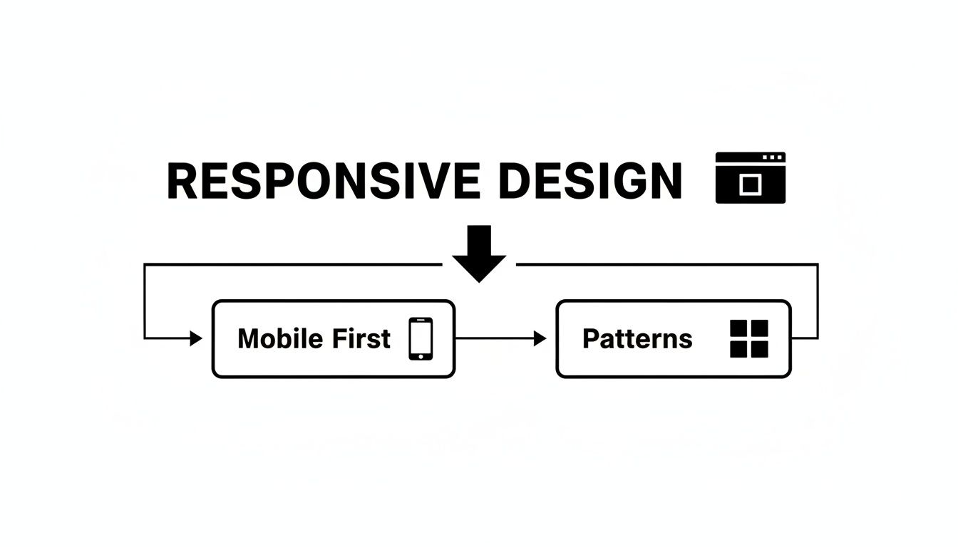
As you can see, a solid responsive strategy always starts with the smallest screen. You nail the core experience there first, then thoughtfully adapt it for larger devices using proven patterns.
Finally, you can’t talk about modern ui design web without giving a nod to microinteractions. These are the small, often subtle animations and bits of feedback that happen when a user does something.
Think about the satisfying "pop" when you like a post, the smooth slide of a menu opening, or the gentle shake of a login form when you mistype your password. These tiny details are what make an interface feel alive and polished. They provide instant feedback, guide the user, and can turn a boring task into something genuinely delightful.
Alright, we’ve talked through the principles and trends that make a great ui design web experience. Now, let's get practical. How do you actually put all this into action without slowing your whole development process to a crawl? The answer is simpler than you think: pre-built, production-ready UI kits.
Think about it like building a house. You wouldn't fire up a kiln to make every single brick or forge every nail yourself. That would be insane. Instead, you use high-quality, standardized materials to build faster and with more confidence. A UI kit is the exact same idea, just for building apps. It's your collection of premium, ready-to-go modules.

This approach completely changes the game for product teams. The conversation shifts from "what should we build?" to "how can we build it right now?" When you adopt a component-based workflow, you’re not just saving a ton of time; you're building on a solid foundation of quality and expert craftsmanship from day one.
Using a UI kit isn't just about speed—it's about building a better product, period. These toolkits come packed with components that have already been designed, coded, and battle-tested for performance and accessibility. This means you inherit industry best practices immediately, freeing you up to focus on the unique business logic that actually makes your product special.
The benefits hit you right away:
This efficiency is crucial, especially when 91% of online consumers are demanding better digital experiences. For startups and indie devs, a solid UI kit can cut design and development time by as much as 80%. That means you can launch an MVP up to five times faster and still meet those sky-high user expectations. You can dig deeper into these trends in this detailed report on better user experience.
The true magic of modern UI kits really comes to life when you need to build for more than just the web. A well-designed kit gives you components that are engineered to work seamlessly across different platforms, including iOS and Android. This is the key to reaching the widest audience possible without tripling your development work.
A great UI kit doesn't just give you buttons and text fields; it gives you a robust, flexible system for building digital products. It’s the framework that supports your innovation, allowing you to focus on solving user problems instead of reinventing the wheel.
For teams working in frameworks like React Native, this is a massive win. You can build your UI once and ship it everywhere, knowing the look, feel, and performance will be rock-solid. The components are often optimized for each platform's unique conventions, delivering a truly native feel to your end-users. If you're building with React Native, you should check out our comprehensive guide on choosing a React Native UI kit in our article.
By starting with a professionally crafted UI kit, you’re not taking a shortcut—you’re taking the smart path. You’re building on the shoulders of experts, which lets your team skip the boring stuff and get straight to creating real value for your users.
Even with a good handle on the principles, you're bound to have questions when you start a new web UI project. Let's tackle some of the most common ones that pop up for designers, developers, and founders.
Think of this as your quick-reference guide for those "what about..." moments that always seem to show up mid-design.
This is probably the number one point of confusion, and for good reason—they're deeply connected. But they are not the same thing, and knowing the difference is crucial for building a great product.
User Interface (UI) Design is all about the look and feel. It's the visual stuff a user actually interacts with: the buttons, the fonts, the color palette, and the layout of the screen. Good ui design web creates a beautiful, intuitive, and consistent visual language. It’s the what of the interface.
User Experience (UX) Design is about the overall journey. It’s a much bigger concept that covers everything from the moment a user hears about your product to the feeling they have after completing a task. UX is built on research, user flows, and a logical structure to make sure the whole process is efficient and satisfying. It’s the why and how behind it all.
Here’s an analogy: if your product was a restaurant, the UX would be the entire experience—how easy it was to get a reservation, the vibe of the place, the friendliness of the staff, and how you feel walking out the door. The UI would be the menu design, the table settings, and the decor. They're the specific touchpoints that shape that bigger experience.
There's no single answer here, because the cost can swing wildly based on a few key things. The biggest drivers are the project's scope, its complexity, and the designer's experience level. You might get a simple landing page from a freelancer for a few hundred dollars.
On the other hand, a complex web application with multiple user journeys, a complete design system, and in-depth prototyping from a top-tier agency could easily run into the tens or even hundreds of thousands of dollars. The best approach is always to get your project requirements down on paper before you start asking for quotes.
That’s the big question on everyone's mind. The short answer? No, not anytime soon. AI tools are getting incredibly good at generating ideas, whipping up assets, and handling repetitive tasks. They can spit out a clean, standard layout from a text prompt in seconds.
But they fall short when it comes to the deeper, strategic side of design. Real ui design web is about understanding business goals, user psychology, and brand identity. It’s about navigating tricky constraints and making thoughtful trade-offs—skills that are way beyond what current AI models can do.
AI is a powerful assistant, not a replacement. It can speed up the workflow by taking care of the boilerplate, but it lacks the critical thinking, taste, and problem-solving that a human designer brings to the table.
Think of AI tools as a way to augment a designer's process. They're great for kickstarting concepts or building out quick prototypes. But the final, polished, and truly effective UI? That still needs a human touch to connect with a real audience.
To really succeed in web UI design, you need a mix of creative chops and technical know-how. The tools will always change, but the core skills are what allow a designer to create interfaces that just work.
A great UI designer typically masters these areas:
Building these skills gives you a foundation that lets you adapt to new trends and tech while consistently shipping high-quality work.
Ready to stop building from scratch and start shipping faster? The gluestack market offers a massive library of production-ready, professionally designed templates and UI kits. Built for React Native, every component is optimized for iOS, Android, and web, so you can focus on your product, not the boilerplate. Explore our free and premium options today at https://market.gluestack.io.

Feb 23, 2026
4 min read
Discover powerful mobile app monetization strategies to boost your revenue. Our guide covers IAPs, ads, and subscriptions for React Native apps and beyond.

Feb 22, 2026
4 min read
A clear guide to app development cost estimation. Learn what drives costs, see budget examples, and discover strategies to build your app for less.

Feb 21, 2026
4 min read
Discover how to promote mobile application effectively with proven ASO, paid campaigns, and retention strategies.
Feb 15, 2026
4 min read
Discover how to create a prototype of a website with a practical, step-by-step guide. Explore tools, testing methods, and tips to bring your idea to life.
Feb 14, 2026
4 min read
Confused about mockups vs wireframes? Learn the key differences, when to use each, and how to streamline your React Native app development workflow.

Feb 13, 2026
4 min read
Discover how mobile apps templates accelerate development. Learn to choose, customize, and deploy high-quality React Native templates for your next project.

Feb 12, 2026
4 min read
Explore mobile application interface design with practical tips, core principles, and platform-aware workflows to craft apps users love.

Feb 10, 2026
4 min read
Learn mobile first design principles to craft fast, accessible apps that delight users. Practical tips, examples, and testing strategies.
Feb 08, 2026
4 min read
Explore the progressive web app vs native debate with our in-depth guide. We compare performance, cost, and UX to help you make the right strategic choice.
Feb 07, 2026
4 min read
Discover how React Native templates can accelerate your app development. This guide explores choosing, customizing, and deploying templates for faster launches.

Feb 05, 2026
4 min read
Discover the key differences between expo vs react native, including workflow, builds, and performance to help you pick the right path for your app.
Feb 03, 2026
4 min read
Master image with text overlay in React Native with responsive, accessible patterns. Learn expo setup, NativeWind styling, and gluestack-ui examples.

Feb 03, 2026
4 min read
Discover cross platform app development with proven strategies to build faster for iOS, Android, and the web using a single, unified codebase.
Feb 01, 2026
4 min read
Learn how to make an app for my business quickly with template-based steps from planning to launch, plus tips to scale and optimize.

Jan 31, 2026
4 min read
Ready to build an app? This guide shares practical strategies for validating your idea, choosing a tech stack, and navigating the App Store launch.
Jan 30, 2026
4 min read
Master responsive design for mobile apps with this guide on fluid layouts, breakpoints, and React Native. Build UIs that adapt perfectly to any screen.

Jan 25, 2026
4 min read
Learn how to design an Android app that stands out. This guide covers UX research, wireframing, Material Design, and the developer handoff process.

Jan 23, 2026
4 min read
Discover 10 essential mobile app design best practices for building exceptional cross-platform apps. Actionable tips for UI, UX, navigation, and performance.

Jan 21, 2026
4 min read
Discover how to debug React Native apps effectively. This guide covers Flipper, React DevTools, and native code troubleshooting for faster development cycles.
Jan 20, 2026
4 min read
Learn how to create app for your business with a practical, modern approach. Plan, customize, and launch with proven steps.
Jan 19, 2026
4 min read
A complete guide to mobile app development for startups. Learn how to validate your idea, build an MVP, and launch a successful app faster and more affordably.

Jan 18, 2026
4 min read
Discover how to choose the right React website template to accelerate your project. Our guide covers everything from quality checklists to deployment.
Jan 17, 2026
4 min read
Discover how to choose, customize, and deploy a React Native app template. This guide provides practical steps for launching production-ready apps faster.

Jan 16, 2026
4 min read
Discover how mobile application templates accelerate development. This guide covers how to choose, customize, and launch your app with the right foundation.

Jan 13, 2026
4 min read
Start your journey in mobile app development for beginners. This guide breaks down how to build your first cross-platform app with React Native and Expo.

Jan 12, 2026
4 min read
Explore the best react native ui libraries and compare features, performance, and ease of use to pick the right toolkit for your app.

Jan 11, 2026
4 min read
Launch your own ride-hailing service with our guide to building a production-ready Uber app clone. Learn MVP strategy, tech stacks, and backend integration.

Jan 10, 2026
4 min read
Master modern cash app design with this guide. Learn the UI/UX, security, and React Native strategies needed to build a fintech app that users trust and love.

Jan 09, 2026
4 min read
Learn how to build a personal finance dashboard with React Native. A practical guide for developers on UI design, data architecture, and production readiness.
Jan 08, 2026
4 min read
A practical guide to building a cross-platform event check in app with React Native. Learn to implement QR scanning, offline sync, and deployment.

Jan 07, 2026
4 min read
Master linear gradient React Native components with our complete guide. Learn practical techniques for Expo, bare RN, and NativeWind to build stunning UIs.

Jan 06, 2026
4 min read
Learn how to change application name in your React Native & Expo projects. This guide covers display names, package IDs, and app store listings.

Jan 05, 2026
4 min read
Discover how to monetize mobile apps with our founder's guide. Learn proven React Native strategies for ads, IAPs, and subscriptions to maximize your revenue.

Jan 04, 2026
4 min read
A practical guide on how to create a website app with a single codebase. Learn to build for web, iOS, and Android using React Native, Expo, and TypeScript.

Jan 03, 2026
4 min read
Learn how to create an app for your business with this definitive guide. Discover practical strategies for validation, development, and launch that work.

Jan 02, 2026
4 min read
Learn how to create a wireframe for a website with this practical guide. Move from initial sketches to developer-ready designs that get built right.
Jan 01, 2026
4 min read
Deciding on progressive web application vs native? This guide offers a deep comparison of performance, cost, UX, and use cases to help you choose wisely.

Dec 31, 2025
4 min read
Discover 10 mobile app security best practices for React Native. Learn to secure data, APIs, and code with actionable tips and examples for 2025.

Dec 30, 2025
4 min read
Unlock the real React Native app development cost. Our guide breaks down pricing by feature, team, and complexity to help you budget with confidence.

Dec 29, 2025
4 min read
A practical guide to master your React Native debug workflow. Learn to use Flipper, React DevTools, and Hermes to solve bugs in Expo and bare RN apps.

Dec 28, 2025
4 min read
The ultimate React Native tutorial for beginners. Learn to build beautiful cross-platform apps using a modern stack like Expo, TypeScript, and gluestack-ui.

Dec 27, 2025
4 min read
A practical guide on how to build a mobile app. Learn to go from concept to a market-ready app using templates, React Native, and proven development strategies.

Dec 26, 2025
4 min read
Discover interface design for websites with actionable tips on layout, responsiveness, and usability to boost conversions.

Dec 25, 2025
4 min read
Discover designs for apps that blend minimal aesthetics with personalization, and learn to build user-centric interfaces that boost engagement.

Dec 24, 2025
4 min read
Learn graphical interface design - essentials for mastering core principles, modern workflows, and cross-platform strategies to build intuitive, engaging UIs.

Dec 23, 2025
4 min read
Discover how high fi wireframes bridge the gap between ideas and code. Learn a practical workflow for creating, testing, and handing off effective UI designs.

Dec 22, 2025
4 min read
Discover mobile app interface design with practical principles, accessibility, and workflows that boost user engagement.

Dec 21, 2025
4 min read
Explore the top 10 UI UX design trends for 2025. Get expert insights and practical React Native tips to build next-gen cross-platform apps that stand out.

Dec 20, 2025
4 min read
Discover how mobile app templates accelerate development from idea to launch. Learn to select, customize, and deploy templates for a faster time to market.

Dec 18, 2025
4 min read
Explore the best react native ui libraries to accelerate mobile development with performance, theming, and accessibility. Expert tips inside.
Dec 16, 2025
4 min read
Master React Native PDF handling. Learn to generate, view, and share PDFs with practical code examples, library comparisons, and performance tips.
Dec 15, 2025
4 min read
A practical guide to choosing the right React Native component library. Learn how to evaluate options, avoid common pitfalls, and build apps faster.

Dec 14, 2025
4 min read
Find the perfect React Native UI library for your project. This guide compares top libraries, selection criteria, and customization strategies.

Dec 13, 2025
4 min read
Learn how to change app name in React Native and Expo. Our guide covers display names, bundle IDs, and store listings for iOS and Android projects.
Dec 12, 2025
4 min read
Discover the best React Native component library for your next project. We compare top libraries on performance, customization, and real-world use cases.
Dec 11, 2025
4 min read
Discover how to choose the right React Native UI kit. This guide covers top kits, selection criteria, and customization to accelerate your app development.
Dec 10, 2025
4 min read
Explore our in-depth guide to find the best React Native UI library. We compare top contenders to help you choose the right fit for your project.
Dec 09, 2025
4 min read
Discover a practical approach to building apps with React Native. This guide covers setup, UI, state management, and testing to help you ship great apps.

Dec 08, 2025
4 min read
android login with facebook: Learn to set up the Facebook SDK, manage tokens, and implement secure authentication across native Android, cross-platform apps.

Dec 07, 2025
4 min read
Master the alert in React Native. Learn to handle platform differences, build custom modals, and apply best practices for a seamless user experience.
Dec 06, 2025
4 min read
keyboardavoidingview react native: Master keyboard handling with KeyboardAvoidingView across iOS, Android, Expo, and TypeScript.
Dec 05, 2025
4 min read
A practical guide to implementing a React Native PDF viewer. Learn to compare libraries, handle native setup, and troubleshoot common issues with real code.

Dec 04, 2025
4 min read
how to validate startup idea: learn proven methods like customer interviews, MVPs, and metrics to confirm market fit.

Dec 03, 2025
4 min read
how to make app like uber: Learn core features, tech stack, development steps, testing, and launch tips.

Dec 02, 2025
4 min read
Build a rock-solid React Native setup. This guide covers Expo vs. Bare workflows, TypeScript, pnpm monorepos, NativeWind, and deployment strategies.
Dec 01, 2025
4 min read
A practical guide to Stripe React Native integration. Learn to set up your server, build payment UIs, handle webhooks, and launch secure mobile payments.

Nov 30, 2025
4 min read
Learn how to master push notifications in React Native. This guide covers setup, best practices, and advanced techniques for engaging your users.

Nov 29, 2025
4 min read
Build powerful location-based apps with our practical guide to react native with google maps. Get setup guides, pro tips, and best practices for iOS & Android.

Nov 28, 2025
4 min read
Explore deep linking react native with a practical guide to configuring URL schemes, universal links, navigation, and testing for Expo and bare apps.

Nov 28, 2025
4 min read
A practical guide to building a scalable React Native design system. Learn to implement tokens, theming, and tools like NativeWind and gluestack-ui.

Nov 26, 2025
4 min read
Learn why react native expo templates speed up your projects with ready-made patterns and practical tips.

Nov 25, 2025
4 min read
Discover how to improve developer productivity with actionable strategies for workflow, tooling, and culture. A practical guide for software engineering teams.

Nov 24, 2025
4 min read
Discover the best cross platform app development tools. Compare top frameworks like Flutter and React Native to build and ship apps faster.

Nov 23, 2025
4 min read
This Expo React Native tutorial provides a hands-on guide to building cross-platform apps. Learn setup, styling with NativeWind, navigation, and deployment.

Nov 22, 2025
4 min read
Build beautiful UIs faster with this guide to Tailwind CSS React Native. Learn setup, styling, and advanced techniques with NativeWind for mobile apps.

Nov 21, 2025
4 min read
Explore our curated list of 7 top-tier React Native app examples. Discover production-ready templates and resources to build your next app faster.
Mar 19, 2025
4 min read
gluestack market offers React Native UI templates to accelerate development. Get customizable, production-ready React Native app templates and Ui kit, some free. Build faster & smarter today!