Dec 24, 2025

4 min read


At its heart, graphical interface design is the visual language that lets people talk to computers. It’s the magic that turns complex code into the simple, intuitive world of icons, menus, and windows we all use every day. It’s what makes technology approachable for everyone, not just programmers.
Imagine trying to drive a car by typing commands into a terminal. Instead of turning a wheel or stepping on a pedal, you’d be frantically typing engine.increase_rpm(500) or brake.apply(pressure: 75). It sounds completely absurd, right? But that’s pretty much how we used to interact with computers—through clunky, text-based command-line interfaces.
Graphical interface design changed the entire game.
Think of a graphical user interface (GUI) as the car's dashboard. It's the essential bridge between a powerful, complex machine and the human sitting in the driver's seat. Instead of forcing you to memorize confusing text commands, a good GUI gives you:
This whole approach makes technology feel natural and intuitive. The steep learning curve of memorizing commands is flattened into the simple act of recognizing and interacting with familiar visual elements.
The move to graphical interfaces wasn't just about making things look pretty; it was a total shift in how we thought about human-computer interaction. The GUI started as a research project back in the 1970s, but it was the Xerox Alto in 1973 that really introduced groundbreaking concepts like the desktop metaphor and the mouse. These innovations paved the way for the user-friendly computers we can't live without today.
You can dive deeper into the fascinating history of graphical user interfaces on Wikipedia if you're curious.
Here's a look at an early GUI, showing off the core elements that made modern computing possible.
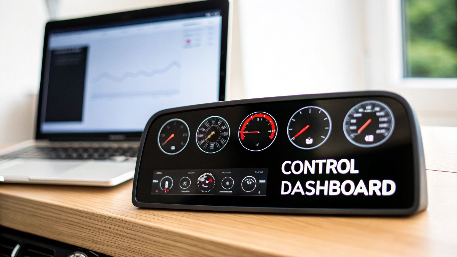
You can see how concepts like windows and icons started to create a much more organized and approachable digital workspace than a blank, intimidating command line.
The real job of graphical interface design is to lower the cognitive load on the user. A great interface already knows what you need and gives you clear, predictable ways to get things done, making even the most complex software feel effortless.
Ultimately, the best graphical interface design is invisible. When it’s done right, you don’t even notice it’s there. You just accomplish your goals, smoothly and without friction. This is especially true when building for today’s users; our guide on mobile app interface design gets into the specifics of creating these seamless experiences on smaller screens. The core principles never change: clarity, consistency, and giving the user intuitive control.
Ever used an app that just clicked? Where every tap felt intuitive and you found what you needed without a second thought? That's not magic—it's the result of solid graphical interface design.
Behind every great user experience are a handful of time-tested principles. These aren't just academic rules; they're the practical foundation for creating interfaces that feel effortless. When done right, the design itself fades into the background, letting the user focus completely on what they want to accomplish. If you want to build truly effective apps, mastering these is non-negotiable.
Here's a quick rundown of the essential principles that turn a confusing screen into an intuitive experience.
| Principle | Description | Impact on User |
|---|---|---|
| Visual Hierarchy | Strategically arranging elements (using size, color, and placement) to guide the user's eye to what's most important. | Effortlessly understands where to look and act first, reducing confusion and cognitive load. |
| Consistency | Ensuring that similar elements look and behave the same way throughout the entire application. | Builds predictability and trust. Users learn patterns once and can apply them everywhere. |
| Feedback | Providing immediate and clear responses to every user action, like a button changing color on click. | Confirms that the system is working, reduces anxiety, and makes the app feel responsive. |
| Contrast & Color | Using color and contrast to create separation, improve readability, and draw attention to key interactive elements. | Easily reads text and spots important actions, like a primary "Buy Now" button. |
These principles work together to create an interface that feels less like a machine and more like a helpful guide. Let's dig into what each one means in practice.
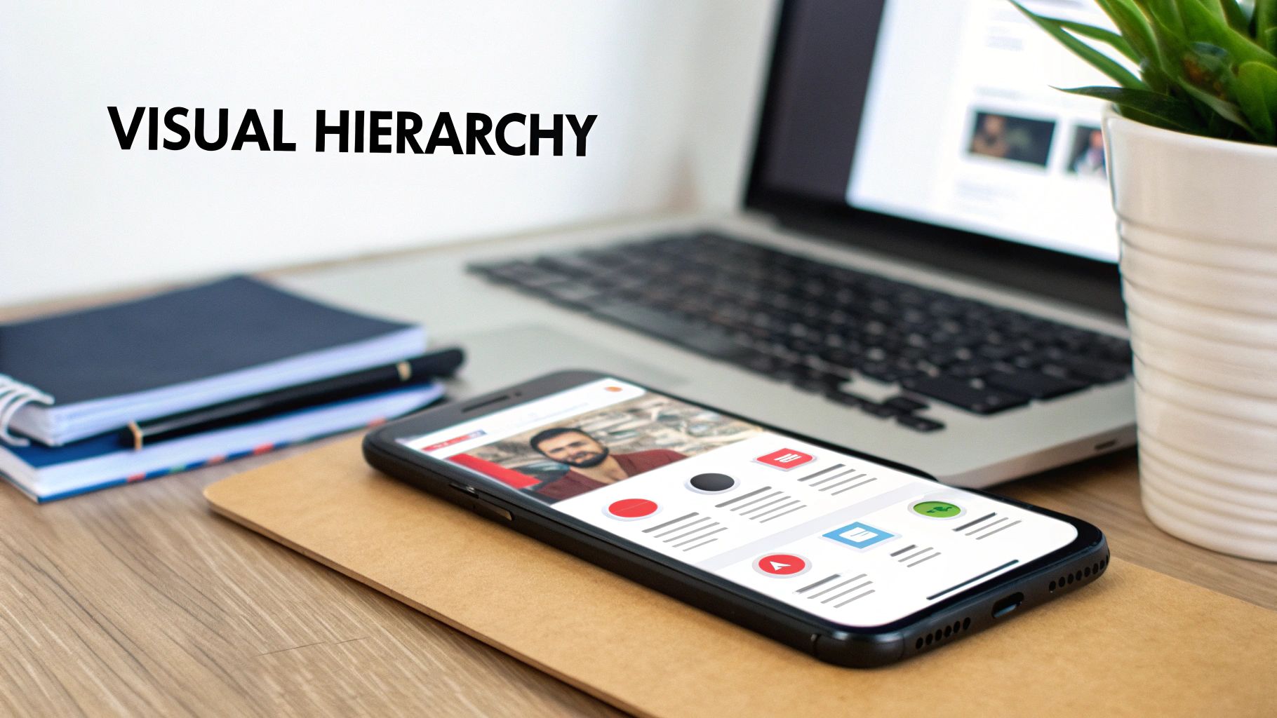
Think of visual hierarchy as a silent tour guide for your user's eyes. It’s how you say, “Start here, then look here, and finish up over there,” all without a single word of instruction. This is all about using size, color, and placement to give more visual weight to the most important elements on the screen.
For instance, a big, bold "Add to Cart" button will always grab more attention than a small, gray "Terms of Service" link. This isn't just about making things look nice; it's about making the interface scannable and steering users toward the actions you want them to take. Without a clear hierarchy, everything screams for attention at once, and you’re left with a cluttered, frustrating mess.
Consistency is what makes an interface feel familiar and trustworthy. Once a user figures out how one part of your app works, they should be able to apply that knowledge everywhere else. This simple idea touches everything from the style of your buttons to the icons you use.
Imagine if every stoplight you drove through used a different set of colors for "stop" and "go." It would be chaos. The same is true for your app. Keeping things consistent dramatically lowers the user's cognitive load—they don't have to constantly relearn the rules on every new screen.
To pull this off, designers focus on a few key areas:
Every action needs a reaction. When a user taps a button, they should get an immediate, clear signal that the app registered their input. Without this feedback loop, people are left wondering, "Did my click go through? Is the app frozen?"
Feedback can be as subtle as a button changing color when pressed or as obvious as a loading spinner popping up while data is being fetched. An item might even do a little bounce animation as it's added to a shopping cart.
A well-designed interface is a conversation between the user and the product. Feedback is the product's way of showing it's listening and responding, which builds user confidence and reduces anxiety.
This back-and-forth is what makes an interface feel alive and responsive. Even an error message is a crucial piece of feedback, helping guide the user back on track when they've made a mistake.
Contrast is one of your most powerful tools for creating focus and separation. High contrast between text and its background is absolutely essential for readability—a cornerstone of accessibility. Beyond just text, contrast helps your most important elements, like call-to-action buttons, pop off the screen.
Color is more than just decoration; it’s a language. A red notification badge screams urgency, while a green checkmark gives a satisfying sense of success. A smart color palette not only reflects the brand's identity but also makes it easier for users to understand and navigate the interface.
To keep your designs feeling fresh and effective, it’s always a good idea to stay aware of the top UI trends of 2024. When you combine all these principles, you create an experience that feels cohesive, predictable, and just plain easy to use.
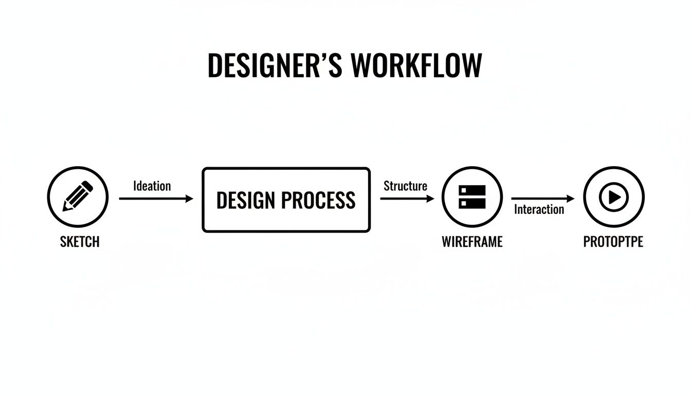
How does a simple idea scribbled on a napkin turn into a polished, interactive app? That journey from a rough concept to a final graphical interface follows a tried-and-true workflow. It’s less of a rigid assembly line and more of a creative cycle—one built on exploration, refinement, and validation to make sure the end product is both beautiful and a joy to use.
It almost always starts with the simplest tools you can find: a pen and paper or a whiteboard. This ideation and sketching phase is all about getting ideas out fast. Designers can freely explore layouts and user flows without getting bogged down by digital tools, churning out rough sketches that are perfect for brainstorming an interface's core structure.
Once the big ideas start to take shape, the process moves into the digital realm.
With a handful of sketches, designers create wireframes. Think of a wireframe as the architectural blueprint for an interface. It’s a low-fidelity, black-and-white outline that focuses purely on structure, hierarchy, and how things work, intentionally leaving out distractions like colors, fonts, and images. This step is all about making sure the layout makes sense before anyone starts thinking about aesthetics.
Next, these skeletal blueprints get fleshed out into mockups. This is where the visual identity truly comes to life. Designers start applying color palettes, typography, icons, and proper spacing to create a static but pixel-perfect image of the final product. A mockup looks exactly like the finished app, but you can’t click on anything just yet.
To bridge that gap, the static mockup is elevated into an interactive prototype. By linking different screens together and adding animations, designers build a clickable simulation of the app. This is huge—it lets stakeholders and test users actually experience the user flow, test out navigation, and give feedback on the app's overall feel long before a single line of code is written.
For a deeper dive, our guide on crafting high-fidelity wireframes explains how to bridge this crucial gap.
The tools we use for interface design have changed dramatically. Between 2010 and 2020, the industry saw a massive shift toward collaborative, cloud-based tools that completely changed how teams work. Figma, launched in 2016, exploded to over 4 million users by 2020, perfectly capturing this new way of designing together.
Today, a few key players really dominate the field:
Modern workflows also increasingly tap into advanced AI image generation capabilities to speed up the creation of visual assets, from placeholder images to unique icons.
On larger projects, keeping things visually consistent across dozens—or even hundreds—of screens is a massive headache. This is where design systems come in. A design system is basically a centralized library of reusable components, guidelines, and even code snippets.
Think of a design system as a set of official LEGO bricks for building an interface. Every button, icon, and color is standardized, ensuring that anyone on the team can build new features that look and feel consistent with the rest of the product.
This "single source of truth" streamlines the entire design and development process. Designers can build screens way faster by using pre-made components, and developers have a clear, official reference for how to implement everything. This tight alignment between design and development is what makes the handoff—where designers give developers all the assets and specs—smooth and efficient.
Back in the day, building a mobile app meant you were actually building two separate apps—one for iOS, one for Android. This was a slow, expensive grind that often left users with two very different experiences.
But frameworks like React Native flipped the script. Now, you can build a single app that runs beautifully on both platforms.
This "write once, run anywhere" approach is a massive win, but it tosses a new puzzle onto the designer's desk: How do you create one interface that feels completely at home on two very different operating systems? The secret is baking flexibility into your design from day one.
A flexible design starts with its layout. We're no longer living in a world of predictable screen sizes; we've got everything from tiny budget Androids to massive iPhones. A fixed-width design just won't cut it.
React Native’s answer to this is Flexbox, a layout model that lets components intelligently grow, shrink, and wrap to fill whatever space is available.
Instead of obsessing over pixel-perfect coordinates, you start thinking in terms of proportions and relationships. For example, you might tell your main content area to "flex: 1", which basically means "take up all the leftover space after the header and footer are in place." This one simple rule ensures your layout looks great on any screen height, no coding gymnastics required.
This is why designers move through a structured process, starting with the big picture before diving into the details.
This workflow shows how you establish the foundational structure (wireframing) before getting lost in visual details—a core principle for creating layouts that can adapt to anything.
While a unified codebase is the goal, a truly great cross-platform app never forgets to respect the local culture. A design that feels intuitive on iOS can feel clunky and foreign on Android, and vice-versa.
Getting this right means spotting the key differences and adapting your design accordingly.
The best cross-platform apps don't feel like they were made for another device. They feel like they were made specifically for the one you're holding, blending shared components with platform-aware details.
To illustrate, let's compare some common conventions.
Here's a quick look at how user expectations differ between the two platforms and how React Native helps bridge the gap.
| Design Element | iOS Convention | Android Convention | React Native Solution |
|---|---|---|---|
| Navigation | Bottom tab bar, left-edge swipe to go back. | Navigation drawer ("hamburger menu"), system back button. | Use libraries like React Navigation to create platform-specific navigation patterns. |
| Alerts & Dialogs | Centered pop-up with distinct button styles. | Material Design-style dialogs, often aligned left. | React Native's Alert API automatically renders the native-style dialog for each OS. |
| Typography | San Francisco is the system font. | Roboto is the standard system font. | Define a custom typography scale but allow for platform-specific font families. |
| Pickers | "Spinner" wheel-style pickers at the bottom of the screen. | Calendar or clock-style pickers in a pop-up dialog. | Use platform-specific modules or libraries that render the native component for each OS. |
By acknowledging these nuances, you can design an app that feels like it belongs, no matter which device a person is using.
Trying to manage all these platform differences on a screen-by-screen basis is a recipe for disaster. This is where a solid component system becomes your best friend.
Instead of designing one-off screens, you shift your focus to creating a library of reusable, self-contained UI building blocks. (For a deeper dive, check out our guide on the best React Native UI libraries).
Think of it as a single source of truth for your app's entire visual language. Every element, from a simple button to a complex card, is designed once and built to handle its own responsiveness and platform quirks.
This approach pays off in a few huge ways:
By combining flexible layouts, a keen eye for platform details, and a unified component system, you can truly master the art of cross-platform design. The result is a single, easy-to-maintain app that delivers a premium, native-feeling experience to every single user.
A gorgeous interface that people can't actually use is, at the end of the day, a failed design. Real success isn’t just about making things look good; it’s about creating an experience that feels intuitive, works efficiently, and welcomes everyone. This is where accessibility and usability testing stop being afterthoughts and become central to the entire design process.
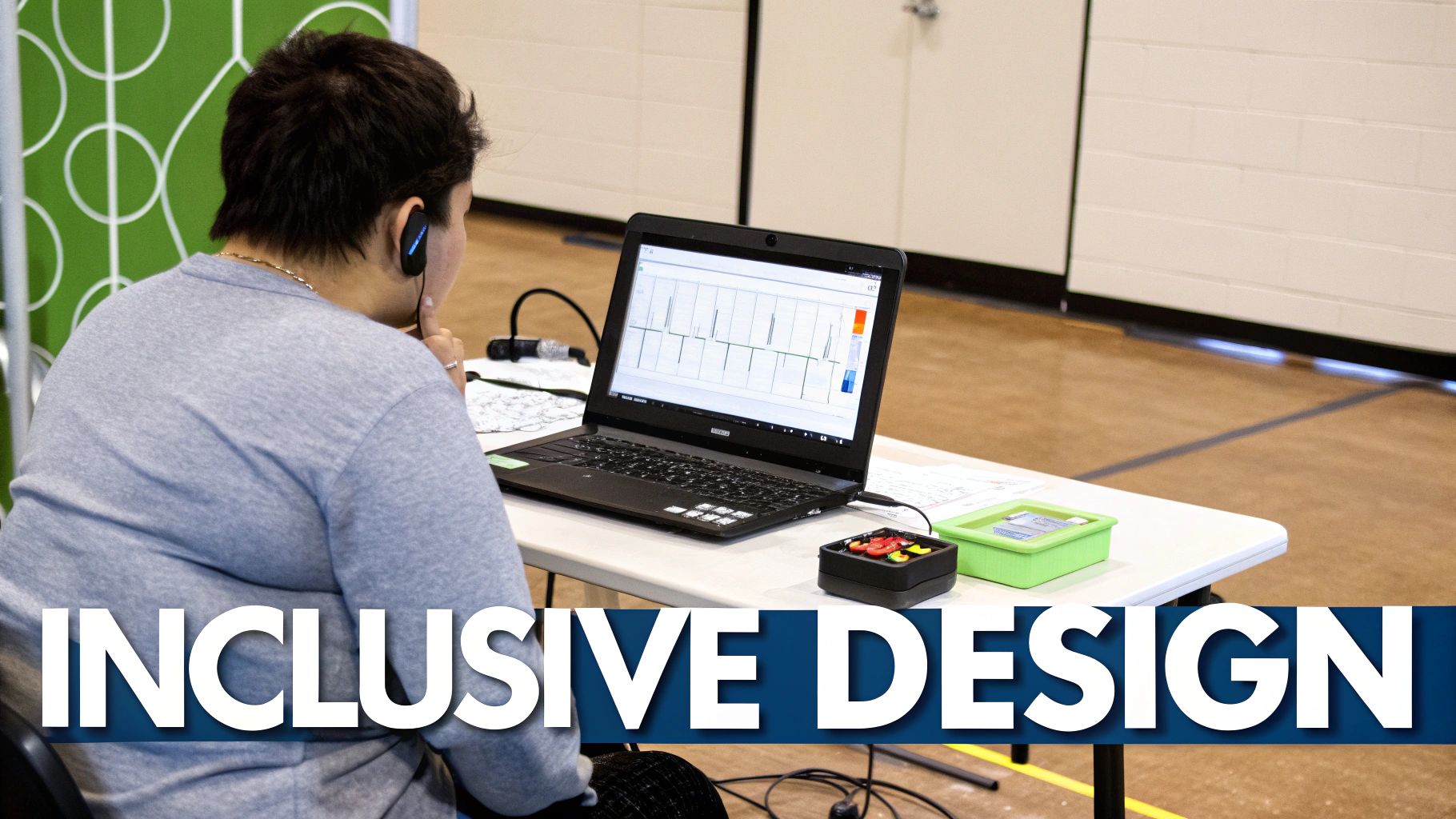
Great design is inclusive design. Weaving these practices in from the start isn't just a box to check—it’s the single most effective way to build a stronger, more reliable product for your whole audience.
Accessibility, often shortened to a11y, is all about making sure your product can be used by people with disabilities. We're talking about individuals with visual, motor, auditory, and cognitive impairments. When you think about this stuff early, you avoid expensive fixes down the road and end up with a much more thoughtful design.
Here are a few key areas to lock in on:
By building with these principles from day one, you're laying a foundation that supports every single user, no matter their abilities.
An accessible product is inherently a more usable product for everyone. Features like high-contrast text, clear navigation, and resizable fonts don't just help users with disabilities—they improve the experience for someone using their phone in bright sunlight or a parent trying to multitask with one hand.
So, while accessibility asks if people can use your interface, usability testing asks how well they can use it. It's all about watching real people try to get things done in your product. This is where your beautiful design assumptions get a reality check.
It doesn’t matter how brilliant your design team is; you are not your user. You're too close to it. You have insider knowledge and biases that make it impossible to see your product with fresh eyes.
Usability testing can be as casual as a "hallway test"—just grabbing a colleague from another department to try out a prototype—or as formal as a structured lab study. The goal is always the same: find the spots where users get stuck, confused, or frustrated. Tiny tweaks based on this feedback can lead to massive improvements in user behavior and, ultimately, your bottom line.
Folding accessibility and usability into your workflow isn't just the right thing to do; it's a smart business move. Making your interface compliant with recognized accessibility standards, like hitting WCAG AA contrast ratios, can grow your potential market reach by an estimated 8–20%. That’s because these improvements open up your product to millions of users around the world who have some form of impairment. If you're curious, you can find more insights on the impact of user-centered design on business at visualfizz.com.
At the end of the day, a real commitment to both accessibility and usability changes graphical interface design from a purely visual exercise into an act of empathy-driven problem-solving. It ensures the products we build aren't just beautiful, but also functional, equitable, and genuinely helpful to the widest possible audience.
As you dive into graphical interface design, you'll notice a few questions that come up time and time again. It’s a field that’s constantly changing, full of little details and big ideas. This section is here to clear up some of the most common points of confusion.
Think of it as your go-to guide for straightforward answers. We’ll cut through the jargon and get straight to the insights you need to talk about modern interface design like you’ve been doing it for years.
This is probably the most-asked question in the entire design world. While UI and UX are totally intertwined, they’re two very different jobs.
UI (User Interface) design is all about what you see and interact with. It’s the visual side of things—the buttons, the colors, the fonts, and the animations. A UI designer’s job is to make the interface look great, guide the user’s attention, and feel satisfying to use.
UX (User Experience) design, on the other hand, is about the entire journey. It focuses on how the product feels to use from start to finish. UX designers are the architects, mapping out user flows, researching what people actually need, and making sure the whole experience is logical, efficient, and even enjoyable.
A simple way to think about it is building a house. UI is the paint, the furniture, and the light fixtures—the things that make the space look and feel a certain way. UX is the floor plan—how you move from room to room and whether the layout actually works for the people living there.
Getting into interface design is more achievable now than ever before. You don't necessarily need a formal degree; what really counts is a killer portfolio and a real understanding of the fundamentals.
Here’s a no-nonsense path to get you started:
The world of GUI design is always moving, pushed forward by new tech and what users have come to expect. Keeping up with these trends is key to creating interfaces that feel fresh and modern.
One of the biggest shifts we’re seeing is a move toward physicality. Interfaces are no longer just flat screens; they’re starting to mimic real-world materials. Think of glassy elements that bend light or buttons that feel tactile and responsive. It makes the whole experience feel more grounded and immersive.
A few other key trends to watch:
A design system is the secret weapon for any product that needs to scale. It’s basically a shared library of reusable components, patterns, and rules that keeps an entire product’s look and feel consistent.
Think of it as the ultimate "single source of truth." Instead of every designer and developer making their own calls, everyone is building from the same set of blocks.
A design system really pays off in three big ways:
Ready to stop building from scratch and start shipping faster? gluestack market offers a huge collection of production-ready React Native templates and UI kits. Built for cross-platform consistency and designed with best practices, our resources give you the head start you need to focus on what matters most: your product.
Find your perfect template at https://market.gluestack.io.

Feb 23, 2026
4 min read
Discover powerful mobile app monetization strategies to boost your revenue. Our guide covers IAPs, ads, and subscriptions for React Native apps and beyond.

Feb 22, 2026
4 min read
A clear guide to app development cost estimation. Learn what drives costs, see budget examples, and discover strategies to build your app for less.

Feb 21, 2026
4 min read
Discover how to promote mobile application effectively with proven ASO, paid campaigns, and retention strategies.
Feb 15, 2026
4 min read
Discover how to create a prototype of a website with a practical, step-by-step guide. Explore tools, testing methods, and tips to bring your idea to life.
Feb 14, 2026
4 min read
Confused about mockups vs wireframes? Learn the key differences, when to use each, and how to streamline your React Native app development workflow.

Feb 13, 2026
4 min read
Discover how mobile apps templates accelerate development. Learn to choose, customize, and deploy high-quality React Native templates for your next project.

Feb 12, 2026
4 min read
Explore mobile application interface design with practical tips, core principles, and platform-aware workflows to craft apps users love.

Feb 10, 2026
4 min read
Learn mobile first design principles to craft fast, accessible apps that delight users. Practical tips, examples, and testing strategies.
Feb 08, 2026
4 min read
Explore the progressive web app vs native debate with our in-depth guide. We compare performance, cost, and UX to help you make the right strategic choice.
Feb 07, 2026
4 min read
Discover how React Native templates can accelerate your app development. This guide explores choosing, customizing, and deploying templates for faster launches.
Feb 05, 2026
4 min read
Discover the key differences between expo vs react native, including workflow, builds, and performance to help you pick the right path for your app.
Feb 03, 2026
4 min read
Master image with text overlay in React Native with responsive, accessible patterns. Learn expo setup, NativeWind styling, and gluestack-ui examples.

Feb 03, 2026
4 min read
Discover cross platform app development with proven strategies to build faster for iOS, Android, and the web using a single, unified codebase.
Feb 01, 2026
4 min read
Learn how to make an app for my business quickly with template-based steps from planning to launch, plus tips to scale and optimize.

Jan 31, 2026
4 min read
Ready to build an app? This guide shares practical strategies for validating your idea, choosing a tech stack, and navigating the App Store launch.
Jan 30, 2026
4 min read
Master responsive design for mobile apps with this guide on fluid layouts, breakpoints, and React Native. Build UIs that adapt perfectly to any screen.
Jan 25, 2026
4 min read
Learn how to design an Android app that stands out. This guide covers UX research, wireframing, Material Design, and the developer handoff process.

Jan 24, 2026
4 min read
Explore ui design web essentials: a complete guide to principles, responsive patterns, and workflows for intuitive, engaging web interfaces.

Jan 23, 2026
4 min read
Discover 10 essential mobile app design best practices for building exceptional cross-platform apps. Actionable tips for UI, UX, navigation, and performance.

Jan 21, 2026
4 min read
Discover how to debug React Native apps effectively. This guide covers Flipper, React DevTools, and native code troubleshooting for faster development cycles.
Jan 20, 2026
4 min read
Learn how to create app for your business with a practical, modern approach. Plan, customize, and launch with proven steps.
Jan 19, 2026
4 min read
A complete guide to mobile app development for startups. Learn how to validate your idea, build an MVP, and launch a successful app faster and more affordably.

Jan 18, 2026
4 min read
Discover how to choose the right React website template to accelerate your project. Our guide covers everything from quality checklists to deployment.
Jan 17, 2026
4 min read
Discover how to choose, customize, and deploy a React Native app template. This guide provides practical steps for launching production-ready apps faster.

Jan 16, 2026
4 min read
Discover how mobile application templates accelerate development. This guide covers how to choose, customize, and launch your app with the right foundation.

Jan 13, 2026
4 min read
Start your journey in mobile app development for beginners. This guide breaks down how to build your first cross-platform app with React Native and Expo.

Jan 12, 2026
4 min read
Explore the best react native ui libraries and compare features, performance, and ease of use to pick the right toolkit for your app.

Jan 11, 2026
4 min read
Launch your own ride-hailing service with our guide to building a production-ready Uber app clone. Learn MVP strategy, tech stacks, and backend integration.
Jan 10, 2026
4 min read
Master modern cash app design with this guide. Learn the UI/UX, security, and React Native strategies needed to build a fintech app that users trust and love.

Jan 09, 2026
4 min read
Learn how to build a personal finance dashboard with React Native. A practical guide for developers on UI design, data architecture, and production readiness.
Jan 08, 2026
4 min read
A practical guide to building a cross-platform event check in app with React Native. Learn to implement QR scanning, offline sync, and deployment.

Jan 07, 2026
4 min read
Master linear gradient React Native components with our complete guide. Learn practical techniques for Expo, bare RN, and NativeWind to build stunning UIs.

Jan 06, 2026
4 min read
Learn how to change application name in your React Native & Expo projects. This guide covers display names, package IDs, and app store listings.
Jan 05, 2026
4 min read
Discover how to monetize mobile apps with our founder's guide. Learn proven React Native strategies for ads, IAPs, and subscriptions to maximize your revenue.

Jan 04, 2026
4 min read
A practical guide on how to create a website app with a single codebase. Learn to build for web, iOS, and Android using React Native, Expo, and TypeScript.

Jan 03, 2026
4 min read
Learn how to create an app for your business with this definitive guide. Discover practical strategies for validation, development, and launch that work.
Jan 02, 2026
4 min read
Learn how to create a wireframe for a website with this practical guide. Move from initial sketches to developer-ready designs that get built right.
Jan 01, 2026
4 min read
Deciding on progressive web application vs native? This guide offers a deep comparison of performance, cost, UX, and use cases to help you choose wisely.

Dec 31, 2025
4 min read
Discover 10 mobile app security best practices for React Native. Learn to secure data, APIs, and code with actionable tips and examples for 2025.

Dec 30, 2025
4 min read
Unlock the real React Native app development cost. Our guide breaks down pricing by feature, team, and complexity to help you budget with confidence.

Dec 29, 2025
4 min read
A practical guide to master your React Native debug workflow. Learn to use Flipper, React DevTools, and Hermes to solve bugs in Expo and bare RN apps.
Dec 28, 2025
4 min read
The ultimate React Native tutorial for beginners. Learn to build beautiful cross-platform apps using a modern stack like Expo, TypeScript, and gluestack-ui.
Dec 27, 2025
4 min read
A practical guide on how to build a mobile app. Learn to go from concept to a market-ready app using templates, React Native, and proven development strategies.

Dec 26, 2025
4 min read
Discover interface design for websites with actionable tips on layout, responsiveness, and usability to boost conversions.

Dec 25, 2025
4 min read
Discover designs for apps that blend minimal aesthetics with personalization, and learn to build user-centric interfaces that boost engagement.

Dec 23, 2025
4 min read
Discover how high fi wireframes bridge the gap between ideas and code. Learn a practical workflow for creating, testing, and handing off effective UI designs.

Dec 22, 2025
4 min read
Discover mobile app interface design with practical principles, accessibility, and workflows that boost user engagement.

Dec 21, 2025
4 min read
Explore the top 10 UI UX design trends for 2025. Get expert insights and practical React Native tips to build next-gen cross-platform apps that stand out.

Dec 20, 2025
4 min read
Discover how mobile app templates accelerate development from idea to launch. Learn to select, customize, and deploy templates for a faster time to market.

Dec 18, 2025
4 min read
Explore the best react native ui libraries to accelerate mobile development with performance, theming, and accessibility. Expert tips inside.
Dec 16, 2025
4 min read
Master React Native PDF handling. Learn to generate, view, and share PDFs with practical code examples, library comparisons, and performance tips.
Dec 15, 2025
4 min read
A practical guide to choosing the right React Native component library. Learn how to evaluate options, avoid common pitfalls, and build apps faster.

Dec 14, 2025
4 min read
Find the perfect React Native UI library for your project. This guide compares top libraries, selection criteria, and customization strategies.
Dec 13, 2025
4 min read
Learn how to change app name in React Native and Expo. Our guide covers display names, bundle IDs, and store listings for iOS and Android projects.
Dec 12, 2025
4 min read
Discover the best React Native component library for your next project. We compare top libraries on performance, customization, and real-world use cases.
Dec 11, 2025
4 min read
Discover how to choose the right React Native UI kit. This guide covers top kits, selection criteria, and customization to accelerate your app development.
Dec 10, 2025
4 min read
Explore our in-depth guide to find the best React Native UI library. We compare top contenders to help you choose the right fit for your project.
Dec 09, 2025
4 min read
Discover a practical approach to building apps with React Native. This guide covers setup, UI, state management, and testing to help you ship great apps.

Dec 08, 2025
4 min read
android login with facebook: Learn to set up the Facebook SDK, manage tokens, and implement secure authentication across native Android, cross-platform apps.

Dec 07, 2025
4 min read
Master the alert in React Native. Learn to handle platform differences, build custom modals, and apply best practices for a seamless user experience.
Dec 06, 2025
4 min read
keyboardavoidingview react native: Master keyboard handling with KeyboardAvoidingView across iOS, Android, Expo, and TypeScript.
Dec 05, 2025
4 min read
A practical guide to implementing a React Native PDF viewer. Learn to compare libraries, handle native setup, and troubleshoot common issues with real code.

Dec 04, 2025
4 min read
how to validate startup idea: learn proven methods like customer interviews, MVPs, and metrics to confirm market fit.

Dec 03, 2025
4 min read
how to make app like uber: Learn core features, tech stack, development steps, testing, and launch tips.

Dec 02, 2025
4 min read
Build a rock-solid React Native setup. This guide covers Expo vs. Bare workflows, TypeScript, pnpm monorepos, NativeWind, and deployment strategies.
Dec 01, 2025
4 min read
A practical guide to Stripe React Native integration. Learn to set up your server, build payment UIs, handle webhooks, and launch secure mobile payments.

Nov 30, 2025
4 min read
Learn how to master push notifications in React Native. This guide covers setup, best practices, and advanced techniques for engaging your users.

Nov 29, 2025
4 min read
Build powerful location-based apps with our practical guide to react native with google maps. Get setup guides, pro tips, and best practices for iOS & Android.

Nov 28, 2025
4 min read
Explore deep linking react native with a practical guide to configuring URL schemes, universal links, navigation, and testing for Expo and bare apps.

Nov 28, 2025
4 min read
A practical guide to building a scalable React Native design system. Learn to implement tokens, theming, and tools like NativeWind and gluestack-ui.

Nov 26, 2025
4 min read
Learn why react native expo templates speed up your projects with ready-made patterns and practical tips.

Nov 25, 2025
4 min read
Discover how to improve developer productivity with actionable strategies for workflow, tooling, and culture. A practical guide for software engineering teams.

Nov 24, 2025
4 min read
Discover the best cross platform app development tools. Compare top frameworks like Flutter and React Native to build and ship apps faster.
Nov 23, 2025
4 min read
This Expo React Native tutorial provides a hands-on guide to building cross-platform apps. Learn setup, styling with NativeWind, navigation, and deployment.

Nov 22, 2025
4 min read
Build beautiful UIs faster with this guide to Tailwind CSS React Native. Learn setup, styling, and advanced techniques with NativeWind for mobile apps.

Nov 21, 2025
4 min read
Explore our curated list of 7 top-tier React Native app examples. Discover production-ready templates and resources to build your next app faster.
Mar 19, 2025
4 min read
gluestack market offers React Native UI templates to accelerate development. Get customizable, production-ready React Native app templates and Ui kit, some free. Build faster & smarter today!