Dec 25, 2025

4 min read


Great designs for apps are about so much more than a pretty interface. They're a careful blend of psychology, rock-solid functionality, and straight-up business goals. The apps that feel completely intuitive, the ones you keep coming back to, are built on a solid foundation of user experience (UX) and user interface (UI) principles. Get this right, and you'll see higher conversions and users who stick around.

Ever wondered why some apps just click—feeling like a natural extension of your own thoughts—while others are a frustrating mess you delete in minutes? The secret is in the deliberate architecture behind the design.
Think of it like a master chef's kitchen. Every single tool and ingredient is placed with purpose, not just to look good, but for maximum efficiency. This perfect setup is what allows the chef to create something amazing without a second thought. That's the core of great app design.
In this kitchen, the overall layout—the logical flow from the prep station to the stove to the plating counter—is the User Experience (UX). It’s the invisible framework that makes the whole process feel seamless. The final presentation of the dish, the colors, the textures, and the garnishes? That’s the User Interface (UI). You absolutely need both; one can't succeed without the other.
Getting a handle on the distinct roles of UX and UI is the very first step toward creating fantastic app designs. They work hand-in-hand but focus on totally different parts of the user's journey.
To really nail this, you have to understand the difference. For a deeper dive, check out this practical guide to UX vs UI. Grasping this core concept will help you avoid the classic pitfall: building a beautiful app that nobody can figure out how to use.
This guide is going to walk you through the essential principles that power modern app design, from clean minimalism all the way to smart personalization. More importantly, you'll see how starting with production-ready templates and tools can let you leapfrog common development hurdles.
By starting with a professional design foundation, your team can redirect its energy from building boilerplate UI to innovating on the core features that truly differentiate your product.
This approach means you can ship beautiful, high-performance apps on iOS, Android, and the web way faster. In today's market, that speed is a massive competitive advantage.

In a world drowning in digital noise, minimalism isn't just an aesthetic—it's a lifeline for clarity and performance. The best designs for apps today are embracing a "less is more" mindset. This isn't just about looking clean; it's about reducing cognitive load, which is a fancy way of saying it makes your app easier to think about and use.
Imagine your app's UI is a crowded room with everyone shouting at once. It's impossible to focus. A minimalist design, on the other hand, is like a quiet library. Every single element has a purpose, guiding the user's attention exactly where it needs to go so they can get things done without getting sidetracked.
This deliberate focus on simplicity is quickly becoming the standard, with minimalist design projected to be a massive trend for 2025. It’s all about stripping away the clutter to build experiences that are lightning-fast and dead simple to use. Google research found that users form an opinion on a design in just 50 milliseconds and consistently prefer simpler layouts. It makes sense, then, that minimalism—with its clean lines and organized feel—is the perfect way to make a great first impression. You can dive deeper into the impact of minimalist app design trends to see just how powerful it is.
Getting minimalism right is more than just deleting stuff. It's a thoughtful process of prioritizing what truly matters. This entire philosophy stands on a few core pillars that work together to create a focused, seamless user journey.
Three things are absolutely key to pulling this off:
When you nail these elements, you create an interface that feels calm, organized, and almost effortless to navigate.
The perks of minimalism go way beyond just looking good; they have a real, measurable impact on how your app actually performs. Every single visual element in your app—every image, gradient, and custom font—adds weight and complexity. It’s simple math: simpler designs lead to faster load times.
The link between design and performance is undeniable. Lighter apps load faster, and that’s a huge deal when you realize mobile users are five times more likely to ditch a task if it isn’t optimized for speed.
This is where your choice of tools really matters. If you’re a React Native developer, frameworks like NativeWind (which brings the magic of Tailwind CSS to mobile) make building sleek, minimalist designs so much easier. By using a utility-first approach, you can create clean interfaces efficiently, ensuring the final app is not just beautiful but also lightweight and blazing fast on iOS, Android, and the web. This whole process helps teams ship clean designs for apps that perform like a dream, keeping users happy and coming back for more.
Let's move past the window dressing for a second. The real brains behind a modern app—the thing that keeps users coming back—is personalization. And I’m not just talking about sticking a user's first name in a greeting.
True personalization is about crafting an experience so perfectly suited to an individual that the app stops feeling like a generic tool and starts feeling like an indispensable part of their day.
Think of it like a personal shopper you actually trust. They don’t just throw random clothes at you; they get your style, remember what you've bought, and even guess what you’ll love next. That’s exactly how smart personalization works in an app. It makes the user feel seen and understood.
This isn’t just a nice-to-have feature anymore; it’s a core requirement for keeping users around. A whopping 80% of consumers are more likely to buy from brands that offer these kinds of tailored experiences. It's why hyper-personalization is pegged as a top trend for 2025—apps are getting smarter, learning user patterns, and delivering custom-fit content and interfaces. If you want to dig deeper, you can discover more about emerging mobile app design trends and see just how big this is getting.
So, how do you pull this off? It’s not about surface-level tricks. Real personalization is woven into the very fabric of the app, making every tap and swipe feel relevant.
Here are a few powerful ways to bring it to life:
When these elements work together, they create a seamless journey that feels like it was built just for that one person.
Now, trying to build all of this complex, personalized logic from scratch is a massive undertaking. It’s a beast of data handling, tricky logic, and a UI that has to twist and turn on a dime. This is exactly where starting with a professional, domain-specific template gives you a huge leg up.
Instead of architecting a complex personalization system from the ground up, you can grab a pre-built foundation. This frees up your team to focus their energy on what really matters: refining the user experience and plugging in your unique business logic.
Think about it. A template for a video streaming app already has the bones for features like "Recommended For You" or "Continue Watching." Your job shifts from building the entire house to just connecting the plumbing and picking out the furniture.
This approach absolutely slashes the development timeline for creating sophisticated, personalized designs for apps. It puts advanced features within reach for smaller teams, letting them go toe-to-toe with the big players by delivering the kind of tailored experiences users now expect. The end game? A stickier product, happier users, and a much, much faster path to launch.
Every development team feels the pressure. The market moves fast, users expect polished experiences from day one, and you need to ship without sacrificing quality. This is where your choice of tools becomes more than just a technical decision—it's a strategic one. Get it right, and you can turn a grueling, months-long build into a streamlined sprint.
Think of it this way: building an app from a blank slate is like trying to build a house by hand-milling every single two-by-four. Sure, you get total control, but it's incredibly slow, expensive, and demands an insane level of craftsmanship for every tiny detail.
Using production-ready UI kits and templates is like starting with a professional architectural blueprint and high-quality, pre-fabricated materials. You’re still the one building the house, but you get a massive head start. It’s about working smarter, not harder, so you can focus your precious time and budget on the unique features that actually make your app stand out.
When you’re building cross-platform designs for apps, a disjointed tech stack is a recipe for disaster. It leads to weird bugs, frustrating inconsistencies between iOS and Android, and a maintenance nightmare down the road. This is exactly why the gluestack market ecosystem is built on a tightly integrated stack designed for modern, efficient development.
Here’s a look at how the key pieces fit together:
To see just how powerful this combination is for styling, check out our in-depth guide to using Tailwind CSS in React Native. These tools aren’t just a random collection; they’re designed to work in perfect harmony, creating a workflow that’s both powerful and a joy to use.
So, should you build your UI from the ground up or start with a premium template? It’s a critical decision that really boils down to your project's most valuable resources: time and money.
For the vast majority of projects—especially MVPs and new products—the speed and quality you get from a production-ready template are game-changing. The goal is to get to market, test your core idea, and iterate based on real user feedback, not to reinvent the login screen for the hundredth time.
To make the choice clearer, let's break down how these approaches stack up.
Deciding where to start can be tough. The table below outlines the key differences between building from scratch, using a free kit, and investing in a premium, production-ready template.
| Approach | Development Speed | Initial Cost | Best For | Long-Term Maintenance |
|---|---|---|---|---|
| Build From Scratch | Slow | High (Developer Hours) | Highly unique, novel interfaces where no existing patterns apply. | High effort; you own and must maintain every line of code. |
| Free UI Kits | Moderate | Low (Free) | Small personal projects, learning, or simple prototypes. | Varies; often lacks support, updates, and accessibility compliance. |
| Premium Templates | Fast | Moderate (One-time) | Startups, agencies, and teams focused on rapid time-to-market. | Low effort; includes updates, documentation, and proven components. |
Ultimately, choosing a premium template isn't an expense; it's an investment in speed and reliability. It empowers your team to skip hundreds of hours of boilerplate work and jump straight into building the features that will make your product a success. It’s the ultimate shortcut to shipping polished designs for apps faster and gaining a crucial edge.
App design trends are a dime a dozen. They show up, get everyone excited for a few months, and then fade away. But the principles that make an app truly sticky? Those are timeless. They aren’t about flashy aesthetics; they’re rooted in basic human psychology.
Getting these fundamentals right is the difference between an app that gets opened once and one that becomes a daily habit. It's about building a foundation of trust and predictability. Users need to feel in control, know where they are, and have a good idea of what’s going to happen when they tap a button. This isn't magic—it's just smart, deliberate design.
First things first: intuitive navigation is non-negotiable. Think of your app like a physical store. If someone walks in and can't find what they're looking for, they're not going to stick around to admire the decor. They'll just leave. Your app's navigation is its floor plan, and it has to be dead simple.
This means leaning into familiar patterns that people already know how to use. A tab bar at the bottom for major sections or a hamburger menu for secondary options are common for a reason—they work. Don't try to reinvent the wheel here. The goal is to make getting around your app feel so second-nature that people don't even have to think about it. For a closer look at creating these seamless journeys, our guide on crafting an effective mobile app interface design dives into practical strategies.
Another piece of this puzzle is a strong visual hierarchy. This is how you guide someone's eyes to the most important stuff on the screen. Using size, color, and placement, you can create a clear path of action, telling them what to look at first, second, and third, all without a single word of instruction.
In modern app development, accessibility isn't a "nice-to-have" feature you tack on at the end. It's a cornerstone of great design. Building for accessibility simply means creating an experience that works for everyone, including people with disabilities. A great starting point is following standards like the Web Content Accessibility Guidelines (WCAG).
This boils down to a few essential practices:
Here's the thing: building an accessible app doesn't just open it up to more people; it makes the experience better for everyone. Clear, legible, and logical design is just good design, period.
Once you've nailed the solid, intuitive, and accessible foundation, you can start adding layers of personality and delight. This is where small details like micro-interactions and haptic feedback come into play.
A micro-interaction is just a tiny animation or response to something the user does. Think of the satisfying "pop" when you like a post or the subtle bounce of a button when you tap it. These little moments provide crucial feedback, telling the user, "Yep, I got that."
Haptic feedback—that gentle vibration you feel on your phone—serves the same purpose. It creates a tangible connection to the digital interface, making the whole experience feel more real and responsive.
These details might seem minor, but they add up. They create an experience that feels polished, thoughtful, and honestly, just more fun to use. They're the little sparks of joy that make an app feel alive.
Investing time in these core principles has a massive business impact. In a crowded app store, a killer user experience isn't a luxury; it's how you win. For every $1 spent on UX design, the average return is a staggering $100. That ROI comes from keeping users around longer, boosting engagement, and driving conversions. It’s not just about making things pretty; it's about making things work for people and for your bottom line.
Turning a brilliant idea into a polished, market-ready app is about more than just slick design principles—it’s about having a smart, repeatable workflow. This is the process that bridges the gap between your concept and the final product, helping your team ship high-quality apps without getting stuck in an endless cycle of rework. A solid, structured path keeps everyone on the same page and moving forward.
The whole journey starts not with a line of code, but with clarity. Before you do anything else, map out your core user journeys. What's the main problem your app is trying to solve? And what are the absolute essential steps a user needs to take to solve it? Answering these questions upfront simplifies every single decision that follows, from the layout down to which features get built first. Once you’ve got that map, you can find a template that already lines up with those core flows, giving you a massive head start.
With a solid foundation in place, it's time to make it yours. This is where you inject your unique brand identity into the template—tweaking color palettes, typography, and icons to create a look and feel that is distinctly you. The goal isn’t to reinvent the wheel; it’s about tailoring a proven structure to fit your vision. This is how you get from a generic wireframe to a detailed prototype that actually feels like your app, fast. For a deeper dive into this stage, our guide on creating high-fi wireframes has some great insights.
After you've nailed down the visual design, the focus shifts to hooking up your backend logic. This means connecting all those beautiful front-end components to the APIs and databases that actually make your app work. Because you started with a production-ready template built on a consistent framework like React Native, this whole integration process is so much smoother. The components are already built to handle data and state changes gracefully, which can save you countless hours of development headaches.
This whole workflow shows how focusing on navigation, accessibility, and delight right from the start has a direct impact on whether users stick around.
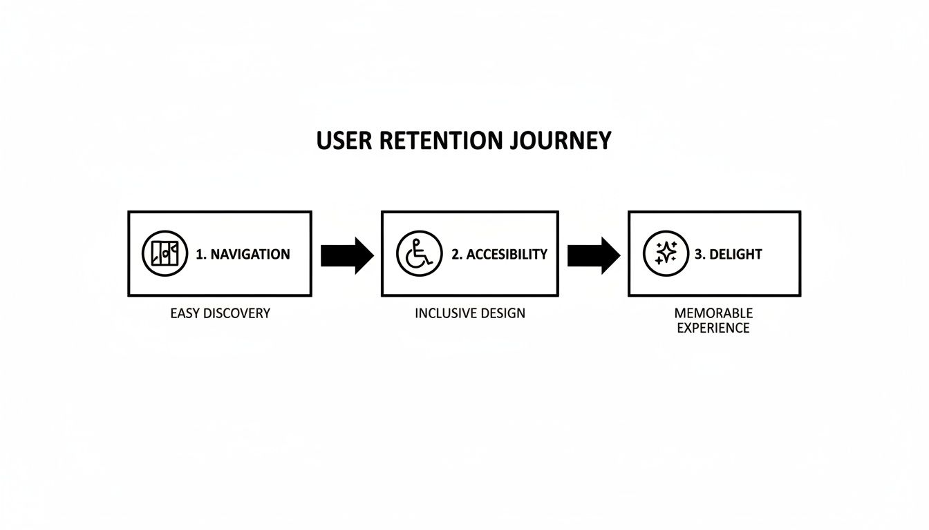
As you can see, a seamless user journey is built on these foundational pillars, which ultimately leads to a much more engaging final product.
Finally, as you get ready to deploy, it’s super important to understand the licensing options for the templates and tools you've chosen. There are different licenses tailored to your scale, whether you’re a solo dev launching an MVP or a big company shipping a flagship product.
By starting with a professional, well-architected foundation, your team can redirect its valuable energy from building boilerplate UI to innovating on the core features that truly differentiate your product in the market.
This strategic workflow—from defining user journeys to customizing a solid template—is the fastest way to launch an exceptional app. It cuts down on technical debt, gets you to market faster, and frees up your team to focus on what really matters: creating something your users will love.
Jumping into the world of app design can feel like a maze of questions, especially when you're trying to make users, developers, and business stakeholders happy all at once. Let's break down some of the most common questions developers and founders run into when creating effective designs for apps.
If you take away only one thing, let it be this: user-centricity. It's the absolute bedrock of good design.
Every single decision you make—the layout, the color palette, the font choice—has to start and end with your user's needs, habits, and goals. You can build the most beautiful app in the world, but if it’s a pain to use, it’s not going to stick around for long. It’s all about creating a seamless, intuitive experience that feels effortless.
The best way to get a consistent feel between iOS and Android is to use a cross-platform framework like React Native. The trick is to focus on universal UI/UX principles rather than getting obsessed with perfectly cloning the native look of one specific platform.
Of course, you’ll want to respect platform-specific patterns for things like navigation gestures or system alerts. But your app's core identity—its brand, its feel—should be the same everywhere. The only way to nail this is through testing on real devices for each OS. No shortcuts!
The goal isn't to make your iOS and Android apps identical clones. It's to make them feel equally familiar and intuitive to users on both platforms, all while showing off your unique brand.
For almost any new project, the answer is a huge "yes." Think about it: production-ready templates and UI kits give you a massive head start. They provide pre-built, battle-tested components for all the standard stuff—authentication, user profiles, settings pages, you name it.
This approach gives you a few serious advantages:
While we're talking about design here, getting an app out the door involves more than just pixels. For a look at what happens after launch, you might find some good info in these additional frequently asked questions about app performance tracking. At the end of the day, a quality template gives you a solid, professional foundation to ship faster and build smarter.
Ready to build beautiful, production-ready designs for apps without starting from a blank screen? Explore the gluestack market to find high-quality React Native templates and UI kits that will help you ship your cross-platform app faster. https://market.gluestack.io
Feb 23, 2026
4 min read
Discover powerful mobile app monetization strategies to boost your revenue. Our guide covers IAPs, ads, and subscriptions for React Native apps and beyond.

Feb 22, 2026
4 min read
A clear guide to app development cost estimation. Learn what drives costs, see budget examples, and discover strategies to build your app for less.

Feb 21, 2026
4 min read
Discover how to promote mobile application effectively with proven ASO, paid campaigns, and retention strategies.
Feb 15, 2026
4 min read
Discover how to create a prototype of a website with a practical, step-by-step guide. Explore tools, testing methods, and tips to bring your idea to life.

Feb 14, 2026
4 min read
Confused about mockups vs wireframes? Learn the key differences, when to use each, and how to streamline your React Native app development workflow.

Feb 13, 2026
4 min read
Discover how mobile apps templates accelerate development. Learn to choose, customize, and deploy high-quality React Native templates for your next project.

Feb 12, 2026
4 min read
Explore mobile application interface design with practical tips, core principles, and platform-aware workflows to craft apps users love.

Feb 10, 2026
4 min read
Learn mobile first design principles to craft fast, accessible apps that delight users. Practical tips, examples, and testing strategies.
Feb 08, 2026
4 min read
Explore the progressive web app vs native debate with our in-depth guide. We compare performance, cost, and UX to help you make the right strategic choice.
Feb 07, 2026
4 min read
Discover how React Native templates can accelerate your app development. This guide explores choosing, customizing, and deploying templates for faster launches.

Feb 05, 2026
4 min read
Discover the key differences between expo vs react native, including workflow, builds, and performance to help you pick the right path for your app.
Feb 03, 2026
4 min read
Master image with text overlay in React Native with responsive, accessible patterns. Learn expo setup, NativeWind styling, and gluestack-ui examples.

Feb 03, 2026
4 min read
Discover cross platform app development with proven strategies to build faster for iOS, Android, and the web using a single, unified codebase.
Feb 01, 2026
4 min read
Learn how to make an app for my business quickly with template-based steps from planning to launch, plus tips to scale and optimize.
Jan 31, 2026
4 min read
Ready to build an app? This guide shares practical strategies for validating your idea, choosing a tech stack, and navigating the App Store launch.
Jan 30, 2026
4 min read
Master responsive design for mobile apps with this guide on fluid layouts, breakpoints, and React Native. Build UIs that adapt perfectly to any screen.

Jan 25, 2026
4 min read
Learn how to design an Android app that stands out. This guide covers UX research, wireframing, Material Design, and the developer handoff process.

Jan 24, 2026
4 min read
Explore ui design web essentials: a complete guide to principles, responsive patterns, and workflows for intuitive, engaging web interfaces.

Jan 23, 2026
4 min read
Discover 10 essential mobile app design best practices for building exceptional cross-platform apps. Actionable tips for UI, UX, navigation, and performance.

Jan 21, 2026
4 min read
Discover how to debug React Native apps effectively. This guide covers Flipper, React DevTools, and native code troubleshooting for faster development cycles.
Jan 20, 2026
4 min read
Learn how to create app for your business with a practical, modern approach. Plan, customize, and launch with proven steps.
Jan 19, 2026
4 min read
A complete guide to mobile app development for startups. Learn how to validate your idea, build an MVP, and launch a successful app faster and more affordably.

Jan 18, 2026
4 min read
Discover how to choose the right React website template to accelerate your project. Our guide covers everything from quality checklists to deployment.
Jan 17, 2026
4 min read
Discover how to choose, customize, and deploy a React Native app template. This guide provides practical steps for launching production-ready apps faster.

Jan 16, 2026
4 min read
Discover how mobile application templates accelerate development. This guide covers how to choose, customize, and launch your app with the right foundation.

Jan 13, 2026
4 min read
Start your journey in mobile app development for beginners. This guide breaks down how to build your first cross-platform app with React Native and Expo.

Jan 12, 2026
4 min read
Explore the best react native ui libraries and compare features, performance, and ease of use to pick the right toolkit for your app.

Jan 11, 2026
4 min read
Launch your own ride-hailing service with our guide to building a production-ready Uber app clone. Learn MVP strategy, tech stacks, and backend integration.

Jan 10, 2026
4 min read
Master modern cash app design with this guide. Learn the UI/UX, security, and React Native strategies needed to build a fintech app that users trust and love.

Jan 09, 2026
4 min read
Learn how to build a personal finance dashboard with React Native. A practical guide for developers on UI design, data architecture, and production readiness.
Jan 08, 2026
4 min read
A practical guide to building a cross-platform event check in app with React Native. Learn to implement QR scanning, offline sync, and deployment.

Jan 07, 2026
4 min read
Master linear gradient React Native components with our complete guide. Learn practical techniques for Expo, bare RN, and NativeWind to build stunning UIs.

Jan 06, 2026
4 min read
Learn how to change application name in your React Native & Expo projects. This guide covers display names, package IDs, and app store listings.
Jan 05, 2026
4 min read
Discover how to monetize mobile apps with our founder's guide. Learn proven React Native strategies for ads, IAPs, and subscriptions to maximize your revenue.

Jan 04, 2026
4 min read
A practical guide on how to create a website app with a single codebase. Learn to build for web, iOS, and Android using React Native, Expo, and TypeScript.

Jan 03, 2026
4 min read
Learn how to create an app for your business with this definitive guide. Discover practical strategies for validation, development, and launch that work.

Jan 02, 2026
4 min read
Learn how to create a wireframe for a website with this practical guide. Move from initial sketches to developer-ready designs that get built right.
Jan 01, 2026
4 min read
Deciding on progressive web application vs native? This guide offers a deep comparison of performance, cost, UX, and use cases to help you choose wisely.

Dec 31, 2025
4 min read
Discover 10 mobile app security best practices for React Native. Learn to secure data, APIs, and code with actionable tips and examples for 2025.

Dec 30, 2025
4 min read
Unlock the real React Native app development cost. Our guide breaks down pricing by feature, team, and complexity to help you budget with confidence.

Dec 29, 2025
4 min read
A practical guide to master your React Native debug workflow. Learn to use Flipper, React DevTools, and Hermes to solve bugs in Expo and bare RN apps.

Dec 28, 2025
4 min read
The ultimate React Native tutorial for beginners. Learn to build beautiful cross-platform apps using a modern stack like Expo, TypeScript, and gluestack-ui.
Dec 27, 2025
4 min read
A practical guide on how to build a mobile app. Learn to go from concept to a market-ready app using templates, React Native, and proven development strategies.

Dec 26, 2025
4 min read
Discover interface design for websites with actionable tips on layout, responsiveness, and usability to boost conversions.

Dec 24, 2025
4 min read
Learn graphical interface design - essentials for mastering core principles, modern workflows, and cross-platform strategies to build intuitive, engaging UIs.

Dec 23, 2025
4 min read
Discover how high fi wireframes bridge the gap between ideas and code. Learn a practical workflow for creating, testing, and handing off effective UI designs.

Dec 22, 2025
4 min read
Discover mobile app interface design with practical principles, accessibility, and workflows that boost user engagement.

Dec 21, 2025
4 min read
Explore the top 10 UI UX design trends for 2025. Get expert insights and practical React Native tips to build next-gen cross-platform apps that stand out.

Dec 20, 2025
4 min read
Discover how mobile app templates accelerate development from idea to launch. Learn to select, customize, and deploy templates for a faster time to market.

Dec 18, 2025
4 min read
Explore the best react native ui libraries to accelerate mobile development with performance, theming, and accessibility. Expert tips inside.
Dec 16, 2025
4 min read
Master React Native PDF handling. Learn to generate, view, and share PDFs with practical code examples, library comparisons, and performance tips.
Dec 15, 2025
4 min read
A practical guide to choosing the right React Native component library. Learn how to evaluate options, avoid common pitfalls, and build apps faster.

Dec 14, 2025
4 min read
Find the perfect React Native UI library for your project. This guide compares top libraries, selection criteria, and customization strategies.
Dec 13, 2025
4 min read
Learn how to change app name in React Native and Expo. Our guide covers display names, bundle IDs, and store listings for iOS and Android projects.
Dec 12, 2025
4 min read
Discover the best React Native component library for your next project. We compare top libraries on performance, customization, and real-world use cases.
Dec 11, 2025
4 min read
Discover how to choose the right React Native UI kit. This guide covers top kits, selection criteria, and customization to accelerate your app development.

Dec 10, 2025
4 min read
Explore our in-depth guide to find the best React Native UI library. We compare top contenders to help you choose the right fit for your project.
Dec 09, 2025
4 min read
Discover a practical approach to building apps with React Native. This guide covers setup, UI, state management, and testing to help you ship great apps.

Dec 08, 2025
4 min read
android login with facebook: Learn to set up the Facebook SDK, manage tokens, and implement secure authentication across native Android, cross-platform apps.

Dec 07, 2025
4 min read
Master the alert in React Native. Learn to handle platform differences, build custom modals, and apply best practices for a seamless user experience.
Dec 06, 2025
4 min read
keyboardavoidingview react native: Master keyboard handling with KeyboardAvoidingView across iOS, Android, Expo, and TypeScript.
Dec 05, 2025
4 min read
A practical guide to implementing a React Native PDF viewer. Learn to compare libraries, handle native setup, and troubleshoot common issues with real code.

Dec 04, 2025
4 min read
how to validate startup idea: learn proven methods like customer interviews, MVPs, and metrics to confirm market fit.

Dec 03, 2025
4 min read
how to make app like uber: Learn core features, tech stack, development steps, testing, and launch tips.

Dec 02, 2025
4 min read
Build a rock-solid React Native setup. This guide covers Expo vs. Bare workflows, TypeScript, pnpm monorepos, NativeWind, and deployment strategies.

Dec 01, 2025
4 min read
A practical guide to Stripe React Native integration. Learn to set up your server, build payment UIs, handle webhooks, and launch secure mobile payments.

Nov 30, 2025
4 min read
Learn how to master push notifications in React Native. This guide covers setup, best practices, and advanced techniques for engaging your users.

Nov 29, 2025
4 min read
Build powerful location-based apps with our practical guide to react native with google maps. Get setup guides, pro tips, and best practices for iOS & Android.

Nov 28, 2025
4 min read
Explore deep linking react native with a practical guide to configuring URL schemes, universal links, navigation, and testing for Expo and bare apps.

Nov 28, 2025
4 min read
A practical guide to building a scalable React Native design system. Learn to implement tokens, theming, and tools like NativeWind and gluestack-ui.

Nov 26, 2025
4 min read
Learn why react native expo templates speed up your projects with ready-made patterns and practical tips.

Nov 25, 2025
4 min read
Discover how to improve developer productivity with actionable strategies for workflow, tooling, and culture. A practical guide for software engineering teams.

Nov 24, 2025
4 min read
Discover the best cross platform app development tools. Compare top frameworks like Flutter and React Native to build and ship apps faster.
Nov 23, 2025
4 min read
This Expo React Native tutorial provides a hands-on guide to building cross-platform apps. Learn setup, styling with NativeWind, navigation, and deployment.

Nov 22, 2025
4 min read
Build beautiful UIs faster with this guide to Tailwind CSS React Native. Learn setup, styling, and advanced techniques with NativeWind for mobile apps.
Nov 21, 2025
4 min read
Explore our curated list of 7 top-tier React Native app examples. Discover production-ready templates and resources to build your next app faster.
Mar 19, 2025
4 min read
gluestack market offers React Native UI templates to accelerate development. Get customizable, production-ready React Native app templates and Ui kit, some free. Build faster & smarter today!