Jan 25, 2026

4 min read


When you set out to design an Android app, you're not just making something that looks good. You're aiming to create an experience that’s intuitive, responsive, and genuinely helpful across a dizzying number of devices. It's less about pure aesthetics and more about crafting a functional, user-centric journey that solves a real problem. This whole process is a blend of sharp research, smart wireframing, and polished UI execution.

Before we jump into the nuts and bolts of wireframes and color palettes, it's worth taking a moment to understand the "why." A well-designed app isn't just a nice-to-have; it's the bedrock of user acquisition, retention, and your overall success. Think of it this way: your app's design is the first handshake, the initial impression you make, and the primary way people will interact with your brand.
The sheer scale of the Android world makes thoughtful design absolutely non-negotiable. With over 3.6 billion users and a projected 73.9% global market share by 2025, Android is where the vast majority of your potential audience lives. If you cut corners on design for this platform, you're basically shutting the door on a massive number of people from day one.
One of the biggest headaches in Android app design has always been device fragmentation. It’s not like the iOS ecosystem, which is relatively tidy and uniform. Android runs on thousands of different devices with a wild variety of screen sizes, resolutions, and hardware guts. This diversity can be a killer.
A design that looks picture-perfect on a high-end Google Pixel might completely fall apart on a budget Samsung phone or a random tablet. This is exactly where a strategic, component-based approach becomes your best friend. Modern tools like React Native, especially when paired with a UI library like gluestack-ui, are built to solve this exact problem. They let you:
A great design goes deeper than just the visual layer; it builds trust. When users find an app easy to navigate and predictable, they’re far more likely to stick around, explore its features, and become loyal customers.
Ultimately, great Android design directly leads to a better user journey. This doesn't just feel good—it can seriously help to improve ecommerce customer experience and fuel real growth. To dig deeper, check out our comprehensive guide on mobile app design best practices.
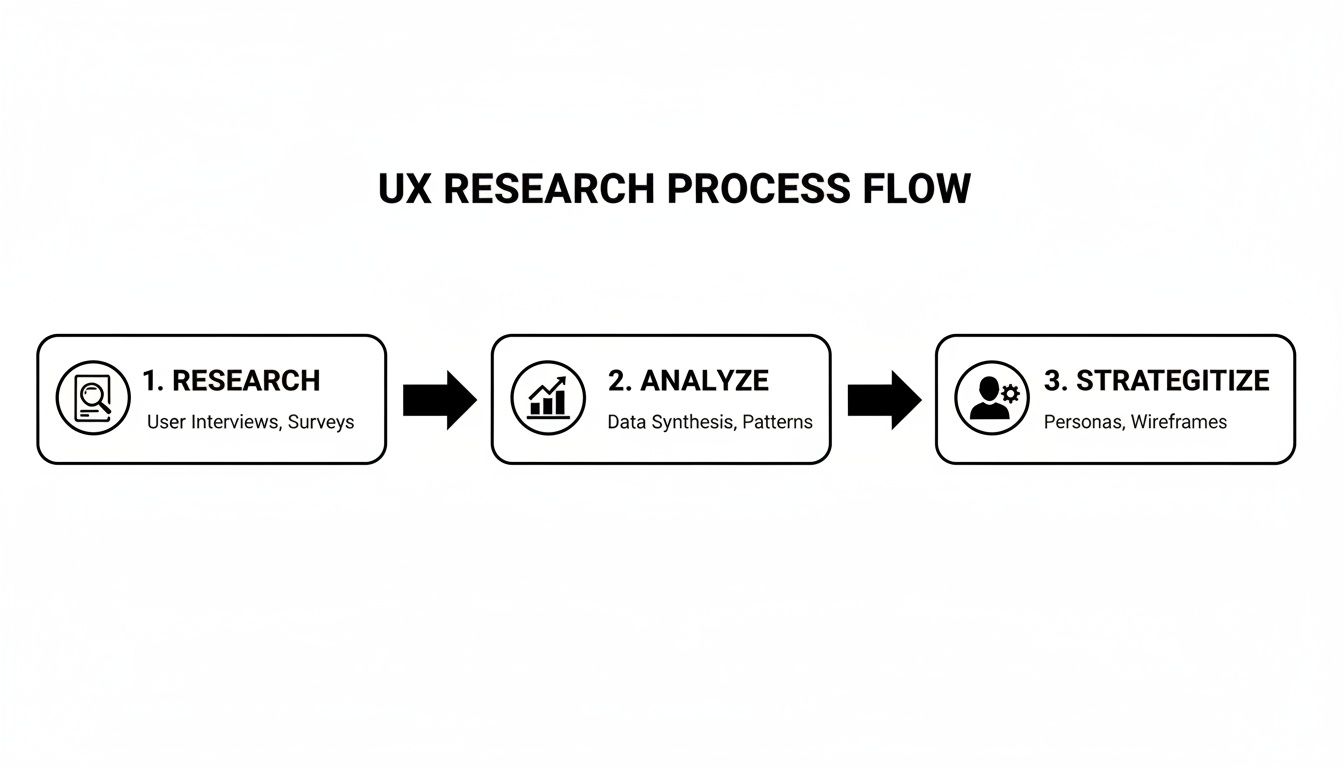
Before you even think about pixels and color palettes, the journey to design a great Android app starts with a simple but critical question: who are we actually building this for, and why?
Skipping this step is a recipe for disaster. It's like trying to build a house without a blueprint—you might end up with something standing, but it almost certainly won't be what anyone needs or wants to live in. This initial discovery phase is all about swapping out your team's assumptions for real, data-driven insights.
The whole point is to get a deep, genuine understanding of your potential users. What are their frustrations? What are they trying to achieve? And in what context will they be pulling out their phone to use your app? This isn't just about asking people what features they want; it's about observing what they do.
The numbers back this up. For every $1 you invest in proper user experience research, the return can be anywhere from $2 to $100. Think about that. This early work pays for itself many times over by simply preventing you from building the wrong thing and having to backtrack later.
Your first mission is to map the terrain. Start by clearly defining your target audience and then dive headfirst into a competitive analysis. Don't just make a list of competitors—download their apps. Use them. Figure out what they do well and, more importantly, where they're dropping the ball. These gaps are where your app can shine.
At the same time, you need to start gathering direct feedback from real people. A few solid methods include:
I can't stress this enough: you are not your user. The features you think are brilliant might be completely irrelevant—or even annoying—to your actual audience. Solid research grounds your project in reality, not your own preferences.
Once you've got a pile of notes, recordings, and survey results, the real work begins. It's time to synthesize all that raw data into clear, actionable documents that will guide every single design decision you make from here on out. This is how you turn scattered information into a coherent UX strategy.
If you're looking for more on how to translate these insights into user-friendly layouts, our guide on mobile app interface design is a great next read.
This strategic phase usually boils down to creating two essential documents:
By creating these foundational pieces, you ensure every choice is directly tied to a real user need. This research isn't just a box you check at the beginning; it’s the pulse of the project, constantly reminding you to build something people will genuinely value and enjoy using.
Alright, you’ve done your homework. You know who you're building for and what problems you're solving. Now comes the exciting part: turning all that research into something tangible. This is where we stop talking in hypotheticals and start building the skeleton of your app with wireframes and prototypes.
Think of it as creating the architectural blueprint for a house. You wouldn't let a construction crew start pouring concrete without one, right? Same deal here.
A wireframe is your app at its most basic. It's a low-fidelity, black-and-white layout—no colors, no fancy fonts, just boxes and lines. Its only job is to map out where things go: buttons, text blocks, images, navigation bars. By stripping away all the visual design, you force everyone to focus purely on function and user flow.
This is your secret weapon for moving fast. You can sketch out a dozen screen variations in a single afternoon, get them in front of your team, and spot confusing navigation or awkward layouts before you've wasted a single minute on pixel-perfect designs. It's all about failing fast and cheap.
Every insight from your initial research directly informs these structural decisions. It’s a continuous flow, not a series of disconnected steps.
Once you’ve landed on a solid structure with wireframes, it's time to add a pulse. A prototype is an interactive, clickable model of your app. It’s where your static blueprints start to feel like a real product. Users can tap through screens, test out the navigation, and give you gut-level feedback on how the app feels to use.
Making prototypes early will save you headaches—and a lot of money. Finding out a user flow is a dead end at this stage is a quick fix in a tool like Figma. Discovering that same problem after it's been coded could mean days or weeks of expensive rework for your developers.
Prototypes are the ultimate communication tool. They kill ambiguity. Showing a stakeholder a clickable model is infinitely more powerful than trying to explain it with static screens and a 20-page document.
Understanding the different stages of this process is key to an efficient workflow. Here's a quick breakdown of the fidelity levels you'll be working with.
Understanding the purpose and tools for each stage of the design process, from basic sketches to interactive prototypes.
| Fidelity Level | Purpose | Common Tools | gluestack market Advantage |
|---|---|---|---|
| Low-Fidelity (Lo-Fi) | Quickly explore concepts, user flows, and core layout. Focus on structure, not visuals. | Pen & Paper, Balsamiq, Whimsical | N/A - This stage is about raw ideas. |
| Mid-Fidelity (Mid-Fi) | Refine the layout with more detail. Define component placement and basic interactions without final styling. | Figma, Sketch, Adobe XD | N/A - Focus is still on structure, not final components. |
| High-Fidelity (Hi-Fi) | Create a visually detailed and interactive representation of the final app. Used for user testing and developer handoff. | Figma, Protopie | Use pre-built templates and gluestack-ui components to build realistic prototypes in record time. |
Each level serves a distinct purpose, moving from broad ideas to a detailed, interactive final product that’s ready for development.
In the world of app development, speed is a massive advantage. UI kits and component libraries are a game-changer here. Instead of painstakingly designing every single button, card, and dropdown menu from scratch, you can pull from a library of production-ready components to assemble your high-fidelity designs.
For React Native teams, this is a no-brainer. Using a resource like gluestack-ui means your prototype is built with the exact same components your developers will use. They're already coded, accessible, and optimized for Android, iOS, and the web. You're not just designing faster; you're creating a prototype that’s a near-perfect preview of the finished product. To really dig in, check out our guide on making high-fi wireframes that look and feel completely real.
The market doesn't lie. With Android app downloads on Google Play expected to reach 187 billion by 2025, you need every edge you can get. Standing out among 3.5 million other apps requires both a stellar user experience and the ability to ship it fast. Quality UI kits give you a serious head start.
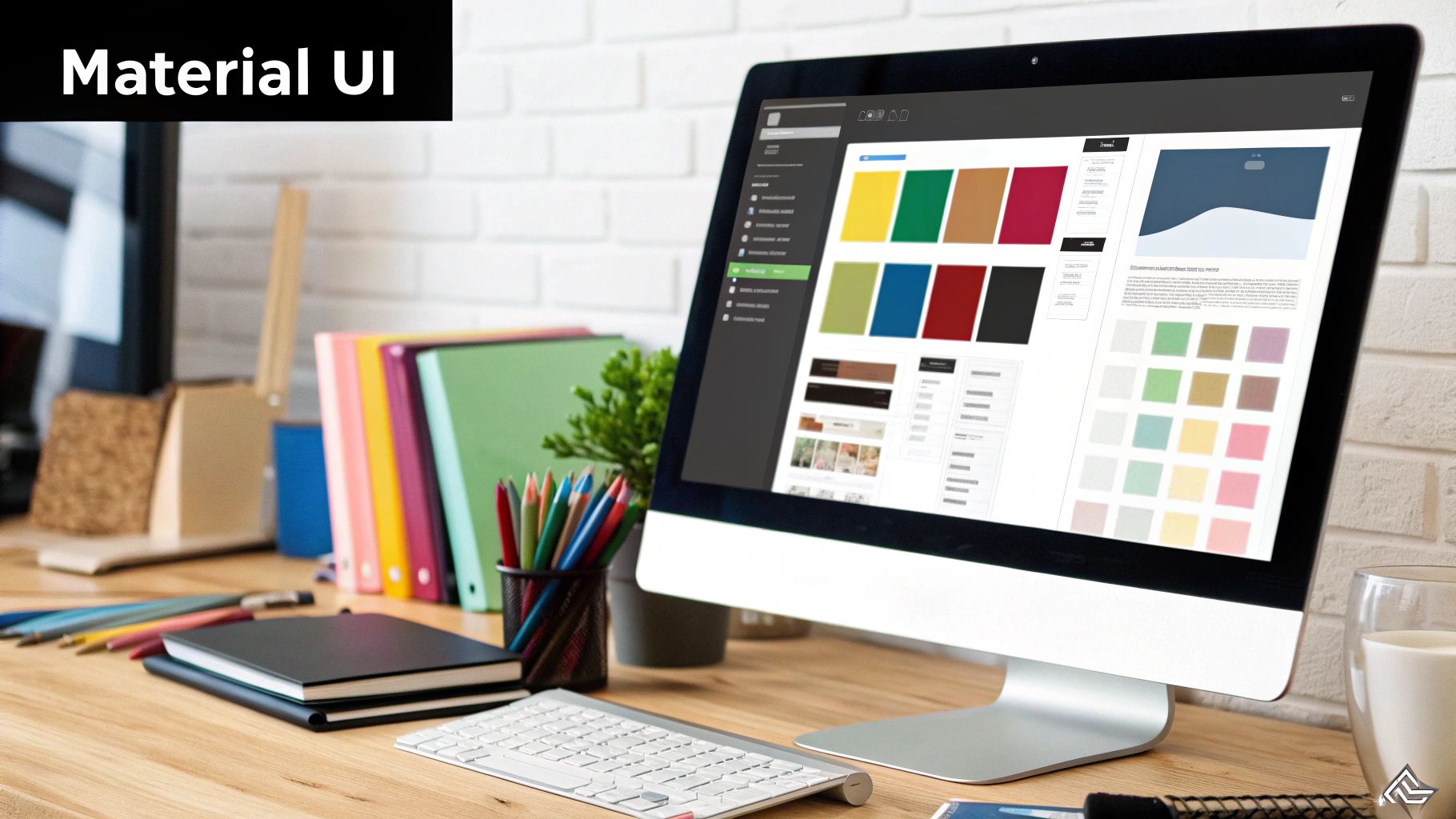
Alright, your wireframes have given you a solid blueprint. Now for the fun part: bringing it to life with personality and visual polish. This is the User Interface (UI) design phase, where we trade those black-and-white structures for a branded, high-fidelity experience.
This isn't just about making things look pretty. Strategic choices in color, typography, and spacing create a cohesive visual language that guides the user’s eye, communicates hierarchy, and makes every tap and swipe feel intuitive. A well-chosen color palette can set the mood, while consistent typography makes text a breeze to read. All these elements work in concert to build trust and make your app a genuine pleasure to use.
When you design an Android app, your best friend in this process is Google's own design system, Material Design. It’s a robust, battle-tested framework for creating beautiful, functional interfaces that feel completely at home on the platform.
The latest evolution, Material You, takes this a huge step further. Its standout feature is dynamic color, a clever system where your app’s UI can automatically adapt its entire color scheme based on the user's wallpaper. It creates a deeply personal and unified experience that stretches across their whole device.
For a React Native developer, implementing this might sound like a nightmare, but modern UI libraries are built to handle this elegance for you. Components from a library like gluestack-ui, for instance, are designed with these principles baked right in. They adapt gracefully to system-level themes, making your app feel perfectly integrated into the user’s Android world without you having to write a line of custom theme logic.
Key aspects of Material You to lean into include:
I’ve seen teams get tangled up trying to invent a completely unique design language from scratch. My advice? Don't reinvent the wheel. Start with Material You as your foundation. You can still inject your brand's unique style, but you’ll be building on a system that billions of users already know and understand.
Getting from a polished Figma design to a live React Native app requires an obsession with detail. The goal is a pixel-perfect match, and this is another spot where a component-based workflow is a game-changer.
When your designs are built using components from a library like gluestack-ui, the handoff to development becomes ridiculously smooth. Developers aren't squinting at visual specs trying to recreate a button; they're implementing the exact same pre-coded component the designer used.
This approach pays off in a few huge ways:
By building on the solid principles of Material You and using production-ready component libraries, you can seriously speed up your UI design process. It lets you focus your creative energy on what truly makes your app unique, knowing that the foundational visual and interactive elements are already rock-solid and professional.
A smooth handoff isn’t just a nice-to-have; it's the only way to ensure your vision becomes a real, functioning app with perfect fidelity.
Think of the handoff as the bridge between your design tool and the final codebase. If that bridge is rickety, things are going to fall through the cracks. Your mission is to eliminate every last bit of guesswork for the developers. They shouldn't have to break out a digital ruler to measure pixels, guess hex codes, or wonder how a button is supposed to feel when someone taps it.
This is where a component-based workflow completely changes the game. When you design an Android app where your design components have a one-to-one match with code components, the entire handoff dynamic shifts from a chore to a collaboration.
A well-organized design file is the bedrock of a great handoff. Just dropping a link to a messy Figma file into Slack is a recipe for disaster. Your file needs to be the single source of truth, a comprehensive guide that developers can navigate with ease.
Before you even think about hitting "Share," make sure your file is immaculate. This means you’ve got to:
I've lost count of how many times I've seen designers just hand off static screens and expect developers to read their minds. The best handoffs are living documents that detail not just the what, but the how and the why behind every single design choice.
Ultimately, the goal is to make the developer's job as easy as humanly possible. When your designs are built with a library like gluestack-ui, the handoff becomes less about providing redlines and visual specs and more about just pointing to the right component.
Because gluestack market templates and UI kits are built with these production-ready components, developers can often copy the exact code for a component directly from the documentation. This isn't just a small improvement; it's a massive time-saver that guarantees what they build is a pixel-perfect match to your design.
This approach transforms the handoff from a manual, error-prone headache into a streamlined flow of pre-designed, pre-coded, and fully accessible components. The result? Faster development cycles, far fewer bugs, and an app that looks and feels exactly as you intended on every single device.
Designing for Android brings its own set of puzzles—especially when you’re juggling multiple devices, user expectations, and tight deadlines. Below are three questions we hear most often, along with practical advice you can apply today.
Hands down, screen fragmentation is the biggest headache. Android runs on everything from flagship phones to budget tablets, each with unique sizes, resolutions, and aspect ratios.
You could build separate layouts for each scenario, but that quickly becomes unmanageable. Instead, aim for a fluid grid that adapts. A cross-platform toolkit like React Native, paired with gluestack-ui, makes this smoother. You define one set of components; they flex to fit any screen.
Strict adherence isn’t mandatory, but Material Design offers a head start on consistency and usability. Google’s guidelines cover:
Material Design Is A Launch Pad, Not A Constraint. Use its core principles to earn user trust, then layer on your brand’s colors, typography, and custom animations.
When you’re racing toward an MVP, every hour counts. Building each screen from scratch can drain your energy and delay feedback. Instead:
This strategy shrinks your design backlog, tightens feedback loops, and gets your prototype into users’ hands faster.
Ready to ditch the blank canvas and ship your MVP in record time? gluestack market delivers React Native starters and UI kits that cut days—or weeks—off your roadmap. Explore our library of customizable, cross-platform app starters and get a head start on your next Android project.

Feb 23, 2026
4 min read
Discover powerful mobile app monetization strategies to boost your revenue. Our guide covers IAPs, ads, and subscriptions for React Native apps and beyond.

Feb 22, 2026
4 min read
A clear guide to app development cost estimation. Learn what drives costs, see budget examples, and discover strategies to build your app for less.

Feb 21, 2026
4 min read
Discover how to promote mobile application effectively with proven ASO, paid campaigns, and retention strategies.

Feb 15, 2026
4 min read
Discover how to create a prototype of a website with a practical, step-by-step guide. Explore tools, testing methods, and tips to bring your idea to life.
Feb 14, 2026
4 min read
Confused about mockups vs wireframes? Learn the key differences, when to use each, and how to streamline your React Native app development workflow.

Feb 13, 2026
4 min read
Discover how mobile apps templates accelerate development. Learn to choose, customize, and deploy high-quality React Native templates for your next project.

Feb 12, 2026
4 min read
Explore mobile application interface design with practical tips, core principles, and platform-aware workflows to craft apps users love.

Feb 10, 2026
4 min read
Learn mobile first design principles to craft fast, accessible apps that delight users. Practical tips, examples, and testing strategies.
Feb 08, 2026
4 min read
Explore the progressive web app vs native debate with our in-depth guide. We compare performance, cost, and UX to help you make the right strategic choice.
Feb 07, 2026
4 min read
Discover how React Native templates can accelerate your app development. This guide explores choosing, customizing, and deploying templates for faster launches.

Feb 05, 2026
4 min read
Discover the key differences between expo vs react native, including workflow, builds, and performance to help you pick the right path for your app.
Feb 03, 2026
4 min read
Master image with text overlay in React Native with responsive, accessible patterns. Learn expo setup, NativeWind styling, and gluestack-ui examples.

Feb 03, 2026
4 min read
Discover cross platform app development with proven strategies to build faster for iOS, Android, and the web using a single, unified codebase.
Feb 01, 2026
4 min read
Learn how to make an app for my business quickly with template-based steps from planning to launch, plus tips to scale and optimize.
Jan 31, 2026
4 min read
Ready to build an app? This guide shares practical strategies for validating your idea, choosing a tech stack, and navigating the App Store launch.
Jan 30, 2026
4 min read
Master responsive design for mobile apps with this guide on fluid layouts, breakpoints, and React Native. Build UIs that adapt perfectly to any screen.

Jan 24, 2026
4 min read
Explore ui design web essentials: a complete guide to principles, responsive patterns, and workflows for intuitive, engaging web interfaces.

Jan 23, 2026
4 min read
Discover 10 essential mobile app design best practices for building exceptional cross-platform apps. Actionable tips for UI, UX, navigation, and performance.

Jan 21, 2026
4 min read
Discover how to debug React Native apps effectively. This guide covers Flipper, React DevTools, and native code troubleshooting for faster development cycles.
Jan 20, 2026
4 min read
Learn how to create app for your business with a practical, modern approach. Plan, customize, and launch with proven steps.
Jan 19, 2026
4 min read
A complete guide to mobile app development for startups. Learn how to validate your idea, build an MVP, and launch a successful app faster and more affordably.

Jan 18, 2026
4 min read
Discover how to choose the right React website template to accelerate your project. Our guide covers everything from quality checklists to deployment.
Jan 17, 2026
4 min read
Discover how to choose, customize, and deploy a React Native app template. This guide provides practical steps for launching production-ready apps faster.

Jan 16, 2026
4 min read
Discover how mobile application templates accelerate development. This guide covers how to choose, customize, and launch your app with the right foundation.

Jan 13, 2026
4 min read
Start your journey in mobile app development for beginners. This guide breaks down how to build your first cross-platform app with React Native and Expo.
Jan 12, 2026
4 min read
Explore the best react native ui libraries and compare features, performance, and ease of use to pick the right toolkit for your app.

Jan 11, 2026
4 min read
Launch your own ride-hailing service with our guide to building a production-ready Uber app clone. Learn MVP strategy, tech stacks, and backend integration.
Jan 10, 2026
4 min read
Master modern cash app design with this guide. Learn the UI/UX, security, and React Native strategies needed to build a fintech app that users trust and love.

Jan 09, 2026
4 min read
Learn how to build a personal finance dashboard with React Native. A practical guide for developers on UI design, data architecture, and production readiness.
Jan 08, 2026
4 min read
A practical guide to building a cross-platform event check in app with React Native. Learn to implement QR scanning, offline sync, and deployment.

Jan 07, 2026
4 min read
Master linear gradient React Native components with our complete guide. Learn practical techniques for Expo, bare RN, and NativeWind to build stunning UIs.

Jan 06, 2026
4 min read
Learn how to change application name in your React Native & Expo projects. This guide covers display names, package IDs, and app store listings.
Jan 05, 2026
4 min read
Discover how to monetize mobile apps with our founder's guide. Learn proven React Native strategies for ads, IAPs, and subscriptions to maximize your revenue.

Jan 04, 2026
4 min read
A practical guide on how to create a website app with a single codebase. Learn to build for web, iOS, and Android using React Native, Expo, and TypeScript.

Jan 03, 2026
4 min read
Learn how to create an app for your business with this definitive guide. Discover practical strategies for validation, development, and launch that work.

Jan 02, 2026
4 min read
Learn how to create a wireframe for a website with this practical guide. Move from initial sketches to developer-ready designs that get built right.
Jan 01, 2026
4 min read
Deciding on progressive web application vs native? This guide offers a deep comparison of performance, cost, UX, and use cases to help you choose wisely.

Dec 31, 2025
4 min read
Discover 10 mobile app security best practices for React Native. Learn to secure data, APIs, and code with actionable tips and examples for 2025.

Dec 30, 2025
4 min read
Unlock the real React Native app development cost. Our guide breaks down pricing by feature, team, and complexity to help you budget with confidence.

Dec 29, 2025
4 min read
A practical guide to master your React Native debug workflow. Learn to use Flipper, React DevTools, and Hermes to solve bugs in Expo and bare RN apps.

Dec 28, 2025
4 min read
The ultimate React Native tutorial for beginners. Learn to build beautiful cross-platform apps using a modern stack like Expo, TypeScript, and gluestack-ui.

Dec 27, 2025
4 min read
A practical guide on how to build a mobile app. Learn to go from concept to a market-ready app using templates, React Native, and proven development strategies.

Dec 26, 2025
4 min read
Discover interface design for websites with actionable tips on layout, responsiveness, and usability to boost conversions.

Dec 25, 2025
4 min read
Discover designs for apps that blend minimal aesthetics with personalization, and learn to build user-centric interfaces that boost engagement.

Dec 24, 2025
4 min read
Learn graphical interface design - essentials for mastering core principles, modern workflows, and cross-platform strategies to build intuitive, engaging UIs.

Dec 23, 2025
4 min read
Discover how high fi wireframes bridge the gap between ideas and code. Learn a practical workflow for creating, testing, and handing off effective UI designs.

Dec 22, 2025
4 min read
Discover mobile app interface design with practical principles, accessibility, and workflows that boost user engagement.

Dec 21, 2025
4 min read
Explore the top 10 UI UX design trends for 2025. Get expert insights and practical React Native tips to build next-gen cross-platform apps that stand out.

Dec 20, 2025
4 min read
Discover how mobile app templates accelerate development from idea to launch. Learn to select, customize, and deploy templates for a faster time to market.

Dec 18, 2025
4 min read
Explore the best react native ui libraries to accelerate mobile development with performance, theming, and accessibility. Expert tips inside.
Dec 16, 2025
4 min read
Master React Native PDF handling. Learn to generate, view, and share PDFs with practical code examples, library comparisons, and performance tips.
Dec 15, 2025
4 min read
A practical guide to choosing the right React Native component library. Learn how to evaluate options, avoid common pitfalls, and build apps faster.

Dec 14, 2025
4 min read
Find the perfect React Native UI library for your project. This guide compares top libraries, selection criteria, and customization strategies.

Dec 13, 2025
4 min read
Learn how to change app name in React Native and Expo. Our guide covers display names, bundle IDs, and store listings for iOS and Android projects.
Dec 12, 2025
4 min read
Discover the best React Native component library for your next project. We compare top libraries on performance, customization, and real-world use cases.
Dec 11, 2025
4 min read
Discover how to choose the right React Native UI kit. This guide covers top kits, selection criteria, and customization to accelerate your app development.
Dec 10, 2025
4 min read
Explore our in-depth guide to find the best React Native UI library. We compare top contenders to help you choose the right fit for your project.
Dec 09, 2025
4 min read
Discover a practical approach to building apps with React Native. This guide covers setup, UI, state management, and testing to help you ship great apps.

Dec 08, 2025
4 min read
android login with facebook: Learn to set up the Facebook SDK, manage tokens, and implement secure authentication across native Android, cross-platform apps.

Dec 07, 2025
4 min read
Master the alert in React Native. Learn to handle platform differences, build custom modals, and apply best practices for a seamless user experience.
Dec 06, 2025
4 min read
keyboardavoidingview react native: Master keyboard handling with KeyboardAvoidingView across iOS, Android, Expo, and TypeScript.
Dec 05, 2025
4 min read
A practical guide to implementing a React Native PDF viewer. Learn to compare libraries, handle native setup, and troubleshoot common issues with real code.

Dec 04, 2025
4 min read
how to validate startup idea: learn proven methods like customer interviews, MVPs, and metrics to confirm market fit.

Dec 03, 2025
4 min read
how to make app like uber: Learn core features, tech stack, development steps, testing, and launch tips.

Dec 02, 2025
4 min read
Build a rock-solid React Native setup. This guide covers Expo vs. Bare workflows, TypeScript, pnpm monorepos, NativeWind, and deployment strategies.

Dec 01, 2025
4 min read
A practical guide to Stripe React Native integration. Learn to set up your server, build payment UIs, handle webhooks, and launch secure mobile payments.

Nov 30, 2025
4 min read
Learn how to master push notifications in React Native. This guide covers setup, best practices, and advanced techniques for engaging your users.

Nov 29, 2025
4 min read
Build powerful location-based apps with our practical guide to react native with google maps. Get setup guides, pro tips, and best practices for iOS & Android.

Nov 28, 2025
4 min read
Explore deep linking react native with a practical guide to configuring URL schemes, universal links, navigation, and testing for Expo and bare apps.

Nov 28, 2025
4 min read
A practical guide to building a scalable React Native design system. Learn to implement tokens, theming, and tools like NativeWind and gluestack-ui.
Nov 26, 2025
4 min read
Learn why react native expo templates speed up your projects with ready-made patterns and practical tips.

Nov 25, 2025
4 min read
Discover how to improve developer productivity with actionable strategies for workflow, tooling, and culture. A practical guide for software engineering teams.
Nov 24, 2025
4 min read
Discover the best cross platform app development tools. Compare top frameworks like Flutter and React Native to build and ship apps faster.
Nov 23, 2025
4 min read
This Expo React Native tutorial provides a hands-on guide to building cross-platform apps. Learn setup, styling with NativeWind, navigation, and deployment.
Nov 22, 2025
4 min read
Build beautiful UIs faster with this guide to Tailwind CSS React Native. Learn setup, styling, and advanced techniques with NativeWind for mobile apps.

Nov 21, 2025
4 min read
Explore our curated list of 7 top-tier React Native app examples. Discover production-ready templates and resources to build your next app faster.
Mar 19, 2025
4 min read
gluestack market offers React Native UI templates to accelerate development. Get customizable, production-ready React Native app templates and Ui kit, some free. Build faster & smarter today!