Jan 07, 2026

4 min read


Using a linear gradient in React Native is one of the quickest ways to take a mobile app's design from basic to beautiful. It’s all about using a library like expo-linear-gradient for Expo projects or react-native-linear-gradient for bare React Native to smoothly blend colors across a component. The result is a modern, professional background effect that feels polished.
Let's be honest, gradients are more than just a design choice; they're a strategic tool for creating apps that feel alive. In a crowded marketplace, a well-executed linear gradient can make an MVP look like a polished, final product right from day one. Top-tier apps use them to guide a user's focus, establish a clear visual hierarchy, and create an atmosphere that keeps people engaged.

It wasn't always this simple. In the early days after React Native's 2015 release, creating smooth gradients was a real headache. Back then, we had to rely on third-party libraries like react-native-linear-gradient to get the job done. This library actually became a staple in over 42% of projects by 2019.
The game changed when Expo SDK 39 baked in native support, slashing setup time by an estimated 70%. Suddenly, teams could ship MVPs with slick UI kits much faster.
This shift empowers developers, especially indie hackers and startups, to implement visually appealing designs without wrestling with dependencies. A thoughtful gradient strategy can seriously elevate the user experience. You can see how gradients fit into the bigger picture by exploring the latest UI/UX design trends.
Key Takeaway: A linear gradient is not just decoration. It's a low-effort, high-impact tool that adds depth, directs attention, and communicates brand identity, ultimately making your app feel more premium and engaging to the end-user.
The principle of using backgrounds to enhance visual appeal extends way beyond mobile UIs. You see it everywhere. An interesting parallel is in e-commerce, where developers are transforming backgrounds with AI in fashion photography to create compelling product visuals.
Both approaches—gradients in apps and AI in photos—use background manipulation to capture attention and create a more polished final product. It’s a powerful idea that sets the stage for the actionable techniques we're about to dive into.
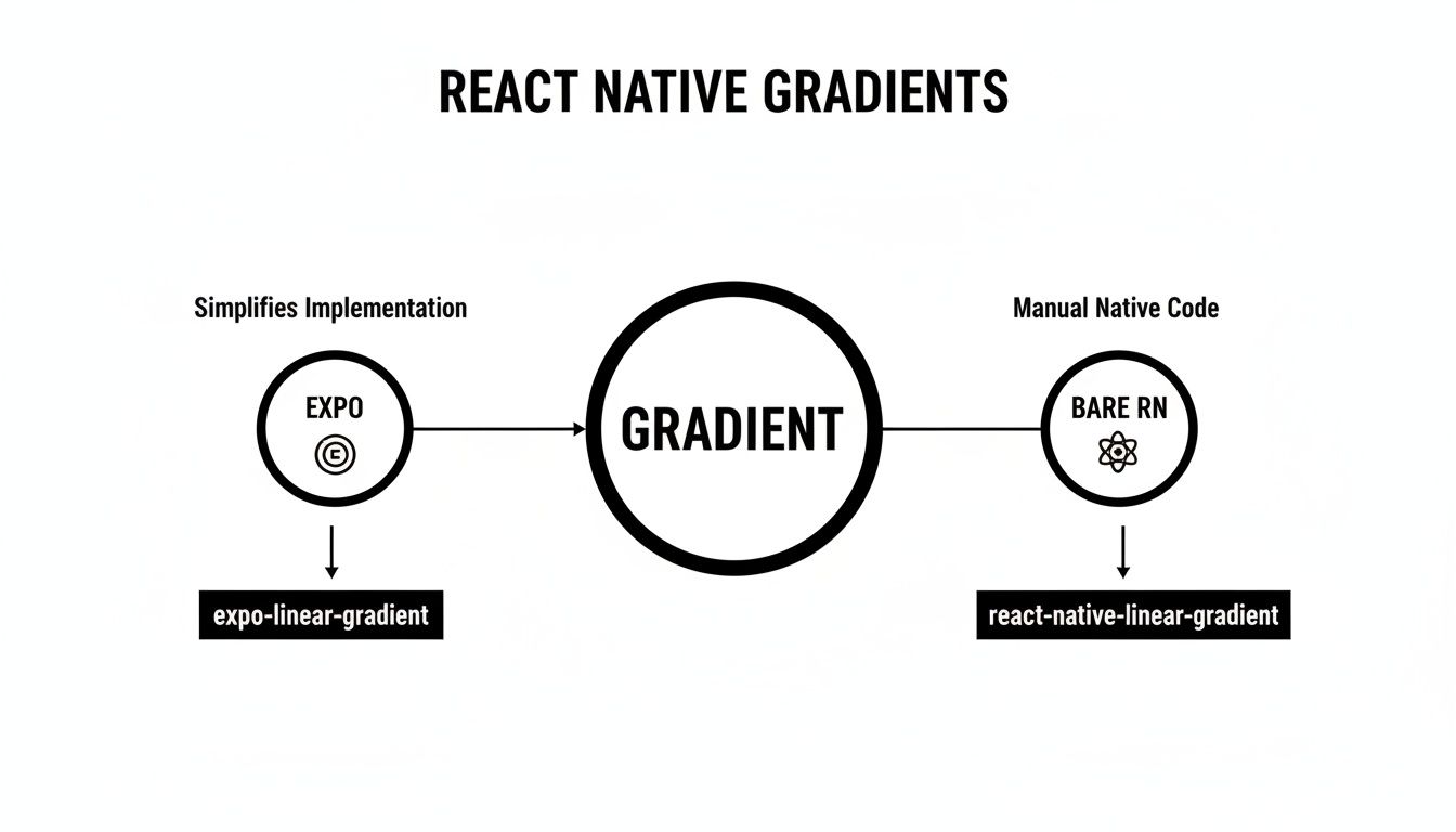
Alright, let's get down to business and turn that theory into a working gradient on your screen. Whether you're in an Expo-managed workflow or a bare React Native setup, getting that first beautiful, two-color linear gradient react native component running is surprisingly straightforward once you know which tool to grab.
If you're just getting your feet wet with React Native, our complete React Native tutorial for beginners is a great place to build a solid foundation before jumping into cool UI tricks like this.
If your project is built with Expo, you're in for a treat. The expo-linear-gradient package is the go-to choice, offering a seamless, JavaScript-only installation that sidesteps any native configuration headaches. It’s the fastest way to get from concept to a running gradient.
Just pop open your terminal and run this command in your project's root:
npx expo install expo-linear-gradient
Using npx expo install is a pro-tip here. It's much safer than npm or yarn in an Expo project because it automatically picks the library version that’s compatible with your specific Expo SDK. This tiny detail can save you from a world of version-mismatch pain.
With the package installed, you can import and use it just like any other component. Here's a quick and dirty example of a full-screen background to get you started:
import React from 'react'; import { StyleSheet } from 'react-native'; import { LinearGradient } from 'expo-linear-gradient';
export default function App() { return ( <LinearGradient // An array of colors to define the gradient colors={['#4c669f', '#3b5998', '#192f6a']} style={styles.container} > {/* Your other app components will go inside */} </LinearGradient> ); }
const styles = StyleSheet.create({ container: { flex: 1, alignItems: 'center', justifyContent: 'center', }, });
For those of you running a bare React Native project, the community-favorite library is react-native-linear-gradient. It does the same job beautifully but needs a couple of extra steps because it has to link native code for both iOS and Android.
First, pull the package into your project:
npm install react-native-linear-gradient
or
yarn add react-native-linear-gradient
After that, you've got one crucial extra step: linking the native bits. For iOS, you'll need to cd into your ios directory and run pod install. This command is what magically connects the necessary native code to your Xcode project.
A Quick Tip for M1/M2 Mac Users: If you hit a wall during the pod installation, try running
arch -x86_64 pod installfrom theiosdirectory. This is a common and effective workaround for architecture-related build errors on Apple Silicon.
The great news is that the component API is nearly identical to the Expo version, which makes your code portable. You just import LinearGradient from the new package and pass your colors prop. And just like that, you have a vibrant linear gradient react native background in your bare project, ready for all your custom styling.
Picking the right library really just comes down to your project setup. Both options are solid, but one will be a much smoother experience depending on whether you're using Expo or a bare workflow.
Here's a quick side-by-side to make the choice crystal clear.
| Feature | expo-linear-gradient | react-native-linear-gradient |
|---|---|---|
| Best For | Expo-managed projects | Bare React Native projects |
| Installation | Single command: npx expo install |
npm/yarn install, plus pod install for iOS |
| Setup Complexity | Very Low. No native configuration needed. | Low to Medium. Requires native linking (pods). |
| Native Code | Handled automatically by the Expo ecosystem. | Requires manual linking for native modules. |
| Ease of Use | Extremely simple, works out of the box. | Simple to use in code, but with an extra setup step. |
| Component API | Nearly identical to the bare RN version. | Nearly identical to the Expo version. |
Ultimately, both libraries get you to the same place: a beautiful, performant gradient. The only real difference is the setup process. Stick with the one designed for your environment, and you can't go wrong.
Got a basic gradient showing up? Awesome. Now, let’s get into the fun stuff. This is where you move beyond the default top-to-bottom fade and start giving your UI some real personality. Having precise control over the gradient's direction, color blending, and where those colors shift is what separates a generic background from a thoughtful, polished design.
Before we dive into the code, this quick diagram lays out the two main paths you'll take for gradients in React Native, depending on your project setup.
The key takeaway here is that whether you’re using the Expo library or the one for bare React Native, the properties you’ll be tweaking are pretty much the same. The techniques for customizing direction and color stops are totally transferable.
By default, every gradient wants to flow straight down. But what if you want a horizontal fade from left to right? Or a slick diagonal effect? This is where the start and end props come in.
These props take a simple object with x and y coordinates, with each value going from 0 to 1.
Just think of it as a coordinate system for your component:
(x: 0, y: 0) is the top-left corner.(x: 1, y: 0.5) is the exact middle of the right edge.(x: 0.5, y: 1) is the center point of the bottom edge.So, to make a horizontal gradient that sweeps from a peachy #FFC371 on the left to a vibrant #FF5F6D on the right, you just tell it to start on the left edge and end on the right.
<LinearGradient colors={['#FFC371', '#FF5F6D']} start={{ x: 0, y: 0.5 }} end={{ x: 1, y: 0.5 }} style={styles.container} /> That simple change gives you total control over the direction. The possibilities for creating subtle (or dramatic) visual effects are suddenly wide open.
Why stick with just two colors? The colors prop is an array, which means you can pack in as many shades as you need to create more complex, eye-catching transitions. A sunset-inspired gradient, for example, might blend three, four, or even five different hues.
It’s as simple as expanding that array: ['#4c669f', '#3b5998', '#192f6a', '#001A72']. The library automatically handles the math to space the transitions evenly between each color in the list.
Pro Tip: While you can add a ton of colors, I've found that using 3 to 5 well-chosen shades usually hits the sweet spot. Overloading a gradient can quickly make it look muddy or just plain chaotic.
For the highest level of control, the locations prop is your best friend. This is an array of numbers (again, between 0 and 1) that maps directly to your colors array. Each number in locations tells its corresponding color exactly where it should be "fully present" along the gradient's path.
Let's say you want a really sharp transition, not a soft blend. You can use locations to make one color dominate most of the space before it finally gives way to the next one.
colors={['blue', 'red']}locations={[0.1, 0.9]}With this setup, the gradient will be solid blue at the 10% mark, transition through the middle, and become solid red by the 90% mark. The space before 10% and after 90% is solid. Mastering the locations prop gives you true artistic freedom, letting you fine-tune every pixel of your design.
If you care about moving quickly without sacrificing quality, modern styling workflows are a lifesaver. When you integrate a linear gradient react native component with a utility-first framework like NativeWind, you unlock the ability to build complex styles with simple, reusable class names. It’s a massive boost to your development speed and keeps your JSX tidy and your styles consistent.
The real magic happens when you move away from inline styles. By defining gradients directly in your tailwind.config.js file, you centralize your entire design system, which makes theming and updating your app an absolute breeze.
To get this set up, you just need to extend Tailwind’s theme configuration. By adding your gradients to the backgroundImage property, you can whip up custom utility classes that apply any linear gradient you can imagine.
Here’s what that looks like in practice. Let's add a "primary" gradient to tailwind.config.js:
// tailwind.config.js
module.exports = {
// ... other configurations
theme: {
extend: {
backgroundImage: {
'gradient-primary': 'linear-gradient(to right, #6D28D9, #A78BFA)',
'gradient-secondary': 'linear-gradient(to bottom, #10B981, #6EE7B7)',
},
},
},
// ... plugins
};
And just like that, you can add a slick gradient to any component with a single class name, like <View className="bg-gradient-primary" />. It’s so much cleaner and more maintainable than wrestling with colors, start, and end props every single time.
This utility-first mindset is what makes modern styling so efficient. If you want to go deeper, our guide on using Tailwind CSS in React Native is the perfect place to start.
This technique really comes alive when you pair it with a component library like gluestack-ui. Because gluestack-ui is built right on top of NativeWind, applying your custom gradient classes to its components feels completely natural.
Let's say you want a button with that new primary gradient. The code is surprisingly simple and elegant:
import { Button, ButtonText } from '@gluestack-ui/themed'; import { LinearGradient } from 'expo-linear-gradient';
// Custom GradientButton component const GradientButton = ({ title, ...props }) => ( <Button as={LinearGradient} // Use LinearGradient as the underlying component colors={['#6D28D9', '#A78BFA']} // Define the gradient colors start={{ x: 0, y: 0 }} end={{ x: 1, y: 0 }} {...props}
<ButtonText>{title}</ButtonText>
By creating small wrapper components like this GradientButton, you're building a truly consistent and professional design system. Every button, card, or header that needs a gradient can just reuse this component. This doesn't just save you time; it enforces your app's visual identity across every screen without you even having to think about it.
Gradients are for more than just backgrounds. When you move beyond simple color fills, a linear gradient react native component can become one of your most powerful tools for crafting UIs that feel polished, dynamic, and memorable. These are the kinds of details that take an app from good to great.
Let’s dig into a few real-world scenarios where gradients really shine, turning standard UI elements into standout features.
One of the most impressive effects you can pull off is gradient text. This is a fantastic technique for powerful headlines, welcome screens, or any text that absolutely needs to grab attention. The magic here is using a gradient as a mask for your text element.
To make this happen, you'll need the @react-native-masked-view/masked-view library. The setup is surprisingly straightforward:
Text component inside a MaskedView.maskElement. This will be another Text component with the exact same content and styling. Think of it as the stencil.LinearGradient component right inside the MaskedView as its direct child.The gradient will only show through where the text mask is, creating a beautiful and professional look that feels way more complex than it actually is to implement.
Gradients are also an absolute lifesaver for improving text legibility over images. Ever put clean white text on a busy photo, only to watch it completely disappear into the background? A subtle gradient overlay is the perfect fix.
By laying a semi-transparent gradient over an image, you can create a darker (or lighter) patch for your text to sit on. A classic move is to add a "scrim"—a gentle black-to-transparent gradient at the bottom of an image. This makes overlaid text pop without totally hiding the photo behind it.
This is my go-to trick for hero sections and image cards. It adds a layer of professional polish and ensures your key messages are always readable, which is a huge win for both UX and accessibility.
For a truly dynamic feel, you can animate your gradients using React Native's built-in Animated API. This is perfect for loading screens, interactive backgrounds, or creating a subtle "shimmer" that makes the UI feel alive. The trick is to keep the animation subtle enough that it doesn't kill performance.
A common approach is to create a gradient that's much wider than the screen and then animate its position to create a smooth, flowing effect.
Animated.Value to keep track of the gradient's position.Animated.loop combined with Animated.timing to shift the gradient back and forth smoothly.Animated.View and apply the animated value to its transform style property.This technique can make skeleton loaders feel less static or add a premium touch to a login screen. And if you're looking for inspiration, tools like the Truegradient AI tool can help you explore new aesthetic possibilities for your projects. These advanced techniques show how a simple linear gradient react native component can become one of the most versatile tools in your design arsenal.
Even the most slick-looking gradient can turn into a major headache if it tanks your app's performance or introduces weird bugs. A beautiful UI that isn't reliable or accessible isn't really a beautiful UI at all. Let's walk through some of the most common snags I've seen developers hit, from performance bottlenecks to those mysterious rendering bugs that leave you staring at a blank screen.
Sometimes, a gradient that looks buttery-smooth on a high-end device will cause noticeable lag on older hardware. That's because rendering gradients, especially if you're animating them, can be pretty demanding on the GPU. If you're building complex animations or UIs where every frame counts, you might want to reach for a library like react-native-skia. It taps into the high-performance Skia graphics engine for much smoother rendering.
For most day-to-day use cases, though, the standard gradient libraries are more than capable. The trick is just to be mindful of what you're asking the device to do.
One of the most frustrating things is a gradient that just refuses to show up. Before you start ripping your code apart, run through this quick mental checklist.
react-native-linear-gradient. After you install the package, did you remember to run pod install in your ios directory? It’s the step everyone forgets at least once.<LinearGradient> component needs to know how much space it can fill. If it's a wrapper, make sure its parent has flex: 1 or a specific height and width. A gradient with zero height is an invisible gradient.# or an invalid hex code (#GGGGGG) will cause the gradient to fail silently.My go-to debugging trick: When a gradient goes missing, the very first thing I do is slap a bright, solid
backgroundColorand aborderWidthon the component. If the box itself doesn't appear, I know it's a layout problem, not a gradient problem. This simple move has saved me countless hours of head-scratching.
A great design is one that works for everyone. When you're laying text over a gradient, accessibility becomes a huge factor.
Good contrast is absolutely non-negotiable. Text placed over a gradient with multiple colors can easily have sections that are readable and sections that are completely illegible. The easiest fix is to either use a subtle, semi-transparent overlay to even out the background or to make sure your font color has enough contrast against every single color in the gradient. Tools like the WCAG Color Contrast Checker browser extension are a lifesaver for this.
On the performance side of things, keep these tips in your back pocket:
React.memo can be a quick and effective win.Ready to skip the boilerplate and ship faster? gluestack market offers a huge collection of production-ready React Native templates and UI kits. Built with best practices in mind, you can focus on your product, not the setup. Check out the templates at gluestack market.

Feb 23, 2026
4 min read
Discover powerful mobile app monetization strategies to boost your revenue. Our guide covers IAPs, ads, and subscriptions for React Native apps and beyond.

Feb 22, 2026
4 min read
A clear guide to app development cost estimation. Learn what drives costs, see budget examples, and discover strategies to build your app for less.

Feb 21, 2026
4 min read
Discover how to promote mobile application effectively with proven ASO, paid campaigns, and retention strategies.

Feb 15, 2026
4 min read
Discover how to create a prototype of a website with a practical, step-by-step guide. Explore tools, testing methods, and tips to bring your idea to life.

Feb 14, 2026
4 min read
Confused about mockups vs wireframes? Learn the key differences, when to use each, and how to streamline your React Native app development workflow.

Feb 13, 2026
4 min read
Discover how mobile apps templates accelerate development. Learn to choose, customize, and deploy high-quality React Native templates for your next project.

Feb 12, 2026
4 min read
Explore mobile application interface design with practical tips, core principles, and platform-aware workflows to craft apps users love.

Feb 10, 2026
4 min read
Learn mobile first design principles to craft fast, accessible apps that delight users. Practical tips, examples, and testing strategies.

Feb 08, 2026
4 min read
Explore the progressive web app vs native debate with our in-depth guide. We compare performance, cost, and UX to help you make the right strategic choice.
Feb 07, 2026
4 min read
Discover how React Native templates can accelerate your app development. This guide explores choosing, customizing, and deploying templates for faster launches.

Feb 05, 2026
4 min read
Discover the key differences between expo vs react native, including workflow, builds, and performance to help you pick the right path for your app.
Feb 03, 2026
4 min read
Master image with text overlay in React Native with responsive, accessible patterns. Learn expo setup, NativeWind styling, and gluestack-ui examples.

Feb 03, 2026
4 min read
Discover cross platform app development with proven strategies to build faster for iOS, Android, and the web using a single, unified codebase.

Feb 01, 2026
4 min read
Learn how to make an app for my business quickly with template-based steps from planning to launch, plus tips to scale and optimize.

Jan 31, 2026
4 min read
Ready to build an app? This guide shares practical strategies for validating your idea, choosing a tech stack, and navigating the App Store launch.

Jan 30, 2026
4 min read
Master responsive design for mobile apps with this guide on fluid layouts, breakpoints, and React Native. Build UIs that adapt perfectly to any screen.

Jan 25, 2026
4 min read
Learn how to design an Android app that stands out. This guide covers UX research, wireframing, Material Design, and the developer handoff process.

Jan 24, 2026
4 min read
Explore ui design web essentials: a complete guide to principles, responsive patterns, and workflows for intuitive, engaging web interfaces.

Jan 23, 2026
4 min read
Discover 10 essential mobile app design best practices for building exceptional cross-platform apps. Actionable tips for UI, UX, navigation, and performance.

Jan 21, 2026
4 min read
Discover how to debug React Native apps effectively. This guide covers Flipper, React DevTools, and native code troubleshooting for faster development cycles.

Jan 20, 2026
4 min read
Learn how to create app for your business with a practical, modern approach. Plan, customize, and launch with proven steps.

Jan 19, 2026
4 min read
A complete guide to mobile app development for startups. Learn how to validate your idea, build an MVP, and launch a successful app faster and more affordably.

Jan 18, 2026
4 min read
Discover how to choose the right React website template to accelerate your project. Our guide covers everything from quality checklists to deployment.
Jan 17, 2026
4 min read
Discover how to choose, customize, and deploy a React Native app template. This guide provides practical steps for launching production-ready apps faster.

Jan 16, 2026
4 min read
Discover how mobile application templates accelerate development. This guide covers how to choose, customize, and launch your app with the right foundation.

Jan 13, 2026
4 min read
Start your journey in mobile app development for beginners. This guide breaks down how to build your first cross-platform app with React Native and Expo.

Jan 12, 2026
4 min read
Explore the best react native ui libraries and compare features, performance, and ease of use to pick the right toolkit for your app.

Jan 11, 2026
4 min read
Launch your own ride-hailing service with our guide to building a production-ready Uber app clone. Learn MVP strategy, tech stacks, and backend integration.

Jan 10, 2026
4 min read
Master modern cash app design with this guide. Learn the UI/UX, security, and React Native strategies needed to build a fintech app that users trust and love.

Jan 09, 2026
4 min read
Learn how to build a personal finance dashboard with React Native. A practical guide for developers on UI design, data architecture, and production readiness.

Jan 08, 2026
4 min read
A practical guide to building a cross-platform event check in app with React Native. Learn to implement QR scanning, offline sync, and deployment.

Jan 06, 2026
4 min read
Learn how to change application name in your React Native & Expo projects. This guide covers display names, package IDs, and app store listings.

Jan 05, 2026
4 min read
Discover how to monetize mobile apps with our founder's guide. Learn proven React Native strategies for ads, IAPs, and subscriptions to maximize your revenue.

Jan 04, 2026
4 min read
A practical guide on how to create a website app with a single codebase. Learn to build for web, iOS, and Android using React Native, Expo, and TypeScript.

Jan 03, 2026
4 min read
Learn how to create an app for your business with this definitive guide. Discover practical strategies for validation, development, and launch that work.

Jan 02, 2026
4 min read
Learn how to create a wireframe for a website with this practical guide. Move from initial sketches to developer-ready designs that get built right.
Jan 01, 2026
4 min read
Deciding on progressive web application vs native? This guide offers a deep comparison of performance, cost, UX, and use cases to help you choose wisely.

Dec 31, 2025
4 min read
Discover 10 mobile app security best practices for React Native. Learn to secure data, APIs, and code with actionable tips and examples for 2025.

Dec 30, 2025
4 min read
Unlock the real React Native app development cost. Our guide breaks down pricing by feature, team, and complexity to help you budget with confidence.

Dec 29, 2025
4 min read
A practical guide to master your React Native debug workflow. Learn to use Flipper, React DevTools, and Hermes to solve bugs in Expo and bare RN apps.

Dec 28, 2025
4 min read
The ultimate React Native tutorial for beginners. Learn to build beautiful cross-platform apps using a modern stack like Expo, TypeScript, and gluestack-ui.

Dec 27, 2025
4 min read
A practical guide on how to build a mobile app. Learn to go from concept to a market-ready app using templates, React Native, and proven development strategies.

Dec 26, 2025
4 min read
Discover interface design for websites with actionable tips on layout, responsiveness, and usability to boost conversions.

Dec 25, 2025
4 min read
Discover designs for apps that blend minimal aesthetics with personalization, and learn to build user-centric interfaces that boost engagement.

Dec 24, 2025
4 min read
Learn graphical interface design - essentials for mastering core principles, modern workflows, and cross-platform strategies to build intuitive, engaging UIs.

Dec 23, 2025
4 min read
Discover how high fi wireframes bridge the gap between ideas and code. Learn a practical workflow for creating, testing, and handing off effective UI designs.

Dec 22, 2025
4 min read
Discover mobile app interface design with practical principles, accessibility, and workflows that boost user engagement.

Dec 21, 2025
4 min read
Explore the top 10 UI UX design trends for 2025. Get expert insights and practical React Native tips to build next-gen cross-platform apps that stand out.

Dec 20, 2025
4 min read
Discover how mobile app templates accelerate development from idea to launch. Learn to select, customize, and deploy templates for a faster time to market.

Dec 18, 2025
4 min read
Explore the best react native ui libraries to accelerate mobile development with performance, theming, and accessibility. Expert tips inside.

Dec 16, 2025
4 min read
Master React Native PDF handling. Learn to generate, view, and share PDFs with practical code examples, library comparisons, and performance tips.

Dec 15, 2025
4 min read
A practical guide to choosing the right React Native component library. Learn how to evaluate options, avoid common pitfalls, and build apps faster.

Dec 14, 2025
4 min read
Find the perfect React Native UI library for your project. This guide compares top libraries, selection criteria, and customization strategies.

Dec 13, 2025
4 min read
Learn how to change app name in React Native and Expo. Our guide covers display names, bundle IDs, and store listings for iOS and Android projects.

Dec 12, 2025
4 min read
Discover the best React Native component library for your next project. We compare top libraries on performance, customization, and real-world use cases.

Dec 11, 2025
4 min read
Discover how to choose the right React Native UI kit. This guide covers top kits, selection criteria, and customization to accelerate your app development.

Dec 10, 2025
4 min read
Explore our in-depth guide to find the best React Native UI library. We compare top contenders to help you choose the right fit for your project.

Dec 09, 2025
4 min read
Discover a practical approach to building apps with React Native. This guide covers setup, UI, state management, and testing to help you ship great apps.

Dec 08, 2025
4 min read
android login with facebook: Learn to set up the Facebook SDK, manage tokens, and implement secure authentication across native Android, cross-platform apps.

Dec 07, 2025
4 min read
Master the alert in React Native. Learn to handle platform differences, build custom modals, and apply best practices for a seamless user experience.

Dec 06, 2025
4 min read
keyboardavoidingview react native: Master keyboard handling with KeyboardAvoidingView across iOS, Android, Expo, and TypeScript.

Dec 05, 2025
4 min read
A practical guide to implementing a React Native PDF viewer. Learn to compare libraries, handle native setup, and troubleshoot common issues with real code.

Dec 04, 2025
4 min read
how to validate startup idea: learn proven methods like customer interviews, MVPs, and metrics to confirm market fit.

Dec 03, 2025
4 min read
how to make app like uber: Learn core features, tech stack, development steps, testing, and launch tips.

Dec 02, 2025
4 min read
Build a rock-solid React Native setup. This guide covers Expo vs. Bare workflows, TypeScript, pnpm monorepos, NativeWind, and deployment strategies.

Dec 01, 2025
4 min read
A practical guide to Stripe React Native integration. Learn to set up your server, build payment UIs, handle webhooks, and launch secure mobile payments.

Nov 30, 2025
4 min read
Learn how to master push notifications in React Native. This guide covers setup, best practices, and advanced techniques for engaging your users.

Nov 29, 2025
4 min read
Build powerful location-based apps with our practical guide to react native with google maps. Get setup guides, pro tips, and best practices for iOS & Android.

Nov 28, 2025
4 min read
Explore deep linking react native with a practical guide to configuring URL schemes, universal links, navigation, and testing for Expo and bare apps.

Nov 28, 2025
4 min read
A practical guide to building a scalable React Native design system. Learn to implement tokens, theming, and tools like NativeWind and gluestack-ui.

Nov 26, 2025
4 min read
Learn why react native expo templates speed up your projects with ready-made patterns and practical tips.

Nov 25, 2025
4 min read
Discover how to improve developer productivity with actionable strategies for workflow, tooling, and culture. A practical guide for software engineering teams.

Nov 24, 2025
4 min read
Discover the best cross platform app development tools. Compare top frameworks like Flutter and React Native to build and ship apps faster.

Nov 23, 2025
4 min read
This Expo React Native tutorial provides a hands-on guide to building cross-platform apps. Learn setup, styling with NativeWind, navigation, and deployment.

Nov 22, 2025
4 min read
Build beautiful UIs faster with this guide to Tailwind CSS React Native. Learn setup, styling, and advanced techniques with NativeWind for mobile apps.

Nov 21, 2025
4 min read
Explore our curated list of 7 top-tier React Native app examples. Discover production-ready templates and resources to build your next app faster.

Mar 19, 2025
4 min read
gluestack market offers React Native UI templates to accelerate development. Get customizable, production-ready React Native app templates and Ui kit, some free. Build faster & smarter today!