Dec 26, 2025

4 min read


When we talk about interface design for websites, we're really talking about the art and science of building the visual world your visitors step into. It’s not just about making things look pretty; it's about crafting a functional, intuitive bridge between a person and your product, making sure their journey is not just easy, but successful.

Think of your website's interface as its digital storefront. Is it welcoming? Is it easy to navigate? A cluttered, confusing entrance will send potential customers running before they even get a chance to see what you offer. A well-designed one, on the other hand, builds instant trust and guides them effortlessly to exactly what they need.
This is why interface design for websites is a core business strategy, not just a final coat of paint. It’s the critical link that translates your product’s value into an experience a user can actually feel and understand. Every single button, menu, and font choice is part of that conversation.
A great interface is often one you don't even notice. The user is focused on their task, not on fumbling with the tool. It creates a frictionless path from what they want to do to getting it done.
At the heart of any great website interface are a few core pillars. These aren't just buzzwords; they are the fundamental components that dictate how a user perceives and interacts with your site. Getting these right is non-negotiable for building an experience that works.
Let's break down what these core pillars are and what they aim to achieve.
| Core Pillars of Effective Website Interface Design |
|---|
| Pillar |
| Visual Hierarchy |
| Layout & Composition |
| Typography & Color |
| Accessibility |
| Interaction Design |
Mastering these pillars is the first step toward creating an interface that not only looks professional but also performs exceptionally well, keeping users engaged and happy.
A strategic UI has a very real, very direct impact on user behavior and, by extension, your revenue. The financial return of a solid user interface is staggering; for every $1 invested in user experience, businesses can see a return of $100.
We've seen simple UI improvements double conversion rates, and in some cases, a full overhaul can even quadruple them. This powerful effect is fueling a web design market that's projected to jump from $61.23 billion in 2025 to $92 billion by 2030.
A successful website interface goes far beyond aesthetics, directly influencing user engagement and even your search visibility. For startups and developers, a strong UI foundation is a massive competitive advantage, speeding up development and improving how the market receives your product.
Understanding these core principles helps you create experiences that are not only polished but also perform brilliantly. For more on making sure your site is running at its best, check out this guide on optimizing website performance for speed and SEO.
This is exactly why getting the fundamentals of a good graphical interface right is so crucial for modern product teams. You can dive deeper with our guide on graphical interface design.

Think of a great interface as a skilled tour guide. It silently directs your attention where it needs to go, making sure you never feel lost or overwhelmed. This magic is the result of visual hierarchy, the art of arranging everything on the screen to show its order of importance.
Without a clear hierarchy, a website is just a chaotic room where every single element is shouting for your attention at once. It’s messy and exhausting.
Good interface design creates a sense of calm and order. When someone lands on your page, their eyes should naturally land on the most critical information first—maybe it's a bold headline, a key benefit, or a call-to-action button. This doesn't happen by accident. It’s a deliberate plan that uses visual cues like size, color, and placement to guide the user's journey.
A huge, bold headline instantly tells you it's more important than the smaller body text. A brightly colored "Sign Up" button practically jumps off a muted background, whispering, "Click me!" This intentional contrast is what creates a clear, easy-to-follow path for the user.
You can design the most beautiful page in the world, but if you don't understand how people actually look at it, you're flying blind. Eye-tracking studies have shown that users scan web pages in pretty predictable ways, and you can absolutely use this to your advantage.
The F-Pattern: On pages with a lot of text, people tend to read in an F-shape. They scan the top headline, read a little of the first few lines, and then just scan down the left side, looking for keywords or interesting headings. If you place your most vital info along this "F," it's way more likely to get noticed.
The Z-Pattern: For simpler pages with less content, the eye often moves in a Z-shape. It zips from top-left to top-right, shoots diagonally down to the bottom-left, and then finishes by scanning across to the bottom-right. This makes the four corners prime real estate for your logo, navigation, and that all-important final call-to-action.
A well-structured layout doesn't fight against how users naturally behave; it anticipates it. When you align your design with these scanning patterns, you reduce the mental effort required from your users, making your interface feel instantly intuitive.
One of the most powerful—and most overlooked—tools in a designer's kit is something that isn't even there: negative space. You might know it as whitespace. It's simply the empty area around and between the elements on your page.
Far from being "wasted" space, it's an active ingredient that gives your content breathing room. In fact, good use of whitespace can improve reading comprehension by up to 20%.
Think of it as punctuation for your design. It separates different ideas, groups related items together, and helps users focus on what really matters. Cluttering your interface is the fastest way to cause confusion and frustration.
A great layout gives every element enough room to breathe, which makes the whole design feel more organized, professional, and approachable. This thoughtful structure is often planned out in the early stages when designers map out the user's journey. You can dive deeper into this foundational step in our guide on creating high-fi wireframes. It's why high-quality templates are so valuable—they bake these principles in from the start, giving you a solid foundation for a great user experience.
If visual hierarchy is the skeleton that holds your interface together, then color, typography, and imagery are its soul. These are the elements that breathe life into a functional layout, turning it into an experience that actually connects with people. In great interface design for websites, these tools aren't just for decoration—they're for communication.
Color is one of the fastest ways to signal a brand’s personality. Are you energetic and bold, or calm and trustworthy? Your palette can answer that question in a heartbeat. Think about financial apps—they often lean into blues and greens to make you feel secure about your money. A food delivery app, on the other hand, might use bright reds and oranges to get your appetite going and create a little urgency.
But using color effectively is about more than just picking a few nice shades. You need to build a system. This means having your primary brand colors, secondary accent colors for things people click on (like buttons), and a solid set of neutrals for text and backgrounds to keep everything readable.
Typography is all about making words easy and pleasant to read. This isn't a small detail; your font choices can make or break the user experience. If someone has to squint to read your text, they're not going to stick around, no matter how amazing your content is.
The trick is to create a clear typographic scale. You’re essentially defining a visual rhythm for your text.
A consistent system like this helps users scan your content without thinking and immediately grasp the hierarchy of information. To really get a handle on how all these pieces work together, it's worth exploring the essential elements of visual design.
Finally, imagery is what makes your interface feel real and human. The best images don't just fill up empty space—they support your message, explain complex ideas, and reinforce who you are as a brand. Generic stock photos can make a site feel impersonal and cheap, but custom or thoughtfully chosen visuals build trust and make you memorable.
Take a look at this example from gluestack market. It shows how consistent brand design, with intentional color and imagery, comes together across different UI components.

See how the bright primary colors, crisp typography, and simple icons create a look that’s both cohesive and appealing? When every element is working in harmony, you get an interface that isn't just beautiful—it's deeply functional and true to the brand.
Let’s be honest, nobody uses just one device anymore. Your users might be scrolling through your site on their phone during the morning commute, pulling it up on a tablet at lunch, and then finally settling in with a laptop at night. A truly great interface makes that journey feel completely natural, not like a series of jarring, broken experiences.
This is where responsive design comes in. It’s not some fancy, optional feature—it’s the absolute bedrock of modern web design. Without it, that beautiful interface you spent hours crafting can turn into a frustrating mess of zoomed-in text and buttons that are completely off-screen on a phone.
The goal is to build one flexible interface that intelligently reconfigures itself for the best possible experience, no matter the screen it’s on. Think of it like a perfectly tailored suit that somehow fits perfectly whether you're standing, sitting, or running. It just works.
One of the best ways to nail responsive design is to adopt a mobile-first approach. It’s a simple but powerful shift in thinking: you start by designing the interface for the smallest screen—a smartphone—and then progressively enhance it for larger screens like tablets and desktops.
Why start small? It forces you to be ruthless with your priorities.
When you have such limited space to work with, you have to focus on the most essential content and user actions. This creates a cleaner, more focused design from the get-go. The core experience is perfected on mobile and then expanded upon—not diluted—for bigger screens. It’s also just good business sense; today, mobile devices account for a staggering 63.15% of all website visits globally. A top-notch mobile experience isn't just nice to have; it's a must.
So, how does all this work in practice? It's not as complicated as it sounds. The magic is really a combination of three core concepts.
Fluid Grids: Instead of rigid, fixed-pixel layouts, a fluid grid uses relative units like percentages. Imagine the columns of your layout are made of elastic. On a wide desktop screen, they can sit comfortably side-by-side, but on a narrow phone screen, they automatically stack on top of each other. No broken layouts, no horizontal scrolling.
Flexible Images: Just like the grid, images also need to be flexible. By setting them to resize within whatever container they're in, you prevent them from "spilling over" and breaking the layout on small screens. They always fit just right.
Media Queries: These are the real brains of the operation. Media queries are simple rules in your site's code that check for things like the screen's width. Based on that, they apply different styles. For example, a media query can say, "If the screen is less than 768 pixels wide, make the font bigger and hide the sidebar."
When you combine these three elements, you create an interface that doesn't just shrink; it intelligently adapts. The layout, text, and even navigation can transform to provide the best possible experience for the user's current context.
The impact here is massive. Responsive design is now so standard that an estimated 90% of all websites use it. Sites that haven't adapted see a 22% higher bounce rate on average. On the flip side, responsive sites don't just see 11% higher conversion rates—they can boost them by as much as 200%. If you want to dive deeper, you can explore more data on the impact of responsive web design from SQ Magazine.
Ever wondered how top-tier companies keep their apps and websites looking perfectly consistent across hundreds of different screens? They're not manually checking every little detail. The secret weapon is a design system.
A design system is the single source of truth for every single part of your site's interface.
Think of it like having a master set of LEGO bricks for your website. Instead of building a button from scratch every time you need one, you just grab the pre-approved, perfectly designed button "brick" and pop it into place. This applies to everything from tiny icons to complex navigation bars.
This component-based approach makes your entire interface predictable and familiar to users, which is a huge factor in building trust. For developers, it’s a game-changer. It dramatically speeds up development and makes future updates ridiculously simple. Instead of hunting down a bug in 100 different places, you just fix the master component once. Done.
A design system is so much more than a component library. It’s a shared language that finally gets designers and developers on the same page. It lays out crystal-clear rules for everything—colors, typography, spacing, interaction patterns—so everyone is building from the same blueprint.
This shared understanding kills the guesswork and cuts down on the painful back-and-forth that grinds projects to a halt. The end result is a much more cohesive product, built way more efficiently. Modern UI libraries and template ecosystems, like the ones you'll find on gluestack market, are essentially ready-made design systems that give you this enterprise-level power from day one.
A design system ensures that as your website grows, it scales with consistency and quality, not chaos. It’s the framework that prevents your interface from becoming a confusing patchwork of different styles over time.
Take a look at this diagram. It shows how a single design has to adapt across different devices, starting from a desktop and flowing down to mobile.
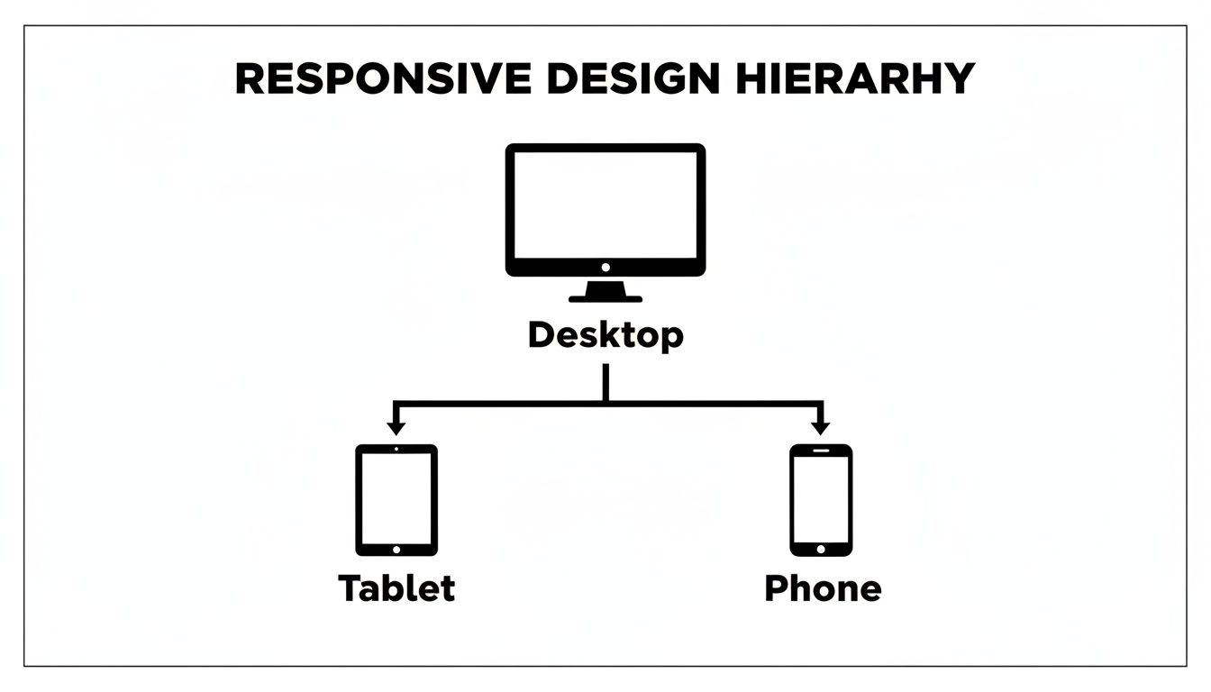
This is the core challenge that a great design system solves: keeping the user experience solid across all those different screen sizes. A robust system makes sure components reflow gracefully, preserving your brand identity and usability no matter what.
For teams building cross-platform apps, this kind of scalability isn't just nice—it's essential. To see how this all comes together in the real world, check out our guide on building a React Native design system.
Starting with a pre-built template can be a massive shortcut in website interface design, shaving off hundreds of hours. But that shortcut only works if you choose the right foundation. Let’s be real: not all templates are created equal, and a bad choice can create more headaches than it solves.
Think of it like building a house. A high-quality, pre-fabricated frame is a fantastic head start. A warped or poorly documented one, though? That’s going to cause problems at every single step. Your goal is to find a solid structure you can confidently build upon, not one you have to constantly fight against.
The real value of a template isn't just how it looks; it's the quality of its bones. A great template embodies best practices in performance, accessibility, and code quality, giving you a professional-grade starting point.
Before you commit to any template, you need to put it through its paces. It's easy to get wowed by a polished demo, but you have to look under the hood at the core components that truly matter for the long haul.
To help you out, we’ve put together a quick checklist. Use this to assess whether a template is just a pretty face or a genuinely solid foundation for your project.
| Evaluation Criteria | What to Look For | Why It Matters |
|---|---|---|
| Accessibility (A11y) | Does it use proper semantic HTML? Is it fully navigable with a keyboard? How does it perform with a screen reader? | An accessible foundation is non-negotiable. Trying to bolt on accessibility after the fact is a nightmare you want to avoid. |
| Component Quality | Is there a consistent library of UI components (buttons, forms, modals)? Do they all follow a coherent design system? | Well-structured components make development faster and ensure your final product looks and feels polished and unified. |
| Documentation | Is the documentation clear, comprehensive, and easy to search? Are there practical examples? | Good documentation is your roadmap. Without it, you're just guessing, which turns customization into a frustrating, time-sucking ordeal. |
| Performance | How fast does the demo site load? Fire up your browser's dev tools and check its performance scores (e.g., Lighthouse). | A bloated, slow template will handicap your user experience from day one. You can't afford to start with a performance deficit. |
| Code Quality & Dev UX | Is the code clean, well-organized, and easy to understand? Does it use modern tools and practices? | Clean code makes your life easier. It means faster customization, simpler debugging, and a much more enjoyable development experience. |
Choosing the right template is half the battle. A solid "yes" across these criteria means you’ve found a template that won’t just save you time upfront but will also support your project's growth down the line.
Once you've snagged a high-quality template, it's time for the fun part: personalization. This is where you transform a generic foundation into an interface that screams your brand, all without dismantling the solid design system it’s built on.
Start by systematically applying your brand’s color palette. Swap out the template's primary, secondary, and accent colors for your own. Simple, but it makes a huge difference.
Next, integrate your brand typography. Define the styles for all your headings (H1, H2, etc.) and body text so every word feels intentional. Finally, replace the placeholder copy and imagery with content that matches your brand’s voice and message. This thoughtful approach ensures you end up with a polished, custom interface that feels truly your own.
Even when you've got the basics down, you're bound to hit a few specific roadblocks on any design project. Let's tackle some of the most common questions that pop up for designers and developers, offering quick, clear answers to get you unstuck.
This one’s a real "how long is a piece of string?" question. The cost can swing wildly from a couple of hundred bucks for a simple template tweak to tens of thousands for a completely custom-built application. The final number really depends on the project's scope, the designer's experience level, and how deep you go with research and user testing.
But thinking of it purely as a cost is the wrong way to look at it. Good UI is an investment, plain and simple. A fantastic, intuitive interface has a direct line to how many users stick around and how many of them convert, paying for itself many times over.
Ah, the classic question. It's crucial to get this one straight because they are two sides of the same coin.
Here’s a simple way to break it down:
UI (User Interface) Design is the what. It’s all the tangible, visual stuff a user sees and interacts with—the buttons they click, the colors, the fonts, and the screen layouts. It's about the look, feel, and interactivity of the product.
UX (User Experience) Design is the how. It’s the overall feeling a user gets from the entire journey. UX covers everything from the moment they first hear about your site to the final goal they accomplish. It's the logic and structure behind the pretty face.
Think of it like this: UI is the saddle, the stirrups, and the reins. UX is the actual feeling of being able to ride the horse and get where you want to go. A beautiful interface (UI) is a massive part of a great overall experience (UX), but it can't save a bad one.
Accessibility (you’ll often see it shortened to "a11y") is all about making sure your website can be used by everyone, including people with disabilities. It’s not just a nice-to-have; it’s essential.
A great place to start is by using high-contrast color combinations for text, making sure every interactive element works with just a keyboard, and adding descriptive alt text to all your images so screen readers can describe them. If you need a more structured approach, the Web Content Accessibility Guidelines (WCAG) provide a rock-solid framework to follow.
Ready to build a top-tier interface without starting from a blank page? gluestack market offers a huge collection of production-ready, fully accessible React Native templates. You can find the perfect foundation for your next project and ship your app in a fraction of the time.

Feb 23, 2026
4 min read
Discover powerful mobile app monetization strategies to boost your revenue. Our guide covers IAPs, ads, and subscriptions for React Native apps and beyond.

Feb 22, 2026
4 min read
A clear guide to app development cost estimation. Learn what drives costs, see budget examples, and discover strategies to build your app for less.

Feb 21, 2026
4 min read
Discover how to promote mobile application effectively with proven ASO, paid campaigns, and retention strategies.
Feb 15, 2026
4 min read
Discover how to create a prototype of a website with a practical, step-by-step guide. Explore tools, testing methods, and tips to bring your idea to life.
Feb 14, 2026
4 min read
Confused about mockups vs wireframes? Learn the key differences, when to use each, and how to streamline your React Native app development workflow.

Feb 13, 2026
4 min read
Discover how mobile apps templates accelerate development. Learn to choose, customize, and deploy high-quality React Native templates for your next project.

Feb 12, 2026
4 min read
Explore mobile application interface design with practical tips, core principles, and platform-aware workflows to craft apps users love.

Feb 10, 2026
4 min read
Learn mobile first design principles to craft fast, accessible apps that delight users. Practical tips, examples, and testing strategies.
Feb 08, 2026
4 min read
Explore the progressive web app vs native debate with our in-depth guide. We compare performance, cost, and UX to help you make the right strategic choice.
Feb 07, 2026
4 min read
Discover how React Native templates can accelerate your app development. This guide explores choosing, customizing, and deploying templates for faster launches.

Feb 05, 2026
4 min read
Discover the key differences between expo vs react native, including workflow, builds, and performance to help you pick the right path for your app.
Feb 03, 2026
4 min read
Master image with text overlay in React Native with responsive, accessible patterns. Learn expo setup, NativeWind styling, and gluestack-ui examples.

Feb 03, 2026
4 min read
Discover cross platform app development with proven strategies to build faster for iOS, Android, and the web using a single, unified codebase.
Feb 01, 2026
4 min read
Learn how to make an app for my business quickly with template-based steps from planning to launch, plus tips to scale and optimize.

Jan 31, 2026
4 min read
Ready to build an app? This guide shares practical strategies for validating your idea, choosing a tech stack, and navigating the App Store launch.
Jan 30, 2026
4 min read
Master responsive design for mobile apps with this guide on fluid layouts, breakpoints, and React Native. Build UIs that adapt perfectly to any screen.

Jan 25, 2026
4 min read
Learn how to design an Android app that stands out. This guide covers UX research, wireframing, Material Design, and the developer handoff process.
Jan 24, 2026
4 min read
Explore ui design web essentials: a complete guide to principles, responsive patterns, and workflows for intuitive, engaging web interfaces.

Jan 23, 2026
4 min read
Discover 10 essential mobile app design best practices for building exceptional cross-platform apps. Actionable tips for UI, UX, navigation, and performance.

Jan 21, 2026
4 min read
Discover how to debug React Native apps effectively. This guide covers Flipper, React DevTools, and native code troubleshooting for faster development cycles.
Jan 20, 2026
4 min read
Learn how to create app for your business with a practical, modern approach. Plan, customize, and launch with proven steps.
Jan 19, 2026
4 min read
A complete guide to mobile app development for startups. Learn how to validate your idea, build an MVP, and launch a successful app faster and more affordably.

Jan 18, 2026
4 min read
Discover how to choose the right React website template to accelerate your project. Our guide covers everything from quality checklists to deployment.
Jan 17, 2026
4 min read
Discover how to choose, customize, and deploy a React Native app template. This guide provides practical steps for launching production-ready apps faster.

Jan 16, 2026
4 min read
Discover how mobile application templates accelerate development. This guide covers how to choose, customize, and launch your app with the right foundation.

Jan 13, 2026
4 min read
Start your journey in mobile app development for beginners. This guide breaks down how to build your first cross-platform app with React Native and Expo.

Jan 12, 2026
4 min read
Explore the best react native ui libraries and compare features, performance, and ease of use to pick the right toolkit for your app.

Jan 11, 2026
4 min read
Launch your own ride-hailing service with our guide to building a production-ready Uber app clone. Learn MVP strategy, tech stacks, and backend integration.
Jan 10, 2026
4 min read
Master modern cash app design with this guide. Learn the UI/UX, security, and React Native strategies needed to build a fintech app that users trust and love.

Jan 09, 2026
4 min read
Learn how to build a personal finance dashboard with React Native. A practical guide for developers on UI design, data architecture, and production readiness.
Jan 08, 2026
4 min read
A practical guide to building a cross-platform event check in app with React Native. Learn to implement QR scanning, offline sync, and deployment.

Jan 07, 2026
4 min read
Master linear gradient React Native components with our complete guide. Learn practical techniques for Expo, bare RN, and NativeWind to build stunning UIs.

Jan 06, 2026
4 min read
Learn how to change application name in your React Native & Expo projects. This guide covers display names, package IDs, and app store listings.
Jan 05, 2026
4 min read
Discover how to monetize mobile apps with our founder's guide. Learn proven React Native strategies for ads, IAPs, and subscriptions to maximize your revenue.

Jan 04, 2026
4 min read
A practical guide on how to create a website app with a single codebase. Learn to build for web, iOS, and Android using React Native, Expo, and TypeScript.

Jan 03, 2026
4 min read
Learn how to create an app for your business with this definitive guide. Discover practical strategies for validation, development, and launch that work.

Jan 02, 2026
4 min read
Learn how to create a wireframe for a website with this practical guide. Move from initial sketches to developer-ready designs that get built right.
Jan 01, 2026
4 min read
Deciding on progressive web application vs native? This guide offers a deep comparison of performance, cost, UX, and use cases to help you choose wisely.

Dec 31, 2025
4 min read
Discover 10 mobile app security best practices for React Native. Learn to secure data, APIs, and code with actionable tips and examples for 2025.

Dec 30, 2025
4 min read
Unlock the real React Native app development cost. Our guide breaks down pricing by feature, team, and complexity to help you budget with confidence.

Dec 29, 2025
4 min read
A practical guide to master your React Native debug workflow. Learn to use Flipper, React DevTools, and Hermes to solve bugs in Expo and bare RN apps.

Dec 28, 2025
4 min read
The ultimate React Native tutorial for beginners. Learn to build beautiful cross-platform apps using a modern stack like Expo, TypeScript, and gluestack-ui.

Dec 27, 2025
4 min read
A practical guide on how to build a mobile app. Learn to go from concept to a market-ready app using templates, React Native, and proven development strategies.

Dec 25, 2025
4 min read
Discover designs for apps that blend minimal aesthetics with personalization, and learn to build user-centric interfaces that boost engagement.

Dec 24, 2025
4 min read
Learn graphical interface design - essentials for mastering core principles, modern workflows, and cross-platform strategies to build intuitive, engaging UIs.

Dec 23, 2025
4 min read
Discover how high fi wireframes bridge the gap between ideas and code. Learn a practical workflow for creating, testing, and handing off effective UI designs.

Dec 22, 2025
4 min read
Discover mobile app interface design with practical principles, accessibility, and workflows that boost user engagement.

Dec 21, 2025
4 min read
Explore the top 10 UI UX design trends for 2025. Get expert insights and practical React Native tips to build next-gen cross-platform apps that stand out.

Dec 20, 2025
4 min read
Discover how mobile app templates accelerate development from idea to launch. Learn to select, customize, and deploy templates for a faster time to market.

Dec 18, 2025
4 min read
Explore the best react native ui libraries to accelerate mobile development with performance, theming, and accessibility. Expert tips inside.
Dec 16, 2025
4 min read
Master React Native PDF handling. Learn to generate, view, and share PDFs with practical code examples, library comparisons, and performance tips.
Dec 15, 2025
4 min read
A practical guide to choosing the right React Native component library. Learn how to evaluate options, avoid common pitfalls, and build apps faster.

Dec 14, 2025
4 min read
Find the perfect React Native UI library for your project. This guide compares top libraries, selection criteria, and customization strategies.

Dec 13, 2025
4 min read
Learn how to change app name in React Native and Expo. Our guide covers display names, bundle IDs, and store listings for iOS and Android projects.
Dec 12, 2025
4 min read
Discover the best React Native component library for your next project. We compare top libraries on performance, customization, and real-world use cases.
Dec 11, 2025
4 min read
Discover how to choose the right React Native UI kit. This guide covers top kits, selection criteria, and customization to accelerate your app development.
Dec 10, 2025
4 min read
Explore our in-depth guide to find the best React Native UI library. We compare top contenders to help you choose the right fit for your project.
Dec 09, 2025
4 min read
Discover a practical approach to building apps with React Native. This guide covers setup, UI, state management, and testing to help you ship great apps.

Dec 08, 2025
4 min read
android login with facebook: Learn to set up the Facebook SDK, manage tokens, and implement secure authentication across native Android, cross-platform apps.

Dec 07, 2025
4 min read
Master the alert in React Native. Learn to handle platform differences, build custom modals, and apply best practices for a seamless user experience.
Dec 06, 2025
4 min read
keyboardavoidingview react native: Master keyboard handling with KeyboardAvoidingView across iOS, Android, Expo, and TypeScript.
Dec 05, 2025
4 min read
A practical guide to implementing a React Native PDF viewer. Learn to compare libraries, handle native setup, and troubleshoot common issues with real code.

Dec 04, 2025
4 min read
how to validate startup idea: learn proven methods like customer interviews, MVPs, and metrics to confirm market fit.

Dec 03, 2025
4 min read
how to make app like uber: Learn core features, tech stack, development steps, testing, and launch tips.

Dec 02, 2025
4 min read
Build a rock-solid React Native setup. This guide covers Expo vs. Bare workflows, TypeScript, pnpm monorepos, NativeWind, and deployment strategies.
Dec 01, 2025
4 min read
A practical guide to Stripe React Native integration. Learn to set up your server, build payment UIs, handle webhooks, and launch secure mobile payments.

Nov 30, 2025
4 min read
Learn how to master push notifications in React Native. This guide covers setup, best practices, and advanced techniques for engaging your users.

Nov 29, 2025
4 min read
Build powerful location-based apps with our practical guide to react native with google maps. Get setup guides, pro tips, and best practices for iOS & Android.

Nov 28, 2025
4 min read
Explore deep linking react native with a practical guide to configuring URL schemes, universal links, navigation, and testing for Expo and bare apps.

Nov 28, 2025
4 min read
A practical guide to building a scalable React Native design system. Learn to implement tokens, theming, and tools like NativeWind and gluestack-ui.

Nov 26, 2025
4 min read
Learn why react native expo templates speed up your projects with ready-made patterns and practical tips.

Nov 25, 2025
4 min read
Discover how to improve developer productivity with actionable strategies for workflow, tooling, and culture. A practical guide for software engineering teams.

Nov 24, 2025
4 min read
Discover the best cross platform app development tools. Compare top frameworks like Flutter and React Native to build and ship apps faster.
Nov 23, 2025
4 min read
This Expo React Native tutorial provides a hands-on guide to building cross-platform apps. Learn setup, styling with NativeWind, navigation, and deployment.
Nov 22, 2025
4 min read
Build beautiful UIs faster with this guide to Tailwind CSS React Native. Learn setup, styling, and advanced techniques with NativeWind for mobile apps.

Nov 21, 2025
4 min read
Explore our curated list of 7 top-tier React Native app examples. Discover production-ready templates and resources to build your next app faster.
Mar 19, 2025
4 min read
gluestack market offers React Native UI templates to accelerate development. Get customizable, production-ready React Native app templates and Ui kit, some free. Build faster & smarter today!