Jan 09, 2026

4 min read


Building a modern personal finance dashboard isn't just about throwing numbers on a screen. It’s about taking raw data and turning it into a story that helps people understand their money, track their net worth, and hit their financial goals. You're crafting a tool that empowers them.

I've seen it happen time and again: a technically brilliant app that flops because it skipped the most critical step. Before you write a single line of code, you need a solid plan. This is where you map out the user's journey from financial confusion to crystal clarity.
It all starts with defining what your user actually wants to accomplish. What problem are you solving for them? Most personal finance apps boil down to a few core goals:
Once you know the what, you can figure out the where. This is your information hierarchy—the art of arranging data so the most important stuff is front and center. A great dashboard usually puts high-level Key Performance Indicators (KPIs) like total net worth and monthly cash flow right at the top. The nitty-gritty details? They should be just a tap or click away, not cluttering the main view.
This strategic thinking directly influences your tech stack. For this tutorial, we’re going with a stack that I’ve found to be incredibly powerful and efficient for this kind of project:
The most effective dashboards are opinionated. They don't just show data; they guide the user's attention to what matters most, turning complex financial information into a simple, understandable story.
To make your dashboard truly useful, you need to zero in on the metrics that matter most to users. I’ve put together a quick table of the KPIs I always consider for a finance app's V1.
| KPI (Key Performance Indicator) | User Goal | Potential UI Component |
|---|---|---|
| Total Net Worth | See my overall financial health at a glance. | Large number display, line chart |
| Monthly Cash Flow | Understand if I'm earning more than I'm spending. | Bar chart, summary card |
| Spending by Category | Find out where my money is going. | Donut chart, categorized list |
| Budget vs. Actuals | Track my progress against spending goals. | Progress bar, alert indicator |
| Investment Portfolio Value | Monitor the performance of my investments. | Sparkline, performance chart |
This isn't an exhaustive list, of course, but it's a solid foundation that addresses the most common user needs right out of the gate.
There's a good reason to build this now. Personal finance apps have exploded since the mid-2010s, becoming a key part of the consumer fintech world. The market is projected to hit a staggering USD 173.6 billion by 2035, and features for budgeting and expense tracking are consistently what users want most.
Before you jump in, it’s worth doing a little recon. Check out what the competition is doing—this list of the best investment tracking apps is a good place to start for feature ideas and to see what users have come to expect.
Once your blueprint is solid, it's time to shift gears and craft a user interface that feels both powerful and effortless. A great personal finance dashboard isn't just a jumble of numbers; it's a living tool that translates complex financial data into clear, actionable insights. The real goal is to make the user’s financial story readable at a single glance.
This means every chart, card, and button needs to pull its weight. A bold, prominent number for net worth, for example, gives an immediate high-level summary. Right below that, a simple line chart can beautifully illustrate how it's changed over time, adding crucial context without cluttering the main view.
Picking the right chart for the right data is less of a science and more of an art. Get it wrong, and you'll not only confuse your users but also misrepresent the information you're trying to share. Think of it as a visual language where each component has a very specific job.
These components are the bread and butter of an effective dashboard. If you're looking to sharpen your skills here, digging into resources on mobile app interface design can give you a much stronger foundation in visual hierarchy and component selection.
It’s easy to fall into the trap of thinking finance apps are a mobile-only game, but user behavior tells a different story. Quick check-ins on account balances definitely happen on the go, but the deeper, more thoughtful analysis often takes place on a bigger screen. Your design has to handle both scenarios gracefully.
This is where responsive design is simply non-negotiable. A mobile view might stack summary cards in a single column, perfect for a quick scroll. A web or tablet view, on the other hand, can expand into a multi-column layout, showing more detailed charts side-by-side.
Market data backs up this dual-platform approach. While mobile is a massive piece of the personal finance tools market—projected to grow at an 8.44% CAGR—web-based dashboards still own a significant share, especially for complex tasks like running reports and analyzing data across multiple accounts. You can discover more insights on the personal finance tools market to really dig into these user trends.
A truly responsive design respects the user's context. It delivers quick, essential data on a small screen during a busy commute and provides a rich, detailed canvas for a weekend financial review on a desktop.
Starting from a blank canvas is a noble idea, but in the real world, it's often inefficient. This is where a component library like gluestack-ui becomes an absolute game-changer. Instead of reinventing the wheel by building basic elements like buttons, cards, and modals, you can grab pre-built, accessible components and focus your energy on what makes your dashboard unique.
For instance, you can grab a pre-made Card component and immediately customize it with your app’s theme—colors, fonts, and spacing—to create a unique "Net Worth" or "Monthly Spending" widget. This approach slashes development time, letting you ship a polished product much faster without cutting corners on quality or accessibility. The key is to treat templates as a launchpad, not a straitjacket.
A dashboard is only as good as the data feeding it. So, let's peel back the UI layer and get into the engine room of your personal finance dashboard. This is where we make the critical decisions about how your app will manage, sync, and secure its information. Frankly, a solid data architecture is what separates an app that feels responsive and trustworthy from one that just feels fragile.
The right strategy really hinges on your app's complexity. If you're building a simple, single-device expense tracker, you can get away with local storage solutions. Something like AsyncStorage or, for a bit more muscle, a client-side database like WatermelonDB will give you offline access and that snappy performance users love. This approach is fantastic for an MVP because it keeps the initial build lean and mean.
But the moment you need to sync data across devices or pull in information from external sources, the game changes. You'll need a proper backend and a clear state management plan. This is where the real architectural fun begins.
This flow chart gives you a high-level look at the process, from blueprinting your data models all the way to customizing the final UI.
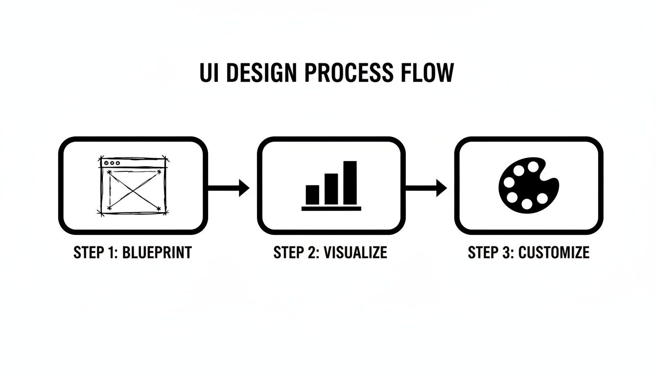
As the visual shows, a solid data blueprint is the non-negotiable first step. You can't effectively visualize or style anything until your data foundation is rock-solid.
One of the best things about using TypeScript is the power to create strongly-typed data models. In a financial app where data integrity is everything, this isn't just a nice-to-have; it's a must. Defining clear interfaces for your core data—like transactions, accounts, and budgets—creates a contract that your entire application has to follow.
For example, a Transaction interface might look something like this:
interface Transaction { id: string; amount: number; date: Date; description: string; category: 'Groceries' | 'Transport' | 'Entertainment' | 'Other'; accountId: string; }
This simple definition saves you from a whole class of bugs down the road. You’ll never accidentally pass a string where a number should be, and your editor will scream at you if you forget a property. As you design your app's backbone, it’s crucial to build a flawless data extraction table for receipts and transactions to lock in this structural integrity right from the start.
Let’s be honest: nobody wants to manually enter every single coffee purchase. That's a huge point of friction. To build a truly useful personal finance dashboard, you'll almost certainly want to connect to users' bank accounts. This is where services like Plaid come into the picture.
Plaid acts as a secure middleman, handling the incredibly complex and sensitive job of connecting to thousands of different financial institutions. The flow generally works like this:
Security here is an absolute. Never, ever, under any circumstances, should your Plaid
client_idorsecretbe stored in your React Native app's source code. They belong on your secure backend server, and only there.
With data flowing in, you need a smart way to manage it on the client side. While React's built-in useState and useContext hooks are great for simple scenarios, a growing finance app will quickly benefit from a dedicated state management library.
Tools like Redux Toolkit, Zustand, or Jotai give you a centralized store for your app's state. This makes it so much easier to handle complex data flows, like when a new transaction comes in and you need to update five different components at once. A global state manager ensures your UI stays perfectly in sync with your data, delivering that fluid, seamless experience users have come to expect.

Alright, we’ve got a solid design and a clear data architecture. Now for the fun part: turning that vision into a real, interactive application. This is where we translate those static mockups and abstract models into the living, breathing components that will make up your personal finance dashboard.
We'll kick things off by scaffolding a new project with Expo, a framework that just makes the whole React Native development experience smoother. Once you’re set up, the first command you’ll run is to pull in gluestack-ui. That single step gives you all the foundational building blocks—buttons, cards, inputs, you name it—accelerating your work from day one.
The main dashboard screen is the first thing your users will see, so it has to make an impact right away. This screen is all about presenting the most critical, high-level info from your data models. Think of it as the "at-a-glance" view of their entire financial world.
A great way to start is by creating a primary DashboardOverview component. Inside, you can use gluestack-ui's layout primitives like Box and VStack to structure everything. You might feature a big, prominent Heading to display the user's total net worth, then slot in smaller Card components for monthly income and expenses.
For instance, a simple card for displaying net worth could look something like this:
import { Card, Heading, Text } from '@gluestack-ui/themed';
const NetWorthCard = ({ amount }) => ( <Card p="$5" m="$3"> <Text size="sm" color="$coolGray500"> Total Net Worth </Text> <Heading size="2xl"> {new Intl.NumberFormat('en-US', { style: 'currency', currency: 'USD', }).format(amount)} </Heading> </Card> ); This little snippet shows just how fast you can compose meaningful UI. By snapping together pre-built components, you get to focus on the logic and data instead of wrestling with CSS to style a card from scratch. It’s a huge boost for getting a functional prototype up and running quickly.
While the main dashboard gives the big picture, users will always want to drill down into the details. That’s where a transaction list screen comes in, and it's a fundamental piece of any finance app. When you're dealing with hundreds or even thousands of transactions, performance is everything.
React Native’s FlatList component is your best friend here. It’s built for performance, only rendering the items currently visible on the screen—a technique called virtualization. Each row in the FlatList can be a custom TransactionListItem component showing the merchant, amount, and date.
You can easily combine FlatList with gluestack-ui components to create a list that’s both polished and blazing fast:
Pressable component from gluestack-ui to handle taps.HStack and VStack to neatly align text and icons within each row.Avatar or Icon to represent the transaction category for quick visual scanning.The real power of a component library emerges when you decide when not to use it. While gluestack-ui can build almost anything, sometimes a unique, highly specialized visualization—like a custom animated budget gauge—justifies building a component from the ground up.
Choosing between a pre-built library component and a custom one is a constant balancing act. It almost always comes down to a trade-off between speed and specificity.
A component library gives you a massive head start on common UI patterns. But for the features that make your app yours, a custom build might be the only way to go.
| Feature | gluestack-ui Advantage | Custom Component Use Case |
|---|---|---|
| Authentication Screens | Speed. Pre-built, accessible forms for login/signup save dozens of hours. | Your app requires a unique multi-step onboarding flow with complex state logic. |
| Standard Data Display | Consistency. Cards, lists, and tables are themed and responsive out of the box. | You need a highly interactive data grid with features like column pinning or grouping. |
| Navigation Elements | Reliability. Pre-tested buttons, tabs, and menus ensure a predictable UX. | A novel navigation pattern, like a radial menu, is central to your app's identity. |
| Interactive Charts/Graphs | Simplicity. Good for basic charts, but limited in advanced interactions. | You require complex, animated data visualizations that are core to the user experience. |
Ultimately, a hybrid approach is usually the smartest path forward. Lean on the library for 80% of your UI to keep development fast and consistent. Reserve your custom efforts for that crucial 20% that truly sets your app apart and delivers its unique value.
Building the core features of your personal finance dashboard is a huge win, but the journey from a working prototype to a polished, production-ready product means crossing that crucial "last mile." This is where the magic happens. It’s all about the details that make an app robust, inclusive, and genuinely delightful for everyone. This is where you add the professional polish users expect from top-tier applications.
Turning a functional app into a great one means zeroing in on the things that directly shape the user experience. We're talking about crucial accessibility features, user-centric customizations like theming, and ensuring the app runs smooth as silk, even when it's crunching a ton of data. These aren't just nice-to-haves; they're essential for earning user trust and keeping them engaged for the long haul.
A truly great app is one that everyone can use. This means baking accessibility into your development process from day one, not tacking it on as an afterthought. Thankfully, React Native and gluestack-ui give us fantastic tools to make this straightforward.
Here are a few key things to keep in mind:
accessibilityLabel and accessibilityHint on every single interactive element. For a "delete transaction" button, a simple icon isn't enough; the label should be crystal clear, like "Delete transaction from January 15th."Beyond accessibility, offering light and dark modes has pretty much become a standard expectation. With gluestack-ui, this is incredibly simple to implement. The library's theming system handles all the token switching automatically. You just define your color palettes for both modes, and the framework does all the heavy lifting.
Launching a production app means you're now responsible for protecting user data. When you're handling sensitive financial information, security is non-negotiable. For a much deeper dive, our guide on mobile app security best practices is essential reading for any developer in this space.
As a user’s transaction history starts to pile up, performance can quickly become a bottleneck. A slow, laggy dashboard is a recipe for a frustrating experience. The most common culprit? Rendering long, endless lists of data.
This is where list virtualization with React Native’s FlatList becomes your best friend. It keeps your app snappy by only rendering the items currently visible on the screen, which makes a world of difference.
Once your app is accessible, themed, and performant, it’s time to get ready for launch. This calls for a rigorous testing and deployment process. You’ll want to create a comprehensive checklist that covers everything from unit and integration tests with Jest to end-to-end testing with a framework like Detox or Maestro.
Before you hit that submit button on the app stores, double-check that you have:
app.json.Following these steps methodically will help ensure a smooth launch, turning all your hard work into a real-world application that genuinely helps users take control of their finances.
As you start piecing together a personal finance dashboard, you'll inevitably run into a few common hurdles. I've seen them trip up developers time and time again. Getting ahead of these issues can save you a ton of time and headaches down the road.
Let's break down some of the most frequent questions that pop up.
One of the first challenges is often internationalization. How do you display $100, €100, and ¥100 correctly? The best tool for the job is already built into modern JavaScript: the Intl.NumberFormat API. It gives you powerful, native localization for currencies and numbers without bloating your app with heavy dependencies.
For translating text labels and messages, the go-to combination in the React ecosystem is i18next paired with react-i18next. It's a robust, industry-standard solution that can handle everything from simple string replacement to complex pluralization rules.
Another big one is security. "How do I add Face ID or Touch ID?" is a question I hear a lot. Thankfully, the expo-local-authentication package makes this surprisingly straightforward. With just a few lines of code, you can check if the device supports biometrics and then trigger the native authentication prompt.
Here's a critical point: Biometrics should only be used for re-authentication—unlocking the app when it's already logged in. It's not a substitute for storing credentials securely. Your sensitive API keys and user tokens absolutely must live in the device's secure keychain, which you can access with a library like
expo-secure-store.
Finally, the big data integration question: "Is it possible to use a service like Plaid with React Native and Expo?" The answer is a resounding yes. You’ll want to use a client-side SDK like react-native-plaid-link-sdk to handle the Link flow, which is the secure pop-up where users connect their bank accounts.
This process gives your app a temporary public token. That token is then sent to your backend server, which is the only place that should have your secret Plaid keys. Your server then securely exchanges the public token for a permanent access token, which it can use to fetch transaction data.
Seriously, this is non-negotiable: never, ever expose your Plaid secret keys on the client-side app. They must only live on your server.
Want to skip weeks of setup and jump straight to building features? Our production-ready templates at gluestack market give you a massive head start. Check out our finance tracking app to see how we’ve already solved these problems for you.
Feb 23, 2026
4 min read
Discover powerful mobile app monetization strategies to boost your revenue. Our guide covers IAPs, ads, and subscriptions for React Native apps and beyond.

Feb 22, 2026
4 min read
A clear guide to app development cost estimation. Learn what drives costs, see budget examples, and discover strategies to build your app for less.

Feb 21, 2026
4 min read
Discover how to promote mobile application effectively with proven ASO, paid campaigns, and retention strategies.

Feb 15, 2026
4 min read
Discover how to create a prototype of a website with a practical, step-by-step guide. Explore tools, testing methods, and tips to bring your idea to life.

Feb 14, 2026
4 min read
Confused about mockups vs wireframes? Learn the key differences, when to use each, and how to streamline your React Native app development workflow.

Feb 13, 2026
4 min read
Discover how mobile apps templates accelerate development. Learn to choose, customize, and deploy high-quality React Native templates for your next project.

Feb 12, 2026
4 min read
Explore mobile application interface design with practical tips, core principles, and platform-aware workflows to craft apps users love.

Feb 10, 2026
4 min read
Learn mobile first design principles to craft fast, accessible apps that delight users. Practical tips, examples, and testing strategies.

Feb 08, 2026
4 min read
Explore the progressive web app vs native debate with our in-depth guide. We compare performance, cost, and UX to help you make the right strategic choice.
Feb 07, 2026
4 min read
Discover how React Native templates can accelerate your app development. This guide explores choosing, customizing, and deploying templates for faster launches.

Feb 05, 2026
4 min read
Discover the key differences between expo vs react native, including workflow, builds, and performance to help you pick the right path for your app.
Feb 03, 2026
4 min read
Master image with text overlay in React Native with responsive, accessible patterns. Learn expo setup, NativeWind styling, and gluestack-ui examples.

Feb 03, 2026
4 min read
Discover cross platform app development with proven strategies to build faster for iOS, Android, and the web using a single, unified codebase.
Feb 01, 2026
4 min read
Learn how to make an app for my business quickly with template-based steps from planning to launch, plus tips to scale and optimize.

Jan 31, 2026
4 min read
Ready to build an app? This guide shares practical strategies for validating your idea, choosing a tech stack, and navigating the App Store launch.

Jan 30, 2026
4 min read
Master responsive design for mobile apps with this guide on fluid layouts, breakpoints, and React Native. Build UIs that adapt perfectly to any screen.

Jan 25, 2026
4 min read
Learn how to design an Android app that stands out. This guide covers UX research, wireframing, Material Design, and the developer handoff process.

Jan 24, 2026
4 min read
Explore ui design web essentials: a complete guide to principles, responsive patterns, and workflows for intuitive, engaging web interfaces.

Jan 23, 2026
4 min read
Discover 10 essential mobile app design best practices for building exceptional cross-platform apps. Actionable tips for UI, UX, navigation, and performance.

Jan 21, 2026
4 min read
Discover how to debug React Native apps effectively. This guide covers Flipper, React DevTools, and native code troubleshooting for faster development cycles.

Jan 20, 2026
4 min read
Learn how to create app for your business with a practical, modern approach. Plan, customize, and launch with proven steps.

Jan 19, 2026
4 min read
A complete guide to mobile app development for startups. Learn how to validate your idea, build an MVP, and launch a successful app faster and more affordably.

Jan 18, 2026
4 min read
Discover how to choose the right React website template to accelerate your project. Our guide covers everything from quality checklists to deployment.
Jan 17, 2026
4 min read
Discover how to choose, customize, and deploy a React Native app template. This guide provides practical steps for launching production-ready apps faster.

Jan 16, 2026
4 min read
Discover how mobile application templates accelerate development. This guide covers how to choose, customize, and launch your app with the right foundation.

Jan 13, 2026
4 min read
Start your journey in mobile app development for beginners. This guide breaks down how to build your first cross-platform app with React Native and Expo.

Jan 12, 2026
4 min read
Explore the best react native ui libraries and compare features, performance, and ease of use to pick the right toolkit for your app.

Jan 11, 2026
4 min read
Launch your own ride-hailing service with our guide to building a production-ready Uber app clone. Learn MVP strategy, tech stacks, and backend integration.

Jan 10, 2026
4 min read
Master modern cash app design with this guide. Learn the UI/UX, security, and React Native strategies needed to build a fintech app that users trust and love.

Jan 08, 2026
4 min read
A practical guide to building a cross-platform event check in app with React Native. Learn to implement QR scanning, offline sync, and deployment.

Jan 07, 2026
4 min read
Master linear gradient React Native components with our complete guide. Learn practical techniques for Expo, bare RN, and NativeWind to build stunning UIs.

Jan 06, 2026
4 min read
Learn how to change application name in your React Native & Expo projects. This guide covers display names, package IDs, and app store listings.

Jan 05, 2026
4 min read
Discover how to monetize mobile apps with our founder's guide. Learn proven React Native strategies for ads, IAPs, and subscriptions to maximize your revenue.

Jan 04, 2026
4 min read
A practical guide on how to create a website app with a single codebase. Learn to build for web, iOS, and Android using React Native, Expo, and TypeScript.

Jan 03, 2026
4 min read
Learn how to create an app for your business with this definitive guide. Discover practical strategies for validation, development, and launch that work.

Jan 02, 2026
4 min read
Learn how to create a wireframe for a website with this practical guide. Move from initial sketches to developer-ready designs that get built right.
Jan 01, 2026
4 min read
Deciding on progressive web application vs native? This guide offers a deep comparison of performance, cost, UX, and use cases to help you choose wisely.

Dec 31, 2025
4 min read
Discover 10 mobile app security best practices for React Native. Learn to secure data, APIs, and code with actionable tips and examples for 2025.

Dec 30, 2025
4 min read
Unlock the real React Native app development cost. Our guide breaks down pricing by feature, team, and complexity to help you budget with confidence.

Dec 29, 2025
4 min read
A practical guide to master your React Native debug workflow. Learn to use Flipper, React DevTools, and Hermes to solve bugs in Expo and bare RN apps.

Dec 28, 2025
4 min read
The ultimate React Native tutorial for beginners. Learn to build beautiful cross-platform apps using a modern stack like Expo, TypeScript, and gluestack-ui.

Dec 27, 2025
4 min read
A practical guide on how to build a mobile app. Learn to go from concept to a market-ready app using templates, React Native, and proven development strategies.

Dec 26, 2025
4 min read
Discover interface design for websites with actionable tips on layout, responsiveness, and usability to boost conversions.

Dec 25, 2025
4 min read
Discover designs for apps that blend minimal aesthetics with personalization, and learn to build user-centric interfaces that boost engagement.

Dec 24, 2025
4 min read
Learn graphical interface design - essentials for mastering core principles, modern workflows, and cross-platform strategies to build intuitive, engaging UIs.

Dec 23, 2025
4 min read
Discover how high fi wireframes bridge the gap between ideas and code. Learn a practical workflow for creating, testing, and handing off effective UI designs.

Dec 22, 2025
4 min read
Discover mobile app interface design with practical principles, accessibility, and workflows that boost user engagement.

Dec 21, 2025
4 min read
Explore the top 10 UI UX design trends for 2025. Get expert insights and practical React Native tips to build next-gen cross-platform apps that stand out.

Dec 20, 2025
4 min read
Discover how mobile app templates accelerate development from idea to launch. Learn to select, customize, and deploy templates for a faster time to market.

Dec 18, 2025
4 min read
Explore the best react native ui libraries to accelerate mobile development with performance, theming, and accessibility. Expert tips inside.
Dec 16, 2025
4 min read
Master React Native PDF handling. Learn to generate, view, and share PDFs with practical code examples, library comparisons, and performance tips.

Dec 15, 2025
4 min read
A practical guide to choosing the right React Native component library. Learn how to evaluate options, avoid common pitfalls, and build apps faster.

Dec 14, 2025
4 min read
Find the perfect React Native UI library for your project. This guide compares top libraries, selection criteria, and customization strategies.

Dec 13, 2025
4 min read
Learn how to change app name in React Native and Expo. Our guide covers display names, bundle IDs, and store listings for iOS and Android projects.

Dec 12, 2025
4 min read
Discover the best React Native component library for your next project. We compare top libraries on performance, customization, and real-world use cases.

Dec 11, 2025
4 min read
Discover how to choose the right React Native UI kit. This guide covers top kits, selection criteria, and customization to accelerate your app development.

Dec 10, 2025
4 min read
Explore our in-depth guide to find the best React Native UI library. We compare top contenders to help you choose the right fit for your project.

Dec 09, 2025
4 min read
Discover a practical approach to building apps with React Native. This guide covers setup, UI, state management, and testing to help you ship great apps.

Dec 08, 2025
4 min read
android login with facebook: Learn to set up the Facebook SDK, manage tokens, and implement secure authentication across native Android, cross-platform apps.

Dec 07, 2025
4 min read
Master the alert in React Native. Learn to handle platform differences, build custom modals, and apply best practices for a seamless user experience.

Dec 06, 2025
4 min read
keyboardavoidingview react native: Master keyboard handling with KeyboardAvoidingView across iOS, Android, Expo, and TypeScript.

Dec 05, 2025
4 min read
A practical guide to implementing a React Native PDF viewer. Learn to compare libraries, handle native setup, and troubleshoot common issues with real code.

Dec 04, 2025
4 min read
how to validate startup idea: learn proven methods like customer interviews, MVPs, and metrics to confirm market fit.

Dec 03, 2025
4 min read
how to make app like uber: Learn core features, tech stack, development steps, testing, and launch tips.

Dec 02, 2025
4 min read
Build a rock-solid React Native setup. This guide covers Expo vs. Bare workflows, TypeScript, pnpm monorepos, NativeWind, and deployment strategies.

Dec 01, 2025
4 min read
A practical guide to Stripe React Native integration. Learn to set up your server, build payment UIs, handle webhooks, and launch secure mobile payments.

Nov 30, 2025
4 min read
Learn how to master push notifications in React Native. This guide covers setup, best practices, and advanced techniques for engaging your users.

Nov 29, 2025
4 min read
Build powerful location-based apps with our practical guide to react native with google maps. Get setup guides, pro tips, and best practices for iOS & Android.

Nov 28, 2025
4 min read
Explore deep linking react native with a practical guide to configuring URL schemes, universal links, navigation, and testing for Expo and bare apps.

Nov 28, 2025
4 min read
A practical guide to building a scalable React Native design system. Learn to implement tokens, theming, and tools like NativeWind and gluestack-ui.

Nov 26, 2025
4 min read
Learn why react native expo templates speed up your projects with ready-made patterns and practical tips.

Nov 25, 2025
4 min read
Discover how to improve developer productivity with actionable strategies for workflow, tooling, and culture. A practical guide for software engineering teams.

Nov 24, 2025
4 min read
Discover the best cross platform app development tools. Compare top frameworks like Flutter and React Native to build and ship apps faster.

Nov 23, 2025
4 min read
This Expo React Native tutorial provides a hands-on guide to building cross-platform apps. Learn setup, styling with NativeWind, navigation, and deployment.

Nov 22, 2025
4 min read
Build beautiful UIs faster with this guide to Tailwind CSS React Native. Learn setup, styling, and advanced techniques with NativeWind for mobile apps.
Nov 21, 2025
4 min read
Explore our curated list of 7 top-tier React Native app examples. Discover production-ready templates and resources to build your next app faster.
Mar 19, 2025
4 min read
gluestack market offers React Native UI templates to accelerate development. Get customizable, production-ready React Native app templates and Ui kit, some free. Build faster & smarter today!