Jan 18, 2026

4 min read


Think of a quality React website template as your development mise en place—a perfectly prepped foundation that lets you get straight to cooking. Instead of wasting time forging your own tools, you start with a production-ready structure. It’s a massive head start.
Picture a chef right before a busy dinner service. They aren't in the back planting vegetables or smithing knives. Everything is already chopped, measured, and laid out, ready to go. That’s exactly what a React website template does for you. It gives you a solid, pre-built foundation, so you and your team can skip the tedious setup and dive right into building the features that actually matter.
This isn't just about convenience; it's a serious strategic move in a market that doesn't wait around. For a startup trying to get an MVP out the door, a template can slash the time it takes to launch. For an agency, it means hitting tight client deadlines with confidence, delivering a polished, professional site without reinventing the wheel on every single project. Even solo developers win, getting to focus their energy on innovation instead of boilerplate.
A great template is so much more than a collection of UI elements. It’s a full-on starter kit that handles the most time-consuming parts of any project for you, with features that are already built and tested:
This head start is absolutely invaluable. React is the undisputed king of the front-end, powering a mind-boggling 45.8% of the JavaScript library market with over 11 million websites built on it. Its component-based approach has been shown to speed up development by as much as 60% compared to older methods, and templates just pour gasoline on that fire. You can dig into more ReactJS statistics to see just how dominant it is.
By taking care of the foundational grunt work, a React website template lets you pour your most precious resource—time—into what truly counts: building the features that will make your product unforgettable.
And today, this idea is being pushed even further. For instance, templates you'll find on marketplaces like gluestack market are specifically engineered to close the gap between web and mobile development. Built with tools like React Native for web, they let you write your code once and ship it to iOS, Android, and the web. This unified approach means you don't need separate teams or codebases, creating a truly seamless development experience from a single template.
Picking a React website template is a bit like choosing the right vehicle for a road trip. You wouldn't take a slick sports car on a bumpy off-road trail, and you wouldn't enter a rugged Jeep in a Grand Prix. Every template is built for a specific kind of journey, and knowing the terrain is the first step to picking the right one.
The world of React templates isn't a one-size-fits-all deal. It's a collection of specialized tools, all built on React but fine-tuned for very different jobs. Your choice here will have a ripple effect on everything from your site's raw performance and SEO chops to how easily it can grow and what platforms it can even run on.
This is the classic fork in the road every developer hits at the start of a project: build from the ground up or hit the ground running with a template.
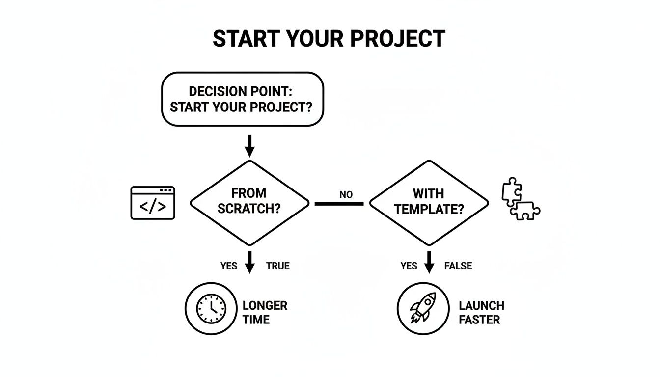
As you can see, a template is your express lane to launch, letting you skip a huge chunk of the initial, often tedious, setup.
To help you choose, let's compare the most common frameworks you'll find powering these templates.
This table breaks down the main players to help you match a template's framework to your project's goals.
| Framework | Primary Use Case | Key Feature | Best For |
|---|---|---|---|
| Standard React (CRA) | Single-Page Applications (SPAs) | Client-Side Rendering (CSR) | Interactive dashboards, user portals, and web apps behind a login. |
| Next.js | SEO-driven websites and web apps | Server-Side Rendering (SSR) & Static Site Generation (SSG) | E-commerce stores, blogs, marketing websites, and complex web applications. |
| Gatsby | High-performance static sites | Static Site Generation (SSG) | Portfolios, documentation sites, marketing landing pages, and personal blogs. |
| React Native for Web | Cross-platform applications | Single codebase for web, iOS, & Android | Startups and products aiming for a simultaneous launch on all platforms. |
Each of these has its own strengths, so let's dig a little deeper into what makes them tick.
Think of a standard React template—often bootstrapped with Create React App (CRA)—as your trusty daily driver. It's perfect for building Single-Page Applications (SPAs), where the user experience is fluid and all the action happens on one page.
These templates are the go-to for rich, interactive dashboards, customer portals, and any web app where top-tier SEO isn't the main goal. Because the content is rendered in the user's browser, the first load might take a second longer, but clicking around after that feels instant. They're straightforward and perfect for projects that live behind a login screen.
Now, if you're building a busy online store or a content-heavy blog, you'll want to look at a Next.js template. This is the high-performance SUV of the React world—built for power, visibility, and handling any terrain you throw at it.
Next.js brings Server-Side Rendering (SSR) and Static Site Generation (SSG) to the party. In simple terms, this means your website's pages are pre-built on a server and sent to the user as complete HTML.
The biggest win here is a massive SEO boost. Search engine crawlers can read your content instantly, which helps you rank higher. It also makes for a much faster initial page load, a crucial factor in keeping visitors from bouncing.
Gatsby templates are the Formula 1 cars of the web—engineered for one thing: pure, unadulterated speed. They’re the perfect choice for sites where the content doesn't change every five minutes, like marketing pages, portfolios, and documentation sites.
Gatsby is a static site generator. During the build process, it grabs your data from wherever it lives (a CMS, Markdown files, etc.) and churns out a folder of static HTML, CSS, and JavaScript files. The end result is a website with almost zero server-side thinking, which leads to mind-blowing performance and rock-solid security.
Finally, we have the game-changing amphibious vehicle: the React Native for web template. This is the magic that powers the templates you'll find on the gluestack market. It solves a huge headache for businesses: how do you build for iOS, Android, and the web without doing the work three times?
With a React Native for web template, you're working from a single codebase. The components you build are smart enough to render as native UI on a phone and as standard HTML on the web. The benefits are massive:
This makes it the ultimate choice for startups and businesses that want to get their product in front of everyone, on every major platform, right from day one.
Not all templates are created equal. It's easy to be wowed by a sleek design, only to discover it's hiding a tangled mess of code that costs you more time in bug fixes than you ever saved upfront. Choosing the right React website template is less about finding the prettiest option and more about doing a proper technical inspection.
Think of it like buying a house. You wouldn't just admire the new paint; you’d hire an inspector to check the foundation, plumbing, and electrical systems. This checklist is your inspection guide. It'll help you look under the hood to make sure you’re building on a solid, future-proof foundation.
First things first: the code itself. A high-quality template should have clean, well-organized, and commented code that’s easy for anyone on your team to pick up and modify. A messy codebase is a massive red flag—a clear sign of future headaches.
Look for these signs of quality:
README.md file with straightforward setup instructions and a clear explanation of the project structure?A well-structured template will just feel intuitive. If you open the source code and immediately feel lost, it's probably best to walk away.
Web accessibility isn’t some optional add-on; it’s a fundamental requirement for building inclusive products that are also legally compliant. An accessible website is usable by everyone, including people with disabilities who might rely on screen readers or other assistive tech. A good template bakes this in from the start.
A template that ignores accessibility forces you to go back and fix foundational issues later, a task that's way harder and more expensive than just getting it right from the beginning. Ensure the template follows WAI-ARIA standards for a more inclusive user experience.
Check for semantic HTML (using tags like <nav>, <main>, and <article> correctly), proper color contrast ratios, and full keyboard navigation support. These are non-negotiable for any professional-grade product.
For any project you expect to grow, TypeScript is a must. It adds static typing to JavaScript, which means you catch errors during development instead of in production. The result is more robust, reliable, and maintainable code.
A template built with TypeScript shows that its creators are focused on professional development standards. It gives you a safety net that makes refactoring code and onboarding new developers a much smoother and more efficient process. If you're building a serious application, don't settle for a plain JavaScript template.
How a template handles styling directly impacts how easy it is to customize. Older templates might use complex CSS-in-JS libraries or tangled SASS files that are a pain to override. Modern, high-quality templates have pretty much all moved to utility-first CSS frameworks.
The most popular choice today is Tailwind CSS. Its utility-first approach lets you build custom designs right in your markup without writing a single line of custom CSS. This makes customization incredibly fast and intuitive. Templates built with Tailwind (or its React Native equivalent, NativeWind) give you maximum flexibility to match your brand's unique look and feel. Given the web development market is valued at USD 87.75 billion and projected to hit USD 134.17 billion by 2031, using efficient tools like Tailwind is key to staying ahead. You can explore more insights on the web development market on Mordor Intelligence.
A slow website is a losing website. A great template should be optimized for performance right out of the box. This comes down to a few key factors that create a fast, smooth user experience.
These performance features are crucial for keeping users engaged and improving your site's quality score with search engines. You should be starting with a fast foundation before you even begin development. For more tips on planning your site's structure, check out our guide on how to create a wireframe for a website.
If people need to find your website through search engines, this is a make-or-break factor. A standard client-side rendered React app can struggle with SEO because search crawlers might just see a blank page before all the JavaScript loads.
To get around this, choose a React website template built on a framework that supports Server-Side Rendering (SSR) or Static Site Generation (SSG), like Next.js or Gatsby. These frameworks pre-render your pages into static HTML, making them instantly readable for search engines and giving your SEO a massive boost.
Finally, always read the fine print. The template's license dictates exactly how you can use it. Can you use it for a commercial project? Do you need to give attribution? Figuring out the licensing terms before you start building is essential to avoid legal headaches down the road.
Think of a good React website template as a launchpad, not the finished rocket. You’ve picked a solid foundation, and now it’s time to make it yours. This really breaks down into two big steps: first, dialing in the visual identity to match your brand, and second, plugging in all the third-party services that make your app actually do something.
The first part of that transformation is all about theming. A high-quality template makes this incredibly straightforward, usually giving you a central config file where you can lay out your brand’s entire visual language. This is where you'll ditch the default styles and inject your own, creating a look that’s consistent and uniquely you across the whole application.
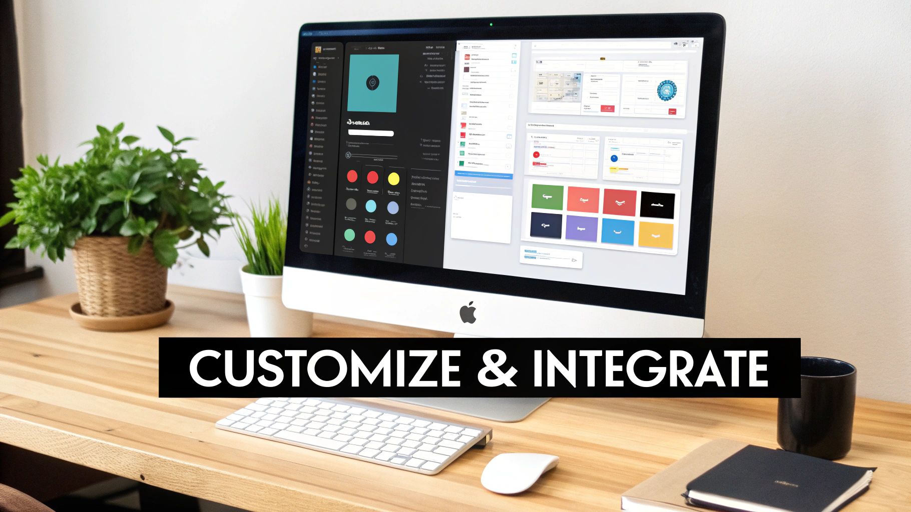
The real goal here is to make it impossible to tell your site ever started from a template. This just takes a few focused tweaks that completely change the final look and feel of your project.
React's massive popularity has built an incredible ecosystem for this kind of work. It’s no surprise that 43.21% of developers report positive experiences with React, putting it at the top of the list for front-end frameworks. With over 25 million weekly NPM downloads, its ecosystem—including styling libraries like Styled Components—is a fantastic playground for building out a custom UI.
Once your site looks the part, you need to make it work. That means connecting it to the services that will handle your data, content, and payments. A well-designed template gives you clear patterns for these integrations, often using environment variables to keep your API keys safe and sound. Good interface design for websites is a huge help here, making sure these connections feel seamless to the user.
Here are three common integrations you'll almost certainly run into:
fetch or a library like Axios—to send and receive data, then updating your app's state with the results.A great template doesn't just give you a design; it gives you a logical structure. It provides clear, designated places to plug in these external services, turning what could be a complex architectural puzzle into a straightforward, step-by-step process.
By moving through these steps, you can methodically transform a generic starter into a completely custom, fully functional application that truly represents your brand. This approach cuts out countless hours of foundational work, freeing you up to focus your energy on the unique features that will actually make a difference for your users.
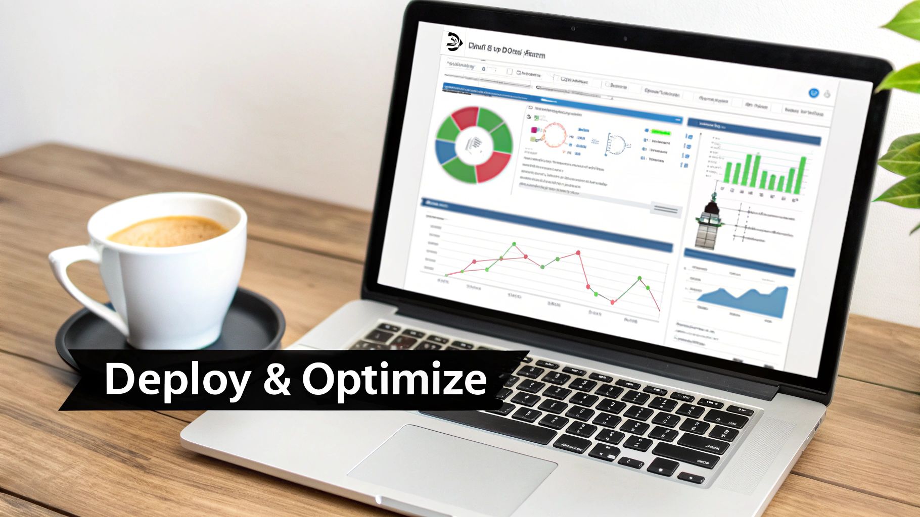
You've customized your React website template and wired up all your essential services. Now for the exciting part: going live. The final sprint involves picking a hosting platform to get your site on the web, then fine-tuning it to make sure every visitor has a fast, smooth experience. Think of this less as a technical finish line and more as the first day of your site's life online.
Choosing where to deploy your site is a bigger deal than it sounds. Thankfully, modern hosting providers have made this ridiculously simple, often linking directly to your Git repository. With just a few clicks, they’ll automatically build and deploy your site every time you push a change.
Each platform brings something different to the table, and the right choice really hinges on your project's needs, your team's comfort level, and your budget.
Here’s a quick rundown of the top contenders:
While Vercel and Netlify win on pure ease of use, AWS Amplify gives you the raw, scalable power of the entire AWS cloud.
A successful launch isn't just about getting your site online. It’s about delivering an experience that is fast, efficient, and reliable from day one. Post-launch optimization is where you turn a good website into a great one.
Once your site is live, the real work begins. Your mission is to make sure every page loads quickly and runs like a dream on any device. A slow site doesn't just annoy users; it tanks your SEO rankings. This makes ongoing performance monitoring a must.
Your first stop should be Google's Lighthouse, an open-source tool built right into Chrome DevTools. It audits your site on performance, accessibility, best practices, and SEO, then gives you a report card with clear steps for improvement. Aiming for a Lighthouse score above 90 is a fantastic starting point.
From there, you can dig into more advanced techniques to squeeze out even more speed. These are especially clutch for giving users on slower networks or less powerful devices a great experience.
Here are a few high-impact strategies to get you started:
By combining a smooth deployment with a smart optimization plan, you can ensure your React website template doesn't just launch successfully—it thrives for the long haul.
Let's be honest: juggling code quality, accessibility, and true cross-platform compatibility can bring any new project to a screeching halt. Finding the right React website template is a huge first step, but what if you could find one that already solved every point on your technical checklist before you even wrote a single line of code? That's exactly why we built gluestack market.
These aren't just pretty designs. gluestack templates are complete, production-ready foundations built for how developers work today. Each one is meticulously crafted with TypeScript for code that scales without breaking and built on top of Expo and NativeWind (think Tailwind CSS, but for React Native). The result? You get a high-performance, accessible, and clean codebase from day one.
The big idea here is simple but incredibly powerful: build for iOS, Android, and the web all at the same time, from one unified codebase. This is more than just a convenience; it's a massive strategic advantage that changes the entire product development game.
By ditching the need for separate web and mobile teams, you can immediately:
gluestack market redefines a "template" from a simple starting point into a true development accelerator. It lets you focus on the unique features that make your product special instead of getting bogged down in boilerplate.
Different businesses have different needs, so we built a range of domain-specific templates to match. Whether you're creating an app for fitness tracking, personal finance, or video streaming, there's a pre-built solution designed to give you a massive head start. You can check out all the production-ready templates over on the gluestack market to find the perfect one for your next project.
And for teams that need to move even faster, our gluestack-ui pro library offers over 50 copy-and-paste screens for everything from authentication flows to e-commerce checkouts. Every purchase comes with the full source code, detailed documentation, and all future updates. With flexible licensing and solid support, gluestack gives you everything you need to ship high-quality, cross-platform apps faster than ever before.
Jumping into the world of React templates can bring up a few questions. It makes sense—you want to be sure you're building on solid ground. Here are some of the most common things we hear from developers weighing their options.
Absolutely. In fact, for large, complex apps, a high-quality template is often the smartest way to start. The key is to look for one built with TypeScript and a scalable component architecture. That's what gives you the rock-solid foundation you need for something enterprise-grade.
Think of it this way: using a template for a big project clears your team's plate. Instead of getting bogged down in foundational UI work, they can jump straight into the complex business logic and unique features that actually deliver value.
The best templates are scaffolds, not cages. The real measure of flexibility comes down to the quality of the template's code and the tech it's built on.
A template built with a utility-first styling system like Tailwind CSS or its React Native cousin, NativeWind, gives you practically limitless freedom. You get the full source code, so you're in complete control to modify, extend, or even replace any part of it to perfectly match your brand and functional needs.
This one depends entirely on the framework humming under the hood. Templates built with Next.js or Gatsby are SEO powerhouses right out of the box because they're designed for Server-Side Rendering (SSR) and Static Site Generation (SSG).
These approaches serve fully-rendered HTML to search engine crawlers, which can give your rankings a serious boost. A standard client-side rendered React app can get there, but it often takes extra work and configuration. If search visibility is a deal-breaker, your best bet is to start with a template built on an SEO-friendly framework from day one.
Ready to ship faster on every platform? Check out production-ready, cross-platform templates and UI kits over at gluestack market.
Feb 23, 2026
4 min read
Discover powerful mobile app monetization strategies to boost your revenue. Our guide covers IAPs, ads, and subscriptions for React Native apps and beyond.

Feb 22, 2026
4 min read
A clear guide to app development cost estimation. Learn what drives costs, see budget examples, and discover strategies to build your app for less.

Feb 21, 2026
4 min read
Discover how to promote mobile application effectively with proven ASO, paid campaigns, and retention strategies.

Feb 15, 2026
4 min read
Discover how to create a prototype of a website with a practical, step-by-step guide. Explore tools, testing methods, and tips to bring your idea to life.

Feb 14, 2026
4 min read
Confused about mockups vs wireframes? Learn the key differences, when to use each, and how to streamline your React Native app development workflow.

Feb 13, 2026
4 min read
Discover how mobile apps templates accelerate development. Learn to choose, customize, and deploy high-quality React Native templates for your next project.

Feb 12, 2026
4 min read
Explore mobile application interface design with practical tips, core principles, and platform-aware workflows to craft apps users love.

Feb 10, 2026
4 min read
Learn mobile first design principles to craft fast, accessible apps that delight users. Practical tips, examples, and testing strategies.
Feb 08, 2026
4 min read
Explore the progressive web app vs native debate with our in-depth guide. We compare performance, cost, and UX to help you make the right strategic choice.
Feb 07, 2026
4 min read
Discover how React Native templates can accelerate your app development. This guide explores choosing, customizing, and deploying templates for faster launches.

Feb 05, 2026
4 min read
Discover the key differences between expo vs react native, including workflow, builds, and performance to help you pick the right path for your app.
Feb 03, 2026
4 min read
Master image with text overlay in React Native with responsive, accessible patterns. Learn expo setup, NativeWind styling, and gluestack-ui examples.

Feb 03, 2026
4 min read
Discover cross platform app development with proven strategies to build faster for iOS, Android, and the web using a single, unified codebase.
Feb 01, 2026
4 min read
Learn how to make an app for my business quickly with template-based steps from planning to launch, plus tips to scale and optimize.

Jan 31, 2026
4 min read
Ready to build an app? This guide shares practical strategies for validating your idea, choosing a tech stack, and navigating the App Store launch.

Jan 30, 2026
4 min read
Master responsive design for mobile apps with this guide on fluid layouts, breakpoints, and React Native. Build UIs that adapt perfectly to any screen.

Jan 25, 2026
4 min read
Learn how to design an Android app that stands out. This guide covers UX research, wireframing, Material Design, and the developer handoff process.

Jan 24, 2026
4 min read
Explore ui design web essentials: a complete guide to principles, responsive patterns, and workflows for intuitive, engaging web interfaces.

Jan 23, 2026
4 min read
Discover 10 essential mobile app design best practices for building exceptional cross-platform apps. Actionable tips for UI, UX, navigation, and performance.

Jan 21, 2026
4 min read
Discover how to debug React Native apps effectively. This guide covers Flipper, React DevTools, and native code troubleshooting for faster development cycles.
Jan 20, 2026
4 min read
Learn how to create app for your business with a practical, modern approach. Plan, customize, and launch with proven steps.

Jan 19, 2026
4 min read
A complete guide to mobile app development for startups. Learn how to validate your idea, build an MVP, and launch a successful app faster and more affordably.
Jan 17, 2026
4 min read
Discover how to choose, customize, and deploy a React Native app template. This guide provides practical steps for launching production-ready apps faster.

Jan 16, 2026
4 min read
Discover how mobile application templates accelerate development. This guide covers how to choose, customize, and launch your app with the right foundation.

Jan 13, 2026
4 min read
Start your journey in mobile app development for beginners. This guide breaks down how to build your first cross-platform app with React Native and Expo.

Jan 12, 2026
4 min read
Explore the best react native ui libraries and compare features, performance, and ease of use to pick the right toolkit for your app.

Jan 11, 2026
4 min read
Launch your own ride-hailing service with our guide to building a production-ready Uber app clone. Learn MVP strategy, tech stacks, and backend integration.

Jan 10, 2026
4 min read
Master modern cash app design with this guide. Learn the UI/UX, security, and React Native strategies needed to build a fintech app that users trust and love.

Jan 09, 2026
4 min read
Learn how to build a personal finance dashboard with React Native. A practical guide for developers on UI design, data architecture, and production readiness.

Jan 08, 2026
4 min read
A practical guide to building a cross-platform event check in app with React Native. Learn to implement QR scanning, offline sync, and deployment.

Jan 07, 2026
4 min read
Master linear gradient React Native components with our complete guide. Learn practical techniques for Expo, bare RN, and NativeWind to build stunning UIs.

Jan 06, 2026
4 min read
Learn how to change application name in your React Native & Expo projects. This guide covers display names, package IDs, and app store listings.
Jan 05, 2026
4 min read
Discover how to monetize mobile apps with our founder's guide. Learn proven React Native strategies for ads, IAPs, and subscriptions to maximize your revenue.

Jan 04, 2026
4 min read
A practical guide on how to create a website app with a single codebase. Learn to build for web, iOS, and Android using React Native, Expo, and TypeScript.

Jan 03, 2026
4 min read
Learn how to create an app for your business with this definitive guide. Discover practical strategies for validation, development, and launch that work.

Jan 02, 2026
4 min read
Learn how to create a wireframe for a website with this practical guide. Move from initial sketches to developer-ready designs that get built right.
Jan 01, 2026
4 min read
Deciding on progressive web application vs native? This guide offers a deep comparison of performance, cost, UX, and use cases to help you choose wisely.

Dec 31, 2025
4 min read
Discover 10 mobile app security best practices for React Native. Learn to secure data, APIs, and code with actionable tips and examples for 2025.

Dec 30, 2025
4 min read
Unlock the real React Native app development cost. Our guide breaks down pricing by feature, team, and complexity to help you budget with confidence.

Dec 29, 2025
4 min read
A practical guide to master your React Native debug workflow. Learn to use Flipper, React DevTools, and Hermes to solve bugs in Expo and bare RN apps.

Dec 28, 2025
4 min read
The ultimate React Native tutorial for beginners. Learn to build beautiful cross-platform apps using a modern stack like Expo, TypeScript, and gluestack-ui.

Dec 27, 2025
4 min read
A practical guide on how to build a mobile app. Learn to go from concept to a market-ready app using templates, React Native, and proven development strategies.

Dec 26, 2025
4 min read
Discover interface design for websites with actionable tips on layout, responsiveness, and usability to boost conversions.

Dec 25, 2025
4 min read
Discover designs for apps that blend minimal aesthetics with personalization, and learn to build user-centric interfaces that boost engagement.

Dec 24, 2025
4 min read
Learn graphical interface design - essentials for mastering core principles, modern workflows, and cross-platform strategies to build intuitive, engaging UIs.

Dec 23, 2025
4 min read
Discover how high fi wireframes bridge the gap between ideas and code. Learn a practical workflow for creating, testing, and handing off effective UI designs.

Dec 22, 2025
4 min read
Discover mobile app interface design with practical principles, accessibility, and workflows that boost user engagement.

Dec 21, 2025
4 min read
Explore the top 10 UI UX design trends for 2025. Get expert insights and practical React Native tips to build next-gen cross-platform apps that stand out.

Dec 20, 2025
4 min read
Discover how mobile app templates accelerate development from idea to launch. Learn to select, customize, and deploy templates for a faster time to market.

Dec 18, 2025
4 min read
Explore the best react native ui libraries to accelerate mobile development with performance, theming, and accessibility. Expert tips inside.
Dec 16, 2025
4 min read
Master React Native PDF handling. Learn to generate, view, and share PDFs with practical code examples, library comparisons, and performance tips.
Dec 15, 2025
4 min read
A practical guide to choosing the right React Native component library. Learn how to evaluate options, avoid common pitfalls, and build apps faster.

Dec 14, 2025
4 min read
Find the perfect React Native UI library for your project. This guide compares top libraries, selection criteria, and customization strategies.

Dec 13, 2025
4 min read
Learn how to change app name in React Native and Expo. Our guide covers display names, bundle IDs, and store listings for iOS and Android projects.

Dec 12, 2025
4 min read
Discover the best React Native component library for your next project. We compare top libraries on performance, customization, and real-world use cases.

Dec 11, 2025
4 min read
Discover how to choose the right React Native UI kit. This guide covers top kits, selection criteria, and customization to accelerate your app development.

Dec 10, 2025
4 min read
Explore our in-depth guide to find the best React Native UI library. We compare top contenders to help you choose the right fit for your project.
Dec 09, 2025
4 min read
Discover a practical approach to building apps with React Native. This guide covers setup, UI, state management, and testing to help you ship great apps.

Dec 08, 2025
4 min read
android login with facebook: Learn to set up the Facebook SDK, manage tokens, and implement secure authentication across native Android, cross-platform apps.

Dec 07, 2025
4 min read
Master the alert in React Native. Learn to handle platform differences, build custom modals, and apply best practices for a seamless user experience.
Dec 06, 2025
4 min read
keyboardavoidingview react native: Master keyboard handling with KeyboardAvoidingView across iOS, Android, Expo, and TypeScript.

Dec 05, 2025
4 min read
A practical guide to implementing a React Native PDF viewer. Learn to compare libraries, handle native setup, and troubleshoot common issues with real code.

Dec 04, 2025
4 min read
how to validate startup idea: learn proven methods like customer interviews, MVPs, and metrics to confirm market fit.

Dec 03, 2025
4 min read
how to make app like uber: Learn core features, tech stack, development steps, testing, and launch tips.

Dec 02, 2025
4 min read
Build a rock-solid React Native setup. This guide covers Expo vs. Bare workflows, TypeScript, pnpm monorepos, NativeWind, and deployment strategies.

Dec 01, 2025
4 min read
A practical guide to Stripe React Native integration. Learn to set up your server, build payment UIs, handle webhooks, and launch secure mobile payments.

Nov 30, 2025
4 min read
Learn how to master push notifications in React Native. This guide covers setup, best practices, and advanced techniques for engaging your users.

Nov 29, 2025
4 min read
Build powerful location-based apps with our practical guide to react native with google maps. Get setup guides, pro tips, and best practices for iOS & Android.

Nov 28, 2025
4 min read
Explore deep linking react native with a practical guide to configuring URL schemes, universal links, navigation, and testing for Expo and bare apps.

Nov 28, 2025
4 min read
A practical guide to building a scalable React Native design system. Learn to implement tokens, theming, and tools like NativeWind and gluestack-ui.

Nov 26, 2025
4 min read
Learn why react native expo templates speed up your projects with ready-made patterns and practical tips.

Nov 25, 2025
4 min read
Discover how to improve developer productivity with actionable strategies for workflow, tooling, and culture. A practical guide for software engineering teams.

Nov 24, 2025
4 min read
Discover the best cross platform app development tools. Compare top frameworks like Flutter and React Native to build and ship apps faster.

Nov 23, 2025
4 min read
This Expo React Native tutorial provides a hands-on guide to building cross-platform apps. Learn setup, styling with NativeWind, navigation, and deployment.
Nov 22, 2025
4 min read
Build beautiful UIs faster with this guide to Tailwind CSS React Native. Learn setup, styling, and advanced techniques with NativeWind for mobile apps.

Nov 21, 2025
4 min read
Explore our curated list of 7 top-tier React Native app examples. Discover production-ready templates and resources to build your next app faster.
Mar 19, 2025
4 min read
gluestack market offers React Native UI templates to accelerate development. Get customizable, production-ready React Native app templates and Ui kit, some free. Build faster & smarter today!