Jan 02, 2026

4 min read


Before you even think about code or color schemes, every great website starts with a solid plan. A wireframe is that plan—a skeletal blueprint that maps out your site's structure, shows where content will live, and defines how users will navigate through it all.
Think of it like building a house. You wouldn't start picking out paint colors before you have the walls up. A wireframe is your architectural drawing, focusing purely on layout and flow.
This initial phase is all about function over fashion. By stripping away all the visual design—colors, fonts, images—you and your team can focus squarely on the user experience. It forces you to answer the tough questions right from the start:
Getting this right is the very first step in crafting a design that feels intuitive. To really get it, you need to understand what is User Experience Design at its core. Wireframing is where those principles start to take physical shape.
Not all wireframes are the same. They start simple and get more detailed as the project moves forward, usually progressing through three levels of "fidelity."
To make it even clearer, here’s a quick breakdown of how these three levels stack up against each other. Each one has its place in the design journey.
| Fidelity Level | Primary Goal | Common Tools | Best For |
|---|---|---|---|
| Low-Fidelity | Rapidly explore concepts & layouts | Pen & Paper, Whiteboard, Whimsical | Early brainstorming, ideation sessions, validating core ideas quickly. |
| Mid-Fidelity | Define structure & information hierarchy | Figma, Balsamiq, Sketch | Solidifying page layouts, organizing content, initial user flow testing. |
| High-Fidelity | Validate usability & developer handoff | Figma, Adobe XD | Detailed usability testing, getting stakeholder sign-off, providing clear specs for developers. |
Choosing the right fidelity depends entirely on where you are in your project. Don't be afraid to live in the lo-fi world for a while; it’s where some of the best ideas come from.
The real power of wireframing is its ability to force clarity and alignment early. Catching a major structural flaw when it’s just a few boxes on a screen saves hundreds of hours and thousands of dollars compared to finding it after the site is already built.
This structured approach became absolutely essential when responsive design took over. Suddenly, we had to plan layouts that worked on a tiny phone, a tablet, and a giant desktop monitor. Wireframing was the only sane way to do it.
Today, it's non-negotiable. With mobile devices now driving 65.49% of all global website traffic, building on a shaky foundation is a recipe for failure. By making wireframing your first real step, you ensure your website is built on a solid, user-focused framework from day one.
It’s tempting to jump right into drawing boxes and laying out pages, but a great wireframe doesn't start there. Before you touch a single design tool, you have to answer two critical questions: What does this website need to do for the business, and what do users need to get done once they land here?
Without that foundation, you’re just decorating. Real design starts by defining clear objectives. For an e-commerce site, the main business goal is pretty obvious: sell stuff. That simple goal breaks down into specific user needs, like "find the right jeans fast," "add them to my cart without a hassle," and "check out in under a minute."
Every single element in your wireframe should tie back to these goals. If a business wants to boost newsletter sign-ups by 20%, your wireframe has to show exactly where and how that's going to happen. It's not just about slapping a form on the page; it's about placing it where it feels natural and helpful, not annoying.
This is all about translating business jargon into real human tasks. Let’s break it down:
Business Goal: Cut down on customer support tickets.
User Goal: Get quick answers to my questions.
Wireframe Solution: A big, easy-to-find FAQ section or a help center link right in the main navigation. No digging required.
Business Goal: Drive engagement for a new fitness app.
User Goal: I need to log my workout in less than 30 seconds.
Wireframe Solution: The home screen has one job: a massive "Quick Log" button that's impossible to miss.
Thinking this way forces every part of your site to earn its spot. This critical thinking is the bread and butter of a good User Experience Designer, who lives to build that bridge between what the company wants and what the user actually needs.
Once you know what everyone is trying to accomplish, you can start mapping out how they’ll get there. This is called a user flow (or user journey), and it's basically a simple, step-by-step map of a user's path from A to B.
Think about mapping out the flow for ordering a ride-share:
Drawing this out forces you to think screen by screen, anticipating what the user needs at each step. This kind of strategic groundwork is also invaluable when you're figuring out how to validate a startup idea; it makes sure your big idea is backed by a logical, user-friendly process.
Tracing these paths before you design is like having a superpower. You can spot friction points from a mile away. Is the "Confirm" button buried? Are there way too many steps to buy one thing? A user flow diagram exposes these flaws before they get cemented into the design.
This process lays the groundwork for moving from a rough sketch to a fully interactive prototype.

As you can see, each stage builds on the last, adding more detail and clarity along the way. When you start with clear goals and user flows, the whole process is built on a solid foundation, making every design decision that follows smarter and more effective.
Once you’ve nailed down your website's goals and mapped out the user journeys, it's time to start giving those ideas a visual form. This is where the real fun begins, using low-fidelity and mid-fidelity wireframes to turn abstract strategies into something tangible—all without getting distracted by polished design details just yet.

The first move in visualizing your website structure is often the simplest. It’s all about low-fidelity (lo-fi) wireframing. Don't worry about creating a masterpiece; this is all about speed and getting ideas out. Grab a pen and paper, a whiteboard, or a simple digital tool like Balsamiq.
The name of the game here is quantity over quality. You want to get as many layout concepts out of your head as you can, as quickly as possible. Think of it as a brainstorming session where you’re just drawing boxes, lines, and squiggles.
Let's say you're designing a meditation app. You could probably sketch five different versions of the home screen in under ten minutes. One might have a huge "Start Session" button front and center. Another might prioritize a browsable library of guided meditations. By using basic shapes, you can rapidly explore the content hierarchy and get a gut feel for what's most intuitive.
This initial sketching phase really just answers one question: What’s the most important stuff on this page, and how can we arrange it to help the user?
After exploring a bunch of ideas with your lo-fi sketches, you’ll probably have one or two concepts that feel like they have legs. Now it’s time to translate those rough ideas into a more structured, clean digital format with a mid-fidelity (mid-fi) wireframe.
This is where you'll fire up tools like Figma or Sketch. A mid-fi wireframe is still not the final design—it intentionally ditches color, real images, and custom typography. Instead, it uses grayscale, standard fonts, and clearly defined components to create a functional blueprint of the website.
A key principle here is to keep it simple. If you make wireframes too detailed, you'll find stakeholders getting hung up on visual elements. Simplicity rules because it keeps the conversation focused on layout and functionality, which is where the most critical decisions are made early on.
This focus on simplicity has a real impact on the bottom line. Keeping initial designs simple has helped cut rework expenses by as much as 53% in some A/B tests. You can learn more about how effective wireframing can deliver results and seriously improve project outcomes.
When you're building a mid-fi wireframe, you're essentially creating a clean, organized map of your website. This means taking your messy sketches and giving them structure.
Imagine you're wireframing an e-commerce product page. Your mid-fi layout would clearly show the placement and size of key elements:
This structured approach transforms a napkin sketch into a clear blueprint the whole team can get behind. It’s also at this stage that you start connecting screens, mapping out how a user gets from the homepage to a product page and on to checkout. This creates a solid plan that eliminates guesswork and sets your developers up for success.
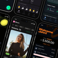
Once your mid-fidelity blueprint gets the green light, it's time to add a layer of realism. This is where we move from a static architectural plan to something stakeholders can actually click through and feel. High-fidelity (hi-fi) wireframes close the gap between pure structure and the final UI, giving everyone a tangible sense of the end product.

We're not picking out final colors or fonts just yet. Instead, the focus is on enriching the structure with more detailed UI elements, realistic content, and those all-important interactive links. The goal is to simulate the real user experience as closely as possible without getting lost in the weeds of full-blown visual design.
The first step in leveling up your wireframe is ditching the generic placeholders for more specific components. Those vague gray boxes need to become detailed representations of what will actually be on the screen.
By adding these details, you shift from a conceptual layout to a much more concrete screen. You can dive deeper into this process and check out some great examples by exploring resources on building compelling high-fi wireframes. This is the level of detail that makes a wireframe genuinely useful for user testing and developer handoffs.
The real magic of a high-fidelity wireframe is interactivity. This is where you connect your static screens to create a clickable prototype that actually mimics a user's journey. Using the prototyping features in tools like Figma, you can link a button on one screen to another, creating a functional, clickable flow.
For instance, that "Sign Up" button on your homepage wireframe should now actually take the user to the registration screen when they click it. This is how you transform a collection of images into a simulated app, and it's fundamental for testing usability. Users can click through an entire process, giving you a chance to spot confusing navigation or friction points long before a single line of code is written.
Creating these interactive pathways is essential for meaningful feedback. It's one thing to show someone a picture of a checkout page; it's another thing entirely to have them experience the five clicks it takes to get there.
A website is never static; it’s constantly responding to what the user does. A complete high-fidelity wireframe has to account for these different states to give developers a comprehensive blueprint. Thinking through these scenarios ahead of time prevents jarring user experiences and last-minute panic during development.
Here are a few common states you absolutely need to design for:
By meticulously crafting these interactive details and accounting for various UI states, your hi-fi wireframe becomes an incredibly valuable tool. It acts as the final checkpoint for usability and the ultimate source of truth for your development team, ensuring everyone is on the same page.
Think of your wireframe as more than just a pretty picture; it's the official instruction manual for your development team. Its real value comes down to one thing: how clearly it communicates your vision. If there's any room for guesswork, you're setting yourself up for a world of pain.
I've seen it happen countless times—a vague wireframe leads to endless back-and-forth emails, blown deadlines, and a final product that looks nothing like what the designer intended. This is where a little extra prep work transforms your design from a simple sketch into an actionable blueprint.

The bridge between design and code is built with clear communication. For wireframes, that communication comes in the form of annotations and specifications. Your wireframe is the map, but the annotations are the turn-by-turn directions that explain what actually happens on the journey.
Annotations are just small, specific notes you attach to elements in your wireframe. They explain functionality, user interactions, business rules—anything that isn't visually obvious. A developer can't read your mind, and a button or form field on its own doesn't tell the whole story.
For example, just dropping a "Sign Up" button onto the screen is nowhere near enough information. A developer is immediately going to have questions. Your annotations need to answer them upfront.
These little details are everything. A classic example is form validation. Your wireframe might show an email input field, but the annotations should spell out the rules: "Must be a valid email format (e.g., [email protected])" or "Display error message 'Please enter a valid email' below the field if format is incorrect." This level of detail crushes ambiguity and empowers your developer to build it right the first time.
A well-annotated wireframe is an investment in efficiency. Every question you answer upfront is one less email, one less meeting, and one less potential bug that needs to be fixed later.
To ensure you're covering all your bases, a checklist is your best friend. It helps you systematically think through every interactive element and make sure nothing gets lost in translation.
Here’s a quick checklist to guide your annotation process, ensuring developers have everything they need to build components correctly.
| Element Category | Annotation Examples | Why It's Important |
|---|---|---|
| Interactive Elements | On hover: Change button color to #5C67F2. On click: Trigger modal 'Confirm Deletion'. |
Defines the expected user feedback and system responses, which are crucial for a good user experience. |
| Forms & Inputs | Validation: Required field, must be a valid email format. Error State: Display 'Invalid Password' in red below the field. |
Prevents bad data from being submitted and guides users to correct their mistakes without confusion. |
| Content & Data | Character limit: 280 characters. Image specs: Must be JPG or PNG, max 5MB. |
Sets clear content constraints for both the back-end (database) and front-end (display). |
| Business Logic | User Role: This button is only visible to 'Admin' users. Conditional Logic: If cart is empty, show 'Your cart is empty' message. |
Explains the underlying rules that govern what users can see and do, preventing features from being built incorrectly. |
| Navigation & Links | Internal Link: Navigates to the /pricing page. External Link: Opens a new tab to help.example.com. |
Ensures all pathways through the site are correctly mapped, avoiding dead ends or confusing user journeys. |
Using a checklist like this turns annotation from a chore into a systematic quality-check, making your handoff process smoother for everyone involved.
These days, people will find your website on everything from a tiny smartphone to a massive desktop monitor. Your wireframe has to account for this. A layout that looks amazing on your laptop can completely break on a mobile screen.
Creating wireframes for different screen sizes isn't a "nice-to-have" anymore—it's a core part of learning how to create a wireframe for a website that actually works.
You should be creating wireframes for at least three key breakpoints:
The goal isn't just to make things smaller. You need to show how the layout adapts. A three-column grid on desktop might need to stack into a single column on mobile. A big navigation bar might collapse into a "hamburger" menu. Your responsive wireframes have to clearly show developers how these components reflow, resize, or get replaced entirely. This is the only way to guarantee a consistent and intuitive experience, no matter the device.
Getting your wireframe in front of people as early as humanly possible is the fastest way to find out if your brilliant ideas actually work. And no, this doesn't have to be a big, expensive production. You can get priceless feedback on a shoestring budget.
The whole point of this exercise is to turn those observations into concrete, actionable design improvements.
To get feedback you can actually use, you have to avoid leading questions like, "So, you think this is easy to use, right?" That just prompts people to be nice. Instead, you need to dig into their experience and what they're trying to accomplish.
The most valuable feedback comes from watching what users do, not just listening to what they say. When their clicks don't match their words, you've just uncovered a genuine usability issue that needs fixing.
Here are a few of my go-to questions to guide a feedback session:
After just a few of these tests, you’ll start to see patterns. Don't get overwhelmed and try to fix every little thing at once. Focus on the big stuff—the issues that caused the most frustration or completely blocked users from getting something done.
Make those quick changes to your wireframe, and then... test it again.
This design-test-refine loop is the engine that drives effective product development. It’s how you ensure you're building a website that truly solves problems for your users, not just one that looks good in a design file. This iterative process is a fundamental part of creating a website wireframe that actually leads to a successful final product.
Even with the best guide, a few questions always bubble up, especially when you're just getting the hang of wireframing. Here are some quick answers to the ones we hear all the time.
This one's a classic. Think of it like building a house.
A wireframe is the architectural blueprint. It’s just the walls, rooms, and windows—the bare-bones structure. It's all about layout and flow, nothing more.
A mockup is like a static, full-color render from an interior designer. It shows you the paint colors, the furniture, the whole aesthetic. You can see it, but you can't interact with it.
Finally, a prototype is the interactive model home. You can walk through it, open doors, and flip light switches to get a real feel for the space. It’s a simulation of the final experience.
Absolutely. In fact, you should.
Low-fidelity wireframing is purely about ideas and structure, not artistic skill. If you can draw a box on a piece of paper, you can create a wireframe. It’s that simple.
Tools like Balsamiq are fantastic for non-designers because they embrace a hand-drawn look, which keeps everyone focused on functionality, not pretty visuals. The goal here is crystal-clear communication, not a pixel-perfect design.
Your annotations need to be thorough enough to leave zero room for a developer to guess what you mean. A good rule of thumb? Explain any interaction, user flow, or business rule that isn't completely obvious from the layout itself.
Always write your notes as if the developer has zero prior context. Your job is to answer their questions before they even think to ask them. This simple habit will save everyone a massive amount of time and prevent frustrating rework.
You should definitely specify things like:
Think of it this way: clear annotations are the secret handshake for a smooth handoff from design to development. Don't skip them.
Ready to stop building from scratch and start shipping faster? gluestack market has a massive library of production-ready React Native templates and UI kits. You can skip the boilerplate and find the perfect launchpad for your next cross-platform app at https://market.gluestack.io.

Feb 23, 2026
4 min read
Discover powerful mobile app monetization strategies to boost your revenue. Our guide covers IAPs, ads, and subscriptions for React Native apps and beyond.

Feb 22, 2026
4 min read
A clear guide to app development cost estimation. Learn what drives costs, see budget examples, and discover strategies to build your app for less.

Feb 21, 2026
4 min read
Discover how to promote mobile application effectively with proven ASO, paid campaigns, and retention strategies.

Feb 15, 2026
4 min read
Discover how to create a prototype of a website with a practical, step-by-step guide. Explore tools, testing methods, and tips to bring your idea to life.

Feb 14, 2026
4 min read
Confused about mockups vs wireframes? Learn the key differences, when to use each, and how to streamline your React Native app development workflow.

Feb 13, 2026
4 min read
Discover how mobile apps templates accelerate development. Learn to choose, customize, and deploy high-quality React Native templates for your next project.

Feb 12, 2026
4 min read
Explore mobile application interface design with practical tips, core principles, and platform-aware workflows to craft apps users love.

Feb 10, 2026
4 min read
Learn mobile first design principles to craft fast, accessible apps that delight users. Practical tips, examples, and testing strategies.

Feb 08, 2026
4 min read
Explore the progressive web app vs native debate with our in-depth guide. We compare performance, cost, and UX to help you make the right strategic choice.
Feb 07, 2026
4 min read
Discover how React Native templates can accelerate your app development. This guide explores choosing, customizing, and deploying templates for faster launches.

Feb 05, 2026
4 min read
Discover the key differences between expo vs react native, including workflow, builds, and performance to help you pick the right path for your app.
Feb 03, 2026
4 min read
Master image with text overlay in React Native with responsive, accessible patterns. Learn expo setup, NativeWind styling, and gluestack-ui examples.

Feb 03, 2026
4 min read
Discover cross platform app development with proven strategies to build faster for iOS, Android, and the web using a single, unified codebase.

Feb 01, 2026
4 min read
Learn how to make an app for my business quickly with template-based steps from planning to launch, plus tips to scale and optimize.

Jan 31, 2026
4 min read
Ready to build an app? This guide shares practical strategies for validating your idea, choosing a tech stack, and navigating the App Store launch.
Jan 30, 2026
4 min read
Master responsive design for mobile apps with this guide on fluid layouts, breakpoints, and React Native. Build UIs that adapt perfectly to any screen.

Jan 25, 2026
4 min read
Learn how to design an Android app that stands out. This guide covers UX research, wireframing, Material Design, and the developer handoff process.

Jan 24, 2026
4 min read
Explore ui design web essentials: a complete guide to principles, responsive patterns, and workflows for intuitive, engaging web interfaces.

Jan 23, 2026
4 min read
Discover 10 essential mobile app design best practices for building exceptional cross-platform apps. Actionable tips for UI, UX, navigation, and performance.

Jan 21, 2026
4 min read
Discover how to debug React Native apps effectively. This guide covers Flipper, React DevTools, and native code troubleshooting for faster development cycles.

Jan 20, 2026
4 min read
Learn how to create app for your business with a practical, modern approach. Plan, customize, and launch with proven steps.

Jan 19, 2026
4 min read
A complete guide to mobile app development for startups. Learn how to validate your idea, build an MVP, and launch a successful app faster and more affordably.

Jan 18, 2026
4 min read
Discover how to choose the right React website template to accelerate your project. Our guide covers everything from quality checklists to deployment.
Jan 17, 2026
4 min read
Discover how to choose, customize, and deploy a React Native app template. This guide provides practical steps for launching production-ready apps faster.

Jan 16, 2026
4 min read
Discover how mobile application templates accelerate development. This guide covers how to choose, customize, and launch your app with the right foundation.

Jan 13, 2026
4 min read
Start your journey in mobile app development for beginners. This guide breaks down how to build your first cross-platform app with React Native and Expo.

Jan 12, 2026
4 min read
Explore the best react native ui libraries and compare features, performance, and ease of use to pick the right toolkit for your app.

Jan 11, 2026
4 min read
Launch your own ride-hailing service with our guide to building a production-ready Uber app clone. Learn MVP strategy, tech stacks, and backend integration.

Jan 10, 2026
4 min read
Master modern cash app design with this guide. Learn the UI/UX, security, and React Native strategies needed to build a fintech app that users trust and love.

Jan 09, 2026
4 min read
Learn how to build a personal finance dashboard with React Native. A practical guide for developers on UI design, data architecture, and production readiness.

Jan 08, 2026
4 min read
A practical guide to building a cross-platform event check in app with React Native. Learn to implement QR scanning, offline sync, and deployment.

Jan 07, 2026
4 min read
Master linear gradient React Native components with our complete guide. Learn practical techniques for Expo, bare RN, and NativeWind to build stunning UIs.

Jan 06, 2026
4 min read
Learn how to change application name in your React Native & Expo projects. This guide covers display names, package IDs, and app store listings.

Jan 05, 2026
4 min read
Discover how to monetize mobile apps with our founder's guide. Learn proven React Native strategies for ads, IAPs, and subscriptions to maximize your revenue.

Jan 04, 2026
4 min read
A practical guide on how to create a website app with a single codebase. Learn to build for web, iOS, and Android using React Native, Expo, and TypeScript.

Jan 03, 2026
4 min read
Learn how to create an app for your business with this definitive guide. Discover practical strategies for validation, development, and launch that work.
Jan 01, 2026
4 min read
Deciding on progressive web application vs native? This guide offers a deep comparison of performance, cost, UX, and use cases to help you choose wisely.

Dec 31, 2025
4 min read
Discover 10 mobile app security best practices for React Native. Learn to secure data, APIs, and code with actionable tips and examples for 2025.

Dec 30, 2025
4 min read
Unlock the real React Native app development cost. Our guide breaks down pricing by feature, team, and complexity to help you budget with confidence.

Dec 29, 2025
4 min read
A practical guide to master your React Native debug workflow. Learn to use Flipper, React DevTools, and Hermes to solve bugs in Expo and bare RN apps.

Dec 28, 2025
4 min read
The ultimate React Native tutorial for beginners. Learn to build beautiful cross-platform apps using a modern stack like Expo, TypeScript, and gluestack-ui.

Dec 27, 2025
4 min read
A practical guide on how to build a mobile app. Learn to go from concept to a market-ready app using templates, React Native, and proven development strategies.

Dec 26, 2025
4 min read
Discover interface design for websites with actionable tips on layout, responsiveness, and usability to boost conversions.

Dec 25, 2025
4 min read
Discover designs for apps that blend minimal aesthetics with personalization, and learn to build user-centric interfaces that boost engagement.

Dec 24, 2025
4 min read
Learn graphical interface design - essentials for mastering core principles, modern workflows, and cross-platform strategies to build intuitive, engaging UIs.

Dec 23, 2025
4 min read
Discover how high fi wireframes bridge the gap between ideas and code. Learn a practical workflow for creating, testing, and handing off effective UI designs.

Dec 22, 2025
4 min read
Discover mobile app interface design with practical principles, accessibility, and workflows that boost user engagement.

Dec 21, 2025
4 min read
Explore the top 10 UI UX design trends for 2025. Get expert insights and practical React Native tips to build next-gen cross-platform apps that stand out.

Dec 20, 2025
4 min read
Discover how mobile app templates accelerate development from idea to launch. Learn to select, customize, and deploy templates for a faster time to market.

Dec 18, 2025
4 min read
Explore the best react native ui libraries to accelerate mobile development with performance, theming, and accessibility. Expert tips inside.
Dec 16, 2025
4 min read
Master React Native PDF handling. Learn to generate, view, and share PDFs with practical code examples, library comparisons, and performance tips.

Dec 15, 2025
4 min read
A practical guide to choosing the right React Native component library. Learn how to evaluate options, avoid common pitfalls, and build apps faster.

Dec 14, 2025
4 min read
Find the perfect React Native UI library for your project. This guide compares top libraries, selection criteria, and customization strategies.

Dec 13, 2025
4 min read
Learn how to change app name in React Native and Expo. Our guide covers display names, bundle IDs, and store listings for iOS and Android projects.

Dec 12, 2025
4 min read
Discover the best React Native component library for your next project. We compare top libraries on performance, customization, and real-world use cases.

Dec 11, 2025
4 min read
Discover how to choose the right React Native UI kit. This guide covers top kits, selection criteria, and customization to accelerate your app development.

Dec 10, 2025
4 min read
Explore our in-depth guide to find the best React Native UI library. We compare top contenders to help you choose the right fit for your project.
Dec 09, 2025
4 min read
Discover a practical approach to building apps with React Native. This guide covers setup, UI, state management, and testing to help you ship great apps.

Dec 08, 2025
4 min read
android login with facebook: Learn to set up the Facebook SDK, manage tokens, and implement secure authentication across native Android, cross-platform apps.

Dec 07, 2025
4 min read
Master the alert in React Native. Learn to handle platform differences, build custom modals, and apply best practices for a seamless user experience.
Dec 06, 2025
4 min read
keyboardavoidingview react native: Master keyboard handling with KeyboardAvoidingView across iOS, Android, Expo, and TypeScript.

Dec 05, 2025
4 min read
A practical guide to implementing a React Native PDF viewer. Learn to compare libraries, handle native setup, and troubleshoot common issues with real code.

Dec 04, 2025
4 min read
how to validate startup idea: learn proven methods like customer interviews, MVPs, and metrics to confirm market fit.

Dec 03, 2025
4 min read
how to make app like uber: Learn core features, tech stack, development steps, testing, and launch tips.

Dec 02, 2025
4 min read
Build a rock-solid React Native setup. This guide covers Expo vs. Bare workflows, TypeScript, pnpm monorepos, NativeWind, and deployment strategies.

Dec 01, 2025
4 min read
A practical guide to Stripe React Native integration. Learn to set up your server, build payment UIs, handle webhooks, and launch secure mobile payments.

Nov 30, 2025
4 min read
Learn how to master push notifications in React Native. This guide covers setup, best practices, and advanced techniques for engaging your users.

Nov 29, 2025
4 min read
Build powerful location-based apps with our practical guide to react native with google maps. Get setup guides, pro tips, and best practices for iOS & Android.

Nov 28, 2025
4 min read
Explore deep linking react native with a practical guide to configuring URL schemes, universal links, navigation, and testing for Expo and bare apps.

Nov 28, 2025
4 min read
A practical guide to building a scalable React Native design system. Learn to implement tokens, theming, and tools like NativeWind and gluestack-ui.

Nov 26, 2025
4 min read
Learn why react native expo templates speed up your projects with ready-made patterns and practical tips.

Nov 25, 2025
4 min read
Discover how to improve developer productivity with actionable strategies for workflow, tooling, and culture. A practical guide for software engineering teams.

Nov 24, 2025
4 min read
Discover the best cross platform app development tools. Compare top frameworks like Flutter and React Native to build and ship apps faster.

Nov 23, 2025
4 min read
This Expo React Native tutorial provides a hands-on guide to building cross-platform apps. Learn setup, styling with NativeWind, navigation, and deployment.

Nov 22, 2025
4 min read
Build beautiful UIs faster with this guide to Tailwind CSS React Native. Learn setup, styling, and advanced techniques with NativeWind for mobile apps.

Nov 21, 2025
4 min read
Explore our curated list of 7 top-tier React Native app examples. Discover production-ready templates and resources to build your next app faster.
Mar 19, 2025
4 min read
gluestack market offers React Native UI templates to accelerate development. Get customizable, production-ready React Native app templates and Ui kit, some free. Build faster & smarter today!