
High-fidelity wireframes are the dress rehearsal before opening night. They're detailed, pixel-perfect blueprints that show you exactly what your digital product will look like, right down to the final colors, fonts, and spacing. Think of them as the complete visual preview before a single line of code gets written.
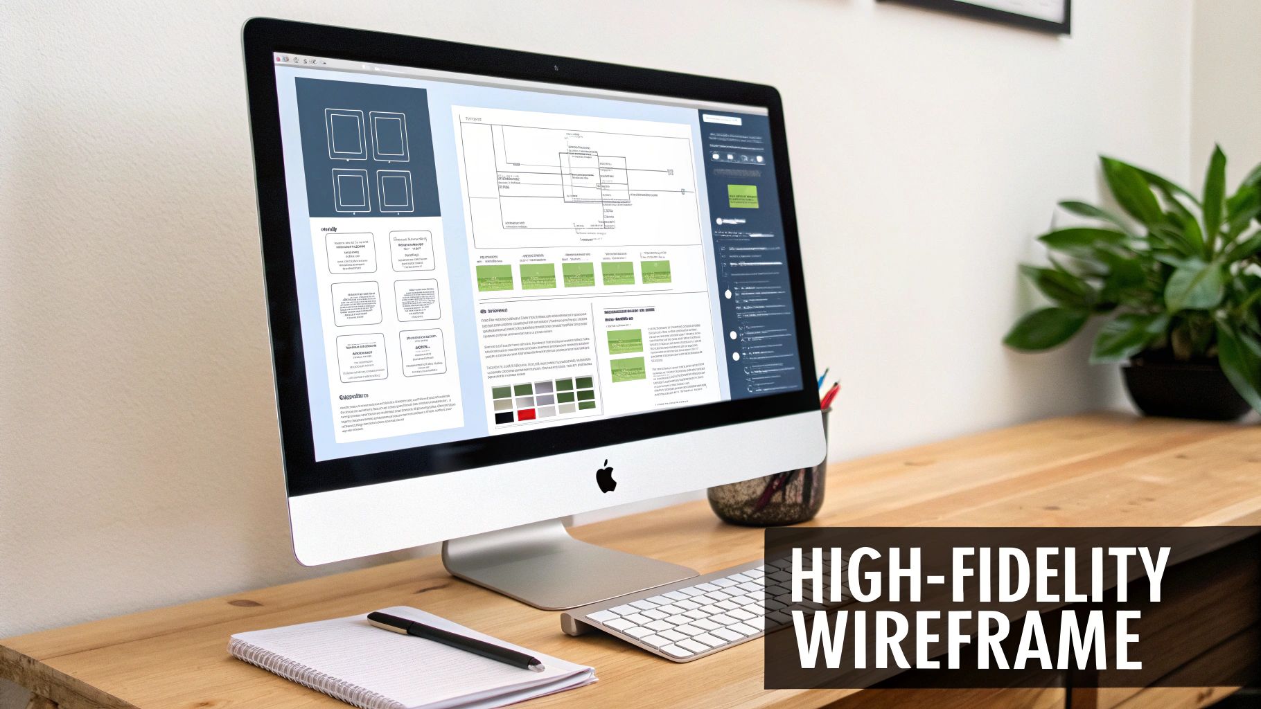
Imagine trying to build a house with just a rough napkin sketch of the floor plan. Now, picture the architect handing you a photorealistic 3D model, complete with paint colors, light fixtures, and furniture. That’s the leap from a low-fidelity sketch to a high-fi wireframe.
These advanced wireframes are static, but they're visually complete. They act as the critical bridge connecting abstract ideas to a tangible, finished product. By locking in the precise UI elements, they get everyone—designers, developers, and stakeholders—on the same page about the look, feel, and user experience.
High-fidelity wireframes force you to move beyond basic boxes and layouts to define the product's soul. This is where you answer the crucial questions before development starts:
Getting this level of detail down is essential for gathering feedback that actually means something. This is a core part of the role of a web designer, who uses these detailed mockups to translate vision into a concrete plan.
A good high-fidelity wireframe is a nearly one-to-one approximation of the final product so that stakeholders can evaluate and sign off on the design before the development team takes over.
Let's be honest: the biggest benefit of spending time on high-fi wireframes is saving a ton of money and headaches down the road.
Fixing a clunky user flow or an awkward layout is a simple drag-and-drop in a design tool. Discovering that same issue after weeks of coding? That’s a recipe for expensive rework, missed deadlines, and a very stressed-out team.
These wireframes are your best defense against risk. They help you validate complex designs, get investors excited, and ensure a seamless handoff to the development team. And if you're building a mobile app, getting the visuals right is half the battle. You can dive deeper into crafting a killer mobile app interface design in our detailed guide.
The design process isn't a single event; it's a journey. You start with a rough idea sketched on a whiteboard and gradually evolve it into a polished, living product. Understanding the different pit stops along this journey—the low-fi wireframe, the high-fi wireframe, and the prototype—is key to knowing which tool to pull out of your toolbox and when.
Think of it like building a custom car. Your low-fidelity wireframe is the first simple pencil sketch. It’s nothing more than lines and boxes, focusing purely on the core structure. Where does the engine go? How many seats will it have? What’s the basic shape? It's all about function and flow, not how pretty it looks.
This is where the sketch starts to feel like a real car. A high-fi wireframe brings in the crucial visual details. It's where you define the exact shade of red paint, the style of the headlights, the texture of the leather seats, and the specific font used on the dashboard dials.
Essentially, it's a static, photorealistic picture of the final product. You can't drive it yet, but you can see exactly how it will look parked in the driveway. This is the stage for getting stakeholder buy-in on the visual direction and making sure every pixel aligns with the brand before you even think about writing code.
A common mistake is blurring the lines between these stages. Low-fidelity is for structure, high-fidelity is for visual precision, and prototypes are for interaction. Each solves a different problem.
Finally, we get to the prototype. This is the drivable model you actually take for a test spin. It’s where your beautiful high-fidelity designs become interactive. Users can click buttons, navigate through menus, and get a genuine feel for how the product works. This is where you test the engine's roar and the smoothness of the gear shifts.
This natural progression ensures you’re answering the right questions at the right time:
To really get a handle on the design spectrum beyond wireframes, it's worth exploring the various rapid prototyping methods that help bring these interactive models to life.
Let's break down the key differences to make it even clearer.
This table quickly highlights the unique role each deliverable plays in the design process.
| Characteristic | Low-Fidelity Wireframe | High-Fidelity Wireframe | Interactive Prototype |
|---|---|---|---|
| Purpose | Validate structure & user flow | Finalize visual design & branding | Test user interaction & usability |
| Visuals | Basic shapes, placeholders | Real UI elements, branding | Polished, pixel-perfect visuals |
| Interactivity | None (static) | None (static) | Clickable, tappable, interactive |
| Tools | Pen & paper, Balsamiq | Figma, Sketch, Adobe XD | Figma, Proto.io, Axure RP |
| Best For | Early-stage ideation, layout | Stakeholder approval, design handoff | User testing, final validation |
By respecting this progression, you avoid the classic pitfall of wasting hours perfecting visuals on a fundamentally flawed structure or coding an interface that hasn't been visually signed off on. Each step builds on the last, creating a solid foundation for a much stronger, user-centric final product. It’s how you methodically turn a simple idea into a polished and functional digital experience.
Going from a rough sketch on a napkin to a polished, pixel-perfect design isn't magic. It's a process. Having a clear, repeatable workflow for creating high-fi wireframes is what separates a smooth project from a chaotic one, ensuring you don’t miss any critical details along the way. The idea is to build up the design progressively, layering detail onto a solid foundation.
You can think of the whole design journey as moving along a spectrum, from a simple blueprint to a living, breathing model of the final app.
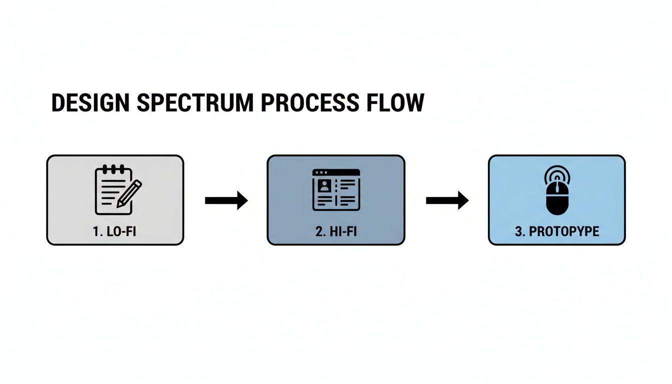
This shows how we start with the bare-bones structure in low-fidelity, flesh it out with visuals in high-fidelity, and then make it interactive in the prototype phase. It's a methodical journey, not a frantic sprint.
First things first, let's take those initial low-fidelity sketches and user flows and give them a digital home. At this point, forget about colors, fonts, or fancy icons. The only thing that matters is getting the core user journey translated into a well-organized screen layout.
Okay, the skeleton is in place. Now it’s time to add the muscle and skin. This is the part where you breathe life into the design by applying your brand’s unique visual identity. This step is what turns that monochromatic blueprint into something that actually looks and feels like the final product.
Start by rolling out the brand’s color palette. Apply primary colors to interactive elements like buttons and links, and use secondary or neutral colors for backgrounds and containers. Next up is typography. Implement the official fonts, setting specific styles, sizes, and weights for headings, body copy, and labels. Consistency is everything here; it’s what creates a cohesive and trustworthy user experience.
High-fidelity wireframing isn't just about making things look pretty. It's about making strategic design decisions that communicate your brand's values and guide user behavior.
Let's be honest, "Lorem Ipsum" is a crutch. It’s fine in the early stages, but for a high-fidelity design, you need the real deal. Using actual text and images is a crucial stress test for your layout. It reveals potential flaws that dummy content conveniently hides, like awkward line breaks, text that overflows its container, or images that just don't fit the vibe.
For example, swap out placeholder headlines for actual copy to check readability and character limits. Ditch the generic gray boxes and use high-quality, relevant images to see how they truly impact the design's aesthetic and emotional tone. This step ensures your design works in the real world, not just in a perfect, idealized one.
The final leg of the journey is all about meticulous refinement. This is where you zoom in, polish every detail, and get the design pixel-perfect and ready for feedback. Double-check every bit of spacing, alignment, and consistency across all your screens.
This stage is also your golden opportunity for early stakeholder alignment, which can save you a world of pain later. In fact, getting stakeholders to review and sign off on high-fi wireframes can slash design iterations by a whopping 40%. Agencies have found that this collaborative approach can trim project timelines from an average of eight weeks down to just five, all because it sets crystal-clear expectations from the get-go. You can read more about how wireframing streamlines project timelines on nerdcow.co.uk.
By sticking to this workflow, you can methodically build detailed, effective high-fidelity wireframes that make communication a breeze and set your project up for a smooth, successful handoff to the developers.
Picking the right software is a bit like a master chef choosing their knives—the right tool won't just speed up your work, it'll fundamentally improve the final result. For high-fi wireframes, your software choice makes a huge difference in how easily you can design, but also how well you can collaborate with developers, stakeholders, and the rest of the team. It becomes the single source of truth for the entire project.
In today's design world, one tool has clearly pulled ahead of the pack.
There's a reason so many design teams have made Figma their home base. It’s entirely browser-based, which completely eliminates the headache of managing different software versions or operating systems. Everyone from the lead designer to the CEO can jump into the latest design file, leave comments, and see updates in real-time, no matter where they are.
This real-time collaboration is Figma's killer feature. It's not just a nice-to-have; it's a game-changer. Figma now dominates the design space, with over 70% of teams using it as their primary tool. For good reason, too—its live features have been shown to slash stakeholder approval times by an average of 30%. That's a massive win for any project's timeline. You can dig into more of these industry stats over on letsgroto.com.
But Figma is more than just a collaboration tool. It's packed with features that serious designers rely on:
While Figma is the clear leader, it’s not the only option. Sketch, a macOS-native app, was the original king of UI design for a long time. It’s still loved by many for its clean, focused interface and snappy performance, making it a fantastic choice for solo designers or teams fully committed to the Apple ecosystem.
Then you have Adobe XD, another powerhouse, especially for teams already using the Adobe Creative Cloud. Its tight integration with Photoshop and Illustrator is a huge plus if your workflow involves a lot of custom graphics or illustrations.
Your choice really comes down to your team's workflow. Figma is built from the ground up for modern, web-first collaboration. Sketch and Adobe XD, on the other hand, offer deep integrations within their own ecosystems.
At the end of the day, these tools are all about creating a clear blueprint that your developers can turn into real, working code. As you're wrapping up your designs, it’s smart to start thinking about the components you’ll need. To get a head start, check out our guide on the best React Native UI libraries—it’s a great resource for seeing how design systems can bridge that gap between your wireframes and a production-ready app.
 Anyone can create a high-fidelity wireframe that looks impressive. But building one that's consistent, scalable, and actually ready for developers? That takes discipline.
Effective design isn't just about making things pretty. It’s about laying a solid visual foundation that holds the entire product experience together. Following a few key professional practices ensures your designs are polished, easy for developers to work with, and built to last.
Think of these principles as the bridge that turns your static screens into a clear blueprint for the final product, leaving zero room for guesswork when it’s time for handoff.
Consistency is the absolute cornerstone of a great user experience. A design system is your single source of truth for every UI component, making sure every button, icon, and form field looks and behaves the same way across the entire app. This is how you eliminate those jarring visual bugs that confuse users and chip away at their trust.
Stop designing elements screen by screen. Instead, focus on building a library of reusable components. For example, define your primary button once—with its specific colors, typography, and padding—and then reuse that same component everywhere. This not only makes you a faster designer but also makes future updates a breeze. To really dive deep on this, check out our guide to building a React Native design system.
When you treat every UI element as part of a larger, interconnected system, you guarantee the final product feels cohesive and professional, not like a jumbled collection of screens.
A grid system is the invisible skeleton holding your design together. It’s a structured framework for placing elements that guarantees perfect alignment and balanced spacing every single time. Using something standard, like an 8-point grid system, brings a clean, mathematical order to your layout that just feels right.
This isn’t just for looks, either. It’s absolutely essential for creating a responsive design that works flawlessly on any device or screen size. A well-defined grid helps developers translate your vision into code with pixel-perfect accuracy.
One of the most common rookie mistakes is designing only for the "happy path"—that perfect scenario where everything works exactly as planned. But real life is messy, and users run into all sorts of other situations. A truly effective high-fi wireframe accounts for every possible user state, ensuring the experience feels seamless no matter what.
Make sure you’ve designed screens for these critical edge cases:
By thoughtfully designing for these states from the beginning, you create a much more resilient and user-friendly product that anticipates needs and handles imperfections gracefully.
A brilliant design is only as good as its execution. This brings us to the final, and most critical, step in the wireframing journey: the handoff. This is the moment your pixel-perfect blueprint gets passed to developers to be turned into a living, breathing application.
Historically, this has been a major point of friction, but modern tools have completely changed the game, making the whole process incredibly smooth.
A well-crafted high-fi wireframe acts as the ultimate source of truth for the project. There's no room for guesswork. Think of it as the visual contract that ensures what was designed is exactly what gets built.
Tools like Figma have transformed the handoff from a clunky, document-heavy chore into a dynamic, collaborative workflow. Gone are the days when developers had to manually measure pixels or guess hex codes from a flattened image.
Now, they can jump right into the design file and inspect any element to get the precise information they need:
This direct access is a massive time-saver. For global enterprises, clear high-fi wireframes are proven to lead to cleaner handoffs, cutting down on development rework by a significant 35%. This is especially true for complex SaaS platforms that rely on things like dynamic filters and reporting. You can find more insights about how wireframes improve project outcomes on letsgroto.com.
While inspection tools provide the "what," clear documentation explains the "why." You can add annotations directly within the wireframe to clarify complex interactions, user flows, or specific states that aren't immediately obvious from just looking at a static screen.
The goal of a handoff isn't just to deliver assets; it's to transfer understanding. The developer should have complete confidence in what they need to build without constant clarification.
This is where component libraries become your secret weapon. When your high-fi wireframe is built using a predefined UI kit—like the ones you'll find on gluestack market—each visual element already maps to a production-ready code component.
This completely closes the gap between design and development. It creates a seamless workflow that takes you all the way from a design concept to a functional React Native UI.
Even with a solid plan, a few questions always pop up when you're deep in the design process. Getting these cleared up early helps your whole team stay on the same page and keeps the project moving smoothly.
Think of a high-fidelity wireframe as the final, static blueprint for a single screen. It should have everything: all the UI elements, the exact typography and color palette you’ll use, and pixel-perfect spacing. It's literally the visual guide developers will follow to build the UI.
But it's crucial to know where to draw the line. High-fi wireframes are not the place for complex interactivity. Things like multi-step user journeys or fancy animations belong in the next stage: the interactive prototype. The goal here is visual perfection, not a mini-app.
It’s tempting to jump straight to the pretty stuff, but I’d strongly advise against it. Skipping the low-fi stage is a classic mistake. You end up wasting time arguing over button colors before you've even confirmed that the core layout and user flow actually work.
Low-fidelity wireframes are your best friend for iterating on foundational ideas quickly and cheaply. Save the investment in high-fidelity polish for when you're confident the structural blueprint is solid.
This one causes a lot of confusion, and you'll often hear the terms used interchangeably. But there's a subtle yet important difference.
A high-fi wireframe is all about the functional layout. It uses the final UI components and structure to answer the question, "How will this screen be built?" It's a practical, structural document.
A mockup, on the other hand, is a static, high-resolution render that's all about the final product's visual aesthetic. It’s about creating a pixel-perfect, realistic image of the app. To put it another way: the wireframe is the detailed architectural plan, while the mockup is the stunning, photorealistic render of the finished house.
Ready to turn those designs into reality? Accelerate your development with production-ready React Native templates from gluestack market. Our UI kits and app starters give you the perfect foundation, letting you go from design to a fully functional app faster than ever. Explore our marketplace and start building today.

Feb 23, 2026

4 min read
Discover powerful mobile app monetization strategies to boost your revenue. Our guide covers IAPs, ads, and subscriptions for React Native apps and beyond.

Feb 22, 2026
4 min read
A clear guide to app development cost estimation. Learn what drives costs, see budget examples, and discover strategies to build your app for less.

Feb 21, 2026
4 min read
Discover how to promote mobile application effectively with proven ASO, paid campaigns, and retention strategies.

Feb 15, 2026
4 min read
Discover how to create a prototype of a website with a practical, step-by-step guide. Explore tools, testing methods, and tips to bring your idea to life.
Feb 14, 2026
4 min read
Confused about mockups vs wireframes? Learn the key differences, when to use each, and how to streamline your React Native app development workflow.

Feb 13, 2026
4 min read
Discover how mobile apps templates accelerate development. Learn to choose, customize, and deploy high-quality React Native templates for your next project.

Feb 12, 2026
4 min read
Explore mobile application interface design with practical tips, core principles, and platform-aware workflows to craft apps users love.

Feb 10, 2026
4 min read
Learn mobile first design principles to craft fast, accessible apps that delight users. Practical tips, examples, and testing strategies.
Feb 08, 2026
4 min read
Explore the progressive web app vs native debate with our in-depth guide. We compare performance, cost, and UX to help you make the right strategic choice.
Feb 07, 2026
4 min read
Discover how React Native templates can accelerate your app development. This guide explores choosing, customizing, and deploying templates for faster launches.

Feb 05, 2026
4 min read
Discover the key differences between expo vs react native, including workflow, builds, and performance to help you pick the right path for your app.
Feb 03, 2026
4 min read
Master image with text overlay in React Native with responsive, accessible patterns. Learn expo setup, NativeWind styling, and gluestack-ui examples.

Feb 03, 2026
4 min read
Discover cross platform app development with proven strategies to build faster for iOS, Android, and the web using a single, unified codebase.
Feb 01, 2026
4 min read
Learn how to make an app for my business quickly with template-based steps from planning to launch, plus tips to scale and optimize.

Jan 31, 2026
4 min read
Ready to build an app? This guide shares practical strategies for validating your idea, choosing a tech stack, and navigating the App Store launch.
Jan 30, 2026
4 min read
Master responsive design for mobile apps with this guide on fluid layouts, breakpoints, and React Native. Build UIs that adapt perfectly to any screen.

Jan 25, 2026
4 min read
Learn how to design an Android app that stands out. This guide covers UX research, wireframing, Material Design, and the developer handoff process.

Jan 24, 2026
4 min read
Explore ui design web essentials: a complete guide to principles, responsive patterns, and workflows for intuitive, engaging web interfaces.

Jan 23, 2026
4 min read
Discover 10 essential mobile app design best practices for building exceptional cross-platform apps. Actionable tips for UI, UX, navigation, and performance.

Jan 21, 2026
4 min read
Discover how to debug React Native apps effectively. This guide covers Flipper, React DevTools, and native code troubleshooting for faster development cycles.

Jan 20, 2026
4 min read
Learn how to create app for your business with a practical, modern approach. Plan, customize, and launch with proven steps.

Jan 19, 2026
4 min read
A complete guide to mobile app development for startups. Learn how to validate your idea, build an MVP, and launch a successful app faster and more affordably.

Jan 18, 2026
4 min read
Discover how to choose the right React website template to accelerate your project. Our guide covers everything from quality checklists to deployment.
Jan 17, 2026
4 min read
Discover how to choose, customize, and deploy a React Native app template. This guide provides practical steps for launching production-ready apps faster.

Jan 16, 2026
4 min read
Discover how mobile application templates accelerate development. This guide covers how to choose, customize, and launch your app with the right foundation.

Jan 13, 2026
4 min read
Start your journey in mobile app development for beginners. This guide breaks down how to build your first cross-platform app with React Native and Expo.

Jan 12, 2026
4 min read
Explore the best react native ui libraries and compare features, performance, and ease of use to pick the right toolkit for your app.

Jan 11, 2026
4 min read
Launch your own ride-hailing service with our guide to building a production-ready Uber app clone. Learn MVP strategy, tech stacks, and backend integration.
Jan 10, 2026
4 min read
Master modern cash app design with this guide. Learn the UI/UX, security, and React Native strategies needed to build a fintech app that users trust and love.

Jan 09, 2026
4 min read
Learn how to build a personal finance dashboard with React Native. A practical guide for developers on UI design, data architecture, and production readiness.

Jan 08, 2026
4 min read
A practical guide to building a cross-platform event check in app with React Native. Learn to implement QR scanning, offline sync, and deployment.

Jan 07, 2026
4 min read
Master linear gradient React Native components with our complete guide. Learn practical techniques for Expo, bare RN, and NativeWind to build stunning UIs.

Jan 06, 2026
4 min read
Learn how to change application name in your React Native & Expo projects. This guide covers display names, package IDs, and app store listings.
Jan 05, 2026
4 min read
Discover how to monetize mobile apps with our founder's guide. Learn proven React Native strategies for ads, IAPs, and subscriptions to maximize your revenue.

Jan 04, 2026
4 min read
A practical guide on how to create a website app with a single codebase. Learn to build for web, iOS, and Android using React Native, Expo, and TypeScript.

Jan 03, 2026
4 min read
Learn how to create an app for your business with this definitive guide. Discover practical strategies for validation, development, and launch that work.

Jan 02, 2026
4 min read
Learn how to create a wireframe for a website with this practical guide. Move from initial sketches to developer-ready designs that get built right.
Jan 01, 2026
4 min read
Deciding on progressive web application vs native? This guide offers a deep comparison of performance, cost, UX, and use cases to help you choose wisely.

Dec 31, 2025
4 min read
Discover 10 mobile app security best practices for React Native. Learn to secure data, APIs, and code with actionable tips and examples for 2025.

Dec 30, 2025
4 min read
Unlock the real React Native app development cost. Our guide breaks down pricing by feature, team, and complexity to help you budget with confidence.

Dec 29, 2025
4 min read
A practical guide to master your React Native debug workflow. Learn to use Flipper, React DevTools, and Hermes to solve bugs in Expo and bare RN apps.

Dec 28, 2025
4 min read
The ultimate React Native tutorial for beginners. Learn to build beautiful cross-platform apps using a modern stack like Expo, TypeScript, and gluestack-ui.

Dec 27, 2025
4 min read
A practical guide on how to build a mobile app. Learn to go from concept to a market-ready app using templates, React Native, and proven development strategies.

Dec 26, 2025
4 min read
Discover interface design for websites with actionable tips on layout, responsiveness, and usability to boost conversions.

Dec 25, 2025
4 min read
Discover designs for apps that blend minimal aesthetics with personalization, and learn to build user-centric interfaces that boost engagement.

Dec 24, 2025
4 min read
Learn graphical interface design - essentials for mastering core principles, modern workflows, and cross-platform strategies to build intuitive, engaging UIs.

Dec 22, 2025
4 min read
Discover mobile app interface design with practical principles, accessibility, and workflows that boost user engagement.

Dec 21, 2025
4 min read
Explore the top 10 UI UX design trends for 2025. Get expert insights and practical React Native tips to build next-gen cross-platform apps that stand out.

Dec 20, 2025
4 min read
Discover how mobile app templates accelerate development from idea to launch. Learn to select, customize, and deploy templates for a faster time to market.

Dec 18, 2025
4 min read
Explore the best react native ui libraries to accelerate mobile development with performance, theming, and accessibility. Expert tips inside.
Dec 16, 2025
4 min read
Master React Native PDF handling. Learn to generate, view, and share PDFs with practical code examples, library comparisons, and performance tips.
Dec 15, 2025
4 min read
A practical guide to choosing the right React Native component library. Learn how to evaluate options, avoid common pitfalls, and build apps faster.

Dec 14, 2025
4 min read
Find the perfect React Native UI library for your project. This guide compares top libraries, selection criteria, and customization strategies.

Dec 13, 2025
4 min read
Learn how to change app name in React Native and Expo. Our guide covers display names, bundle IDs, and store listings for iOS and Android projects.

Dec 12, 2025
4 min read
Discover the best React Native component library for your next project. We compare top libraries on performance, customization, and real-world use cases.

Dec 11, 2025
4 min read
Discover how to choose the right React Native UI kit. This guide covers top kits, selection criteria, and customization to accelerate your app development.

Dec 10, 2025
4 min read
Explore our in-depth guide to find the best React Native UI library. We compare top contenders to help you choose the right fit for your project.
Dec 09, 2025
4 min read
Discover a practical approach to building apps with React Native. This guide covers setup, UI, state management, and testing to help you ship great apps.

Dec 08, 2025
4 min read
android login with facebook: Learn to set up the Facebook SDK, manage tokens, and implement secure authentication across native Android, cross-platform apps.

Dec 07, 2025
4 min read
Master the alert in React Native. Learn to handle platform differences, build custom modals, and apply best practices for a seamless user experience.
Dec 06, 2025
4 min read
keyboardavoidingview react native: Master keyboard handling with KeyboardAvoidingView across iOS, Android, Expo, and TypeScript.
Dec 05, 2025
4 min read
A practical guide to implementing a React Native PDF viewer. Learn to compare libraries, handle native setup, and troubleshoot common issues with real code.

Dec 04, 2025
4 min read
how to validate startup idea: learn proven methods like customer interviews, MVPs, and metrics to confirm market fit.

Dec 03, 2025
4 min read
how to make app like uber: Learn core features, tech stack, development steps, testing, and launch tips.

Dec 02, 2025
4 min read
Build a rock-solid React Native setup. This guide covers Expo vs. Bare workflows, TypeScript, pnpm monorepos, NativeWind, and deployment strategies.

Dec 01, 2025
4 min read
A practical guide to Stripe React Native integration. Learn to set up your server, build payment UIs, handle webhooks, and launch secure mobile payments.

Nov 30, 2025
4 min read
Learn how to master push notifications in React Native. This guide covers setup, best practices, and advanced techniques for engaging your users.

Nov 29, 2025
4 min read
Build powerful location-based apps with our practical guide to react native with google maps. Get setup guides, pro tips, and best practices for iOS & Android.

Nov 28, 2025
4 min read
Explore deep linking react native with a practical guide to configuring URL schemes, universal links, navigation, and testing for Expo and bare apps.

Nov 28, 2025
4 min read
A practical guide to building a scalable React Native design system. Learn to implement tokens, theming, and tools like NativeWind and gluestack-ui.

Nov 26, 2025
4 min read
Learn why react native expo templates speed up your projects with ready-made patterns and practical tips.

Nov 25, 2025
4 min read
Discover how to improve developer productivity with actionable strategies for workflow, tooling, and culture. A practical guide for software engineering teams.

Nov 24, 2025
4 min read
Discover the best cross platform app development tools. Compare top frameworks like Flutter and React Native to build and ship apps faster.

Nov 23, 2025
4 min read
This Expo React Native tutorial provides a hands-on guide to building cross-platform apps. Learn setup, styling with NativeWind, navigation, and deployment.

Nov 22, 2025
4 min read
Build beautiful UIs faster with this guide to Tailwind CSS React Native. Learn setup, styling, and advanced techniques with NativeWind for mobile apps.

Nov 21, 2025
4 min read
Explore our curated list of 7 top-tier React Native app examples. Discover production-ready templates and resources to build your next app faster.
Mar 19, 2025
4 min read
gluestack market offers React Native UI templates to accelerate development. Get customizable, production-ready React Native app templates and Ui kit, some free. Build faster & smarter today!
