Jan 04, 2026

4 min read


Building a website app isn't just about slapping some code together. The real magic is creating a single application that feels perfectly at home on the web, iOS, and Android—all from one unified codebase. We'll get into the weeds of how to do that with a modern stack like React Native and Expo, but first, let's talk strategy.
Every great app I've ever worked on started long before a single line of code was written. The most critical part of the whole process is the planning phase. It’s here that you set the direction for the project and, more importantly, prevent those costly, soul-crushing mistakes that pop up down the line.
A solid foundation isn't just about picking the right tech. It’s about getting crystal clear on your purpose and truly understanding the people you're building for.
Before you even think about development, you have to nail down the core problem your app is going to solve. Who are you building this for? What specific pain points are you going to eliminate for them? Answering these questions gives you a clear architectural blueprint that will guide every single feature and design choice you make.
I've found it helps to break down the initial planning into three simple parts: define your purpose, choose your tools, and find ways to accelerate your timeline. It’s a straightforward approach to building a website app with a clear strategy from day one.
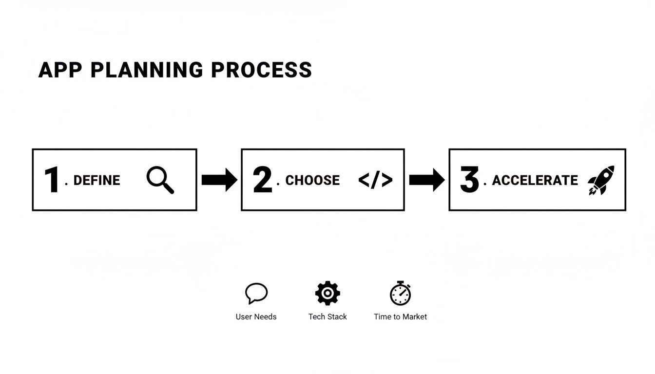
As you can see, everything starts with the user. From there, you pick a tech stack that supports your cross-platform goals and lean on templates to get to market faster.
And while you're at it, don't forget the basics. Making sure your app is robust and trustworthy from the get-go means baking in essential website security best practices from the very beginning.
A rookie mistake I see all the time is jumping straight into coding without a clear plan. Trust me on this: taking the time to nail down your app's purpose, audience, and core features will save you hundreds of hours in rework later.
The technology you choose has a massive impact on your development speed, how well your app can scale, and how painful (or easy) long-term maintenance will be. To create a website app that also runs like a dream on mobile, my go-to recommendation is a specific combination of tools purpose-built for this kind of universal development.
This table gives a quick rundown of the key players in our modern cross-platform tech stack.
| Technology | Role in Your Project | Key Benefit |
|---|---|---|
| React Native & Expo | The core framework | Write code once in JavaScript and deploy it as a native app on iOS, Android, and a high-performance website. |
| TypeScript | The code quality layer | Adds static types to JavaScript, helping you catch errors early and write more reliable, maintainable code. |
| gluestack market Templates | The development accelerator | Provides a massive head start with pre-built UI, navigation, and core features right out of the box. |
Each of these tools is powerful on its own, but together they form a cohesive ecosystem that just works, letting you focus on building features instead of fighting with your tools.
This combination is about more than just convenience; it’s a strategic choice. The mobile app world is exploding, with global revenue projected to skyrocket to US$1,103.48 billion by 2034. With nearly 998 new apps hitting Google Play every day, speed is your secret weapon. Using pre-built templates lets you launch faster and focus your energy on what makes your app unique.
This cross-platform approach isn't some niche strategy anymore; it's being adopted by startups and huge companies alike. For a deeper dive into the specifics, check out our guide on how to build a mobile app: https://market.gluestack.io/blog/how-to-build-a-mobile-app.
Alright, with a solid plan mapped out, it’s time to get our hands dirty. This is where we stop talking strategy and start building the digital workspace for our new website app. Getting your development environment set up correctly from the get-go is non-negotiable—it’s the difference between a smooth project and a series of frustrating headaches down the line.
The bedrock of our entire stack is Node.js. Think of it as the engine that lets us run JavaScript outside of a browser, powering all our build tools and the local development server. You’ll also want a good code editor. I’m a big fan of Visual Studio Code; it’s wildly popular in the React community for a reason, thanks to its powerful features and massive extension marketplace.

First things first, you need to install Node.js. I always recommend grabbing the Long Term Support (LTS) version directly from the official Node.js website. It’s the most stable choice, especially for projects you plan to take into production.
Once Node.js is on your machine, you'll have access to npm (Node Package Manager). We'll use this to install our main weapon of choice: the Expo Command Line Interface (CLI). Honestly, Expo is what makes building universal React apps a genuinely pleasant experience.
To get it set up, just open your terminal and run this command:
npm install -g expo-cli
That single line gives you everything you need to create, run, and manage your cross-platform projects. If you want a more detailed breakdown, our guide on the complete React Native setup covers every little step.
Now for the fun part: spinning up a new project. We’ll use an Expo template that comes with TypeScript right out of the box. Trust me, having TypeScript from day one adds a layer of safety and predictability that becomes invaluable as your app starts to grow.
In your terminal, navigate to where you want to store your project and run this:
npx create-expo-app my-website-app -t expo-template-blank-typescript
This command scaffolds a new project called my-website-app, pre-configured with all the TypeScript goodies we need.
Next, let's jumpstart development by bringing in a theme from gluestack market. For this walkthrough, we'll grab a free UI kit. Move into your new project folder (cd my-website-app) and install the dependencies for gluestack-ui. This gives you a whole suite of accessible, production-ready components right away.
My two cents: Don't reinvent the wheel. Seriously. Integrating a well-built UI kit like
gluestack-uiat the start saves hundreds of hours. You get accessibility, theme support, and platform consistency for free, which lets you focus on building the features that make your app unique.
Once the setup is done, you’ll see a new folder full of files. It can look a bit intimidating at first, but you'll only spend your time in a handful of key places.
Here’s a quick rundown of what matters most:
app/ directory: This is home base for your screens and navigation logic, all powered by Expo Router. Think of these as the "pages" of your website app.components/ directory: A standard spot to keep all your reusable UI bits and pieces—things like custom buttons, cards, or layout containers.app.json: This is your app's main configuration file. You’ll tweak things like its name, icon, splash screen, and other platform-specific settings here.package.json: This file lists all of your project's dependencies and holds the scripts for running, building, and testing your app.With everything in place, it’s time for the moment of truth. Let's see this thing run. From your project's root directory, pop open your terminal and run:
npx expo start
This command fires up the Expo development server and opens the Metro Bundler interface in your web browser. From there, you have a few options to see your app live:
w to open the web version in a new browser tab.i to launch the app in an iOS Simulator (this requires Xcode).a to launch it in an Android Emulator (this requires Android Studio).And just like that, you're up and running. You now have a live development environment serving your new app to three different platforms, all from a single command and a single codebase. Pretty cool, right?
Alright, with your development environment all warmed up, we can move past the setup and dive into the fun part: actually building your app. This is where the abstract idea and boilerplate code start to morph into a real, functional, and hopefully beautiful user experience. And it all begins with a smart, scalable architecture.
A well-organized app isn't just a nice-to-have; it's essential for your project's long-term health. Seriously. Taking the time to think about how your files and components fit together from day one will save you from a world of hurt later on. A messy codebase gets exponentially harder to debug, update, and expand as the project grows.

The template from gluestack market already gives you a fantastic head start, typically organizing code by features or routes. You'll notice that files related to user authentication—like login, sign-up, and password reset—are all neatly grouped together. This is a battle-tested pattern that makes your code intuitive to navigate.
My advice? Stick with this feature-based structure and build on it. When you’re ready to add a new feature, say a user profile section, just create a new folder for it. Inside that folder, I usually break it down like this:
screens/: This is where the main screen components live, like UserProfileScreen.tsx and EditProfileScreen.tsx.components/: For smaller, reusable UI bits that are specific to the profile feature—think ProfileAvatar.tsx or StatsCounter.tsx.hooks/: A great spot for custom React hooks, maybe for fetching user data or handling form logic.This self-contained approach keeps all the related logic bundled together, making your features feel like mini-apps within your main application.
Now, let's get to the look and feel. The real magic of using gluestack-ui is its seamless integration with NativeWind, which brings the utility-first goodness of Tailwind CSS over to React Native. Instead of wrestling with separate style sheets, you apply styles directly in your components with those familiar class names.
For instance, a standard button from your template might be as simple as:
<Button text="Sign In" />
But you can easily tweak it on the fly with NativeWind classes:
<Button text="Sign In" className="bg-blue-600 hover:bg-blue-700 rounded-full" />
Just like that, you've completely changed the button's appearance without touching a single line of CSS. It's an incredibly fast way to iterate. If you want to go deeper, there are a ton of great examples in this guide on using Tailwind CSS in React Native.
I can't overstate how much this approach speeds up UI work. You're not constantly switching between your component file and a stylesheet; all the context you need is right there in the markup. It also makes wrangling responsive designs for both web and mobile way more straightforward.
Let's walk through a real-world task. Imagine your gluestack market template has a pre-built dashboard, but you need to add a "Recent Activity" feed.
app/ directory and locate the DashboardScreen.tsx file.components/ folder, you'd create a new file, maybe ActivityFeed.tsx. This component will handle fetching and displaying the activity items.ActivityFeed.tsx, you’ll use gluestack-ui components like Box, Text, and VStack along with NativeWind classes to style the feed. You'd probably map over an array of activity data to render out a list.DashboardScreen.tsx, import your new ActivityFeed component, and drop it right into the existing layout.And that's it. You've just extended the template's functionality without having to rebuild the entire dashboard from the ground up.
What if you need a brand new screen, like a "Notifications" page? With Expo Router, this is almost laughably easy.
All you have to do is create a new file in your app/ directory—let's call it notifications.tsx. Expo Router sees that file and automatically creates a new route for you, accessible at the /notifications URL.
Inside that new file, you build your screen using the same gluestack-ui components and NativeWind utilities you've been using.
To link to your new page from somewhere else, like your main navigation menu, just use Expo Router's <Link> component:
<Link href="/notifications">View Notifications</Link>
This file-based routing system completely removes the headache of managing complex navigation configurations, letting you just focus on building the pages. When you combine this with a library of pre-built UI components, you can add new, fully-styled features to your app in a fraction of the time it would take otherwise.
With the structure in place and a beautiful UI ready to go, it's time to breathe some life into your application. This is the fun part, where we pivot from what the app looks like to what it does. We're about to wire up the business logic that transforms those static screens into a dynamic, interactive tool that actually solves a problem for your users.
A great app is so much more than a slick design. Its real value comes from its functionality—how it manages user input, fetches live data, and makes sure the whole experience feels snappy and inclusive. This is the engine under the hood.
Just about every app needs to collect information from users. Think sign-up forms, search bars, or settings pages. Trying to manage form state by hand—tracking what the user types, validating it, and handling submissions—can get incredibly messy, really fast. This is exactly why libraries like Formik or React Hook Form are non-negotiable in my toolkit.
Instead of cobbling together a dozen useState hooks for every single input field, these tools give you a clean, structured way to manage the entire form's lifecycle. They take care of validation, error messages, and submission states, which absolutely demolishes the amount of boilerplate code you'd otherwise have to write.
Let's say you're building a simple login form. The process looks something like this:
gluestack-ui components like <Input> and <Button>, linking them to the state managed by your chosen form library.Pairing this approach with TypeScript is a game-changer. TypeScript locks in the shape of your form data, catching potential bugs where you might accidentally try to access a field that doesn't even exist.
One of the biggest time-sinks I see junior developers fall into is writing custom form logic from scratch. Adopting a battle-tested form library from day one isn't just a best practice; it's a massive productivity boost. You'll build reliable forms in minutes, not hours.
Your app probably isn't going to live in a vacuum. It'll need to talk to a server to fetch or send data—loading user profiles, submitting new posts, you name it. While you can use the browser's built-in fetch API, modern data-fetching libraries like TanStack Query (which you might remember as React Query) offer a vastly superior developer experience.
These libraries handle all the tricky bits of data synchronization for you, right out of the box:
For example, fetching a user's data can be as simple as creating a custom hook. Inside that hook, TanStack Query makes the API request. In your component, you just call the hook and instantly get back the data, along with handy booleans like isLoading and isError. This makes building a robust, responsive UI around your data an absolute breeze.
When you build an app, you have a responsibility to make it usable for everyone, including people with disabilities. Accessibility isn't some extra feature you tack on at the end; it's a fundamental part of building a professional, high-quality product. Plus, studies have shown that accessible websites often have better SEO and reach a much wider audience. Win-win.
Fortunately, gluestack-ui was built with accessibility as a first-class citizen. It provides props that map directly to web accessibility standards (like ARIA attributes) and native mobile accessibility features.
Here are a few quick wins you can implement right away:
accessibilityLabel: Always provide a descriptive label for components that don't have visible text, like an icon-only button. This is what a screen reader will announce to visually impaired users.accessibilityRole: Clearly define an element's purpose, such as 'button', 'header', or 'link'. This gives assistive technologies the context they need to understand your UI's structure.Adding these simple props takes seconds but can make a world of difference to someone relying on a screen reader.
Let's be honest: performance is a feature. A slow, janky app will drive users away, no matter how amazing it looks. As your application grows, you have to be mindful of how your components render and how you handle computationally expensive tasks.
Two of the most powerful techniques in React for tackling this are lazy loading and memoization.
React.memo for components or the useMemo hook for values, prevents unnecessary re-renders. If a component's props haven't changed, React can skip the work of re-rendering it, saving precious processing power and keeping your UI feeling silky smooth.You’ve poured everything into building your app—now for the final, most rewarding part: getting it out into the world. This last mile is all about making sure everything works perfectly through solid testing and then pushing it live to the web, the App Store, and Google Play. This is where a project becomes a real, live product.
Don't think of this as just a final box to check. A rock-solid testing and deployment strategy is what separates a buggy, forgotten app from a stable, successful one that people love to use.

Before you even dream of hitting that deploy button, you need total confidence in your code. The best way to catch those sneaky bugs early is with a few different layers of testing. Trust me, it saves a world of pain later. For a deep dive, it's worth brushing up on software testing best practices.
Here’s the simple breakdown I stick to:
My personal take? Start with Jest for your core logic. Once that's solid, layer in a few crucial E2E tests for the most important user flows—like signing up or making a purchase. This gives you great coverage without bogging down your development speed.
Getting your website live is almost ridiculously easy these days, thanks to platforms built for modern web apps. Services like Vercel or Netlify make deploying a React-based app feel like magic.
First, you need to create a production-ready version of your site. From your project's root folder, you'll run the command Expo provides:
npx expo export --platform web
This command crunches all your code, optimizes your images, and bundles it all into a neat dist or web-build folder. After that, you just connect your GitHub repository to a service like Vercel, tell it where to find that build folder, and you're done. Seriously. Every time you push a change to your main branch, Vercel will automatically redeploy the site for you.
Okay, mobile deployment is a bit more of a process, but Expo Application Services (EAS) makes it so much simpler. EAS is a cloud service that handles the tricky part of building the native .ipa (iOS) and .aab (Android) files that the app stores require.
The general workflow looks like this:
eas.json to define your build settings for development, preview, and production.eas build --profile production sends your code to the cloud to be built.eas submit can automatically upload the files to Apple’s App Store Connect and the Google Play Console for you.To give you some context, a medium-complexity React Native app can take 855-1,390 development hours, costing anywhere from $42,750 to $69,500. But here's the kicker: by starting with production-ready templates from a place like gluestack market, you can slash those timelines and costs by 20-40%. This is a huge advantage, letting you get your MVP launched in weeks, not months.
Finally, don’t sleep on your app store presence. This is your digital storefront. A sloppy listing can kill your download numbers before you even get started.
Spend real time on this. Get compelling screenshots that show off your best features, write a description that’s clear and exciting, and pick keywords that will help people find you. A polished listing signals quality and makes people want to hit that "Install" button.
When you start diving into universal apps, a few questions always pop up, especially when you're trying to build a website that needs to feel just as good on a phone. It's smart to get these concerns out of the way early, because the answers really show off what the React Native and Expo ecosystem is capable of. Let's tackle a few of the big ones.
A lot of developers are skeptical at first. Can something born for mobile really deliver a snappy experience on the web? It's a fair question.
Absolutely. Modern tooling like Expo uses a library called React Native for Web, which is brilliant at translating your universal components into standard, semantic HTML. Now, it's not going to be identical to a site you hand-coded from scratch in React.js, but for the vast majority of apps—think complex dashboards, social platforms, and e-commerce stores—the performance is fantastic.
The secret sauce is that libraries like gluestack-ui are built with web performance in mind from day one, making sure every component is lean and responsive. The real win, though, is having just one codebase. That single factor cuts down on development and maintenance time so drastically compared to the headache of juggling separate web and mobile projects.
Okay, so what about the inevitable little differences between platforms? You know, those unique quirks you find on the web versus iOS or Android.
This is another area where Expo and React Native have some elegant answers. The go-to method is using platform-specific file extensions. You can create a Component.web.tsx, a Component.native.tsx, and even drill down to Component.ios.tsx or Component.android.tsx. The bundler is smart enough to just grab the right file for the platform it's building for.
For tiny, inline tweaks, you can pull in the Platform module directly from React Native:
if (Platform.OS === 'web') { /* Run this little bit of code only on the web */ }
And when it comes to styling, tools like NativeWind handle most of the responsive stuff for you. But for those moments you need that extra bit of control, you can use platform-specific prefixes right in your class names, like web:bg-blue-500 to apply a style only on the web. It's incredibly clean.
A lot of teams I talk to worry that platform-specific code will make their project a mess. In practice, these tools keep things incredibly organized. You'll find that 95% of your code is truly universal, with only small, targeted adjustments needed for the last 5%.
The main "limitation" of starting with a template is that you begin with a pre-defined architecture and design system—which, ironically, is also its biggest strength. Because you get full source code access, these templates from places like gluestack market are 100% customizable. You can change literally anything you want.
The only real trade-off is the little bit of time you'll spend learning the template's structure. But that's almost always a tiny fraction of the time it would take to build everything—authentication, navigation, state management, and a full UI library—from scratch. Templates are for teams who want to move fast and focus on what makes their app unique, not on boilerplate.
This is a big one, and thankfully, Expo for Web has you completely covered. It plays nicely with frameworks like Next.js and has its own powerful file-based routing system (Expo Router) that fully supports server-side rendering (SSR). That's a non-negotiable for getting search engines to properly index your site.
You get full control to manage metadata like titles and descriptions for every page, manipulate the <head> tags, and generate a sitemap.xml just like you would with any other modern web framework. Using a well-structured template gives you a massive head start here, as the routing and page structure are already set up with SEO best practices in mind.
Ready to stop building from scratch and start shipping your app idea? The gluestack market offers a huge library of production-ready templates and UI kits to help you build and launch faster. Explore the marketplace and find the perfect foundation for your next project.
Feb 23, 2026
4 min read
Discover powerful mobile app monetization strategies to boost your revenue. Our guide covers IAPs, ads, and subscriptions for React Native apps and beyond.

Feb 22, 2026
4 min read
A clear guide to app development cost estimation. Learn what drives costs, see budget examples, and discover strategies to build your app for less.

Feb 21, 2026
4 min read
Discover how to promote mobile application effectively with proven ASO, paid campaigns, and retention strategies.

Feb 15, 2026
4 min read
Discover how to create a prototype of a website with a practical, step-by-step guide. Explore tools, testing methods, and tips to bring your idea to life.

Feb 14, 2026
4 min read
Confused about mockups vs wireframes? Learn the key differences, when to use each, and how to streamline your React Native app development workflow.

Feb 13, 2026
4 min read
Discover how mobile apps templates accelerate development. Learn to choose, customize, and deploy high-quality React Native templates for your next project.

Feb 12, 2026
4 min read
Explore mobile application interface design with practical tips, core principles, and platform-aware workflows to craft apps users love.

Feb 10, 2026
4 min read
Learn mobile first design principles to craft fast, accessible apps that delight users. Practical tips, examples, and testing strategies.

Feb 08, 2026
4 min read
Explore the progressive web app vs native debate with our in-depth guide. We compare performance, cost, and UX to help you make the right strategic choice.
Feb 07, 2026
4 min read
Discover how React Native templates can accelerate your app development. This guide explores choosing, customizing, and deploying templates for faster launches.

Feb 05, 2026
4 min read
Discover the key differences between expo vs react native, including workflow, builds, and performance to help you pick the right path for your app.
Feb 03, 2026
4 min read
Master image with text overlay in React Native with responsive, accessible patterns. Learn expo setup, NativeWind styling, and gluestack-ui examples.

Feb 03, 2026
4 min read
Discover cross platform app development with proven strategies to build faster for iOS, Android, and the web using a single, unified codebase.
Feb 01, 2026
4 min read
Learn how to make an app for my business quickly with template-based steps from planning to launch, plus tips to scale and optimize.

Jan 31, 2026
4 min read
Ready to build an app? This guide shares practical strategies for validating your idea, choosing a tech stack, and navigating the App Store launch.

Jan 30, 2026
4 min read
Master responsive design for mobile apps with this guide on fluid layouts, breakpoints, and React Native. Build UIs that adapt perfectly to any screen.

Jan 25, 2026
4 min read
Learn how to design an Android app that stands out. This guide covers UX research, wireframing, Material Design, and the developer handoff process.

Jan 24, 2026
4 min read
Explore ui design web essentials: a complete guide to principles, responsive patterns, and workflows for intuitive, engaging web interfaces.

Jan 23, 2026
4 min read
Discover 10 essential mobile app design best practices for building exceptional cross-platform apps. Actionable tips for UI, UX, navigation, and performance.

Jan 21, 2026
4 min read
Discover how to debug React Native apps effectively. This guide covers Flipper, React DevTools, and native code troubleshooting for faster development cycles.

Jan 20, 2026
4 min read
Learn how to create app for your business with a practical, modern approach. Plan, customize, and launch with proven steps.

Jan 19, 2026
4 min read
A complete guide to mobile app development for startups. Learn how to validate your idea, build an MVP, and launch a successful app faster and more affordably.

Jan 18, 2026
4 min read
Discover how to choose the right React website template to accelerate your project. Our guide covers everything from quality checklists to deployment.
Jan 17, 2026
4 min read
Discover how to choose, customize, and deploy a React Native app template. This guide provides practical steps for launching production-ready apps faster.

Jan 16, 2026
4 min read
Discover how mobile application templates accelerate development. This guide covers how to choose, customize, and launch your app with the right foundation.

Jan 13, 2026
4 min read
Start your journey in mobile app development for beginners. This guide breaks down how to build your first cross-platform app with React Native and Expo.

Jan 12, 2026
4 min read
Explore the best react native ui libraries and compare features, performance, and ease of use to pick the right toolkit for your app.

Jan 11, 2026
4 min read
Launch your own ride-hailing service with our guide to building a production-ready Uber app clone. Learn MVP strategy, tech stacks, and backend integration.

Jan 10, 2026
4 min read
Master modern cash app design with this guide. Learn the UI/UX, security, and React Native strategies needed to build a fintech app that users trust and love.

Jan 09, 2026
4 min read
Learn how to build a personal finance dashboard with React Native. A practical guide for developers on UI design, data architecture, and production readiness.

Jan 08, 2026
4 min read
A practical guide to building a cross-platform event check in app with React Native. Learn to implement QR scanning, offline sync, and deployment.

Jan 07, 2026
4 min read
Master linear gradient React Native components with our complete guide. Learn practical techniques for Expo, bare RN, and NativeWind to build stunning UIs.

Jan 06, 2026
4 min read
Learn how to change application name in your React Native & Expo projects. This guide covers display names, package IDs, and app store listings.
Jan 05, 2026
4 min read
Discover how to monetize mobile apps with our founder's guide. Learn proven React Native strategies for ads, IAPs, and subscriptions to maximize your revenue.

Jan 03, 2026
4 min read
Learn how to create an app for your business with this definitive guide. Discover practical strategies for validation, development, and launch that work.

Jan 02, 2026
4 min read
Learn how to create a wireframe for a website with this practical guide. Move from initial sketches to developer-ready designs that get built right.
Jan 01, 2026
4 min read
Deciding on progressive web application vs native? This guide offers a deep comparison of performance, cost, UX, and use cases to help you choose wisely.

Dec 31, 2025
4 min read
Discover 10 mobile app security best practices for React Native. Learn to secure data, APIs, and code with actionable tips and examples for 2025.

Dec 30, 2025
4 min read
Unlock the real React Native app development cost. Our guide breaks down pricing by feature, team, and complexity to help you budget with confidence.

Dec 29, 2025
4 min read
A practical guide to master your React Native debug workflow. Learn to use Flipper, React DevTools, and Hermes to solve bugs in Expo and bare RN apps.

Dec 28, 2025
4 min read
The ultimate React Native tutorial for beginners. Learn to build beautiful cross-platform apps using a modern stack like Expo, TypeScript, and gluestack-ui.

Dec 27, 2025
4 min read
A practical guide on how to build a mobile app. Learn to go from concept to a market-ready app using templates, React Native, and proven development strategies.

Dec 26, 2025
4 min read
Discover interface design for websites with actionable tips on layout, responsiveness, and usability to boost conversions.

Dec 25, 2025
4 min read
Discover designs for apps that blend minimal aesthetics with personalization, and learn to build user-centric interfaces that boost engagement.

Dec 24, 2025
4 min read
Learn graphical interface design - essentials for mastering core principles, modern workflows, and cross-platform strategies to build intuitive, engaging UIs.

Dec 23, 2025
4 min read
Discover how high fi wireframes bridge the gap between ideas and code. Learn a practical workflow for creating, testing, and handing off effective UI designs.

Dec 22, 2025
4 min read
Discover mobile app interface design with practical principles, accessibility, and workflows that boost user engagement.

Dec 21, 2025
4 min read
Explore the top 10 UI UX design trends for 2025. Get expert insights and practical React Native tips to build next-gen cross-platform apps that stand out.

Dec 20, 2025
4 min read
Discover how mobile app templates accelerate development from idea to launch. Learn to select, customize, and deploy templates for a faster time to market.

Dec 18, 2025
4 min read
Explore the best react native ui libraries to accelerate mobile development with performance, theming, and accessibility. Expert tips inside.
Dec 16, 2025
4 min read
Master React Native PDF handling. Learn to generate, view, and share PDFs with practical code examples, library comparisons, and performance tips.
Dec 15, 2025
4 min read
A practical guide to choosing the right React Native component library. Learn how to evaluate options, avoid common pitfalls, and build apps faster.

Dec 14, 2025
4 min read
Find the perfect React Native UI library for your project. This guide compares top libraries, selection criteria, and customization strategies.

Dec 13, 2025
4 min read
Learn how to change app name in React Native and Expo. Our guide covers display names, bundle IDs, and store listings for iOS and Android projects.

Dec 12, 2025
4 min read
Discover the best React Native component library for your next project. We compare top libraries on performance, customization, and real-world use cases.

Dec 11, 2025
4 min read
Discover how to choose the right React Native UI kit. This guide covers top kits, selection criteria, and customization to accelerate your app development.

Dec 10, 2025
4 min read
Explore our in-depth guide to find the best React Native UI library. We compare top contenders to help you choose the right fit for your project.
Dec 09, 2025
4 min read
Discover a practical approach to building apps with React Native. This guide covers setup, UI, state management, and testing to help you ship great apps.

Dec 08, 2025
4 min read
android login with facebook: Learn to set up the Facebook SDK, manage tokens, and implement secure authentication across native Android, cross-platform apps.

Dec 07, 2025
4 min read
Master the alert in React Native. Learn to handle platform differences, build custom modals, and apply best practices for a seamless user experience.
Dec 06, 2025
4 min read
keyboardavoidingview react native: Master keyboard handling with KeyboardAvoidingView across iOS, Android, Expo, and TypeScript.
Dec 05, 2025
4 min read
A practical guide to implementing a React Native PDF viewer. Learn to compare libraries, handle native setup, and troubleshoot common issues with real code.

Dec 04, 2025
4 min read
how to validate startup idea: learn proven methods like customer interviews, MVPs, and metrics to confirm market fit.

Dec 03, 2025
4 min read
how to make app like uber: Learn core features, tech stack, development steps, testing, and launch tips.

Dec 02, 2025
4 min read
Build a rock-solid React Native setup. This guide covers Expo vs. Bare workflows, TypeScript, pnpm monorepos, NativeWind, and deployment strategies.

Dec 01, 2025
4 min read
A practical guide to Stripe React Native integration. Learn to set up your server, build payment UIs, handle webhooks, and launch secure mobile payments.

Nov 30, 2025
4 min read
Learn how to master push notifications in React Native. This guide covers setup, best practices, and advanced techniques for engaging your users.

Nov 29, 2025
4 min read
Build powerful location-based apps with our practical guide to react native with google maps. Get setup guides, pro tips, and best practices for iOS & Android.

Nov 28, 2025
4 min read
Explore deep linking react native with a practical guide to configuring URL schemes, universal links, navigation, and testing for Expo and bare apps.

Nov 28, 2025
4 min read
A practical guide to building a scalable React Native design system. Learn to implement tokens, theming, and tools like NativeWind and gluestack-ui.

Nov 26, 2025
4 min read
Learn why react native expo templates speed up your projects with ready-made patterns and practical tips.

Nov 25, 2025
4 min read
Discover how to improve developer productivity with actionable strategies for workflow, tooling, and culture. A practical guide for software engineering teams.

Nov 24, 2025
4 min read
Discover the best cross platform app development tools. Compare top frameworks like Flutter and React Native to build and ship apps faster.

Nov 23, 2025
4 min read
This Expo React Native tutorial provides a hands-on guide to building cross-platform apps. Learn setup, styling with NativeWind, navigation, and deployment.

Nov 22, 2025
4 min read
Build beautiful UIs faster with this guide to Tailwind CSS React Native. Learn setup, styling, and advanced techniques with NativeWind for mobile apps.

Nov 21, 2025
4 min read
Explore our curated list of 7 top-tier React Native app examples. Discover production-ready templates and resources to build your next app faster.
Mar 19, 2025
4 min read
gluestack market offers React Native UI templates to accelerate development. Get customizable, production-ready React Native app templates and Ui kit, some free. Build faster & smarter today!