Jan 10, 2026

4 min read

A great cash app design feels less like a financial tool and more like a natural extension of how we connect. It’s not just about pretty buttons and colors; it's about building an experience founded on simplicity, speed, and a level of trust that feels rock-solid. The goal is to make sending and receiving money feel as intuitive and safe as sending a text message.
This core philosophy is what separates the apps that thrive from the ones that get deleted.
So, what’s the secret sauce behind an app like Cash App that gets millions of people hooked? It's a design strategy that’s obsessed with what the user actually needs: sending money to a friend without jumping through a bunch of hoops.
Before a single line of code gets written, you have to nail this user-centric blueprint. This means being ruthless about cutting out any feature, button, or piece of text that could cause even a moment of confusion. When people are dealing with their money, any friction can quickly turn into anxiety.
At the end of the day, a successful payment app is built on a few core ideas that all work together. Think of them less as a checklist and more as guiding principles for every design choice you make.
At its core, a payment app is a digital wallet. To build a successful one, you must first master the fundamentals of how this core technology works to serve user needs for security and convenience.
To build a truly effective payment app, it's crucial to understand the fundamental principles that guide its design. These pillars ensure that the app is not just functional but also trustworthy, intuitive, and efficient for the end-user.
| Pillar | Key Focus | Impact on User Experience |
|---|---|---|
| Simplicity | Minimalist UI, clear navigation, and focused core actions. | Reduces user anxiety and makes financial transactions feel effortless and approachable. |
| Speed | Fast onboarding, instant transaction processing, and responsive feedback. | Meets modern user expectations for immediate results and builds confidence in the app's reliability. |
| Security | Transparent security features, clear confirmations, and robust authentication. | Fosters a deep sense of trust, encouraging users to connect their financial accounts and use the app regularly. |
| Trust | Consistent branding, instant notifications, and accessible transaction history. | Creates a reliable and predictable environment where users feel safe managing their money. |
These principles aren't just buzzwords; they are the bedrock of an application that people will integrate into their daily lives. By focusing on these areas, you create an experience that feels both powerful and profoundly simple.
The payment app market is noisy, but the platforms that win are almost always the ones that prioritize simplicity. Just look at Cash App—it commands around 20% market share in the U.S. digital banking space. A huge part of that success comes from its relentless focus on making peer-to-peer payments incredibly simple.
When you're designing your own app, it’s worth taking the time to really understand the underlying digital wallet technology that makes it all happen. Having that foundational knowledge helps you design flows that aren't just easy to use, but are also efficient and secure on the back end.
Every design choice should ultimately answer one question for the user: "How can I get this done as quickly and safely as possible?"
When you're building a cash app, success hinges on making money feel simple and safe. That sense of clarity doesn't happen by accident. It's the result of meticulously mapping out every single user interaction, ensuring each tap flows logically and intuitively into the next. The entire user journey, starting from the very first time they open your app, needs to be seamless.
Your onboarding flow is the first handshake with your user—it’s your best chance to build trust right out of the gate. Instead of hitting them with a wall of forms, break it down. Ask for just one piece of information per screen, like an email, phone number, or a unique username ($cashtag). This approach, known as progressive disclosure, makes the whole process feel less like an interrogation and more like a friendly welcome.
Once they're in, it's all about the main event: sending and receiving money. This has to be lightning-fast and dead simple. The central screen should immediately present a number pad for entering an amount. No guesswork. The primary action is right there.
After they've typed in a number, they need to pick a person. A great design makes this incredibly fast by:
The final confirmation screen is the moment of truth. It must clearly summarize the transaction: who's getting paid, how much is being sent, and where the money is coming from. A big, unmistakable button like "Pay" or "Confirm" seals the deal.
This process highlights the core principles that make or break a fintech app—a smooth onboarding, an incredibly simple core function, and clear, immediate feedback.
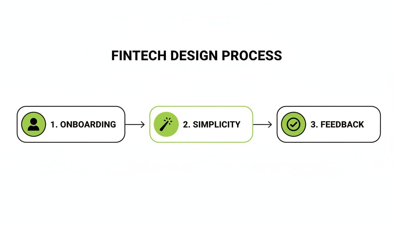
As the diagram shows, a trustworthy user journey is built on that foundation: seamless onboarding, radical simplicity in the main payment flow, and instant feedback after every action.
Beyond sending money, a few other screens are absolutely critical for building a complete and trustworthy experience. Each one has to live up to the same standard of clarity you've set.
A Transaction History screen should be a clean, scrollable list of every payment and receipt. Each line item needs to clearly show the person, the amount, and the date. Tapping on a transaction should pull up more details, like its status (pending, completed, failed) and any notes attached.
The Digital Wallet or Balance view needs to be impossible to miss. Users want to see their balance at a glance. This screen is also the natural home for "Add Cash" and "Cash Out" buttons, with straightforward flows for linking and managing bank accounts or debit cards.
Remember, every screen is an opportunity to reinforce trust. Confusing navigation or hidden information erodes user confidence quickly. Prioritize transparency in every element of your cash app design.
Finally, the Settings screen needs to be well-organized. Don't just dump everything in one long list. Group related items under logical headings like "Profile," "Security," and "Notifications." This is where people will go to manage personal info, set up Face ID or a PIN, and tweak their alerts. A clean layout here makes users feel like they're in full control of their account and their data.
In the world of fintech, trust is everything. You could have the slickest interface on the planet, but if people feel their money is at risk, they’re gone. Building a secure cash app design goes way beyond backend encryption—it’s about making security a visible, intuitive part of the user experience itself. When you get it right, these features don't add friction; they build confidence.

The trick is to fold in robust security measures so they feel natural, not like a chore. Users today just expect modern apps to have advanced protection. If you don't offer it, you’re basically signaling that you don’t take their security seriously.
Nobody wants to manually type a password every single time they open an app anymore. It’s clunky, slow, and just feels outdated. For any payment app to be taken seriously today, biometric authentication is a non-negotiable.
By making these features simple to find and enable in the settings, you’re not just securing their account; you're handing them the keys. That control is what deepens their trust in your platform. If you're looking for a solid foundation, our guide on mobile app security best practices is a great place to start.
When a user sends money, they aren't just completing a transaction; they're placing their trust in your app's ability to protect them. Your UI must constantly reassure them that this trust is well-placed.
How your app talks about security is just as important as the security itself. Vague or overly dramatic notifications can create panic, which is the last thing you want. Security alerts should be clear, calm, and actionable. A notification for a new login, for example, should plainly state the device and location, then offer a simple link: "Not you? Secure your account."
Beyond just security, genuine trust comes from building a product that works for everyone. Accessibility isn't an afterthought—it's a core piece of a trustworthy cash app design. An app that’s hard for some people to use just feels unreliable and unwelcoming.
Make sure you nail these accessibility fundamentals from the get-go:
Making these elements a priority from day one shows a real commitment to all your users. That commitment is what builds a more robust, trustworthy, and ultimately more successful app.
Let's be honest: reinventing the wheel is a developer's nightmare. This is especially true when you're tackling something as complex as a cash app design. The real goal is to get a secure, polished app into the hands of users as fast as possible—not to burn months building basic UI components that have been perfected a thousand times over. Modern tools can absolutely slash your development timeline without cutting corners on quality.

This is precisely where a framework like React Native comes into its own. It lets you write your code once and ship it to both iOS and Android, literally cutting your development workload in half. When you pair it with a tool like Expo, you can sidestep a ton of the native configuration headaches and handle builds, updates, and deployments with incredible speed.
Even with a solid cross-platform framework, building every single screen from the ground up is a monumental task. Think about it: onboarding flows, login pages, transaction histories, user settings... it all adds up.
A much smarter way to work is to start with a production-ready template. It's like getting a complete, professionally designed application skeleton on day one.
Using a pre-built template from gluestack market can be a total game-changer. You're not just starting with an empty project; you're getting dozens of screens that are already:
This approach lets you jump right into the fun part—customizing the app and building out the unique features that will make your product stand out. If this is a new concept for you, it's worth checking out how gluestack market provides a one-stop hub for React Native UI templates and can get your project moving at lightning speed.
Powering these templates is a robust component library like gluestack-ui. Think of it as your personal toolkit of high-quality, universal building blocks—buttons, inputs, alerts, modals—that guarantee a consistent look and feel across the entire app.
Let's take the critical "Send Money" screen as an example. You can piece together the whole interface in a fraction of the time using these pre-made components.
<Input /> component for the dollar amount, already configured for a numeric keyboard.<Button /> component for the main "Pay" call-to-action, styled with your primary brand color.<Alert /> dialog to confirm a successful transaction or clearly explain what went wrong.When you lean on a component library, you free yourself from the tedious work of styling and managing state for every little element. That means you can pour all your energy into the core logic and user experience that actually make your cash app special.
The financial potential of a well-made payment app is staggering. Just look at Cash App, which generated $16.25 billion in annual revenue and processed $282.9 billion in annual inflows in a recent fiscal year. You can dig into Cash App's impressive financial performance on Wikipedia for more details. This just goes to show that a thoughtfully designed app, built efficiently, can create powerful network effects that lead to massive user adoption and commercial success.
At the end of the day, using tools like React Native, Expo, and gluestack market isn't about taking shortcuts. It's about building on top of a solid, professional foundation so you can invest your time where it truly counts: creating a secure, intuitive, and trustworthy financial experience for your users.
Let's be honest: an untested design is just a collection of pretty assumptions. Before you sink a ton of time and money into development, you absolutely have to turn those static screens into an interactive prototype that real people can get their hands on. This is where you find out what actually works.
Modern design tools have made this part of the process ridiculously simple. You can easily link screens together to create clickable prototypes that walk a user through core flows like sending money, adding cash to a balance, or scrolling through transaction history. This gives test users a genuine feel for how the app will behave.
This isn't just about squashing bugs. It's about validating the entire logic of your cash app design. Does the payment flow make sense? Are the buttons and prompts crystal clear? Getting this right now will save you from monumental headaches and rework later.
Once your prototype is clicking and feeling real, the real learning begins. The whole point of user testing is to watch what people do, not just listen to what they say they'll do. Even if you're on a shoestring budget, you can get incredible insights from just a handful of informal sessions with your target audience.
Your role during these sessions is to be a guide, not a leader. Give your users a clear task, then step back and watch.
To keep things organized and ensure you’re making data-driven improvements, use a structured UI/UX design feedback form to collect feedback from users and stakeholders. It’s a game-changer for prioritizing what to fix. And if you want to make your prototypes even more convincing, check out our guide on building high-fidelity wireframes.
Gathering feedback is only step one. The real magic happens when you translate those observations into tangible design improvements. Start looking for patterns. If three out of five people get confused on the exact same screen, you’ve found a problem worth solving.
A thoughtful design that is relentlessly tested and refined is what drives massive user adoption. It's no coincidence that the most successful payment apps are also the simplest to use.
You just have to look at the explosive growth of platforms like Cash App, which reported a staggering 57 million monthly transacting active users as of early 2025. They didn't get there by accident. That’s a massive leap from just 7 million users back in 2017, and it proves that a relentless focus on simplicity and responding to user feedback is what wins the market.
Focus first on the feedback that impacts core features and, most importantly, user trust. Then, iterate. Tweak your prototype based on what you learned, and then get it back in front of users. This cycle—prototype, test, refine, repeat—is the fastest and most reliable path to building a cash app people will actually love to use.
When you're diving into the world of fintech, questions are going to come up. It's just the nature of the beast. Getting your head around the complexities of a modern cash app design can feel a bit overwhelming, but clearing up a few key things early on will save you a world of headaches later.
One of the first things people ask is about the tech stack. Do you really need to build two separate, native apps for iOS and Android? A few years ago, the answer was probably yes. Today? Not so much. Cross-platform frameworks like React Native have come a long way, letting you write your code once and ship it everywhere. You get to cut down on development time and cost without making users feel like they're using a second-rate app.
Then there's the big one: how do you get people to trust a brand-new app with their hard-earned money?
Honestly, the biggest tightrope to walk in cash app design is finding that perfect balance between iron-clad security and a super-smooth user experience. It's a constant tug-of-war. You absolutely need things like two-factor authentication, but you can't let those measures get in the way of someone quickly sending $10 to a friend for lunch.
The apps that truly nail this make their security feel almost invisible. They weave it into the experience so seamlessly—using biometrics or behind-the-scenes risk analysis—that the user feels completely safe without ever feeling slowed down. That's the goal.
Finally, a question that often comes from the more technical folks is about scale. How do you architect an app that can handle a massive amount of data—think 9 TB daily for the big players—without buckling under the pressure? The trick is to plan for that growth from the very beginning by choosing a backend that can grow with you. Leveraging cloud services and building on a microservices-based system gives you the flexibility to handle more users and more transactions without a hitch. It's all about thinking ahead so your app stays fast and reliable, no matter how big you get.
Ready to stop building from scratch and launch your app faster? gluestack market has a library of production-ready React Native templates built for a world-class user experience. Check out our accessible, themeable, and professionally crafted screens at https://market.gluestack.io.
Feb 23, 2026
4 min read
Discover powerful mobile app monetization strategies to boost your revenue. Our guide covers IAPs, ads, and subscriptions for React Native apps and beyond.

Feb 22, 2026
4 min read
A clear guide to app development cost estimation. Learn what drives costs, see budget examples, and discover strategies to build your app for less.

Feb 21, 2026
4 min read
Discover how to promote mobile application effectively with proven ASO, paid campaigns, and retention strategies.

Feb 15, 2026
4 min read
Discover how to create a prototype of a website with a practical, step-by-step guide. Explore tools, testing methods, and tips to bring your idea to life.

Feb 14, 2026
4 min read
Confused about mockups vs wireframes? Learn the key differences, when to use each, and how to streamline your React Native app development workflow.

Feb 13, 2026
4 min read
Discover how mobile apps templates accelerate development. Learn to choose, customize, and deploy high-quality React Native templates for your next project.

Feb 12, 2026
4 min read
Explore mobile application interface design with practical tips, core principles, and platform-aware workflows to craft apps users love.

Feb 10, 2026
4 min read
Learn mobile first design principles to craft fast, accessible apps that delight users. Practical tips, examples, and testing strategies.
Feb 08, 2026
4 min read
Explore the progressive web app vs native debate with our in-depth guide. We compare performance, cost, and UX to help you make the right strategic choice.
Feb 07, 2026
4 min read
Discover how React Native templates can accelerate your app development. This guide explores choosing, customizing, and deploying templates for faster launches.

Feb 05, 2026
4 min read
Discover the key differences between expo vs react native, including workflow, builds, and performance to help you pick the right path for your app.
Feb 03, 2026
4 min read
Master image with text overlay in React Native with responsive, accessible patterns. Learn expo setup, NativeWind styling, and gluestack-ui examples.

Feb 03, 2026
4 min read
Discover cross platform app development with proven strategies to build faster for iOS, Android, and the web using a single, unified codebase.
Feb 01, 2026
4 min read
Learn how to make an app for my business quickly with template-based steps from planning to launch, plus tips to scale and optimize.
Jan 31, 2026
4 min read
Ready to build an app? This guide shares practical strategies for validating your idea, choosing a tech stack, and navigating the App Store launch.
Jan 30, 2026
4 min read
Master responsive design for mobile apps with this guide on fluid layouts, breakpoints, and React Native. Build UIs that adapt perfectly to any screen.

Jan 25, 2026
4 min read
Learn how to design an Android app that stands out. This guide covers UX research, wireframing, Material Design, and the developer handoff process.

Jan 24, 2026
4 min read
Explore ui design web essentials: a complete guide to principles, responsive patterns, and workflows for intuitive, engaging web interfaces.

Jan 23, 2026
4 min read
Discover 10 essential mobile app design best practices for building exceptional cross-platform apps. Actionable tips for UI, UX, navigation, and performance.

Jan 21, 2026
4 min read
Discover how to debug React Native apps effectively. This guide covers Flipper, React DevTools, and native code troubleshooting for faster development cycles.
Jan 20, 2026
4 min read
Learn how to create app for your business with a practical, modern approach. Plan, customize, and launch with proven steps.
Jan 19, 2026
4 min read
A complete guide to mobile app development for startups. Learn how to validate your idea, build an MVP, and launch a successful app faster and more affordably.

Jan 18, 2026
4 min read
Discover how to choose the right React website template to accelerate your project. Our guide covers everything from quality checklists to deployment.
Jan 17, 2026
4 min read
Discover how to choose, customize, and deploy a React Native app template. This guide provides practical steps for launching production-ready apps faster.

Jan 16, 2026
4 min read
Discover how mobile application templates accelerate development. This guide covers how to choose, customize, and launch your app with the right foundation.

Jan 13, 2026
4 min read
Start your journey in mobile app development for beginners. This guide breaks down how to build your first cross-platform app with React Native and Expo.

Jan 12, 2026
4 min read
Explore the best react native ui libraries and compare features, performance, and ease of use to pick the right toolkit for your app.

Jan 11, 2026
4 min read
Launch your own ride-hailing service with our guide to building a production-ready Uber app clone. Learn MVP strategy, tech stacks, and backend integration.

Jan 09, 2026
4 min read
Learn how to build a personal finance dashboard with React Native. A practical guide for developers on UI design, data architecture, and production readiness.
Jan 08, 2026
4 min read
A practical guide to building a cross-platform event check in app with React Native. Learn to implement QR scanning, offline sync, and deployment.

Jan 07, 2026
4 min read
Master linear gradient React Native components with our complete guide. Learn practical techniques for Expo, bare RN, and NativeWind to build stunning UIs.

Jan 06, 2026
4 min read
Learn how to change application name in your React Native & Expo projects. This guide covers display names, package IDs, and app store listings.
Jan 05, 2026
4 min read
Discover how to monetize mobile apps with our founder's guide. Learn proven React Native strategies for ads, IAPs, and subscriptions to maximize your revenue.

Jan 04, 2026
4 min read
A practical guide on how to create a website app with a single codebase. Learn to build for web, iOS, and Android using React Native, Expo, and TypeScript.

Jan 03, 2026
4 min read
Learn how to create an app for your business with this definitive guide. Discover practical strategies for validation, development, and launch that work.

Jan 02, 2026
4 min read
Learn how to create a wireframe for a website with this practical guide. Move from initial sketches to developer-ready designs that get built right.
Jan 01, 2026
4 min read
Deciding on progressive web application vs native? This guide offers a deep comparison of performance, cost, UX, and use cases to help you choose wisely.

Dec 31, 2025
4 min read
Discover 10 mobile app security best practices for React Native. Learn to secure data, APIs, and code with actionable tips and examples for 2025.

Dec 30, 2025
4 min read
Unlock the real React Native app development cost. Our guide breaks down pricing by feature, team, and complexity to help you budget with confidence.

Dec 29, 2025
4 min read
A practical guide to master your React Native debug workflow. Learn to use Flipper, React DevTools, and Hermes to solve bugs in Expo and bare RN apps.

Dec 28, 2025
4 min read
The ultimate React Native tutorial for beginners. Learn to build beautiful cross-platform apps using a modern stack like Expo, TypeScript, and gluestack-ui.
Dec 27, 2025
4 min read
A practical guide on how to build a mobile app. Learn to go from concept to a market-ready app using templates, React Native, and proven development strategies.

Dec 26, 2025
4 min read
Discover interface design for websites with actionable tips on layout, responsiveness, and usability to boost conversions.

Dec 25, 2025
4 min read
Discover designs for apps that blend minimal aesthetics with personalization, and learn to build user-centric interfaces that boost engagement.

Dec 24, 2025
4 min read
Learn graphical interface design - essentials for mastering core principles, modern workflows, and cross-platform strategies to build intuitive, engaging UIs.

Dec 23, 2025
4 min read
Discover how high fi wireframes bridge the gap between ideas and code. Learn a practical workflow for creating, testing, and handing off effective UI designs.

Dec 22, 2025
4 min read
Discover mobile app interface design with practical principles, accessibility, and workflows that boost user engagement.

Dec 21, 2025
4 min read
Explore the top 10 UI UX design trends for 2025. Get expert insights and practical React Native tips to build next-gen cross-platform apps that stand out.

Dec 20, 2025
4 min read
Discover how mobile app templates accelerate development from idea to launch. Learn to select, customize, and deploy templates for a faster time to market.

Dec 18, 2025
4 min read
Explore the best react native ui libraries to accelerate mobile development with performance, theming, and accessibility. Expert tips inside.
Dec 16, 2025
4 min read
Master React Native PDF handling. Learn to generate, view, and share PDFs with practical code examples, library comparisons, and performance tips.

Dec 15, 2025
4 min read
A practical guide to choosing the right React Native component library. Learn how to evaluate options, avoid common pitfalls, and build apps faster.

Dec 14, 2025
4 min read
Find the perfect React Native UI library for your project. This guide compares top libraries, selection criteria, and customization strategies.

Dec 13, 2025
4 min read
Learn how to change app name in React Native and Expo. Our guide covers display names, bundle IDs, and store listings for iOS and Android projects.

Dec 12, 2025
4 min read
Discover the best React Native component library for your next project. We compare top libraries on performance, customization, and real-world use cases.

Dec 11, 2025
4 min read
Discover how to choose the right React Native UI kit. This guide covers top kits, selection criteria, and customization to accelerate your app development.

Dec 10, 2025
4 min read
Explore our in-depth guide to find the best React Native UI library. We compare top contenders to help you choose the right fit for your project.
Dec 09, 2025
4 min read
Discover a practical approach to building apps with React Native. This guide covers setup, UI, state management, and testing to help you ship great apps.

Dec 08, 2025
4 min read
android login with facebook: Learn to set up the Facebook SDK, manage tokens, and implement secure authentication across native Android, cross-platform apps.

Dec 07, 2025
4 min read
Master the alert in React Native. Learn to handle platform differences, build custom modals, and apply best practices for a seamless user experience.
Dec 06, 2025
4 min read
keyboardavoidingview react native: Master keyboard handling with KeyboardAvoidingView across iOS, Android, Expo, and TypeScript.
Dec 05, 2025
4 min read
A practical guide to implementing a React Native PDF viewer. Learn to compare libraries, handle native setup, and troubleshoot common issues with real code.

Dec 04, 2025
4 min read
how to validate startup idea: learn proven methods like customer interviews, MVPs, and metrics to confirm market fit.

Dec 03, 2025
4 min read
how to make app like uber: Learn core features, tech stack, development steps, testing, and launch tips.

Dec 02, 2025
4 min read
Build a rock-solid React Native setup. This guide covers Expo vs. Bare workflows, TypeScript, pnpm monorepos, NativeWind, and deployment strategies.

Dec 01, 2025
4 min read
A practical guide to Stripe React Native integration. Learn to set up your server, build payment UIs, handle webhooks, and launch secure mobile payments.

Nov 30, 2025
4 min read
Learn how to master push notifications in React Native. This guide covers setup, best practices, and advanced techniques for engaging your users.

Nov 29, 2025
4 min read
Build powerful location-based apps with our practical guide to react native with google maps. Get setup guides, pro tips, and best practices for iOS & Android.

Nov 28, 2025
4 min read
Explore deep linking react native with a practical guide to configuring URL schemes, universal links, navigation, and testing for Expo and bare apps.

Nov 28, 2025
4 min read
A practical guide to building a scalable React Native design system. Learn to implement tokens, theming, and tools like NativeWind and gluestack-ui.

Nov 26, 2025
4 min read
Learn why react native expo templates speed up your projects with ready-made patterns and practical tips.

Nov 25, 2025
4 min read
Discover how to improve developer productivity with actionable strategies for workflow, tooling, and culture. A practical guide for software engineering teams.

Nov 24, 2025
4 min read
Discover the best cross platform app development tools. Compare top frameworks like Flutter and React Native to build and ship apps faster.

Nov 23, 2025
4 min read
This Expo React Native tutorial provides a hands-on guide to building cross-platform apps. Learn setup, styling with NativeWind, navigation, and deployment.

Nov 22, 2025
4 min read
Build beautiful UIs faster with this guide to Tailwind CSS React Native. Learn setup, styling, and advanced techniques with NativeWind for mobile apps.
Nov 21, 2025
4 min read
Explore our curated list of 7 top-tier React Native app examples. Discover production-ready templates and resources to build your next app faster.
Mar 19, 2025
4 min read
gluestack market offers React Native UI templates to accelerate development. Get customizable, production-ready React Native app templates and Ui kit, some free. Build faster & smarter today!