Jan 23, 2026

4 min read


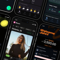
In 2026, the mobile app market is more saturated than ever, and user expectations are at an all-time high. A functional app is no longer enough; users demand intuitive, beautiful, and performant experiences that seamlessly integrate into their daily lives. Getting the design right from the start is the difference between a top-charting success and an app that gets uninstalled within minutes. This guide dives deep into 10 critical mobile app design best practices that are essential for building successful applications.
We'll move beyond generic advice and provide specific, actionable insights you can implement immediately. This roundup is crafted for developers and product teams building with modern cross-platform tools like React Native, Expo, and NativeWind, emphasizing efficiency without sacrificing quality. For those looking to accelerate development even further, the principles discussed here are foundational to creating or using production-ready templates, such as those found on a UI marketplace like gluestack market.
This article will equip you with a comprehensive checklist covering the most vital aspects of app creation today. You will learn how to master:
By focusing on these core pillars, you will be prepared to build an application that not only meets but exceeds user expectations, ensuring it stands out in a competitive landscape. Let's explore the essential practices that will define your app's success.
In modern cross-platform development, responsive design is a non-negotiable best practice. It’s the art of creating a single user interface that fluidly adapts to various screen sizes, resolutions, and orientations. This ensures your application delivers a consistent and optimal user experience, whether it's on a compact smartphone, a large tablet, or a web browser. For React Native developers, this means building a UI that looks and feels native on every device without writing separate codebases.

A responsive layout directly impacts usability and market reach. Consider a finance app like Mint; its dashboard must be just as readable on a 6.1-inch iPhone as it is on a 12.9-inch iPad Pro. Similarly, fitness apps must adapt workout displays from a small smartwatch screen to a tablet. Without responsive design, users on certain devices will face distorted layouts, unreadable text, and inaccessible controls, leading to frustration and app abandonment.
For developers using Expo and React Native, frameworks like NativeWind (which brings Tailwind CSS to mobile) and UI kits like gluestack-ui simplify the process.
sm:, md:, lg:) to apply styles conditionally based on screen width. You can define a component to be a flex column on small screens (flex-col) and switch to a flex row on medium screens and up (md:flex-row).p={{ base: '$2', md: '$4' }}, which automatically applies different spacing values for mobile (base) and larger screens (md).Unlike desktop applications that rely on precise mouse clicks, mobile interfaces are governed by the less-exact nature of human fingertips. Touch-friendly interface design is the practice of creating interactive elements with sufficient size, spacing, and feedback to accommodate this reality. It ensures that every button, link, and form field is easy to tap accurately, preventing user frustration and improving overall usability. This is a fundamental aspect of mobile app design best practices, as it directly impacts how users interact with your core features.

A poorly designed touch interface leads directly to user errors and abandonment. Imagine a dating app where the "like" and "dislike" buttons are too close together, or a music app where the pause button is too small to hit while jogging. These minor flaws create major friction. By prioritizing generous touch targets, developers ensure their app is accessible and enjoyable for everyone, including users with larger fingers or those with motor impairments. For anyone building a production app, especially with templates from the gluestack market, getting this right is critical for user satisfaction and retention. You can explore more detailed principles of a strong mobile app interface design to build a solid foundation.
Implementing touch-friendly controls in React Native and Expo is straightforward by following established guidelines and using the right tools.
minWidth and minHeight styles on components like Pressable or TouchableOpacity.m='$2' or gap='$3' on a container.onPress state to change a button’s background color or scale it slightly. For critical actions, integrate haptic feedback using a library like react-native-haptic-feedback to provide a subtle vibration, enhancing the tactile experience.On a mobile screen, every pixel is prime real estate. This limitation demands a thoughtful information hierarchy and simplified navigation. The goal is to help users find features and content quickly without overwhelming them, using established patterns like bottom tabs, drawer menus, or stack navigation. A clear, intuitive path through your app is one of the most critical mobile app design best practices for user retention.
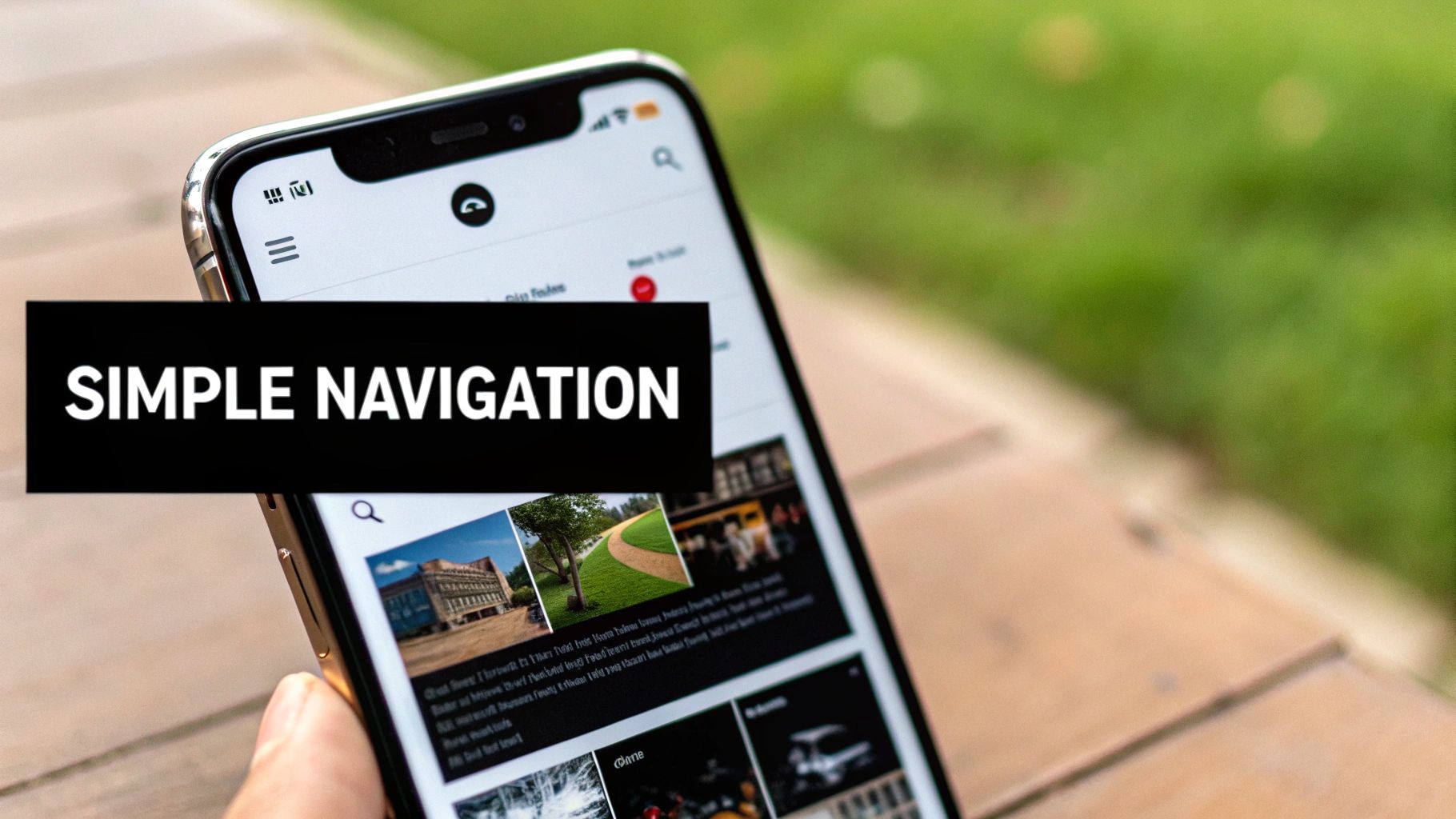
Complex navigation leads to high cognitive load, causing users to get lost or frustrated. An effective information architecture ensures that users can accomplish their primary goals in the fewest taps possible. For example, a fitness app like Strava places core actions like "Home," "Maps," and "Record" in a persistent bottom tab bar for immediate access. This reduces friction and makes the app feel effortless to use. Poor navigation, on the other hand, is a direct path to app abandonment.
For React Native developers, libraries like React Navigation are essential tools. When building your UI, focus on established, user-friendly patterns.
In the competitive mobile landscape, performance isn't just a technical detail; it's a core component of mobile app design best practices. Users expect apps to be instantaneous, with screens that load in a blink and interactions that feel fluid. A slow or janky app is one of the quickest ways to earn an uninstall, making performance optimization a critical priority from day one. For developers building with React Native and Expo, this means a deliberate focus on efficient code, asset management, and data handling.
Poor performance directly translates to a poor user experience. Imagine a weather app that takes ten seconds to show today's forecast or a finance app where the dashboard stutters while scrolling. These delays create friction and erode user trust. High-performing apps feel reliable and professional, encouraging longer engagement sessions and higher retention rates. Conversely, an app that freezes, drains the battery, or takes too long to load is quickly abandoned for a faster alternative.
The ecosystem around Expo and React Native provides powerful tools for building high-performance applications. By leveraging modern JavaScript features and platform-specific optimizations, developers can ensure a smooth experience.
React.lazy() and <Suspense> to load screens and components only when they are needed. This significantly reduces the initial bundle size and shortens the app's startup time, getting the user to the first screen faster.expo-image for optimized image caching and loading.Accessibility, often abbreviated as "A11y," is the practice of designing and developing applications that are usable by everyone, including people with disabilities. This is not an optional feature but a foundational aspect of inclusive and effective mobile app design best practices. It involves building interfaces that support assistive technologies like screen readers, ensuring sufficient color contrast for visual impairments, and providing clear navigation for all users.

Integrating accessibility from the start is both an ethical responsibility and a smart business decision. It expands your potential user base and is often a legal requirement. For example, a finance app must use a high-contrast dark mode to be readable for users with visual impairments. Similarly, a meditation app becomes unusable for blind users if its guided sessions are not compatible with screen readers. Neglecting accessibility alienates a significant portion of the population and can lead to a poor user experience for everyone.
For React Native developers, building accessible apps is more achievable than ever, especially when using modern UI libraries. Many pre-built components handle the complex parts for you, allowing you to focus on the overall user experience.
accessibilityLabel="Open settings"), and provide alt text for all images. This context is vital for users who cannot see the screen.Often referred to as "negative space," white space is the unmarked area between elements in a design. It's a fundamental principle of mobile app design best practices that dictates layout breathing room, content separation, and overall aesthetic clarity. A strong visual hierarchy, created using size, color, and font weight, directs the user’s eye to the most important information first, creating an intuitive and effortless journey through the app.
Effective use of white space and hierarchy reduces cognitive load, making an interface feel less cluttered and more premium. Consider the minimalist checkout flow of an app like Stripe or the clean, focused interface of a meditation app like Calm. The generous spacing guides users' attention to calls-to-action and critical content, preventing them from feeling overwhelmed. Without this, an app can appear busy and chaotic, making it difficult for users to find what they need and complete tasks efficiently.
For developers using Expo and React Native, modern styling tools and UI kits provide built-in systems to enforce consistency. This is where frameworks like NativeWind and UI kits like gluestack-ui become invaluable.
p-4 (padding 16px) or m-6 (margin 24px) make this easy to enforce across your entire application.One of the most critical mobile app design best practices is balancing a consistent brand identity with a native platform feel. Users have ingrained expectations for how apps should behave on their devices; iOS apps should feel like iOS apps, and Android apps should feel like Android apps. While cross-platform frameworks like React Native allow for massive code sharing, ignoring platform-specific conventions can create a disjointed and unfamiliar user experience, ultimately hindering adoption.
Respecting platform conventions builds trust and reduces the user's cognitive load. When an app uses familiar navigation patterns, gestures, and animations, users don't have to learn a new interface from scratch. For example, Spotify on iOS utilizes a native swipe-back gesture, while its Android counterpart responds to the hardware/software back button. Similarly, Instagram employs subtle fade transitions on iOS but uses slide transitions that align with Android's Material Design. Failing to adhere to these norms can make your app feel foreign and less intuitive.
For developers using Expo and React Native, achieving a native feel without duplicating effort is entirely possible with the right tools and techniques. UI kits like gluestack-ui are invaluable, as many of their components automatically adapt their appearance and behavior based on the operating system.
Platform.select() for granular control: React Native’s built-in Platform module is perfect for applying minor, platform-specific styles. You can use Platform.select() to assign different font weights, shadow effects, or margins for iOS and Android within the same style object.The first few minutes a user spends in your app are the most critical. An effective onboarding and first-time user experience (FTUE) is designed to guide users, showcase core value, and reduce initial friction. This process includes everything from welcome screens and interactive tutorials to the progressive disclosure of advanced features, ensuring users feel confident and motivated to continue. For any app, this is a make-or-break mobile app design best practice.
A poor onboarding experience is a primary cause of app uninstalls. If users are confused or overwhelmed, they won't stick around to discover your app's benefits. Language learning app Duolingo excels here by immediately immersing users in a playful, interactive first lesson. Similarly, meditation apps like Headspace often provide a free introductory session as part of their onboarding, demonstrating value before asking for a commitment. This initial positive interaction is key to user activation and long-term retention.
For developers, the goal is to create a seamless flow that feels helpful, not restrictive. Authentication and profile setup screens, like those found in gluestack market templates, are an excellent starting point for building a structured onboarding sequence.
Mobile internet connections are often unreliable, dropping in subways, elevators, or rural areas. A core principle of modern mobile app design best practices is ensuring the app remains useful even without a stable network. This involves designing for offline functionality and graceful degradation, where the app either works completely offline by caching data or transparently limits features until connectivity is restored, preventing user frustration.
An app that freezes or shows an endless spinner when the network drops provides a poor user experience. For many app categories, offline access is not just a feature but a necessity. Consider music apps like Spotify, where users expect to listen to downloaded playlists during flights. Likewise, navigation apps like Google Maps must provide access to cached map data when a signal is lost. By planning for offline states, you create a resilient and dependable application that retains users.
For React Native developers, several tools and techniques make implementing robust offline support straightforward. The goal is to cache data, queue actions, and clearly communicate the app's status to the user.
expo-sqlite library.react-native-netinfo library is essential for detecting changes in network connectivity. Use it to trigger data synchronization, display an "Offline Mode" banner, or disable features that require an internet connection.Intuition is a starting point, but data is the North Star for effective mobile app design. A data-driven approach means validating every design choice with real user analytics, A/B testing, and research instead of relying on assumptions. This practice of continuous optimization, powered by metrics, is what separates successful apps from those that stagnate. It’s about building a feedback loop where you measure user behavior, learn from it, and iterate to create compounding improvements over time.
Without data, you are designing in the dark. For example, a dating app might find that data shows video profiles increase matches by 30%, a critical insight for prioritizing features. A finance app might use heatmaps to discover that users are abandoning the checkout process at the address field, pinpointing a specific friction point to fix. These insights are crucial for improving key metrics like retention, conversion, and time-in-app, directly impacting your app's success. This is one of the most vital mobile app design best practices for achieving product-market fit.
For React Native and Expo developers, integrating analytics tools is straightforward and should be done from day one. This allows you to gather baseline data and make informed decisions quickly.
app_open, user_signup, feature_usage, and purchase to understand the user journey.| Feature | Implementation Complexity 🔄 | Resource Requirements ⚡ | Expected Outcomes 📊 | Ideal Use Cases | Key Advantages ⭐💡 |
|---|---|---|---|---|---|
| Responsive Design for Multiple Screen Sizes | High 🔄 — breakpoints, orientation, safe areas | Moderate ⚡ — design system, device testing matrix | 📊 Wider device reach; consistent UX across screens | Multi-device apps (phone, tablet, web), dashboards | ⭐ Reduces platform-specific code; 💡 Use NativeWind breakpoints, mobile-first |
| Touch-Friendly Interface Design | Low–Medium 🔄 — touch targets, spacing, feedback | Low ⚡ — design rules, simple haptics integration | 📊 Fewer input errors; higher accessibility and retention | Mobile-first apps, e‑commerce, media players | ⭐ Improves usability; 💡 Follow 44/48pt rules and test one-handed |
| Simplified Navigation & Information Architecture | Medium 🔄 — IA definition, nav patterns | Low–Moderate ⚡ — nav libraries, user testing | 📊 Faster discovery; lower cognitive load and churn | Feature-rich apps (finance, fitness, social) | ⭐ Easier onboarding; 💡 Limit bottom tabs to 3–5, use clear icons |
| Fast Performance & Efficient Loading | High 🔄 — profiling, code-splitting, rendering | High ⚡ — tooling, monitoring, engineering time | 📊 Better retention, app store rankings, lower bounce | Content-heavy, real-time, streaming apps | ⭐ Critical for success; 💡 Use lazy loading, compress assets, set budgets |
| Accessibility (A11y) as a Core Requirement | Medium–High 🔄 — ARIA, focus, contrast management | Moderate ⚡ — testing tools, accessibility expertise | 📊 Expands audience; lowers legal/compliance risk | All public apps; regulated sectors and broad audiences | ⭐ Improves UX for all; 💡 Test VoiceOver/TalkBack, maintain 4.5:1 contrast |
| Smart Use of White Space & Visual Hierarchy | Low 🔄 — spacing scale, typography system | Low ⚡ — design tokens and style guide | 📊 Better readability; perceived premium quality | Content-driven and premium-feel interfaces | ⭐ Reduces clutter; 💡 Define spacing scale (8px base) and stick to it |
| Platform Consistency with Native Feel | High 🔄 — platform-specific behaviors and testing | Moderate–High ⚡ — dual QA, platform expertise | 📊 Higher ratings; users feel familiar and confident | Apps seeking native polish and platform features | ⭐ Feels native to users; 💡 Use Platform.select and platform-aware components |
| Effective Onboarding & First-Time UX | Medium 🔄 — flows, contextual permissions, tutorials | Moderate ⚡ — content, analytics, A/B testing | 📊 Improved Day 1/7 retention and activation | Apps with complex features or high churn risk | ⭐ Boosts conversion; 💡 Keep 3–5 screens, allow skip, A/B test flows |
| Offline Functionality & Graceful Degradation | High 🔄 — caching, sync, conflict resolution | High ⚡ — storage libs, sync logic, extensive testing | 📊 Higher engagement in poor networks; perceived speed boost | Music, maps, fitness, any offline-critical app | ⭐ Increases reliability; 💡 Use SQLite/AsyncStorage, queue mutations, show offline UI |
| Data-Driven Design & Continuous Optimization | Medium–High 🔄 — analytics, experiments, analysis | Moderate–High ⚡ — analytics tools, privacy/compliance | 📊 Validated improvements; measurable ROI over time | Growth-focused, monetized apps, MVP iteration | ⭐ Reduces guesswork; 💡 Track key events, run A/B tests, combine qual + quant |
Navigating the complex landscape of modern app creation requires more than just a great idea; it demands a commitment to excellence in execution. The journey from concept to a successful, user-loved application is paved with the deliberate application of mobile app design best practices. We've explored ten foundational pillars, from the non-negotiable requirement of responsive layouts and touch-friendly interfaces to the critical importance of accessibility and performance optimization. These aren't just items on a pre-launch checklist; they are the very essence of a user-centric design philosophy that separates fleeting novelties from enduring digital products.
Implementing these principles consistently is what transforms a functional app into a delightful one. Think of each practice as an interconnected gear in a finely tuned machine. A simplified navigation system is ineffective if performance is slow. A beautiful visual hierarchy is lost if it isn't accessible to all users. A seamless onboarding flow means little if the app doesn't function reliably offline. True mastery lies in understanding and balancing these elements to create a cohesive, intuitive, and enjoyable experience for every user, every time.
The path to integrating these best practices can be steep, especially for indie developers or startups operating with lean teams and tight deadlines. The challenge often lies in translating theoretical knowledge into practical, bug-free code that works seamlessly across iOS, Android, and the web. This is where strategic decisions about your development stack and tooling become paramount. Building everything from scratch is a noble endeavor, but often an inefficient one that diverts precious resources away from your core business logic and unique value proposition.
Adopting a design system or leveraging pre-built components is a powerful accelerator. It ensures consistency, enforces accessibility standards, and bakes performance considerations directly into your workflow. This approach doesn't mean sacrificing creativity; it means building upon a solid, professionally-engineered foundation so you can focus your creative energy where it matters most. As you embark on the journey of creating exceptional mobile applications, it's beneficial to explore the wider field of Application Development to gain a comprehensive understanding of the entire process, from initial design to final deployment and maintenance.
Mastering mobile app design best practices is an ongoing process of learning, implementing, and iterating. To put these concepts into action, consider the following steps:
By internalizing these principles and applying them with discipline, you are not just designing an app; you are engineering an experience. You are building trust, fostering engagement, and creating a product that users will not only appreciate but will integrate into their daily lives. The market is crowded, but there is always room for quality, and that quality begins with a deep-seated commitment to these fundamental mobile app design best practices.
Ready to ship a beautiful, high-performance, and accessible cross-platform app without spending months building from the ground up? Explore gluestack market to discover production-ready starter kits and templates built on these very principles. Kickstart your next project with a solid foundation and focus on what makes your app unique by visiting gluestack market today.

Feb 23, 2026
4 min read
Discover powerful mobile app monetization strategies to boost your revenue. Our guide covers IAPs, ads, and subscriptions for React Native apps and beyond.

Feb 22, 2026
4 min read
A clear guide to app development cost estimation. Learn what drives costs, see budget examples, and discover strategies to build your app for less.

Feb 21, 2026
4 min read
Discover how to promote mobile application effectively with proven ASO, paid campaigns, and retention strategies.

Feb 15, 2026
4 min read
Discover how to create a prototype of a website with a practical, step-by-step guide. Explore tools, testing methods, and tips to bring your idea to life.

Feb 14, 2026
4 min read
Confused about mockups vs wireframes? Learn the key differences, when to use each, and how to streamline your React Native app development workflow.

Feb 13, 2026
4 min read
Discover how mobile apps templates accelerate development. Learn to choose, customize, and deploy high-quality React Native templates for your next project.

Feb 12, 2026
4 min read
Explore mobile application interface design with practical tips, core principles, and platform-aware workflows to craft apps users love.

Feb 10, 2026
4 min read
Learn mobile first design principles to craft fast, accessible apps that delight users. Practical tips, examples, and testing strategies.
Feb 08, 2026
4 min read
Explore the progressive web app vs native debate with our in-depth guide. We compare performance, cost, and UX to help you make the right strategic choice.
Feb 07, 2026
4 min read
Discover how React Native templates can accelerate your app development. This guide explores choosing, customizing, and deploying templates for faster launches.

Feb 05, 2026
4 min read
Discover the key differences between expo vs react native, including workflow, builds, and performance to help you pick the right path for your app.
Feb 03, 2026
4 min read
Master image with text overlay in React Native with responsive, accessible patterns. Learn expo setup, NativeWind styling, and gluestack-ui examples.

Feb 03, 2026
4 min read
Discover cross platform app development with proven strategies to build faster for iOS, Android, and the web using a single, unified codebase.
Feb 01, 2026
4 min read
Learn how to make an app for my business quickly with template-based steps from planning to launch, plus tips to scale and optimize.

Jan 31, 2026
4 min read
Ready to build an app? This guide shares practical strategies for validating your idea, choosing a tech stack, and navigating the App Store launch.
Jan 30, 2026
4 min read
Master responsive design for mobile apps with this guide on fluid layouts, breakpoints, and React Native. Build UIs that adapt perfectly to any screen.

Jan 25, 2026
4 min read
Learn how to design an Android app that stands out. This guide covers UX research, wireframing, Material Design, and the developer handoff process.

Jan 24, 2026
4 min read
Explore ui design web essentials: a complete guide to principles, responsive patterns, and workflows for intuitive, engaging web interfaces.

Jan 21, 2026
4 min read
Discover how to debug React Native apps effectively. This guide covers Flipper, React DevTools, and native code troubleshooting for faster development cycles.

Jan 20, 2026
4 min read
Learn how to create app for your business with a practical, modern approach. Plan, customize, and launch with proven steps.

Jan 19, 2026
4 min read
A complete guide to mobile app development for startups. Learn how to validate your idea, build an MVP, and launch a successful app faster and more affordably.

Jan 18, 2026
4 min read
Discover how to choose the right React website template to accelerate your project. Our guide covers everything from quality checklists to deployment.
Jan 17, 2026
4 min read
Discover how to choose, customize, and deploy a React Native app template. This guide provides practical steps for launching production-ready apps faster.

Jan 16, 2026
4 min read
Discover how mobile application templates accelerate development. This guide covers how to choose, customize, and launch your app with the right foundation.

Jan 13, 2026
4 min read
Start your journey in mobile app development for beginners. This guide breaks down how to build your first cross-platform app with React Native and Expo.

Jan 12, 2026
4 min read
Explore the best react native ui libraries and compare features, performance, and ease of use to pick the right toolkit for your app.

Jan 11, 2026
4 min read
Launch your own ride-hailing service with our guide to building a production-ready Uber app clone. Learn MVP strategy, tech stacks, and backend integration.

Jan 10, 2026
4 min read
Master modern cash app design with this guide. Learn the UI/UX, security, and React Native strategies needed to build a fintech app that users trust and love.

Jan 09, 2026
4 min read
Learn how to build a personal finance dashboard with React Native. A practical guide for developers on UI design, data architecture, and production readiness.

Jan 08, 2026
4 min read
A practical guide to building a cross-platform event check in app with React Native. Learn to implement QR scanning, offline sync, and deployment.

Jan 07, 2026
4 min read
Master linear gradient React Native components with our complete guide. Learn practical techniques for Expo, bare RN, and NativeWind to build stunning UIs.

Jan 06, 2026
4 min read
Learn how to change application name in your React Native & Expo projects. This guide covers display names, package IDs, and app store listings.

Jan 05, 2026
4 min read
Discover how to monetize mobile apps with our founder's guide. Learn proven React Native strategies for ads, IAPs, and subscriptions to maximize your revenue.

Jan 04, 2026
4 min read
A practical guide on how to create a website app with a single codebase. Learn to build for web, iOS, and Android using React Native, Expo, and TypeScript.

Jan 03, 2026
4 min read
Learn how to create an app for your business with this definitive guide. Discover practical strategies for validation, development, and launch that work.

Jan 02, 2026
4 min read
Learn how to create a wireframe for a website with this practical guide. Move from initial sketches to developer-ready designs that get built right.
Jan 01, 2026
4 min read
Deciding on progressive web application vs native? This guide offers a deep comparison of performance, cost, UX, and use cases to help you choose wisely.

Dec 31, 2025
4 min read
Discover 10 mobile app security best practices for React Native. Learn to secure data, APIs, and code with actionable tips and examples for 2025.

Dec 30, 2025
4 min read
Unlock the real React Native app development cost. Our guide breaks down pricing by feature, team, and complexity to help you budget with confidence.

Dec 29, 2025
4 min read
A practical guide to master your React Native debug workflow. Learn to use Flipper, React DevTools, and Hermes to solve bugs in Expo and bare RN apps.

Dec 28, 2025
4 min read
The ultimate React Native tutorial for beginners. Learn to build beautiful cross-platform apps using a modern stack like Expo, TypeScript, and gluestack-ui.

Dec 27, 2025
4 min read
A practical guide on how to build a mobile app. Learn to go from concept to a market-ready app using templates, React Native, and proven development strategies.

Dec 26, 2025
4 min read
Discover interface design for websites with actionable tips on layout, responsiveness, and usability to boost conversions.

Dec 25, 2025
4 min read
Discover designs for apps that blend minimal aesthetics with personalization, and learn to build user-centric interfaces that boost engagement.

Dec 24, 2025
4 min read
Learn graphical interface design - essentials for mastering core principles, modern workflows, and cross-platform strategies to build intuitive, engaging UIs.

Dec 23, 2025
4 min read
Discover how high fi wireframes bridge the gap between ideas and code. Learn a practical workflow for creating, testing, and handing off effective UI designs.

Dec 22, 2025
4 min read
Discover mobile app interface design with practical principles, accessibility, and workflows that boost user engagement.

Dec 21, 2025
4 min read
Explore the top 10 UI UX design trends for 2025. Get expert insights and practical React Native tips to build next-gen cross-platform apps that stand out.

Dec 20, 2025
4 min read
Discover how mobile app templates accelerate development from idea to launch. Learn to select, customize, and deploy templates for a faster time to market.

Dec 18, 2025
4 min read
Explore the best react native ui libraries to accelerate mobile development with performance, theming, and accessibility. Expert tips inside.
Dec 16, 2025
4 min read
Master React Native PDF handling. Learn to generate, view, and share PDFs with practical code examples, library comparisons, and performance tips.
Dec 15, 2025
4 min read
A practical guide to choosing the right React Native component library. Learn how to evaluate options, avoid common pitfalls, and build apps faster.

Dec 14, 2025
4 min read
Find the perfect React Native UI library for your project. This guide compares top libraries, selection criteria, and customization strategies.

Dec 13, 2025
4 min read
Learn how to change app name in React Native and Expo. Our guide covers display names, bundle IDs, and store listings for iOS and Android projects.

Dec 12, 2025
4 min read
Discover the best React Native component library for your next project. We compare top libraries on performance, customization, and real-world use cases.

Dec 11, 2025
4 min read
Discover how to choose the right React Native UI kit. This guide covers top kits, selection criteria, and customization to accelerate your app development.

Dec 10, 2025
4 min read
Explore our in-depth guide to find the best React Native UI library. We compare top contenders to help you choose the right fit for your project.
Dec 09, 2025
4 min read
Discover a practical approach to building apps with React Native. This guide covers setup, UI, state management, and testing to help you ship great apps.

Dec 08, 2025
4 min read
android login with facebook: Learn to set up the Facebook SDK, manage tokens, and implement secure authentication across native Android, cross-platform apps.

Dec 07, 2025
4 min read
Master the alert in React Native. Learn to handle platform differences, build custom modals, and apply best practices for a seamless user experience.
Dec 06, 2025
4 min read
keyboardavoidingview react native: Master keyboard handling with KeyboardAvoidingView across iOS, Android, Expo, and TypeScript.

Dec 05, 2025
4 min read
A practical guide to implementing a React Native PDF viewer. Learn to compare libraries, handle native setup, and troubleshoot common issues with real code.

Dec 04, 2025
4 min read
how to validate startup idea: learn proven methods like customer interviews, MVPs, and metrics to confirm market fit.

Dec 03, 2025
4 min read
how to make app like uber: Learn core features, tech stack, development steps, testing, and launch tips.

Dec 02, 2025
4 min read
Build a rock-solid React Native setup. This guide covers Expo vs. Bare workflows, TypeScript, pnpm monorepos, NativeWind, and deployment strategies.

Dec 01, 2025
4 min read
A practical guide to Stripe React Native integration. Learn to set up your server, build payment UIs, handle webhooks, and launch secure mobile payments.

Nov 30, 2025
4 min read
Learn how to master push notifications in React Native. This guide covers setup, best practices, and advanced techniques for engaging your users.

Nov 29, 2025
4 min read
Build powerful location-based apps with our practical guide to react native with google maps. Get setup guides, pro tips, and best practices for iOS & Android.

Nov 28, 2025
4 min read
Explore deep linking react native with a practical guide to configuring URL schemes, universal links, navigation, and testing for Expo and bare apps.

Nov 28, 2025
4 min read
A practical guide to building a scalable React Native design system. Learn to implement tokens, theming, and tools like NativeWind and gluestack-ui.

Nov 26, 2025
4 min read
Learn why react native expo templates speed up your projects with ready-made patterns and practical tips.

Nov 25, 2025
4 min read
Discover how to improve developer productivity with actionable strategies for workflow, tooling, and culture. A practical guide for software engineering teams.

Nov 24, 2025
4 min read
Discover the best cross platform app development tools. Compare top frameworks like Flutter and React Native to build and ship apps faster.

Nov 23, 2025
4 min read
This Expo React Native tutorial provides a hands-on guide to building cross-platform apps. Learn setup, styling with NativeWind, navigation, and deployment.

Nov 22, 2025
4 min read
Build beautiful UIs faster with this guide to Tailwind CSS React Native. Learn setup, styling, and advanced techniques with NativeWind for mobile apps.

Nov 21, 2025
4 min read
Explore our curated list of 7 top-tier React Native app examples. Discover production-ready templates and resources to build your next app faster.
Mar 19, 2025
4 min read
gluestack market offers React Native UI templates to accelerate development. Get customizable, production-ready React Native app templates and Ui kit, some free. Build faster & smarter today!