Let's be honest, in today's jam-packed app stores, responsive design isn't just a nice-to-have; it's the bedrock of a successful app. It’s the magic that lets a single app deliver a flawless experience on every device imaginable, from the smallest phone to the biggest tablet. This isn't a luxury anymore—it's the bare minimum for reaching everyone you want to reach.
Picture your app's user interface like water. It should flow and adapt to whatever container it's poured into, without you having to force it. For developers and startups, this way of thinking is a total game-changer. It means you can write one smart codebase that just works—delivering a consistent, top-notch experience on iOS, Android, and even the web. No more tripling your development time and budget for different platforms.
This "build once, deploy everywhere" mindset is your ticket to competing in the big leagues. As of the second quarter of 2025, mobile devices drove a massive 62.54% of all global website traffic, and that's not even counting tablets. The message is loud and clear: people are on their phones, and your app needs to meet them there with an interface that feels right.
A responsive approach does more than just save you money and headaches. It directly shapes how users feel about your app, which has a huge impact on your growth. When your app looks and feels perfect on any screen, you start to see some serious benefits:
When we talk about the user experience, the expectations on mobile are wildly different from desktop. The context is completely different, and understanding this is key to building something people will love.
This table gives a quick rundown of why a one-size-fits-all approach just doesn't work:
| Metric | Mobile Devices | Desktop Devices |
|---|---|---|
| Session Length | Short, frequent bursts (1-2 minutes) | Longer, more focused sessions (10+ minutes) |
| Interaction | Touch, swipe, gestures | Mouse clicks, keyboard input |
| Connectivity | Often variable (Wi-Fi, 4G/5G) | Generally stable and fast |
| Screen Real Estate | Extremely limited; focus is critical | Abundant; can display more info at once |
| User Goal | Quick, task-oriented (e.g., check message) | In-depth research, content creation |
As you can see, mobile users are often on the go, dealing with flaky internet, and looking to get something done fast. Your design has to respect that reality.
The whole idea is simple: meet users where they are. A responsive app doesn't try to cram a desktop experience onto a tiny screen. It respects the user's device choice by delivering an experience that feels perfectly optimized, every single time.
To really nail the fundamentals of building robust mobile apps, especially those in demanding fields, it helps to look at broader best practices. For instance, A Practical Guide to Mobile App Development for Healthcare offers great insights into creating highly reliable and adaptable interfaces.
The good news is that modern tools make this goal more realistic than ever. Solutions like React Native, especially when paired with frameworks like gluestack-ui and ready-to-go templates from gluestack market, give developers a massive head start. You can build truly responsive apps right from the beginning, without reinventing the wheel. If you want to dive deeper, check out our guide on mobile app interface design for more practical tips.
To really nail responsive design in your mobile apps, you have to stop thinking about just shrinking things down. It’s less about scaling down a big screen and more about creating a truly dynamic experience. This all rests on three core pillars that work together to make your app feel right at home, no matter what device it’s on.
First up is the idea of a fluid layout. Picture your app's screen as a piece of stretchable fabric instead of a rigid pane of glass. Instead of locking component widths with fixed pixels (like 300px wide), you use flexible units like percentages or flexbox. This lets elements grow and shrink in proportion to the screen, adapting gracefully without any weird gaps or content spilling over the edges.
The whole point is to design a single, intelligent interface that works beautifully across different platforms, just like this concept map shows.
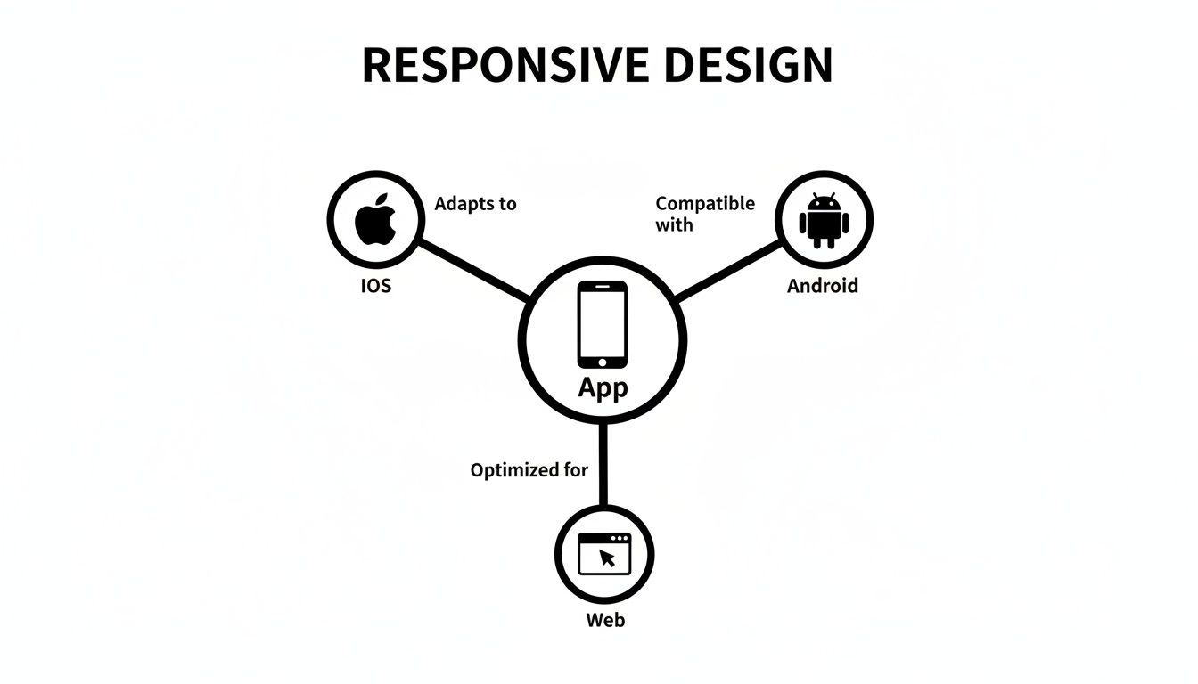
This visual really captures the goal: a central app design that intelligently branches out to give iOS, Android, and web users an experience that feels tailor-made for them.
While a fluid layout is great for handling small size changes, you need a different game plan for the big jumps—like going from a phone to a tablet. That's where breakpoints come into play. Think of them as checkpoints where your app's layout makes a significant shift to better use the extra real estate.
For instance, a list of products might be a simple single-column scroll on a phone. But once the screen width hits a certain breakpoint (say, 768 pixels), the layout can completely transform into a two or even three-column grid. This isn't just resizing; it's a strategic reorganization to make the app more usable on bigger screens.
A couple of common ways to approach this are:
A truly responsive UI doesn't just adapt; it anticipates. By using fluid layouts for the small stuff and breakpoints for the big shifts, you create an interface that feels custom-built for every single user.
The final piece of the puzzle is making sure all your elements are scalable. This means everything inside your layout—text, images, buttons—has to adapt just as smoothly. A perfect fluid grid doesn't mean much if the text inside it becomes tiny and unreadable or images turn into a pixelated mess.
This involves using relative units for your fonts so text size adjusts with the screen. For images, it means serving up different resolutions based on screen density, ensuring they look crisp without hogging bandwidth. At the end of the day, every component needs to be as flexible as the layout holding it to create a consistently polished experience.
Alright, let's get down to business and turn theory into practice. Building adaptive layouts for your app becomes surprisingly simple when you pair React Native with a utility-first framework like NativeWind. This combo lets you bake responsive logic right into your components, keeping your code clean and your UI genuinely flexible.
NativeWind essentially brings the magic of Tailwind CSS into the React Native world. This means you can use those familiar, intuitive prefixes to apply styles at specific breakpoints. Your layouts will automatically reflow, resize, and reshuffle based on the screen size. The whole idea is beautifully simple: design for mobile first, then just layer on adjustments for bigger screens.
First things first, you need to define your breakpoints inside the tailwind.config.js file. Think of these as the trigger points where your layout transforms. While NativeWind gives you some solid defaults out of the box, you have total control to tweak them to perfectly match your app's content.
Here’s a pretty standard configuration to get started:
// tailwind.config.js module.exports = { theme: { screens: { 'sm': '640px', // Small devices, like large phones 'md': '768px', // Medium devices, like tablets 'lg': '1024px', // Large devices, for web/desktop }, }, }
With this setup, you now have sm:, md:, and lg: prefixes ready to go. So, a style like md:flex-row will only kick in and apply the flex-row class once the screen width hits 768px. It’s that easy.
Let's apply this to a classic UI pattern: a product grid. On a small phone screen, we want a clean, single-column list that’s easy to scroll. But on a tablet or a larger screen, we want those same items to spread out into a multi-column grid to make better use of all that extra space.
With NativeWind, pulling this off is incredibly elegant. Check out this React Native component:
import { View, Text } from 'react-native';
const ProductCard = () => ( <View className="p-4 bg-white rounded-lg shadow-md"> <Text>Product Info</Text> </View> );
const ProductGrid = () => ( <View className="flex flex-col md:flex-row md:flex-wrap"> {/* On mobile (default), this is a column. At 'md' breakpoint, it becomes a row that wraps */} <View className="w-full p-2 md:w-1/2 lg:w-1/3"> <ProductCard /> </View> <View className="w-full p-2 md:w-1/2 lg:w-1/3"> <ProductCard /> </View> <View className="w-full p-2 md:w-1/2 lg:w-1/3"> <ProductCard /> </View> </View> );
See what's happening here? Each product card wrapper starts with w-full, stacking them neatly in a single column. But once the screen hits the md breakpoint (768px), the width swaps to md:w-1/2, creating a two-column grid. Go even wider to the lg breakpoint (1024px), and it shifts again to lg:w-1/3 for a three-column layout.
This all happens on the fly without a single line of complex conditional logic in your JavaScript. If you want to really get the hang of these techniques, you can explore a deeper dive into using Tailwind CSS with React Native.
When you're planning for so many different devices, it pays to think about the bigger picture. A smart, responsive design is a cornerstone of successful cross-platform app development, making sure your users get a consistent, high-quality experience no matter what device they're on. This utility-first approach doesn't just simplify your code; it makes your app's adaptive behavior a breeze to read and maintain.
Building a fully responsive app from the ground up demands a ton of meticulous work. But here’s the thing: you don’t have to build every single component from scratch. A powerful strategy to slash your development time—while still shipping a high-quality, adaptive experience—is to lean on production-ready UI kits and templates.
Think of it like baking a cake. You could measure out the flour, sugar, and cocoa yourself, or you could use a premium cake mix. Both get you a cake, but one path is way faster and has a lot less room for error. This is where a universal component library like gluestack-ui becomes a game-changer. It gives you a whole suite of components designed with responsiveness baked right in, saving you countless hours of styling and testing.
These components are already configured to adapt across iOS, Android, and the web. That means the tricky logic for handling different screen sizes, orientations, and pixel densities is already sorted. You get to skip the grunt work and focus on your app's unique features.
Want an even bigger head start? Look no further than marketplaces like gluestack market. Instead of just grabbing individual components, you can find entire, industry-specific app templates for niches like fitness, finance, or social media. Imagine starting your project with all the complex responsive logic for navigation, forms, and data displays already built and polished.
This approach massively shortens the runway to launching a professional-looking, cross-platform MVP. By 2024, a staggering 90% of websites had already gone responsive, a trend that's now the standard for hybrid apps. This just goes to show how critical it is for developers to ship apps that work flawlessly on every screen. For startups, using pre-built responsive screens can prevent up to 40% of users from needing support simply because of a clunky interface.
For a startup or an agency, this is a massive advantage. You get to skip the foundational UI challenges and dive straight into what makes your product unique, turning a months-long process into a matter of weeks.
This is especially true for teams that need to move fast. Adopting a pre-built template means you inherit a well-structured, accessible, and thoroughly tested codebase. You can learn more about how a comprehensive React Native UI Kit can serve as the foundation for your next project.
At the end of the day, using these tools isn't just about saving time. You're building on a foundation of best practices, ensuring your app delivers the seamless, adaptive experience that users simply expect from day one.

Building a responsive mobile app that actually feels good to use is about way more than just making your layout stretch and shrink. The real magic is in the details—the subtle stuff that separates a clunky interface from one that feels intuitive and polished on any device.
Get these details right, and you'll sidestep the common issues that secretly frustrate users and tank your app's experience.
One of the biggest mistakes I see developers make is designing only for device width. They get so focused on how a layout reflows from a phone to a tablet that they completely forget about screen height. This blind spot leads to crucial content getting pushed below the fold on shorter phones or awkward, empty gaps on taller ones. A truly robust design has to consider both dimensions to feel balanced.
Another classic trap is getting carried away with breakpoints. While they're essential tools, piling on too many can turn your styling logic into a tangled mess of conditional rules. It becomes a nightmare to debug or update down the road.
It’s easy to get caught up in the visuals, but performance is the bedrock of a good user experience. Forcing a tiny phone to download a massive, high-res image meant for a 4K desktop monitor will cripple your app’s load time. And a slow app is an app that gets deleted—research shows 53% of mobile users will ditch a site if it takes more than three seconds to load.
To avoid this, you have to serve up properly sized images based on the device’s screen size and pixel density. It's not optional.
Accessibility is another area where responsive designs often stumble. A button that’s a breeze to click with a mouse can be a thumb-fumbling nightmare on a small screen. This is why designing with adequate touch targets is absolutely non-negotiable.
Here are a few critical mistakes to steer clear of:
The goal isn't just to stop your layout from breaking. It’s to make sure the user experience stays excellent in every possible context. That means you absolutely have to test on a wide range of actual, physical devices.
Ultimately, avoiding these pitfalls comes down to thinking holistically. When you consider performance, accessibility, and the huge variety of device shapes and sizes from the very beginning, you're on the right track to building an app that doesn’t just look great—it delivers a fast, inclusive, and frustration-free experience for everyone.
Look, your responsive design is only as strong as your testing. It doesn't matter if it looks perfect on your phone if it completely falls apart on someone else's. The only way to guarantee a smooth interface for every single user is to build a practical, multi-layered testing strategy.
This whole process kicks off with real-time feedback. Firing up a tool like Expo Go lets you instantly see how your code changes look and feel on your actual physical phone. This immediate, hands-on feedback loop is gold for catching weird layout issues and interaction bugs early on, long before they snowball into bigger headaches.
Of course, just testing on your own phone isn't going to cut it. You have to account for the wild west of screen sizes and resolutions out there.
This is where simulators and emulators become your best friends. For native development, Xcode Simulator (for iOS) and Android Studio Emulator (for Android) let you quickly sanity-check your app on dozens of virtual devices. You can jump from a tiny iPhone SE to a massive Android tablet in a second, making sure your breakpoints and fluid layouts are actually doing what you told them to do.
When you're dealing with the web side of your cross-platform app, browser developer tools are clutch. They have powerful modes that mimic all sorts of mobile viewports, letting you test your responsive design without ever leaving your desktop.
A classic mistake is stopping at simulators. Real confidence only comes from testing on a wide range of actual hardware, which brings us to the final layer of your strategy.
Finally, before you go live, cloud-based device farms like BrowserStack are non-negotiable. They give you access to a huge inventory of real physical devices, so you can confirm your app works flawlessly across different brands, operating systems, and browser versions.
User expectations are sky-high; studies show a whopping 83% expect a seamless flow when they switch devices. A clunky, unresponsive app can lead to bounce rates as high as 60%—a massive risk that thorough testing completely neutralizes. You can dig into more insights about mobile design trends and user behavior to really nail down your strategy.
It's a common point of confusion. Think of responsive design as being completely fluid—like pouring water into different shaped glasses, it just fills the space it's given. It’s one layout that flexes and contorts to fit any screen perfectly.
Adaptive design, on the other hand, is more like having a few specific sizes of t-shirts (small, medium, large). It checks the screen size and serves up one of a handful of pre-built, fixed layouts that fits best.
For anyone building with React Native, especially for both mobile and web, a responsive approach is almost always the way to go. It’s just more flexible and won't break when some new, weirdly-sized device hits the market.
There’s no magic number here. A solid starting point for most apps is three or four key breakpoints: one for small phones, another for those bigger "phablet" style devices, one for tablets, and maybe one for desktop web.
Frameworks like NativeWind give you some really sensible defaults that handle the vast majority of use cases right out of the box. The real pro-tip is to stop thinking about specific devices. Instead, add a breakpoint when your layout naturally starts to look a bit wonky or crowded.
The best responsive designs are content-driven, not device-driven. Your layout should shift when the content itself needs more room to breathe, ensuring it always looks great no matter the exact pixel dimensions of the screen.
Of course. You can absolutely use React Native's built-in Dimensions API to grab the screen size and write a bunch of conditional styles. People have certainly done it. But let's be honest, that approach gets messy, fast. Your code can quickly become a tangled web of logic that's a nightmare to maintain.
This is exactly why tools like NativeWind and component libraries like gluestack-ui exist. They take all that complexity and hide it behind a clean, declarative system. It makes building and, more importantly, managing responsive layouts so much faster and more intuitive.
Ready to stop building from scratch? Explore production-ready templates on gluestack market and launch your cross-platform app faster than you ever thought possible: https://market.gluestack.io

Feb 23, 2026

4 min read
Discover powerful mobile app monetization strategies to boost your revenue. Our guide covers IAPs, ads, and subscriptions for React Native apps and beyond.

Feb 22, 2026
4 min read
A clear guide to app development cost estimation. Learn what drives costs, see budget examples, and discover strategies to build your app for less.

Feb 21, 2026
4 min read
Discover how to promote mobile application effectively with proven ASO, paid campaigns, and retention strategies.

Feb 15, 2026
4 min read
Discover how to create a prototype of a website with a practical, step-by-step guide. Explore tools, testing methods, and tips to bring your idea to life.

Feb 14, 2026
4 min read
Confused about mockups vs wireframes? Learn the key differences, when to use each, and how to streamline your React Native app development workflow.

Feb 13, 2026
4 min read
Discover how mobile apps templates accelerate development. Learn to choose, customize, and deploy high-quality React Native templates for your next project.

Feb 12, 2026
4 min read
Explore mobile application interface design with practical tips, core principles, and platform-aware workflows to craft apps users love.

Feb 10, 2026
4 min read
Learn mobile first design principles to craft fast, accessible apps that delight users. Practical tips, examples, and testing strategies.

Feb 08, 2026
4 min read
Explore the progressive web app vs native debate with our in-depth guide. We compare performance, cost, and UX to help you make the right strategic choice.
Feb 07, 2026
4 min read
Discover how React Native templates can accelerate your app development. This guide explores choosing, customizing, and deploying templates for faster launches.

Feb 05, 2026
4 min read
Discover the key differences between expo vs react native, including workflow, builds, and performance to help you pick the right path for your app.
Feb 03, 2026
4 min read
Master image with text overlay in React Native with responsive, accessible patterns. Learn expo setup, NativeWind styling, and gluestack-ui examples.

Feb 03, 2026
4 min read
Discover cross platform app development with proven strategies to build faster for iOS, Android, and the web using a single, unified codebase.

Feb 01, 2026
4 min read
Learn how to make an app for my business quickly with template-based steps from planning to launch, plus tips to scale and optimize.

Jan 31, 2026
4 min read
Ready to build an app? This guide shares practical strategies for validating your idea, choosing a tech stack, and navigating the App Store launch.

Jan 25, 2026
4 min read
Learn how to design an Android app that stands out. This guide covers UX research, wireframing, Material Design, and the developer handoff process.

Jan 24, 2026
4 min read
Explore ui design web essentials: a complete guide to principles, responsive patterns, and workflows for intuitive, engaging web interfaces.

Jan 23, 2026
4 min read
Discover 10 essential mobile app design best practices for building exceptional cross-platform apps. Actionable tips for UI, UX, navigation, and performance.

Jan 21, 2026
4 min read
Discover how to debug React Native apps effectively. This guide covers Flipper, React DevTools, and native code troubleshooting for faster development cycles.

Jan 20, 2026
4 min read
Learn how to create app for your business with a practical, modern approach. Plan, customize, and launch with proven steps.

Jan 19, 2026
4 min read
A complete guide to mobile app development for startups. Learn how to validate your idea, build an MVP, and launch a successful app faster and more affordably.

Jan 18, 2026
4 min read
Discover how to choose the right React website template to accelerate your project. Our guide covers everything from quality checklists to deployment.
Jan 17, 2026
4 min read
Discover how to choose, customize, and deploy a React Native app template. This guide provides practical steps for launching production-ready apps faster.

Jan 16, 2026
4 min read
Discover how mobile application templates accelerate development. This guide covers how to choose, customize, and launch your app with the right foundation.

Jan 13, 2026
4 min read
Start your journey in mobile app development for beginners. This guide breaks down how to build your first cross-platform app with React Native and Expo.

Jan 12, 2026
4 min read
Explore the best react native ui libraries and compare features, performance, and ease of use to pick the right toolkit for your app.

Jan 11, 2026
4 min read
Launch your own ride-hailing service with our guide to building a production-ready Uber app clone. Learn MVP strategy, tech stacks, and backend integration.

Jan 10, 2026
4 min read
Master modern cash app design with this guide. Learn the UI/UX, security, and React Native strategies needed to build a fintech app that users trust and love.

Jan 09, 2026
4 min read
Learn how to build a personal finance dashboard with React Native. A practical guide for developers on UI design, data architecture, and production readiness.

Jan 08, 2026
4 min read
A practical guide to building a cross-platform event check in app with React Native. Learn to implement QR scanning, offline sync, and deployment.

Jan 07, 2026
4 min read
Master linear gradient React Native components with our complete guide. Learn practical techniques for Expo, bare RN, and NativeWind to build stunning UIs.

Jan 06, 2026
4 min read
Learn how to change application name in your React Native & Expo projects. This guide covers display names, package IDs, and app store listings.

Jan 05, 2026
4 min read
Discover how to monetize mobile apps with our founder's guide. Learn proven React Native strategies for ads, IAPs, and subscriptions to maximize your revenue.

Jan 04, 2026
4 min read
A practical guide on how to create a website app with a single codebase. Learn to build for web, iOS, and Android using React Native, Expo, and TypeScript.

Jan 03, 2026
4 min read
Learn how to create an app for your business with this definitive guide. Discover practical strategies for validation, development, and launch that work.

Jan 02, 2026
4 min read
Learn how to create a wireframe for a website with this practical guide. Move from initial sketches to developer-ready designs that get built right.
Jan 01, 2026
4 min read
Deciding on progressive web application vs native? This guide offers a deep comparison of performance, cost, UX, and use cases to help you choose wisely.

Dec 31, 2025
4 min read
Discover 10 mobile app security best practices for React Native. Learn to secure data, APIs, and code with actionable tips and examples for 2025.

Dec 30, 2025
4 min read
Unlock the real React Native app development cost. Our guide breaks down pricing by feature, team, and complexity to help you budget with confidence.

Dec 29, 2025
4 min read
A practical guide to master your React Native debug workflow. Learn to use Flipper, React DevTools, and Hermes to solve bugs in Expo and bare RN apps.

Dec 28, 2025
4 min read
The ultimate React Native tutorial for beginners. Learn to build beautiful cross-platform apps using a modern stack like Expo, TypeScript, and gluestack-ui.

Dec 27, 2025
4 min read
A practical guide on how to build a mobile app. Learn to go from concept to a market-ready app using templates, React Native, and proven development strategies.

Dec 26, 2025
4 min read
Discover interface design for websites with actionable tips on layout, responsiveness, and usability to boost conversions.

Dec 25, 2025
4 min read
Discover designs for apps that blend minimal aesthetics with personalization, and learn to build user-centric interfaces that boost engagement.

Dec 24, 2025
4 min read
Learn graphical interface design - essentials for mastering core principles, modern workflows, and cross-platform strategies to build intuitive, engaging UIs.

Dec 23, 2025
4 min read
Discover how high fi wireframes bridge the gap between ideas and code. Learn a practical workflow for creating, testing, and handing off effective UI designs.

Dec 22, 2025
4 min read
Discover mobile app interface design with practical principles, accessibility, and workflows that boost user engagement.

Dec 21, 2025
4 min read
Explore the top 10 UI UX design trends for 2025. Get expert insights and practical React Native tips to build next-gen cross-platform apps that stand out.

Dec 20, 2025
4 min read
Discover how mobile app templates accelerate development from idea to launch. Learn to select, customize, and deploy templates for a faster time to market.

Dec 18, 2025
4 min read
Explore the best react native ui libraries to accelerate mobile development with performance, theming, and accessibility. Expert tips inside.
Dec 16, 2025
4 min read
Master React Native PDF handling. Learn to generate, view, and share PDFs with practical code examples, library comparisons, and performance tips.
Dec 15, 2025
4 min read
A practical guide to choosing the right React Native component library. Learn how to evaluate options, avoid common pitfalls, and build apps faster.

Dec 14, 2025
4 min read
Find the perfect React Native UI library for your project. This guide compares top libraries, selection criteria, and customization strategies.

Dec 13, 2025
4 min read
Learn how to change app name in React Native and Expo. Our guide covers display names, bundle IDs, and store listings for iOS and Android projects.

Dec 12, 2025
4 min read
Discover the best React Native component library for your next project. We compare top libraries on performance, customization, and real-world use cases.

Dec 11, 2025
4 min read
Discover how to choose the right React Native UI kit. This guide covers top kits, selection criteria, and customization to accelerate your app development.

Dec 10, 2025
4 min read
Explore our in-depth guide to find the best React Native UI library. We compare top contenders to help you choose the right fit for your project.
Dec 09, 2025
4 min read
Discover a practical approach to building apps with React Native. This guide covers setup, UI, state management, and testing to help you ship great apps.

Dec 08, 2025
4 min read
android login with facebook: Learn to set up the Facebook SDK, manage tokens, and implement secure authentication across native Android, cross-platform apps.

Dec 07, 2025
4 min read
Master the alert in React Native. Learn to handle platform differences, build custom modals, and apply best practices for a seamless user experience.
Dec 06, 2025
4 min read
keyboardavoidingview react native: Master keyboard handling with KeyboardAvoidingView across iOS, Android, Expo, and TypeScript.

Dec 05, 2025
4 min read
A practical guide to implementing a React Native PDF viewer. Learn to compare libraries, handle native setup, and troubleshoot common issues with real code.

Dec 04, 2025
4 min read
how to validate startup idea: learn proven methods like customer interviews, MVPs, and metrics to confirm market fit.

Dec 03, 2025
4 min read
how to make app like uber: Learn core features, tech stack, development steps, testing, and launch tips.

Dec 02, 2025
4 min read
Build a rock-solid React Native setup. This guide covers Expo vs. Bare workflows, TypeScript, pnpm monorepos, NativeWind, and deployment strategies.

Dec 01, 2025
4 min read
A practical guide to Stripe React Native integration. Learn to set up your server, build payment UIs, handle webhooks, and launch secure mobile payments.

Nov 30, 2025
4 min read
Learn how to master push notifications in React Native. This guide covers setup, best practices, and advanced techniques for engaging your users.

Nov 29, 2025
4 min read
Build powerful location-based apps with our practical guide to react native with google maps. Get setup guides, pro tips, and best practices for iOS & Android.

Nov 28, 2025
4 min read
Explore deep linking react native with a practical guide to configuring URL schemes, universal links, navigation, and testing for Expo and bare apps.

Nov 28, 2025
4 min read
A practical guide to building a scalable React Native design system. Learn to implement tokens, theming, and tools like NativeWind and gluestack-ui.

Nov 26, 2025
4 min read
Learn why react native expo templates speed up your projects with ready-made patterns and practical tips.

Nov 25, 2025
4 min read
Discover how to improve developer productivity with actionable strategies for workflow, tooling, and culture. A practical guide for software engineering teams.

Nov 24, 2025
4 min read
Discover the best cross platform app development tools. Compare top frameworks like Flutter and React Native to build and ship apps faster.

Nov 23, 2025
4 min read
This Expo React Native tutorial provides a hands-on guide to building cross-platform apps. Learn setup, styling with NativeWind, navigation, and deployment.

Nov 22, 2025
4 min read
Build beautiful UIs faster with this guide to Tailwind CSS React Native. Learn setup, styling, and advanced techniques with NativeWind for mobile apps.

Nov 21, 2025
4 min read
Explore our curated list of 7 top-tier React Native app examples. Discover production-ready templates and resources to build your next app faster.
Mar 19, 2025
4 min read
gluestack market offers React Native UI templates to accelerate development. Get customizable, production-ready React Native app templates and Ui kit, some free. Build faster & smarter today!
