Dec 22, 2025

4 min read


When we talk about mobile app interface design, we’re really talking about the craft of creating the visual world your user lives in. It’s not just about making things look pretty; it's about building a smooth, intuitive experience that guides someone from A to B without them even having to think about it.
A great interface is the invisible bridge between what a user wants to do and your app's powerful features.

In a jam-packed app store, your interface is the first, and most crucial, handshake with a new user. It’s so much more than a collection of buttons and menus; it's the very soul of the user experience. Think of it as your app's silent narrator, guiding people through its story without them ever feeling lost or confused.
On the flip side, a clunky, confusing interface is a dead-end. It causes frustration and, almost always, immediate abandonment. This isn't a small hiccup—it has a real and severe impact on your business. The competition is always just one tap away.
Investing in high-quality mobile app interface design isn't a luxury anymore; it’s a critical business decision. The stakes are incredibly high. A user’s first impression often decides an app’s fate.
Data shows that a staggering 88% of consumers are significantly less likely to return to an app after a single poor experience. That number alone shows why our focus has to shift from just "making things look good" to "making things work brilliantly."
A thoughtfully designed interface directly fuels key business goals:
The best interfaces just blend into the background, letting the user focus completely on their task. This doesn’t happen by accident. It requires a deep understanding of user behavior, platform conventions, and the latest UI/UX design trends. A great design feels like it can read the user's mind, anticipating their needs and providing clear feedback for every tap and swipe.
Your app's interface is the engine of its user experience. A powerful engine runs smoothly, getting users to their destination without a second thought. A broken one leaves them stranded on the side of the road.
Ultimately, effective mobile app interface design is about solving problems. It’s about creating something that not only looks great but, more importantly, feels effortless. By prioritizing clarity, consistency, and usability, you build the foundation that separates a forgotten app from a smashing success.
Great mobile app design feels effortless, almost like magic. But it isn't. It’s a craft built on a handful of core principles that, once you get them, can turn a confusing screen into something truly intuitive. Think of these principles as the grammar of visual design—they bring structure and clarity, guiding a user’s eye exactly where it needs to go.
The most important of these is visual hierarchy. This is how you tell someone what matters most on the screen without using a single word. Picture a newspaper: the headline is massive, the subheadings are a bit smaller, and the body text is smallest of all. Your brain instantly gets the order of importance. The same logic applies to an app, where you use size, color, and placement to create a clear path for the user's attention.
A bright, bold "Sign Up" button will always grab more attention than a tiny, gray "Terms of Service" link. This isn't just about making things look good; it's about creating a smooth, obvious flow that reduces the mental effort required from the user.
Next up is consistency, the absolute bedrock of an interface people can trust. Consistency simply means that similar elements look and act in predictable ways all through your app. A magnifying glass icon should always mean "search," and your main call-to-action button should always have the same shape and color.
This predictability helps the user build a mental map of your app, letting them navigate new screens with confidence because they’ve already learned the rules. When an app breaks its own rules, it just creates confusion and chips away at trust. It’s like driving in a town where stop signs are sometimes green—you have to second-guess every move, which is a surefire way to frustrate someone.
A consistent interface is a promise to your user: "What you learned on the last screen still applies here." This creates a sense of mastery and control, which are key components of a positive user experience.
Another piece of the puzzle is feedback. Every single action a user takes needs to have a clear, immediate reaction. Tapping a button should trigger a visual cue—a subtle color shift, a quick animation—letting the user know their tap registered. This tiny back-and-forth between the person and the interface is vital for building confidence and killing uncertainty. Without it, users are left wondering, "Did that actually work?" This principle is universal, and looking at how developers approach crafting intuitive game interfaces can offer some fantastic lessons for creating highly engaging experiences in any app.
While these principles are universal, how you apply them changes quite a bit between the two giants of mobile: iOS and Android. Each platform has its own design language, and people expect apps to feel "native" on their device. Ignoring these conventions is a classic mistake that makes an app feel clunky and out of place.
Take navigation, for example. It’s a huge differentiator. iOS apps almost always use a bottom tab bar for main navigation. Android, on the other hand, has historically used a mix of bottom navigation, top tabs, and even a slide-out navigation drawer. Understanding these nuances is non-negotiable for good mobile app design.
To make this clearer, let's break down the core philosophies and common UI patterns for each platform.
The following table compares the core principles and common UI components of the two major mobile operating systems. Use this as a guide to ensure your design choices feel right at home on either platform.
| Design Principle | iOS (Human Interface Guidelines) | Android (Material You/Design) |
|---|---|---|
| Core Philosophy | Clarity, Deference, Depth. The UI should help users understand and interact with content, not compete with it for attention. | Material is the Metaphor. The UI is inspired by physical materials, light, and motion, creating a tangible, grounded feel. |
| Navigation | Primarily uses a bottom tab bar for top-level navigation. A back arrow in the top-left corner is the standard for returning to a previous screen. | Employs a flexible system including bottom navigation bars, navigation drawers (side menus), and top tab bars within screens. |
| Buttons & Controls | Often uses text-based buttons, toggles, and sliders with a clean, minimalist look. Ghost buttons (text with a thin border) are common. | Features prominent, often colorful Floating Action Buttons (FABs) for primary actions. Buttons have clear visual states (contained, outlined, text). |
| Typography | San Francisco (SF) is the system font, meticulously designed for legibility across all Apple devices. It emphasizes clean lines and readability. | Roboto is the standard system font, designed to be modern yet approachable. Dynamic color and typography are central to Material You. |
| Alerts & Pop-ups | Uses centered, modal "Alerts" for critical information and "Action Sheets" that slide up from the bottom for contextual choices. | Utilizes "Dialogs" for alerts and "Snackbars" or "Toasts" for brief, non-intrusive feedback that appears at the bottom of the screen. |
Getting a feel for these platform-specific "rules" is the first step toward creating an interface that doesn't just work, but feels genuinely part of the user's device.
How an app feels is just as important as how it looks. Sure, great visuals will grab a user's attention, but it’s the physical interaction—the tap, the swipe, the pinch—that truly defines their experience.
Think about it like designing a real-world tool. A hammer might look beautiful, but if it’s awkward to hold and swing, it’s a failure. The same exact principle applies to your mobile app interface.
Since touch is the main way people will use your app, getting the ergonomics right isn't just a nice-to-have; it's a must. This means you have to understand how people actually hold and use their phones. A huge amount of mobile use is one-handed, which makes the placement of buttons and other interactive elements absolutely critical for comfort and ease of use.
This whole concept hinges on a few core principles that all work together.

As you can see, it starts with a logical structure (hierarchy) and predictable patterns (consistency). Only when those are in place can you properly acknowledge user actions with meaningful feedback.
Ever heard of the "thumb zone"? It's the area of the screen a user can comfortably reach with their thumb while holding their phone with one hand. It’s incredibly simple, yet so many designers forget about it.
Placing your most-used actions—like navigation buttons or the main call-to-action—within this natural arc makes a world of difference in usability. When you force someone to stretch their thumb all the way to the top corner for a key button, you create physical strain and a little bit of frustration. Enough of those little frustrations, and they’ll just delete the app.
Think of the screen in three distinct areas for one-handed use:
When you design with the thumb zone in mind, you’re creating an interface that feels natural and comfortable, almost like an extension of the user's hand.
We’ve all been there. You try to tap a tiny button, but your finger hits the one right next to it by mistake. It’s a common annoyance that stems directly from poorly sized or spaced touch targets. When you cram elements together or make them too small, you're just inviting errors.
Designing for touch means accepting that fingers are not pixel-perfect mouse cursors. Your design has to make room for this imprecision by giving people generous, easy-to-hit targets.
The industry has landed on some solid best practices here. Apple recommends a minimum touch target size of 44x44 pixels for iOS, and Google suggests 48x48dp for Android. Sticking to these guidelines ensures people can interact with your app confidently, without the frustration of constant mis-taps. Just as important is leaving enough breathing room between those targets to prevent accidental clicks.
Every single time a user takes an action, your app needs to respond. Instantly. This feedback is what closes the loop, confirming that the system got the message and is working on the request. It’s the digital equivalent of a nod or a spoken "okay."
Feedback can come in a few different flavors:
These ergonomic principles seem like common sense, but a shocking number of apps get them wrong. In fact, some research suggests that as many as 84% of mobile apps struggle to implement touch interfaces correctly. You can discover more research about mobile interface challenges and see just how common these problems are.
By truly mastering touch design, you can easily set your app apart from the competition and deliver an experience that people genuinely enjoy using.
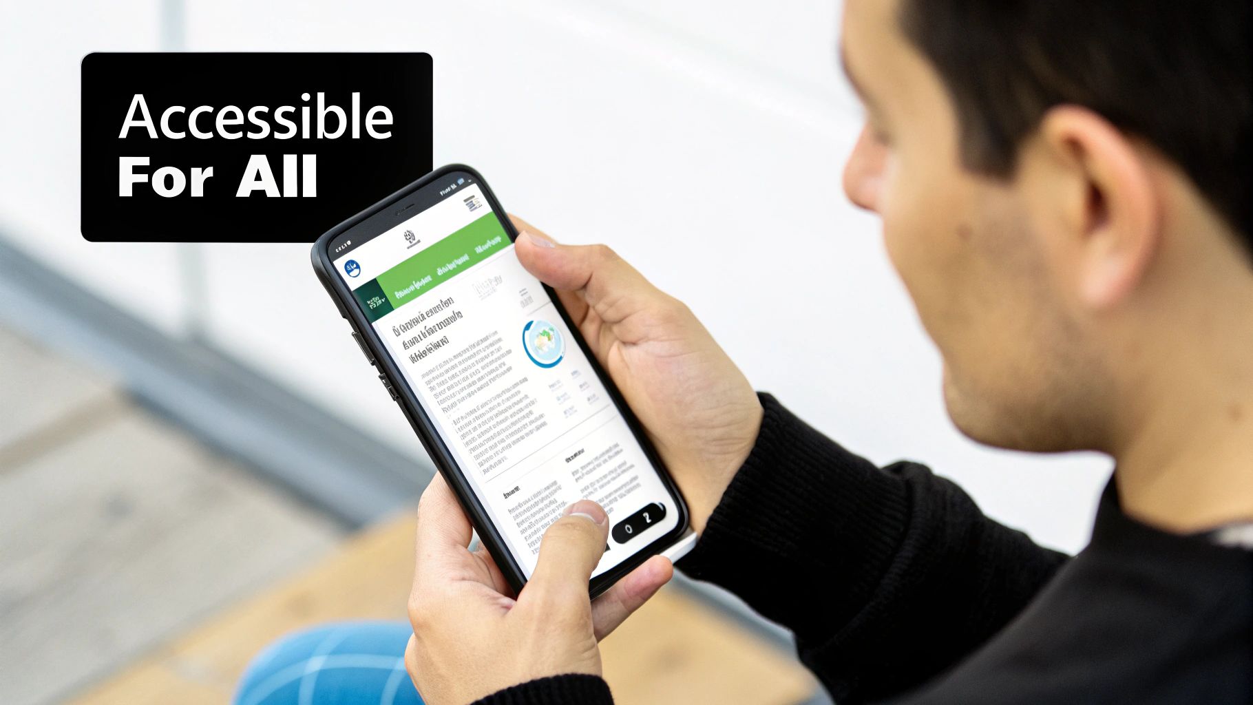
A truly great mobile app interface design is one that works for everyone, no matter their abilities. For way too long, accessibility felt like a checkbox item—something you tacked on at the end to meet compliance. But the best designers have flipped that script. They now see it for what it is: a core strategy for building a better, clearer, and more usable product for all.
When you start thinking inclusively from day one, it forces a level of intention that elevates the entire user experience. This isn't just about following guidelines; it's about empathy. It's about expanding your app's reach to the widest possible audience. The funny thing is, an accessible app is almost always a more intuitive app for everybody.
So, what does this look like in practice? Making an interface inclusive boils down to a few practical choices that have a massive impact on usability. These aren't crazy technical hurdles; they're just thoughtful design decisions.
By focusing on a few key areas, you can make your app dramatically easier for people to use:
Think about modern features like dark mode. It’s a perfect example of an accessibility feature going mainstream. Sure, it looks cool, but its real purpose is to reduce eye strain in low-light environments and improve focus. It’s an accessibility win that millions of people now use just because they prefer it.
When you design for the edges—for users with specific needs—you often create a better experience for everyone in the middle. Simplicity and clarity are universal benefits.
This user-first approach is quickly becoming the standard. Features like dark mode and big, legible typography aren't optional extras anymore; they're expected. This shift comes from a simple realization: accessibility and good design are two sides of the same coin. Generous white space, clear type, and simple navigation make an app easier for everyone to use.
Ultimately, building inclusive interfaces isn't a limitation—it’s a creative catalyst. It challenges you to communicate more clearly and design more intentionally. And in a crowded market, an app that's genuinely usable is a huge advantage. The right tools can also give you a head start; check out our guide on React Native UI libraries to find component kits built with accessibility baked in from the start.
Once you’ve meticulously planned out your interface, the next big step is turning those static designs into a living, breathing application. This is where the rubber meets the road, bridging the gap between your design files and functional code. For countless teams, React Native has become the framework of choice for building cross-platform apps that feel genuinely native.
But the real challenge here isn’t just writing code. It's about doing it efficiently without reinventing the wheel for every single button, card, and form field. Kicking off every project from a blank slate is a recipe for slow progress and maddening inconsistencies. This is exactly why modern component libraries have become an absolute game-changer in the mobile app design workflow.
Think of a component library as a massive box of high-quality, pre-made LEGO bricks. Instead of having to mold the plastic for each piece yourself, you get a huge collection of perfectly crafted blocks—buttons, inputs, modals, you name it—all ready to be snapped together. This approach completely changes the development timeline, speeding things up while ensuring a consistent visual language across your entire app.
One of the biggest wins is that these libraries are usually built with best practices baked right in, including critical accessibility features and platform-specific conventions. You get a massive head start on creating an inclusive and intuitive user experience without needing to become an expert on every nuance of iOS and Android design guidelines from day one.
A library like gluestack-ui takes this idea and runs with it. It’s not just a random collection of components; it's a universal system designed to work seamlessly across iOS, Android, and the web. Built on a foundation that embraces utility-first CSS, it gives developers incredible flexibility. If you're curious about the nitty-gritty, you can learn more about using Tailwind CSS in React Native to see how this styling magic works.
This means you can maintain a single design system and codebase while still shipping a polished, platform-appropriate experience to all your users. Customizing components to match your brand’s unique look and feel—from colors and fonts to spacing and shadows—becomes a straightforward task, not a complex coding headache.
A great component library doesn't just give you code snippets; it gives you a scalable design system. It allows you to build faster, maintain consistency, and focus your energy on the unique features that make your app special.
The efficiency gains are huge. Instead of spending weeks building something like a login form from scratch, you can assemble a production-ready one in minutes. This frees up your developers to focus on the tricky business logic and all the little details that create a truly delightful user experience.
For teams who need to move even faster, marketplaces like gluestack market are a goldmine of templates and UI kits. We’re not just talking about individual components here. These are complete, pre-built screens and even entire application shells for specific use cases like fitness trackers, finance apps, or social media feeds.
Each template is designed to be a fully functional starting point, complete with navigation, state management, and a beautiful UI. It’s a shortcut that lets you launch an MVP in a fraction of the time it would normally take.
Let’s walk through a quick example. Imagine your mobile app design calls for a user profile screen. Instead of building it piece by piece, your process becomes much simpler:
This workflow transforms development from a slow, laborious construction job into a streamlined process of assembly and customization. By leaning on these powerful tools, you can bring your mobile app interface designs to life faster, more consistently, and with a higher level of quality than ever before.
Hitting "launch" isn't the finish line—it's the starting pistol. A great mobile app interface design isn't a static masterpiece; it’s a living, breathing thing that has to evolve with real users. The most successful apps treat design as a constant cycle: build, measure, learn, and repeat.
This mindset is everything. What looks absolutely perfect in Figma can introduce all sorts of unexpected friction when it's actually in someone's hands.
You don't need a massive budget or a dedicated UX research team to get started, either. Practical testing can be surprisingly down-to-earth and affordable. The whole point is to stop guessing and start gathering real evidence about what’s working and what isn't. It's about listening to your users, both through what they say and, more importantly, what they do.
First things first: you need to collect both qualitative and quantitative data. Think of it like putting together a puzzle—each method gives you a different piece, and you need them all to see the full picture of the user experience. You can start small and build up your efforts as you grow.
For a deeper look into the toolkit available, check out these essential user research methods.
Here are a few incredibly effective ways to get feedback:
A design is never truly finished. It’s a hypothesis that needs to be tested against the reality of user interaction. The feedback you gather is not criticism; it's the data you need to improve.
Along with watching people use your app, you need to track key metrics to understand how everyone is using it at scale. Analytics tools are your best friend here, helping you spot patterns and identify friction points you'd never see otherwise.
Don't get lost in vanity metrics. Focus on the numbers that directly reflect the quality of your interface:
When you combine direct observation with this kind of hard data, you create a powerful feedback loop. This ongoing cycle of testing and tweaking is what ensures your app doesn't just launch well but continues to exceed user expectations for a long time to come.
Even with a comprehensive guide, a few questions always pop up. It's totally normal. Let's tackle some of the most common ones head-on to make sure you're walking away with a crystal-clear understanding of mobile app interface design.
Think of this as the part where we clear up any lingering confusion and lock in what you've learned.
This is probably the most-asked question in all of design, and for good reason. The line can seem blurry, but the distinction is everything. Let's use a car analogy.
User Experience (UX) design is the entire feeling of the drive. It's how comfortable the seats are, how intuitive it is to find the A/C, and whether the ride is smooth or bumpy. UX is the master plan—it’s the research, strategy, and problem-solving that makes a trip from A to B feel effortless and even enjoyable.
User Interface (UI) design, then, is the dashboard itself. It’s the look of the speedometer, the satisfying click of the buttons on the radio, and the color palette of the interior. The UI is what you actually see and touch; it's the specific set of controls you use to operate the car.
You can have the most beautiful dashboard in the world (great UI), but if the car has a terrible engine and uncomfortable seats (bad UX), the drive is still awful. They have to work in perfect harmony.
Ah, the dream of "design once, run anywhere." While it sounds efficient, ignoring platform-specific conventions is one of the fastest ways to make your app feel cheap and out of place. While iOS and Android have borrowed from each other over the years, their core DNA is still different.
An app that ignores platform conventions is like a tourist shouting in the wrong language. You might get your point across, but it’s awkward, clunky, and everyone can tell you don’t belong.
Users are deeply familiar with the patterns of their chosen device. An iOS user instinctively reaches for a bottom tab bar to navigate. An Android user is used to things like a navigation drawer or top tabs. When you put an iOS-style back arrow on an Android app or a Floating Action Button on an iPhone, it creates a subtle friction that just feels wrong.
Respecting these native conventions makes your app feel like a natural extension of the user's phone, which builds trust and makes it far more intuitive to use.
Technically, no. You could build every single button, slider, and modal from scratch. You could also forge your own nails every time you want to hang a picture. For modern app development, it's a wildly inefficient way to work.
Using a component library like gluestack-ui is like having a professional-grade toolbox filled with perfectly crafted, ready-to-use parts.
Here’s why it’s a no-brainer:
Using a library frees up your brainpower to focus on what makes your app unique, not on rebuilding solved problems. It's a strategic move that pays for itself in development speed and final product quality.
Ready to stop building from the ground up and start shipping beautiful apps faster? gluestack market is a curated collection of production-ready React Native templates and UI kits. Find the perfect launchpad for your next project and bring your mobile app interface design to life in record time. Check out the templates at https://market.gluestack.io.

Feb 23, 2026
4 min read
Discover powerful mobile app monetization strategies to boost your revenue. Our guide covers IAPs, ads, and subscriptions for React Native apps and beyond.

Feb 22, 2026
4 min read
A clear guide to app development cost estimation. Learn what drives costs, see budget examples, and discover strategies to build your app for less.

Feb 21, 2026
4 min read
Discover how to promote mobile application effectively with proven ASO, paid campaigns, and retention strategies.
Feb 15, 2026
4 min read
Discover how to create a prototype of a website with a practical, step-by-step guide. Explore tools, testing methods, and tips to bring your idea to life.
Feb 14, 2026
4 min read
Confused about mockups vs wireframes? Learn the key differences, when to use each, and how to streamline your React Native app development workflow.

Feb 13, 2026
4 min read
Discover how mobile apps templates accelerate development. Learn to choose, customize, and deploy high-quality React Native templates for your next project.

Feb 12, 2026
4 min read
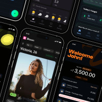
Explore mobile application interface design with practical tips, core principles, and platform-aware workflows to craft apps users love.

Feb 10, 2026
4 min read
Learn mobile first design principles to craft fast, accessible apps that delight users. Practical tips, examples, and testing strategies.
Feb 08, 2026
4 min read
Explore the progressive web app vs native debate with our in-depth guide. We compare performance, cost, and UX to help you make the right strategic choice.
Feb 07, 2026
4 min read
Discover how React Native templates can accelerate your app development. This guide explores choosing, customizing, and deploying templates for faster launches.

Feb 05, 2026
4 min read
Discover the key differences between expo vs react native, including workflow, builds, and performance to help you pick the right path for your app.
Feb 03, 2026
4 min read
Master image with text overlay in React Native with responsive, accessible patterns. Learn expo setup, NativeWind styling, and gluestack-ui examples.

Feb 03, 2026
4 min read
Discover cross platform app development with proven strategies to build faster for iOS, Android, and the web using a single, unified codebase.
Feb 01, 2026
4 min read
Learn how to make an app for my business quickly with template-based steps from planning to launch, plus tips to scale and optimize.

Jan 31, 2026
4 min read
Ready to build an app? This guide shares practical strategies for validating your idea, choosing a tech stack, and navigating the App Store launch.
Jan 30, 2026
4 min read
Master responsive design for mobile apps with this guide on fluid layouts, breakpoints, and React Native. Build UIs that adapt perfectly to any screen.

Jan 25, 2026
4 min read
Learn how to design an Android app that stands out. This guide covers UX research, wireframing, Material Design, and the developer handoff process.

Jan 24, 2026
4 min read
Explore ui design web essentials: a complete guide to principles, responsive patterns, and workflows for intuitive, engaging web interfaces.

Jan 23, 2026
4 min read
Discover 10 essential mobile app design best practices for building exceptional cross-platform apps. Actionable tips for UI, UX, navigation, and performance.

Jan 21, 2026
4 min read
Discover how to debug React Native apps effectively. This guide covers Flipper, React DevTools, and native code troubleshooting for faster development cycles.
Jan 20, 2026
4 min read
Learn how to create app for your business with a practical, modern approach. Plan, customize, and launch with proven steps.
Jan 19, 2026
4 min read
A complete guide to mobile app development for startups. Learn how to validate your idea, build an MVP, and launch a successful app faster and more affordably.

Jan 18, 2026
4 min read
Discover how to choose the right React website template to accelerate your project. Our guide covers everything from quality checklists to deployment.
Jan 17, 2026
4 min read
Discover how to choose, customize, and deploy a React Native app template. This guide provides practical steps for launching production-ready apps faster.

Jan 16, 2026
4 min read
Discover how mobile application templates accelerate development. This guide covers how to choose, customize, and launch your app with the right foundation.

Jan 13, 2026
4 min read
Start your journey in mobile app development for beginners. This guide breaks down how to build your first cross-platform app with React Native and Expo.

Jan 12, 2026
4 min read
Explore the best react native ui libraries and compare features, performance, and ease of use to pick the right toolkit for your app.

Jan 11, 2026
4 min read
Launch your own ride-hailing service with our guide to building a production-ready Uber app clone. Learn MVP strategy, tech stacks, and backend integration.

Jan 10, 2026
4 min read
Master modern cash app design with this guide. Learn the UI/UX, security, and React Native strategies needed to build a fintech app that users trust and love.

Jan 09, 2026
4 min read
Learn how to build a personal finance dashboard with React Native. A practical guide for developers on UI design, data architecture, and production readiness.
Jan 08, 2026
4 min read
A practical guide to building a cross-platform event check in app with React Native. Learn to implement QR scanning, offline sync, and deployment.

Jan 07, 2026
4 min read
Master linear gradient React Native components with our complete guide. Learn practical techniques for Expo, bare RN, and NativeWind to build stunning UIs.

Jan 06, 2026
4 min read
Learn how to change application name in your React Native & Expo projects. This guide covers display names, package IDs, and app store listings.
Jan 05, 2026
4 min read
Discover how to monetize mobile apps with our founder's guide. Learn proven React Native strategies for ads, IAPs, and subscriptions to maximize your revenue.

Jan 04, 2026
4 min read
A practical guide on how to create a website app with a single codebase. Learn to build for web, iOS, and Android using React Native, Expo, and TypeScript.

Jan 03, 2026
4 min read
Learn how to create an app for your business with this definitive guide. Discover practical strategies for validation, development, and launch that work.

Jan 02, 2026
4 min read
Learn how to create a wireframe for a website with this practical guide. Move from initial sketches to developer-ready designs that get built right.
Jan 01, 2026
4 min read
Deciding on progressive web application vs native? This guide offers a deep comparison of performance, cost, UX, and use cases to help you choose wisely.

Dec 31, 2025
4 min read
Discover 10 mobile app security best practices for React Native. Learn to secure data, APIs, and code with actionable tips and examples for 2025.

Dec 30, 2025
4 min read
Unlock the real React Native app development cost. Our guide breaks down pricing by feature, team, and complexity to help you budget with confidence.

Dec 29, 2025
4 min read
A practical guide to master your React Native debug workflow. Learn to use Flipper, React DevTools, and Hermes to solve bugs in Expo and bare RN apps.

Dec 28, 2025
4 min read
The ultimate React Native tutorial for beginners. Learn to build beautiful cross-platform apps using a modern stack like Expo, TypeScript, and gluestack-ui.

Dec 27, 2025
4 min read
A practical guide on how to build a mobile app. Learn to go from concept to a market-ready app using templates, React Native, and proven development strategies.

Dec 26, 2025
4 min read
Discover interface design for websites with actionable tips on layout, responsiveness, and usability to boost conversions.

Dec 25, 2025
4 min read
Discover designs for apps that blend minimal aesthetics with personalization, and learn to build user-centric interfaces that boost engagement.

Dec 24, 2025
4 min read
Learn graphical interface design - essentials for mastering core principles, modern workflows, and cross-platform strategies to build intuitive, engaging UIs.

Dec 23, 2025
4 min read
Discover how high fi wireframes bridge the gap between ideas and code. Learn a practical workflow for creating, testing, and handing off effective UI designs.

Dec 21, 2025
4 min read
Explore the top 10 UI UX design trends for 2025. Get expert insights and practical React Native tips to build next-gen cross-platform apps that stand out.

Dec 20, 2025
4 min read
Discover how mobile app templates accelerate development from idea to launch. Learn to select, customize, and deploy templates for a faster time to market.

Dec 18, 2025
4 min read
Explore the best react native ui libraries to accelerate mobile development with performance, theming, and accessibility. Expert tips inside.
Dec 16, 2025
4 min read
Master React Native PDF handling. Learn to generate, view, and share PDFs with practical code examples, library comparisons, and performance tips.
Dec 15, 2025
4 min read
A practical guide to choosing the right React Native component library. Learn how to evaluate options, avoid common pitfalls, and build apps faster.

Dec 14, 2025
4 min read
Find the perfect React Native UI library for your project. This guide compares top libraries, selection criteria, and customization strategies.
Dec 13, 2025
4 min read
Learn how to change app name in React Native and Expo. Our guide covers display names, bundle IDs, and store listings for iOS and Android projects.
Dec 12, 2025
4 min read
Discover the best React Native component library for your next project. We compare top libraries on performance, customization, and real-world use cases.
Dec 11, 2025
4 min read
Discover how to choose the right React Native UI kit. This guide covers top kits, selection criteria, and customization to accelerate your app development.
Dec 10, 2025
4 min read
Explore our in-depth guide to find the best React Native UI library. We compare top contenders to help you choose the right fit for your project.
Dec 09, 2025
4 min read
Discover a practical approach to building apps with React Native. This guide covers setup, UI, state management, and testing to help you ship great apps.

Dec 08, 2025
4 min read
android login with facebook: Learn to set up the Facebook SDK, manage tokens, and implement secure authentication across native Android, cross-platform apps.

Dec 07, 2025
4 min read
Master the alert in React Native. Learn to handle platform differences, build custom modals, and apply best practices for a seamless user experience.
Dec 06, 2025
4 min read
keyboardavoidingview react native: Master keyboard handling with KeyboardAvoidingView across iOS, Android, Expo, and TypeScript.
Dec 05, 2025
4 min read
A practical guide to implementing a React Native PDF viewer. Learn to compare libraries, handle native setup, and troubleshoot common issues with real code.

Dec 04, 2025
4 min read
how to validate startup idea: learn proven methods like customer interviews, MVPs, and metrics to confirm market fit.

Dec 03, 2025
4 min read
how to make app like uber: Learn core features, tech stack, development steps, testing, and launch tips.

Dec 02, 2025
4 min read
Build a rock-solid React Native setup. This guide covers Expo vs. Bare workflows, TypeScript, pnpm monorepos, NativeWind, and deployment strategies.

Dec 01, 2025
4 min read
A practical guide to Stripe React Native integration. Learn to set up your server, build payment UIs, handle webhooks, and launch secure mobile payments.

Nov 30, 2025
4 min read
Learn how to master push notifications in React Native. This guide covers setup, best practices, and advanced techniques for engaging your users.

Nov 29, 2025
4 min read
Build powerful location-based apps with our practical guide to react native with google maps. Get setup guides, pro tips, and best practices for iOS & Android.

Nov 28, 2025
4 min read
Explore deep linking react native with a practical guide to configuring URL schemes, universal links, navigation, and testing for Expo and bare apps.

Nov 28, 2025
4 min read
A practical guide to building a scalable React Native design system. Learn to implement tokens, theming, and tools like NativeWind and gluestack-ui.

Nov 26, 2025
4 min read
Learn why react native expo templates speed up your projects with ready-made patterns and practical tips.

Nov 25, 2025
4 min read
Discover how to improve developer productivity with actionable strategies for workflow, tooling, and culture. A practical guide for software engineering teams.

Nov 24, 2025
4 min read
Discover the best cross platform app development tools. Compare top frameworks like Flutter and React Native to build and ship apps faster.
Nov 23, 2025
4 min read
This Expo React Native tutorial provides a hands-on guide to building cross-platform apps. Learn setup, styling with NativeWind, navigation, and deployment.

Nov 22, 2025
4 min read
Build beautiful UIs faster with this guide to Tailwind CSS React Native. Learn setup, styling, and advanced techniques with NativeWind for mobile apps.

Nov 21, 2025
4 min read
Explore our curated list of 7 top-tier React Native app examples. Discover production-ready templates and resources to build your next app faster.
Mar 19, 2025
4 min read
gluestack market offers React Native UI templates to accelerate development. Get customizable, production-ready React Native app templates and Ui kit, some free. Build faster & smarter today!