Feb 12, 2026

4 min read


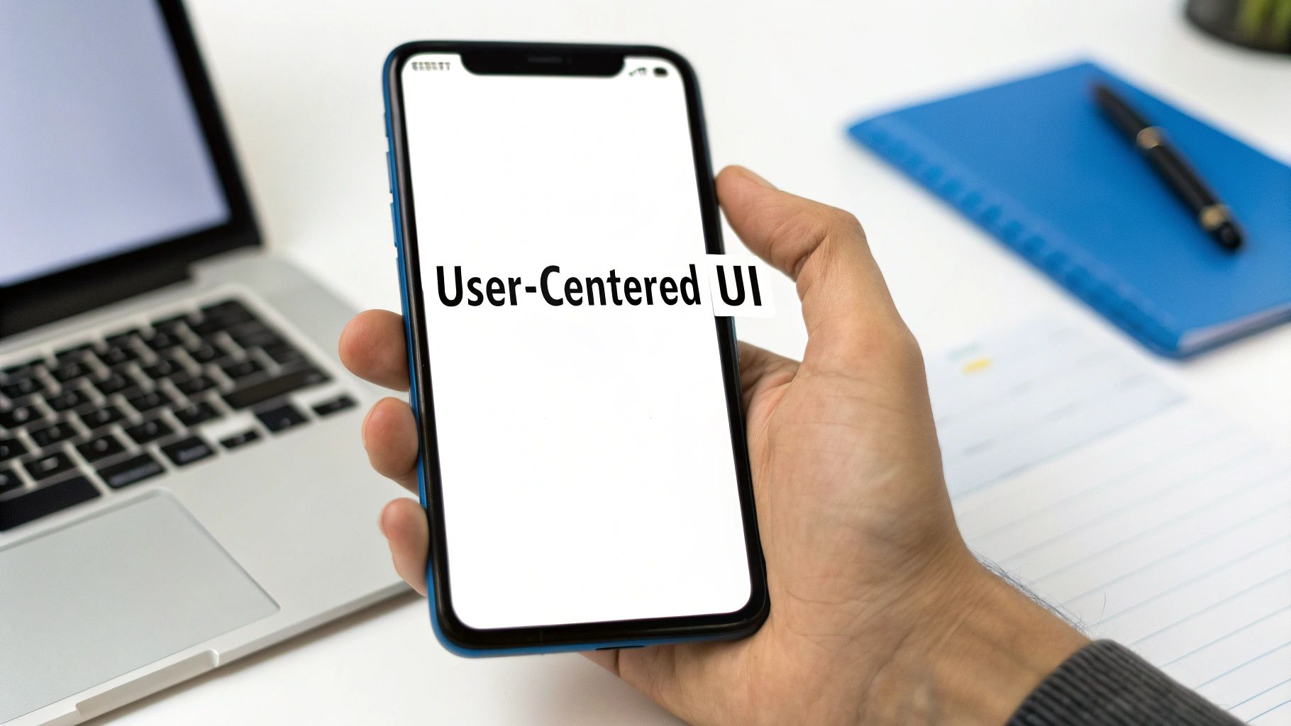
When you open an app, what’s the first thing you notice? The colors, the buttons, the way everything is laid out on the screen. That entire visual and interactive experience is what we call mobile application interface design.
It’s about blending two critical ingredients: the visual appeal (UI) and the intuitive functionality (UX). The goal is to create an app that isn't just nice to look at, but is genuinely effortless and even enjoyable to use.
Think of an app's interface as the cockpit of an airplane. A poorly designed cockpit with confusing controls and an illogical layout would make flying impossible, no matter how powerful the engines are. In the same way, an app's interface is the critical bridge connecting the user to all the powerful code running behind the scenes. Its entire job is to make complex actions feel simple.
This means carefully placing every single button, menu, icon, and piece of text in a way that just feels right to the user. A great design almost reads the user's mind, guiding them toward their goals without any friction or head-scratching moments.
It’s the reason you can pick up a brand-new app and instinctively know where to tap to find your profile or make a purchase. This careful orchestration is what separates a five-star app from one that gets deleted right after the first use.
At the core of mobile interface design, you'll always find two disciplines working hand-in-hand: User Interface (UI) and User Experience (UX). People often use them interchangeably, but they’re really two sides of the same coin.
A beautiful button (UI) is totally useless if the user can't find it when they need it (UX). You really need both working in perfect harmony. You can explore a deeper dive into these concepts in our guide on https://market.gluestack.io/blog/graphical-interface-design.
A well-designed mobile interface is like a great conversation—it flows naturally, feels intuitive, and leaves the user feeling understood and empowered. It's about building a relationship, not just a product.
To break it down even further, here's a quick side-by-side comparison.
| Aspect | UI Design (The 'What') | UX Design (The 'How') |
|---|---|---|
| Focus | Visual elements, branding, and aesthetics | Overall feel, usability, and the user's journey |
| Goal | To create an attractive and intuitive interface | To make the user's interaction efficient and enjoyable |
| Components | Colors, typography, buttons, icons, and layout | User research, wireframes, prototypes, and user flows |
| Key Question | How does it look and feel? | How does it work and make the user feel? |
Ultimately, a stunning UI without a solid UX foundation is just a pretty picture. And a seamless UX with a terrible UI can feel clunky and untrustworthy. You need both to win.
Getting the interface right has become a massive deal for businesses. The global User Interface (UI) Design Market was valued at $3.21 billion in 2026 and is on track to hit a staggering $9.83 billion by 2035. What’s driving this? Mobile. Our phones are where we spend most of our digital lives, making a great interface non-negotiable for success.
A strong interface has a direct line to user retention and achieving your business goals. Once a solid design is in place, many businesses turn to professional app development services to bring their vision to life.
Frameworks like React Native have become invaluable here, helping developers build a consistent, high-quality interface that works beautifully across different devices. This sets the stage perfectly for the practical principles we're about to dive into.
 Building a killer mobile app isn't about some secret formula. It's about nailing a few fundamental rules that separate the apps we love from the ones we delete. These core principles are the invisible architecture behind every great mobile interface, and they’re what make an app feel intuitive instead of frustrating.
Think of these principles less like rigid constraints and more like your compass. They ensure every single design decision you make puts the user first. After all, when someone opens your app, they have a goal. A great interface gets out of their way, making the journey feel like a smoothly paved highway instead of a bumpy, unmarked dirt road.
If there's one principle to rule them all, it's clarity. If users can't figure out what an icon does or where a menu will lead them, they're gone. An interface has to communicate its purpose and function without a hint of ambiguity.
This is about more than just clean layouts and readable fonts. Real clarity is about lowering the user's cognitive load—that's the mental horsepower they have to burn just to use your app. Every single element on the screen should have a clear job, guiding the user to their next step. A cluttered screen is the enemy of clarity.
Think about a ride-sharing app. You open it, and what do you see? A map and a "Where to?" box. That's it. This focused design instantly tells you what the app does without any distractions.
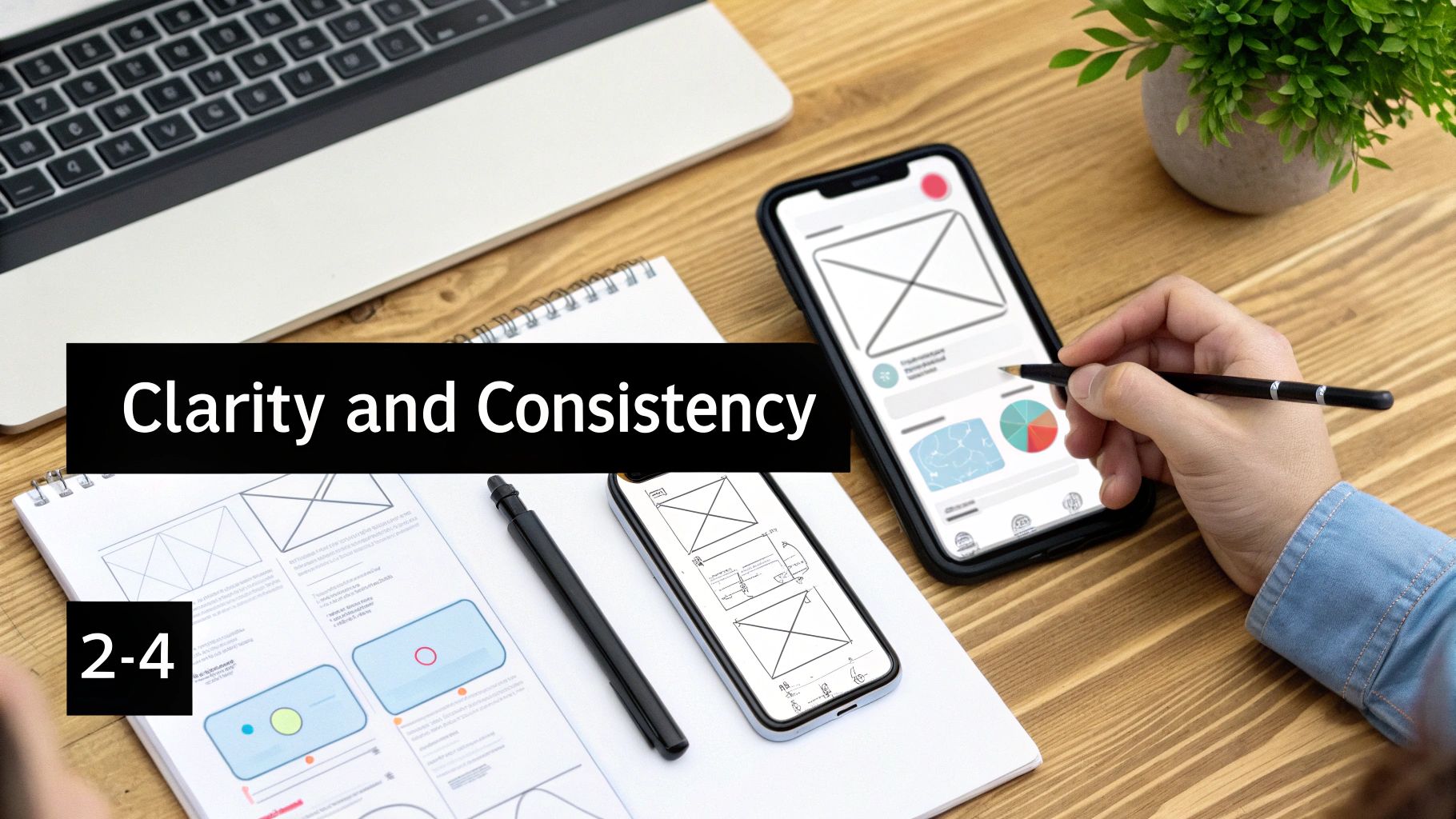
Consistency is what makes an app feel predictable and reliable. It’s the visual and functional glue holding the entire experience together. When buttons, icons, and navigation patterns act the same way on every screen, users only have to learn the ropes once.
This builds a powerful sense of confidence. Imagine if the "save" icon was a floppy disk on one screen but a checkmark on another—total chaos. An inconsistent interface forces users to relearn the rules with every tap.
A consistent design language doesn't just make an app easier to use; it builds brand trust. It reassures users that they are in a well-crafted, professional environment where things work as expected.
You need to master two types of consistency:
A great interface never leaves the user guessing. Every action should trigger an immediate and obvious reaction. This is the principle of feedback.
When a user taps a button, it should light up or change state to acknowledge the tap. If a file is uploading, a progress bar should show them what's happening. This constant conversation confirms the app got the message and is working on it, which stops users from getting anxious or tapping the same button over and over.
This goes hand-in-hand with user control. Users need to feel like they're in the driver's seat. Give them an easy way to undo an action (like deleting an email) or back out of a process (like closing a pop-up). This freedom to explore without the fear of breaking something makes for a much more engaging and stress-free experience.
Mastering clarity, consistency, and feedback is how you lay the rock-solid foundation for an exceptional mobile app.
Building an app for both iOS and Android is a bit like being a diplomat. You have to speak two different languages, understand two different cultures, and respect their unique customs. A surprisingly common mistake is to just copy-paste an iOS design onto Android (or the other way around). It almost never works. The result is an app that feels… off. Clumsy. It just doesn't belong.
The goal isn’t to make one design look identical everywhere. It's about crafting a single, smart design system that translates your app's core identity into the native language of each platform. Users have years of muscle memory and deep-seated expectations for how an app on their phone should look, feel, and behave. When you meet those expectations, your app feels instantly familiar and trustworthy.
Getting this right is a massive business. The UI/UX Design Services market, which is almost entirely driven by mobile, is on track to hit a staggering USD 450 billion by 2033. That growth comes from billions of apps all needing interfaces that feel right on both iOS and Android. You can dig into more of the data in this detailed report on UI/UX design services.
To really nail the design, it helps to understand the core philosophies that Apple and Google follow. They see the world differently, and it shows in their software.
Apple's Human Interface Guidelines (HIG) are all about a clean, almost deferential aesthetic. The content is the hero. The UI itself is designed to feel light and unobtrusive, often using blur and translucency to create a sense of depth and let the content shine through. The focus is always on clarity and giving the user a predictable path.
Google's Material Design, on the other hand, is inspired by the real world—specifically, paper and ink. It uses elevation, shadows, and bold colors to create a tangible, responsive interface. The idea is that every element on screen has a physical presence, which makes interactions feel grounded and intuitive.
These foundational worldviews trickle down into every single pixel of the user interface.
How users find their way around your app is one of the biggest differences between the two platforms. Get this wrong, and your app will immediately feel like it was made for "the other phone."
The choice between a tab bar and a navigation drawer isn't just a cosmetic one; it fundamentally shapes how your app is structured. Putting a hamburger menu in an iOS app feels weird and inefficient. An Android app that doesn't respect the system back gesture feels broken.
Even the small stuff, like fonts and buttons, follows different rules.
| Element | Apple iOS | Google Android |
|---|---|---|
| System Font | San Francisco (SF), a font meticulously designed by Apple for perfect legibility on their devices. | Roboto, a versatile font that manages to be both clean and geometric, yet warm and friendly. |
| Buttons | Often just plain text with a tint color, or contained in a simple, rounded rectangle. Understated. | Typically have more obvious elevation and shadows to make them look and feel "pressable." |
| Alerts/Dialogs | Centered on the screen, with text-aligned action buttons arranged horizontally at the bottom. | Aligned to the left, with action buttons often stacked vertically or placed horizontally. |
Respecting these tiny details is what separates a good app from a great one. A user should never have to stop and think about which OS your app was originally designed for. It should just feel like it belongs on the device in their hand. That's when your mobile interface design becomes a seamless, natural part of their world.
Turning a stunning design concept into a living, breathing application is where the rubber meets the road—and where many projects get stuck. In the old days, the designer-to-developer handover felt clumsy, kind of like asking a master builder to construct a skyscraper from a beautiful but dimension-less painting. That's all changed. Today, the mobile application interface design workflow is a well-oiled machine, built to create a seamless bridge between design tools and actual code.
This modern process is all about speaking the same language. Instead of just tossing static images over the fence, designers now build dynamic prototypes in tools like Figma. These aren't just pretty pictures; they're interactive blueprints that define every space, state, and user flow. Getting this shared understanding right from the start is the secret to building better apps, faster.
The whole journey starts by creating a single source of truth that both designers and developers can rally around.
The beating heart of this modern workflow is the design system. Think of it as the ultimate instruction manual for your app's entire look and feel. It’s got every color, font, icon, and button, all meticulously defined and organized. In Figma, designers pull from these pre-defined elements to build out screens.
But here’s where the magic really happens: that design system gets translated directly into a component library in the code. For a React Native project, this means every button component in Figma has a perfect twin—a <Button> component in the codebase. This one-to-one mapping kills the guesswork and guarantees pixel-perfect consistency.
When you create a shared component library, you're not just aligning pixels; you're aligning your teams. The Figma file becomes living documentation for the codebase (and vice versa), slashing miscommunication and painful rework.
This creates an incredibly powerful feedback loop. If a designer tweaks the main button's color in Figma, that change can be mirrored in the code almost instantly, propagating across the entire app in minutes.
A huge part of what makes this seamless translation possible is utility-first CSS, which we can use in React Native thanks to libraries like NativeWind. Instead of making up custom CSS class names, both designers and developers use a shared vocabulary of utility classes.
bg-blue-500, text-white, and rounded-lg.This direct translation means a developer can glance at a design and know exactly what code to write. It’s like having a universal translator for visual style, ensuring the final product is a perfect match for the original vision. For anyone building on niche mobile platforms, understanding the ecosystem of Telegram Mini App companies can also show how these modern workflows are adapted for very specific requirements.
So, what does this actually look like day-to-day? The process usually follows a clear, collaborative path designed to cut out friction and boost momentum.
This modern, component-driven approach transforms the design-to-code handoff from a single, high-stakes event into a continuous, collaborative conversation.
A truly great mobile interface feels invisible. It just works. But getting to that point of "effortless" isn't an accident—it's the result of some very deliberate work behind the scenes. Two of the most critical pillars holding up any quality app are accessibility and performance.
Think of them less as technical checkboxes and more as the foundation for an experience that works for everyone, on any device.
A slow, janky interface will test the patience of even your most loyal user. An inaccessible one slams the door on a huge chunk of your potential audience. Building an inclusive and performant app isn't something you tack on at the end; you have to weave these principles into your design and development process from day one.
The flow from idea to code often looks something like this:
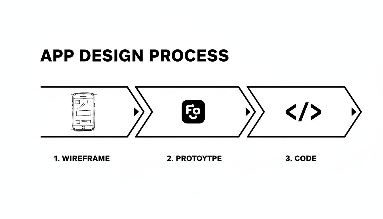
This simple path from wireframe to prototype to code shows that the final implementation is built directly on the decisions you make early in the design phase. Get those right, and the rest falls into place.
Accessibility, often shortened to a11y (because there are 11 letters between 'a' and 'y'), is all about making your app usable by people with disabilities. This can include visual, auditory, motor, or cognitive impairments. Here's the kicker, though: when you design for accessibility, you almost always end up making the app better for everyone.
An accessible design doesn't just widen your audience; it forces you to build a more robust, intuitive, and thoughtfully structured interface for everyone. It’s a powerful catalyst for better overall design.
For example, making your app work with a screen reader forces you to organize information in a clear, logical way. Using high color contrast to help users with low vision also happens to make your app way easier to read in bright sunlight. It’s a total win-win.
Here are a few practical things you can do to make your interface more inclusive:
When we talk about performance in a mobile app, we're talking about speed and responsiveness. Users expect things to happen instantly. Animations should be fluid. Even a delay of a few hundred milliseconds can make an app feel laggy and broken.
In the world of React Native, performance optimization usually boils down to one thing: preventing unnecessary work. Your goal is to keep the UI thread free so it can respond to user input immediately. No stuttering, no lag.
Key Performance Strategies:
React.memo for functional components, and use hooks like useCallback and useMemo to stop unnecessary recalculations and function re-creations.FlatList component. It virtualizes the list, which means it only renders the items currently visible on the screen, saving a ton of memory and keeping things snappy.Why would you build a car from scratch when you can start the race in a high-performance machine? After getting a handle on the core principles of mobile interface design, the smartest next move is to find ways to build faster. This is where UI kits and ready-made templates become your secret weapon.
Think of a UI kit as a professional-grade LEGO set for app development. Instead of molding each individual brick—designing buttons, coding input fields, testing modals—you get a box full of perfectly crafted, battle-tested components. These libraries are a powerful way to skip the tedious, time-consuming process of building foundational UI from the ground up.
For startups and agencies, speed to market is everything. Domain-specific templates take this acceleration to a whole new level. Imagine you're launching a new wellness app. Instead of staring at a blank screen, you could start with a template that already has layouts for meditations, progress tracking, and user profiles ready to go.
These pre-built starters for niches like finance, social media, or fitness aren't just about saving time; they're about tapping into proven design patterns. With users spending an average of 4.8 hours per day on their phones, a familiar and intuitive interface is non-negotiable. It’s been shown that adaptive layouts, a core feature of quality UI kits, can boost task-completion rates by up to 22% and engagement by nearly 31%. For React Native developers on a tight deadline, these templates deliver that polished experience without the custom-coding marathon.
A high-quality system like gluestack-ui gives you a library of components that are accessible, performant, and consistent right out of the box. It’s the bridge that connects all the principles of great design to a tangible solution that saves you a ton of time and resources.
Using a production-ready UI kit isn't taking a shortcut. It's making a strategic decision to focus your team's energy on what truly matters—your app's unique features and the value it delivers to users.
Adopting a UI kit isn't just about the initial build; it’s a long-term play for maintainability and scale. When your entire application is built from a single, consistent set of components, making updates becomes incredibly simple. Need to change your brand's primary color? You update it in one central place, and that change ripples through the entire app instantly.
This approach keeps your mobile application interface design cohesive as your app grows and new features are added. For teams looking to build robust, cross-platform applications quickly, exploring a pre-built React Native UI kit is the smartest first step you can take. It allows you to stand on the shoulders of expert design and engineering, freeing you up to focus on innovation.
Even with all the principles down, some questions always seem to pop up when you're in the middle of a project. Getting your hands dirty with a new app build is where the rubber meets the road, and it helps to have some go-to answers for the most common hurdles.
Let's tackle a few of them.
If I had to pick just one thing, it would be clarity. No question.
You can have the most beautiful, visually stunning app in the world, but if people can't figure out how to use it in the first few seconds, they're gone. A confusing design, no matter how pretty, is a failed design.
Clarity isn't just one thing, though. It's about easy-to-read text, icons that make sense without a second thought, and a flow that guides the user naturally. The real goal is to get the interface out of the user's way so they can just do the thing they downloaded your app to do.
Think "adapt," not "duplicate." You want your app to feel like a native on both platforms, not like a tourist wearing the wrong clothes. Start by building a solid brand identity and a flexible component system that can serve as the foundation for both versions.
From there, it's all about tailoring the key interactions to what users on each platform expect. Things like alerts, navigation, and even how you handle the back button matter. An iOS user is hardwired to look for a tab bar at the bottom, while an Android user instinctively uses the system-wide back gesture.
Honestly, the most efficient way to get this right is by using a solid cross-platform UI library. It does most of the heavy lifting for you, handling a ton of the platform-specific tweaks while keeping your brand consistent and making your app feel at home on any device.
For the vast majority of teams—especially startups and agencies on a tight timeline—a high-quality UI kit is a no-brainer.
Building a complete, accessible, and high-performing design system from the ground up is a massive undertaking. It's expensive, it's slow, and it's full of pitfalls.
A production-ready UI kit gives you a tested, reliable foundation to build on. This lets you and your team pour your precious time and energy into the stuff that actually makes your product unique—the features that solve your users' problems and make them stick around.
Ready to stop building everything from scratch and start shipping great apps faster? gluestack market has a massive collection of production-ready, accessible, and performant React Native templates and UI kits. You can build your next project in a fraction of the time.
Check out our templates at gluestack market and see for yourself.

Feb 23, 2026
4 min read
Discover powerful mobile app monetization strategies to boost your revenue. Our guide covers IAPs, ads, and subscriptions for React Native apps and beyond.

Feb 22, 2026
4 min read
A clear guide to app development cost estimation. Learn what drives costs, see budget examples, and discover strategies to build your app for less.

Feb 21, 2026
4 min read
Discover how to promote mobile application effectively with proven ASO, paid campaigns, and retention strategies.
Feb 15, 2026
4 min read
Discover how to create a prototype of a website with a practical, step-by-step guide. Explore tools, testing methods, and tips to bring your idea to life.
Feb 14, 2026
4 min read
Confused about mockups vs wireframes? Learn the key differences, when to use each, and how to streamline your React Native app development workflow.

Feb 13, 2026
4 min read
Discover how mobile apps templates accelerate development. Learn to choose, customize, and deploy high-quality React Native templates for your next project.

Feb 10, 2026
4 min read
Learn mobile first design principles to craft fast, accessible apps that delight users. Practical tips, examples, and testing strategies.
Feb 08, 2026
4 min read
Explore the progressive web app vs native debate with our in-depth guide. We compare performance, cost, and UX to help you make the right strategic choice.
Feb 07, 2026
4 min read
Discover how React Native templates can accelerate your app development. This guide explores choosing, customizing, and deploying templates for faster launches.

Feb 05, 2026
4 min read
Discover the key differences between expo vs react native, including workflow, builds, and performance to help you pick the right path for your app.
Feb 03, 2026
4 min read
Master image with text overlay in React Native with responsive, accessible patterns. Learn expo setup, NativeWind styling, and gluestack-ui examples.

Feb 03, 2026
4 min read
Discover cross platform app development with proven strategies to build faster for iOS, Android, and the web using a single, unified codebase.
Feb 01, 2026
4 min read
Learn how to make an app for my business quickly with template-based steps from planning to launch, plus tips to scale and optimize.
Jan 31, 2026
4 min read
Ready to build an app? This guide shares practical strategies for validating your idea, choosing a tech stack, and navigating the App Store launch.
Jan 30, 2026
4 min read
Master responsive design for mobile apps with this guide on fluid layouts, breakpoints, and React Native. Build UIs that adapt perfectly to any screen.

Jan 25, 2026
4 min read
Learn how to design an Android app that stands out. This guide covers UX research, wireframing, Material Design, and the developer handoff process.

Jan 24, 2026
4 min read
Explore ui design web essentials: a complete guide to principles, responsive patterns, and workflows for intuitive, engaging web interfaces.

Jan 23, 2026
4 min read
Discover 10 essential mobile app design best practices for building exceptional cross-platform apps. Actionable tips for UI, UX, navigation, and performance.

Jan 21, 2026
4 min read
Discover how to debug React Native apps effectively. This guide covers Flipper, React DevTools, and native code troubleshooting for faster development cycles.
Jan 20, 2026
4 min read
Learn how to create app for your business with a practical, modern approach. Plan, customize, and launch with proven steps.
Jan 19, 2026
4 min read
A complete guide to mobile app development for startups. Learn how to validate your idea, build an MVP, and launch a successful app faster and more affordably.

Jan 18, 2026
4 min read
Discover how to choose the right React website template to accelerate your project. Our guide covers everything from quality checklists to deployment.
Jan 17, 2026
4 min read
Discover how to choose, customize, and deploy a React Native app template. This guide provides practical steps for launching production-ready apps faster.

Jan 16, 2026
4 min read
Discover how mobile application templates accelerate development. This guide covers how to choose, customize, and launch your app with the right foundation.
Jan 13, 2026
4 min read
Start your journey in mobile app development for beginners. This guide breaks down how to build your first cross-platform app with React Native and Expo.

Jan 12, 2026
4 min read
Explore the best react native ui libraries and compare features, performance, and ease of use to pick the right toolkit for your app.

Jan 11, 2026
4 min read
Launch your own ride-hailing service with our guide to building a production-ready Uber app clone. Learn MVP strategy, tech stacks, and backend integration.
Jan 10, 2026
4 min read
Master modern cash app design with this guide. Learn the UI/UX, security, and React Native strategies needed to build a fintech app that users trust and love.

Jan 09, 2026
4 min read
Learn how to build a personal finance dashboard with React Native. A practical guide for developers on UI design, data architecture, and production readiness.
Jan 08, 2026
4 min read
A practical guide to building a cross-platform event check in app with React Native. Learn to implement QR scanning, offline sync, and deployment.

Jan 07, 2026
4 min read
Master linear gradient React Native components with our complete guide. Learn practical techniques for Expo, bare RN, and NativeWind to build stunning UIs.

Jan 06, 2026
4 min read
Learn how to change application name in your React Native & Expo projects. This guide covers display names, package IDs, and app store listings.
Jan 05, 2026
4 min read
Discover how to monetize mobile apps with our founder's guide. Learn proven React Native strategies for ads, IAPs, and subscriptions to maximize your revenue.

Jan 04, 2026
4 min read
A practical guide on how to create a website app with a single codebase. Learn to build for web, iOS, and Android using React Native, Expo, and TypeScript.

Jan 03, 2026
4 min read
Learn how to create an app for your business with this definitive guide. Discover practical strategies for validation, development, and launch that work.

Jan 02, 2026
4 min read
Learn how to create a wireframe for a website with this practical guide. Move from initial sketches to developer-ready designs that get built right.
Jan 01, 2026
4 min read
Deciding on progressive web application vs native? This guide offers a deep comparison of performance, cost, UX, and use cases to help you choose wisely.

Dec 31, 2025
4 min read
Discover 10 mobile app security best practices for React Native. Learn to secure data, APIs, and code with actionable tips and examples for 2025.

Dec 30, 2025
4 min read
Unlock the real React Native app development cost. Our guide breaks down pricing by feature, team, and complexity to help you budget with confidence.

Dec 29, 2025
4 min read
A practical guide to master your React Native debug workflow. Learn to use Flipper, React DevTools, and Hermes to solve bugs in Expo and bare RN apps.

Dec 28, 2025
4 min read
The ultimate React Native tutorial for beginners. Learn to build beautiful cross-platform apps using a modern stack like Expo, TypeScript, and gluestack-ui.
Dec 27, 2025
4 min read
A practical guide on how to build a mobile app. Learn to go from concept to a market-ready app using templates, React Native, and proven development strategies.

Dec 26, 2025
4 min read
Discover interface design for websites with actionable tips on layout, responsiveness, and usability to boost conversions.

Dec 25, 2025
4 min read
Discover designs for apps that blend minimal aesthetics with personalization, and learn to build user-centric interfaces that boost engagement.

Dec 24, 2025
4 min read
Learn graphical interface design - essentials for mastering core principles, modern workflows, and cross-platform strategies to build intuitive, engaging UIs.

Dec 23, 2025
4 min read
Discover how high fi wireframes bridge the gap between ideas and code. Learn a practical workflow for creating, testing, and handing off effective UI designs.

Dec 22, 2025
4 min read
Discover mobile app interface design with practical principles, accessibility, and workflows that boost user engagement.

Dec 21, 2025
4 min read
Explore the top 10 UI UX design trends for 2025. Get expert insights and practical React Native tips to build next-gen cross-platform apps that stand out.

Dec 20, 2025
4 min read
Discover how mobile app templates accelerate development from idea to launch. Learn to select, customize, and deploy templates for a faster time to market.

Dec 18, 2025
4 min read
Explore the best react native ui libraries to accelerate mobile development with performance, theming, and accessibility. Expert tips inside.
Dec 16, 2025
4 min read
Master React Native PDF handling. Learn to generate, view, and share PDFs with practical code examples, library comparisons, and performance tips.
Dec 15, 2025
4 min read
A practical guide to choosing the right React Native component library. Learn how to evaluate options, avoid common pitfalls, and build apps faster.

Dec 14, 2025
4 min read
Find the perfect React Native UI library for your project. This guide compares top libraries, selection criteria, and customization strategies.
Dec 13, 2025
4 min read
Learn how to change app name in React Native and Expo. Our guide covers display names, bundle IDs, and store listings for iOS and Android projects.
Dec 12, 2025
4 min read
Discover the best React Native component library for your next project. We compare top libraries on performance, customization, and real-world use cases.
Dec 11, 2025
4 min read
Discover how to choose the right React Native UI kit. This guide covers top kits, selection criteria, and customization to accelerate your app development.
Dec 10, 2025
4 min read
Explore our in-depth guide to find the best React Native UI library. We compare top contenders to help you choose the right fit for your project.
Dec 09, 2025
4 min read
Discover a practical approach to building apps with React Native. This guide covers setup, UI, state management, and testing to help you ship great apps.

Dec 08, 2025
4 min read
android login with facebook: Learn to set up the Facebook SDK, manage tokens, and implement secure authentication across native Android, cross-platform apps.

Dec 07, 2025
4 min read
Master the alert in React Native. Learn to handle platform differences, build custom modals, and apply best practices for a seamless user experience.
Dec 06, 2025
4 min read
keyboardavoidingview react native: Master keyboard handling with KeyboardAvoidingView across iOS, Android, Expo, and TypeScript.
Dec 05, 2025
4 min read
A practical guide to implementing a React Native PDF viewer. Learn to compare libraries, handle native setup, and troubleshoot common issues with real code.

Dec 04, 2025
4 min read
how to validate startup idea: learn proven methods like customer interviews, MVPs, and metrics to confirm market fit.

Dec 03, 2025
4 min read
how to make app like uber: Learn core features, tech stack, development steps, testing, and launch tips.

Dec 02, 2025
4 min read
Build a rock-solid React Native setup. This guide covers Expo vs. Bare workflows, TypeScript, pnpm monorepos, NativeWind, and deployment strategies.

Dec 01, 2025
4 min read
A practical guide to Stripe React Native integration. Learn to set up your server, build payment UIs, handle webhooks, and launch secure mobile payments.

Nov 30, 2025
4 min read
Learn how to master push notifications in React Native. This guide covers setup, best practices, and advanced techniques for engaging your users.

Nov 29, 2025
4 min read
Build powerful location-based apps with our practical guide to react native with google maps. Get setup guides, pro tips, and best practices for iOS & Android.

Nov 28, 2025
4 min read
Explore deep linking react native with a practical guide to configuring URL schemes, universal links, navigation, and testing for Expo and bare apps.

Nov 28, 2025
4 min read
A practical guide to building a scalable React Native design system. Learn to implement tokens, theming, and tools like NativeWind and gluestack-ui.

Nov 26, 2025
4 min read
Learn why react native expo templates speed up your projects with ready-made patterns and practical tips.

Nov 25, 2025
4 min read
Discover how to improve developer productivity with actionable strategies for workflow, tooling, and culture. A practical guide for software engineering teams.

Nov 24, 2025
4 min read
Discover the best cross platform app development tools. Compare top frameworks like Flutter and React Native to build and ship apps faster.
Nov 23, 2025
4 min read
This Expo React Native tutorial provides a hands-on guide to building cross-platform apps. Learn setup, styling with NativeWind, navigation, and deployment.

Nov 22, 2025
4 min read
Build beautiful UIs faster with this guide to Tailwind CSS React Native. Learn setup, styling, and advanced techniques with NativeWind for mobile apps.

Nov 21, 2025
4 min read
Explore our curated list of 7 top-tier React Native app examples. Discover production-ready templates and resources to build your next app faster.
Mar 19, 2025
4 min read
gluestack market offers React Native UI templates to accelerate development. Get customizable, production-ready React Native app templates and Ui kit, some free. Build faster & smarter today!