Feb 10, 2026

4 min read

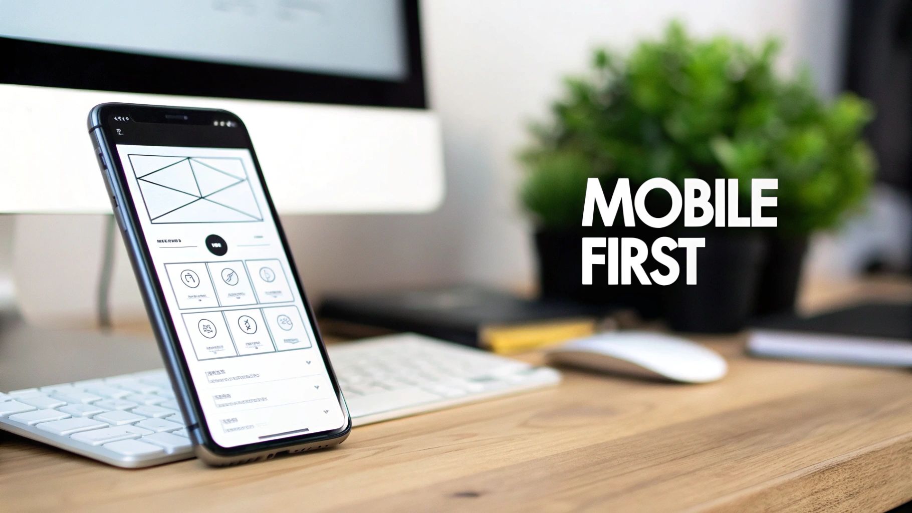
Think about the last time you used an app on your phone. Was it a seamless experience, or did you find yourself pinching and zooming just to read the text? The difference often comes down to one core philosophy: mobile-first design.
It's not just a buzzword; it's a completely different way of thinking about how we build things for the web. Instead of designing a sprawling desktop website and then trying to shrink it down, we start with the smallest screen—the smartphone—and build our way up. This simple flip forces a ruthless focus on what really matters.
Let's be honest: designing for the desktop first is like building a mansion and then trying to cram it onto a tiny plot of land. It just doesn’t work. You end up with a clunky, compromised, and frustrating mobile version. That old-school method, known as "graceful degradation," involves stripping features away for smaller screens, and it almost always feels like an afterthought.
The mobile-first approach turns that entire process on its head. It’s built on a principle called progressive enhancement. You start with a rock-solid foundation of essential features that work perfectly on a phone. That initial constraint is actually a gift—it makes you prioritize like a pro.
This isn't just some design trend we're chasing. It's a direct response to how people actually live. Mobile isn't just a way to access the internet; for many, it's the primary way. Recent data shows that mobile now accounts for over 63% of all web traffic, and that number keeps climbing.
People expect information right here, right now, wherever they are. For any business, that statistic is a wake-up call. If your mobile experience isn't top-notch, you're already behind. You can explore more data on why this should be your top priority for success.
Adopting this user-centric mindset pays off in massive ways:
In a nutshell, mobile-first design isn’t about ignoring the desktop. It's about building a stronger, more resilient foundation that guarantees the heart of your application works flawlessly for the vast majority of your users. Once that's solid, you can thoughtfully add the bells and whistles for those with more screen real estate.
To see just how different these two mindsets are, let's put them side-by-side. The contrast in both process and outcome is stark.
| Aspect | Mobile First (Progressive Enhancement) | Desktop First (Graceful Degradation) |
|---|---|---|
| Starting Point | Designs for the smallest screen (smartphone) | Designs for the largest screen (desktop) |
| Core Philosophy | Start with essentials, then add features for larger screens | Start with all features, then remove them for smaller screens |
| Content Focus | Prioritizes core content and key user tasks from day one | Often includes secondary content that gets cut on mobile |
| Performance | Naturally faster and lighter due to an initial focus on efficiency | Can be slow and bloated on mobile as assets are "shrunk" |
| User Experience | Clean, focused, and intuitive across all devices | Often feels cluttered or compromised on smaller screens |
| Flexibility | Easier to adapt to new screen sizes and devices in the future | Can be rigid and difficult to adapt without a major redesign |
Ultimately, choosing mobile-first is a strategic decision that ripples through your entire project, from user satisfaction right down to your search engine rankings. It's about meeting your users where they are, and increasingly, that's on their phones.
To really get why mobile-first design matters so much, you need to know it wasn't just some random idea. It was a direct response to a massive shift in how we all started using the internet. The whole thing kicked off around 2009, thanks to a designer named Luke Wroblewski who was already seeing the future play out.
Back then, the web was built for big desktop monitors. The first iPhone had only been around for a couple of years, but it was already changing the game. People were no longer chained to their desks, and this new world of being constantly connected was just beginning. Most companies, though, were still building these huge, complex websites and then trying to awkwardly cram them onto a tiny phone screen. It just didn't work.
That old "shrink-it-down" approach was completely failing to keep up. The smartphone market was blowing up, and mobile data usage was going through the roof. For instance, by the end of 2009, AT&T—which was the only carrier for the iPhone in the US at the time—saw its mobile data traffic jump by a mind-blowing 4,932%. The data was screaming one thing: people were flooding to the mobile web, but the web simply wasn't built for them. You can get a sense of just how wild that growth was by looking at the early data trends of mobile usage on core.ac.uk.
Wroblewski saw this huge disconnect and came up with a solution that was as simple as it was brilliant: start with the smallest screen first. This single idea forced everyone to tackle the real constraints of mobile head-on, instead of treating them as a last-minute problem.
By designing for mobile first, you have to distill your product down to its most essential elements. It's a creative constraint that breeds clarity and focus, benefiting users on every single device, not just the smallest ones.
This wasn't just a technical tweak; it was a fundamental shift in strategy. It was a recognition that someone on their phone is in a totally different mindset. They're likely on the move, they need answers fast, and they have zero patience for a cluttered, slow-loading site.
Wroblewski's thinking laid the foundation for what we now call progressive enhancement. The idea is simple: instead of starting with a feature-packed desktop site and stripping things away (graceful degradation), you start with a solid, core experience on mobile and then add more features and complexity as the screen size increases. This way, you guarantee that the most important stuff works for everyone, everywhere.
Understanding this history is so important. Mobile-first design isn’t just a set of arbitrary rules. It’s a smart, logical response to how people actually live their lives online today. It’s a philosophy born from watching real human behavior, making sure our technology actually serves us, not the other way around.
To really get mobile-first design, you have to move past the theory and get your hands dirty. This isn't about memorizing a checklist; it's about internalizing a few core principles that should guide every single decision you make. Think of them as the fundamental ingredients for cooking up an experience that feels completely natural and effortless to your users, no matter what device they're on.
Each principle takes a classic mobile constraint—like screen size or network speed—and flips it into a design strength. Once you get the hang of them, you'll be building apps that are not just functional but also fast, easy to use, and genuinely enjoyable for the huge majority of people who will interact with your work.
Let’s break these essentials down.
On a desktop, you’ve got a massive canvas to play with. On a mobile device, you have a postcard. This forces you to make tough—but incredibly valuable—decisions about what actually matters. Content prioritization is the art of figuring out the single most important thing a user needs to do on any given screen and building the entire interface around it.
Picture someone opening a weather app. What do they want? The current temperature and the forecast for the next few hours. That info needs to be front and center, no scrolling or tapping required. Secondary details, like air quality index or historical data, can live further down the page or in a separate view. This simple act of decluttering dramatically lowers the user's cognitive load, letting them get what they need and get on with their day.
We don't use our phones with a precise mouse cursor; we use our thumbs. And let's be honest, thumbs are clumsy. Designing for touch means creating interfaces that are forgiving and comfortable for one-handed use. It’s about more than just making buttons bigger; you have to consider the "thumb zone"—the area of the screen a user can comfortably reach without contorting their hand.
Here are a few practical ways to nail this:
By designing for the thumb, you are designing for comfort and speed. An interface that feels physically easy to use is one that users will return to again and again.
This infographic really drives home how the mobile-first concept wasn't just a clever idea—it was a necessary response to the explosion in mobile usage.
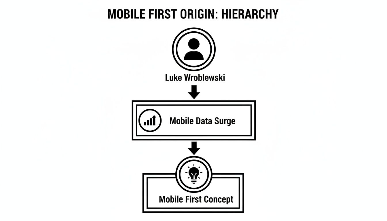
As you can see, the whole movement, championed by Luke Wroblewski, was a direct answer to the massive surge in mobile data consumption. It was a solution born out of necessity.
On mobile, speed isn't just a nice bonus—it’s a deal-breaker. Users on spotty Wi-Fi or cellular data have zero patience for slow-loading apps. In fact, studies show that 53% of mobile users will bounce if a site takes more than three seconds to load.
The beauty of mobile-first design is that it practically forces you to build for performance from the get-go. You start with only the essential assets. You have no choice but to optimize images, minify code, and be picky about heavy scripts. This lean foundation not only creates a snappy experience on mobile but also translates to a ridiculously fast app on desktop. To dig a bit deeper into this, there are great resources on Mobile First Design.
This is the strategic engine that powers the whole mobile-first philosophy. Instead of building a massive, feature-packed desktop site and then trying to cram and cut it down for mobile (a process called "graceful degradation"), you do the exact opposite. You start with a rock-solid baseline of content and functionality that works on every device, even older ones with limited browsers.
From that simple foundation, you progressively layer on more advanced features and richer visual experiences for devices that can handle them.
This approach guarantees that every single user gets a solid, working experience, while people on more powerful devices get an even better one. It’s a far more resilient and future-proof way to build. For a closer look at how these ideas apply across different platforms, check out our guide on responsive design for mobile apps.
By weaving these principles into your workflow, you’ll stop just "making things smaller" and start strategically crafting experiences that respect your user's context, device, and time.
Knowing the principles of mobile-first design is one thing. Actually translating them into clean, functional code that feels great on a real device? That’s a whole different ballgame.
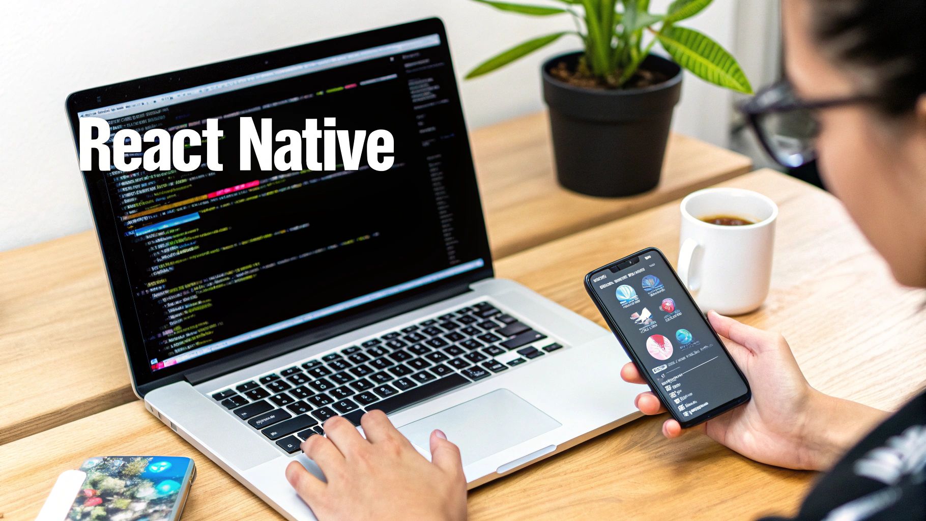
For those of us working with React Native, the goal is always to build an experience that feels truly native on both iOS and Android. But the job doesn’t stop there. That same experience needs to scale intelligently to larger screens, like tablets or even web browsers.
Luckily, the modern React Native ecosystem has some incredible tools that make this process far smoother than it used to be. By picking the right tech, you can close the gap between theory and a tangible, responsive app faster than you might think.
If you want to build a genuinely responsive application, you need a stack that has mobile-first thinking baked right into its DNA. A killer combination for this is Expo, NativeWind, and a component library like gluestack-ui.
Each piece of this puzzle plays a specific, vital role:
This stack isn't just a random collection of popular tools; it's a strategic choice. It gives you a clear path to putting mobile-first principles into practice without constantly reinventing the wheel.
To help you see how these tools fit together, here’s a quick breakdown of how they support a mobile-first workflow.
| Tool | Mobile First Benefit | Example Use Case |
|---|---|---|
| Expo | Write Once, Run Anywhere. Simplifies building for iOS, Android, and web from one codebase, making responsive scaling a core part of the process. | Developing a component and instantly previewing it on an iPhone, an Android tablet, and a web browser without complex setup. |
| NativeWind | Responsive by Default. Its utility classes apply to mobile first, with simple prefixes (md:, lg:) to add styles for larger screens. |
Using className="flex-col md:flex-row" to make a card stack vertically on mobile but switch to a horizontal layout on tablets. |
| gluestack-ui | Accelerated Development. Provides pre-built, accessible, and responsive components, so you don't have to build common UI elements from scratch. | Grabbing a pre-made Modal or Button component that already works perfectly on all screen sizes, saving hours of work. |
This combination allows you to move quickly, stay consistent, and keep your focus on creating a great user experience, no matter the device.
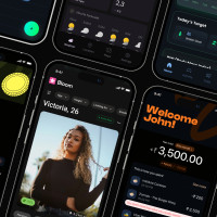
Let's see this in action. Imagine we’re building a simple product card. On a small phone screen, we want the image stacked on top of the text. On a larger tablet or desktop screen, we want the image to sit beside the text in a clean horizontal layout.
With NativeWind, this is surprisingly simple. The library uses responsive prefixes like md: or lg: that only apply styles once the screen width hits a certain breakpoint. This is progressive enhancement, expressed directly in your code. You start by styling for the smallest screen, and then you layer on the changes for bigger ones.
By default, all utility classes in NativeWind target mobile. When you add a breakpoint prefix like
md:flex-row, you're telling the component, "Be a column by default, but become a row on medium screens and up." This is the mobile-first philosophy in action.
Here's what that looks like in a code snippet:
import { View, Text, Image } from 'react-native';
const ProductCard = ({ title, description, imageUrl }) => { return ( // Default: column layout for mobile // md breakpoint: switch to row layout for tablets/web <View className="flex flex-col md:flex-row bg-white rounded-lg shadow-md overflow-hidden"> <Image source={{ uri: imageUrl }} // Default: full-width image for mobile // md breakpoint: fixed width for larger screens className="w-full h-48 object-cover md:w-48 md:h-auto" /> <View className="p-4"> <Text className="text-lg font-bold">{title}</Text> <Text className="mt-2 text-gray-600">{description}</Text> </View> </View> ); };
See how that works? The main View starts with flex-col for our mobile default. The md:flex-row class then overrides it on medium screens, creating the horizontal layout we wanted. The same logic applies to the Image component's width and height. Simple, readable, and effective.
While NativeWind is fantastic for styling, manually building every single UI element is still a grind. This is where a UI kit like gluestack-ui becomes a huge productivity boost.
It provides components that are not only pre-styled but are also built from the ground up with accessibility and responsiveness in mind. If you want to go even deeper, it's worth exploring the benefits of a complete React Native design system and how it can supercharge your entire development process.
Using a pre-built component library means you're not starting from zero. You can focus on what makes your app unique, confident that your UI is built on solid, mobile-first ground. It’s all about working smarter, not harder, so you can ship better apps, faster.
So, you’ve built a sharp-looking app based on solid mobile-first principles. That’s a fantastic start, but it’s really only half the battle. If you don't actually validate your work with real testing, you're just flying blind and hoping your design choices land with users.
Testing isn’t some final checkbox you tick off before launch. Think of it as a continuous feedback loop that confirms your brilliant design theory translates into a genuinely great experience in the real world. It's about more than just making sure the app doesn't crash; you need to dig deeper.
This means a multi-faceted approach is non-negotiable. You’ve got to combine technical checks with human-centric feedback. The goal is to be certain your layout adapts flawlessly, the performance is snappy, and the whole thing feels intuitive to the people who will actually use it. Without that vital feedback, even the most well-intentioned design can fall completely flat.
The first layer of testing is all about the technicals. Your main goal here is to make sure your app's layout doesn't just shrink down—it needs to intelligently reflow and adapt across a whole spectrum of screen sizes. A design that looks pixel-perfect on a small iPhone might completely break on a larger Android phone or a small tablet.
A great place to begin is with simulators and emulators. Tools like the Xcode Simulator for iOS and Android Studio's Virtual Devices are your best friends for quickly spotting layout bugs. They let you rapidly cycle through different screen dimensions, resolutions, and orientations (portrait vs. landscape) to catch those obvious alignment or overflow issues right away.
But simulators can't tell you the whole story. Real-device testing is absolutely essential for nailing down issues related to pixel density, weird color rendering, and how the app feels performance-wise. You don't need a massive device lab to get started, either. Just focus on a few key devices that represent your target audience, like a popular mid-range Android phone and a recent iPhone model.
Once you’ve confirmed the layout is technically sound, it’s time to bring in the human element. Is the app actually easy and enjoyable to use? This is where user experience (UX) testing comes into play, and it doesn't have to be a complicated, expensive affair.
One of the most powerful things you can do is run a few informal usability tests. Seriously, just ask a handful of people—friends, colleagues, or folks from your target audience—to perform a few specific tasks in your app while you watch them.
You're not looking for perfection in these sessions. The real goal is to spot the biggest points of friction. It's a well-known fact that testing with just five users can uncover 85% of the usability problems in your design.
To make your designs even more concrete before this phase, think about creating detailed visual guides. You can learn more about this by exploring the process of building high-fi wireframes, which helps bridge the gap between early concepts and a testable prototype.
Finally, your mobile-first design must be fast. For users on the go, performance isn't a bonus feature—it's everything. Slow load times or a janky interface are the fastest ways to get your app uninstalled for good.
You'll want to measure a few critical performance metrics to make sure your app feels snappy and responsive.
Thinking mobile-first isn't just a trendy design tactic; it’s a core business strategy. When you nail the mobile experience, you directly influence user satisfaction, drive up conversions, and sharpen how people see your brand in a ridiculously crowded market. It's the only real blueprint for building apps that feel right because they meet people where they already are—on their phones.
This whole philosophy forces you to be intentional. When you start with the smallest screen, you're not just shrinking a desktop site. You're distilling your entire product down to its most essential, valuable core. This is how you guarantee your app is solid, blazing fast, and works for the biggest possible audience right from the get-go.
Adopting this mindset pays off in real, tangible ways that go far beyond just clean code. It leads directly to faster load times (which search engines love) and a more intuitive journey for your users (which they love even more). Honestly, it's about future-proofing your work. An app built this way is far easier to adapt to whatever new devices and user expectations are coming down the pike.
For developers, it creates a clearer, more constrained environment that actually encourages focus and efficiency. For the business, it means a product that performs better, makes more users happy, and ultimately drives the bottom line. It’s a classic win-win, aligning technical craftsmanship with smart business goals.
Mobile-first design isn’t about making sacrifices. It’s about making smart, user-centric decisions from the very beginning that pay dividends across every single platform.
At the end of the day, this blueprint is all about clarity. It's a commitment to ruthless prioritization, designing for thumbs, and demanding lightning-fast performance. Even when you're looking at tools for broader web development, like platforms such as Remixable which is built to simplify website creation, the smartest ones are grounded in a mobile-first philosophy to ensure they work for everyone.
The main takeaway couldn't be simpler: build for the majority first. Once you master these principles, you're set up to create apps that aren't just functional, but genuinely exceptional. You're not just building an app; you're laying a foundation strong enough to support whatever comes next, making sure your work stays relevant and loved for years to come.
Even with a solid game plan, switching to a mobile-first mindset can bring up some tricky questions. It's a real shift in how we think and build. Let's tackle some of the most common hurdles developers run into when they make the leap from desktop-down to mobile-up.
This one trips people up all the time. Think of it like this: all mobile-first designs are responsive, but not all responsive designs are mobile-first. The real difference is where you start and what you prioritize.
Responsive design is fundamentally about flexibility—making a layout that can bend and reflow to fit any screen. Often, this process starts with the full desktop experience, which then gets condensed and rearranged for smaller devices.
Mobile-first, on the other hand, is a much stricter philosophy.
You start with the tightest constraints imaginable—the smartphone—and you absolutely nail that core experience. From there, you progressively enhance the design, adding more features and complexity as you get more screen space to work with. It's a subtle distinction, but it completely changes your priorities.
Absolutely. In fact, it's more critical than ever. Mobile devices now account for over 60% of all global web traffic. That's not just a trend; it's the new standard. Designing for the smallest screen first isn't just a good idea—it’s the only way to meet the majority of your users where they are.
This approach lines up perfectly with how people actually use technology today. They want things to be fast, easy, and accessible on the go. When you prioritize mobile, you're building an app that's already optimized for speed, usability, and the very context in which most people will first discover it.
Not even close. This is probably the biggest myth out there. The goal isn't to deliver a stripped-down, boring desktop experience. It's to build a much stronger, more focused foundation for all experiences.
When you force yourself to define the absolute essential features for a tiny screen, you end up with a lean, fast, and clutter-free core product. As you scale up to a desktop view, you're not just throwing more stuff on the screen. Instead, you get to be really intentional about adding features that truly benefit from the extra space, like:
This way, the desktop version feels like a powerful, deliberate upgrade of the mobile core—not a bloated, separate application. It forces you to justify every single element you add, no matter the screen size.
Ready to build beautiful, responsive apps without starting from scratch? gluestack market offers a huge collection of production-ready React Native templates and UI kits. Ship your cross-platform app faster by visiting us at https://market.gluestack.io.
Feb 23, 2026
4 min read
Discover powerful mobile app monetization strategies to boost your revenue. Our guide covers IAPs, ads, and subscriptions for React Native apps and beyond.

Feb 22, 2026
4 min read
A clear guide to app development cost estimation. Learn what drives costs, see budget examples, and discover strategies to build your app for less.

Feb 21, 2026
4 min read
Discover how to promote mobile application effectively with proven ASO, paid campaigns, and retention strategies.
Feb 15, 2026
4 min read
Discover how to create a prototype of a website with a practical, step-by-step guide. Explore tools, testing methods, and tips to bring your idea to life.
Feb 14, 2026
4 min read
Confused about mockups vs wireframes? Learn the key differences, when to use each, and how to streamline your React Native app development workflow.

Feb 13, 2026
4 min read
Discover how mobile apps templates accelerate development. Learn to choose, customize, and deploy high-quality React Native templates for your next project.

Feb 12, 2026
4 min read
Explore mobile application interface design with practical tips, core principles, and platform-aware workflows to craft apps users love.
Feb 08, 2026
4 min read
Explore the progressive web app vs native debate with our in-depth guide. We compare performance, cost, and UX to help you make the right strategic choice.
Feb 07, 2026
4 min read
Discover how React Native templates can accelerate your app development. This guide explores choosing, customizing, and deploying templates for faster launches.

Feb 05, 2026
4 min read
Discover the key differences between expo vs react native, including workflow, builds, and performance to help you pick the right path for your app.
Feb 03, 2026
4 min read
Master image with text overlay in React Native with responsive, accessible patterns. Learn expo setup, NativeWind styling, and gluestack-ui examples.

Feb 03, 2026
4 min read
Discover cross platform app development with proven strategies to build faster for iOS, Android, and the web using a single, unified codebase.
Feb 01, 2026
4 min read
Learn how to make an app for my business quickly with template-based steps from planning to launch, plus tips to scale and optimize.

Jan 31, 2026
4 min read
Ready to build an app? This guide shares practical strategies for validating your idea, choosing a tech stack, and navigating the App Store launch.
Jan 30, 2026
4 min read
Master responsive design for mobile apps with this guide on fluid layouts, breakpoints, and React Native. Build UIs that adapt perfectly to any screen.

Jan 25, 2026
4 min read
Learn how to design an Android app that stands out. This guide covers UX research, wireframing, Material Design, and the developer handoff process.

Jan 24, 2026
4 min read
Explore ui design web essentials: a complete guide to principles, responsive patterns, and workflows for intuitive, engaging web interfaces.

Jan 23, 2026
4 min read
Discover 10 essential mobile app design best practices for building exceptional cross-platform apps. Actionable tips for UI, UX, navigation, and performance.

Jan 21, 2026
4 min read
Discover how to debug React Native apps effectively. This guide covers Flipper, React DevTools, and native code troubleshooting for faster development cycles.
Jan 20, 2026
4 min read
Learn how to create app for your business with a practical, modern approach. Plan, customize, and launch with proven steps.
Jan 19, 2026
4 min read
A complete guide to mobile app development for startups. Learn how to validate your idea, build an MVP, and launch a successful app faster and more affordably.

Jan 18, 2026
4 min read
Discover how to choose the right React website template to accelerate your project. Our guide covers everything from quality checklists to deployment.
Jan 17, 2026
4 min read
Discover how to choose, customize, and deploy a React Native app template. This guide provides practical steps for launching production-ready apps faster.

Jan 16, 2026
4 min read
Discover how mobile application templates accelerate development. This guide covers how to choose, customize, and launch your app with the right foundation.

Jan 13, 2026
4 min read
Start your journey in mobile app development for beginners. This guide breaks down how to build your first cross-platform app with React Native and Expo.

Jan 12, 2026
4 min read
Explore the best react native ui libraries and compare features, performance, and ease of use to pick the right toolkit for your app.

Jan 11, 2026
4 min read
Launch your own ride-hailing service with our guide to building a production-ready Uber app clone. Learn MVP strategy, tech stacks, and backend integration.

Jan 10, 2026
4 min read
Master modern cash app design with this guide. Learn the UI/UX, security, and React Native strategies needed to build a fintech app that users trust and love.

Jan 09, 2026
4 min read
Learn how to build a personal finance dashboard with React Native. A practical guide for developers on UI design, data architecture, and production readiness.
Jan 08, 2026
4 min read
A practical guide to building a cross-platform event check in app with React Native. Learn to implement QR scanning, offline sync, and deployment.

Jan 07, 2026
4 min read
Master linear gradient React Native components with our complete guide. Learn practical techniques for Expo, bare RN, and NativeWind to build stunning UIs.

Jan 06, 2026
4 min read
Learn how to change application name in your React Native & Expo projects. This guide covers display names, package IDs, and app store listings.
Jan 05, 2026
4 min read
Discover how to monetize mobile apps with our founder's guide. Learn proven React Native strategies for ads, IAPs, and subscriptions to maximize your revenue.

Jan 04, 2026
4 min read
A practical guide on how to create a website app with a single codebase. Learn to build for web, iOS, and Android using React Native, Expo, and TypeScript.

Jan 03, 2026
4 min read
Learn how to create an app for your business with this definitive guide. Discover practical strategies for validation, development, and launch that work.

Jan 02, 2026
4 min read
Learn how to create a wireframe for a website with this practical guide. Move from initial sketches to developer-ready designs that get built right.
Jan 01, 2026
4 min read
Deciding on progressive web application vs native? This guide offers a deep comparison of performance, cost, UX, and use cases to help you choose wisely.

Dec 31, 2025
4 min read
Discover 10 mobile app security best practices for React Native. Learn to secure data, APIs, and code with actionable tips and examples for 2025.

Dec 30, 2025
4 min read
Unlock the real React Native app development cost. Our guide breaks down pricing by feature, team, and complexity to help you budget with confidence.

Dec 29, 2025
4 min read
A practical guide to master your React Native debug workflow. Learn to use Flipper, React DevTools, and Hermes to solve bugs in Expo and bare RN apps.

Dec 28, 2025
4 min read
The ultimate React Native tutorial for beginners. Learn to build beautiful cross-platform apps using a modern stack like Expo, TypeScript, and gluestack-ui.
Dec 27, 2025
4 min read
A practical guide on how to build a mobile app. Learn to go from concept to a market-ready app using templates, React Native, and proven development strategies.

Dec 26, 2025
4 min read
Discover interface design for websites with actionable tips on layout, responsiveness, and usability to boost conversions.

Dec 25, 2025
4 min read
Discover designs for apps that blend minimal aesthetics with personalization, and learn to build user-centric interfaces that boost engagement.

Dec 24, 2025
4 min read
Learn graphical interface design - essentials for mastering core principles, modern workflows, and cross-platform strategies to build intuitive, engaging UIs.

Dec 23, 2025
4 min read
Discover how high fi wireframes bridge the gap between ideas and code. Learn a practical workflow for creating, testing, and handing off effective UI designs.

Dec 22, 2025
4 min read
Discover mobile app interface design with practical principles, accessibility, and workflows that boost user engagement.

Dec 21, 2025
4 min read
Explore the top 10 UI UX design trends for 2025. Get expert insights and practical React Native tips to build next-gen cross-platform apps that stand out.

Dec 20, 2025
4 min read
Discover how mobile app templates accelerate development from idea to launch. Learn to select, customize, and deploy templates for a faster time to market.

Dec 18, 2025
4 min read
Explore the best react native ui libraries to accelerate mobile development with performance, theming, and accessibility. Expert tips inside.
Dec 16, 2025
4 min read
Master React Native PDF handling. Learn to generate, view, and share PDFs with practical code examples, library comparisons, and performance tips.
Dec 15, 2025
4 min read
A practical guide to choosing the right React Native component library. Learn how to evaluate options, avoid common pitfalls, and build apps faster.

Dec 14, 2025
4 min read
Find the perfect React Native UI library for your project. This guide compares top libraries, selection criteria, and customization strategies.
Dec 13, 2025
4 min read
Learn how to change app name in React Native and Expo. Our guide covers display names, bundle IDs, and store listings for iOS and Android projects.
Dec 12, 2025
4 min read
Discover the best React Native component library for your next project. We compare top libraries on performance, customization, and real-world use cases.
Dec 11, 2025
4 min read
Discover how to choose the right React Native UI kit. This guide covers top kits, selection criteria, and customization to accelerate your app development.

Dec 10, 2025
4 min read
Explore our in-depth guide to find the best React Native UI library. We compare top contenders to help you choose the right fit for your project.
Dec 09, 2025
4 min read
Discover a practical approach to building apps with React Native. This guide covers setup, UI, state management, and testing to help you ship great apps.

Dec 08, 2025
4 min read
android login with facebook: Learn to set up the Facebook SDK, manage tokens, and implement secure authentication across native Android, cross-platform apps.

Dec 07, 2025
4 min read
Master the alert in React Native. Learn to handle platform differences, build custom modals, and apply best practices for a seamless user experience.
Dec 06, 2025
4 min read
keyboardavoidingview react native: Master keyboard handling with KeyboardAvoidingView across iOS, Android, Expo, and TypeScript.
Dec 05, 2025
4 min read
A practical guide to implementing a React Native PDF viewer. Learn to compare libraries, handle native setup, and troubleshoot common issues with real code.

Dec 04, 2025
4 min read
how to validate startup idea: learn proven methods like customer interviews, MVPs, and metrics to confirm market fit.

Dec 03, 2025
4 min read
how to make app like uber: Learn core features, tech stack, development steps, testing, and launch tips.

Dec 02, 2025
4 min read
Build a rock-solid React Native setup. This guide covers Expo vs. Bare workflows, TypeScript, pnpm monorepos, NativeWind, and deployment strategies.

Dec 01, 2025
4 min read
A practical guide to Stripe React Native integration. Learn to set up your server, build payment UIs, handle webhooks, and launch secure mobile payments.

Nov 30, 2025
4 min read
Learn how to master push notifications in React Native. This guide covers setup, best practices, and advanced techniques for engaging your users.

Nov 29, 2025
4 min read
Build powerful location-based apps with our practical guide to react native with google maps. Get setup guides, pro tips, and best practices for iOS & Android.

Nov 28, 2025
4 min read
Explore deep linking react native with a practical guide to configuring URL schemes, universal links, navigation, and testing for Expo and bare apps.

Nov 28, 2025
4 min read
A practical guide to building a scalable React Native design system. Learn to implement tokens, theming, and tools like NativeWind and gluestack-ui.

Nov 26, 2025
4 min read
Learn why react native expo templates speed up your projects with ready-made patterns and practical tips.

Nov 25, 2025
4 min read
Discover how to improve developer productivity with actionable strategies for workflow, tooling, and culture. A practical guide for software engineering teams.

Nov 24, 2025
4 min read
Discover the best cross platform app development tools. Compare top frameworks like Flutter and React Native to build and ship apps faster.
Nov 23, 2025
4 min read
This Expo React Native tutorial provides a hands-on guide to building cross-platform apps. Learn setup, styling with NativeWind, navigation, and deployment.

Nov 22, 2025
4 min read
Build beautiful UIs faster with this guide to Tailwind CSS React Native. Learn setup, styling, and advanced techniques with NativeWind for mobile apps.

Nov 21, 2025
4 min read
Explore our curated list of 7 top-tier React Native app examples. Discover production-ready templates and resources to build your next app faster.
Mar 19, 2025
4 min read
gluestack market offers React Native UI templates to accelerate development. Get customizable, production-ready React Native app templates and Ui kit, some free. Build faster & smarter today!